|
Published on Archi.ru (https://archi.ru) |
|
| 16.04.2020 | |
|
Wicker Vitality |
|
|
Natalia Koriakovskaia |
|
| Architect: | |
| Andrey Romanov | |
| Ekaterina Kuznetsova | |
| Studio: | |
| ADM | |
|
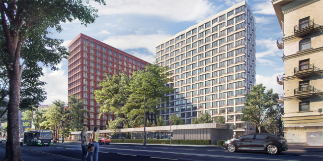
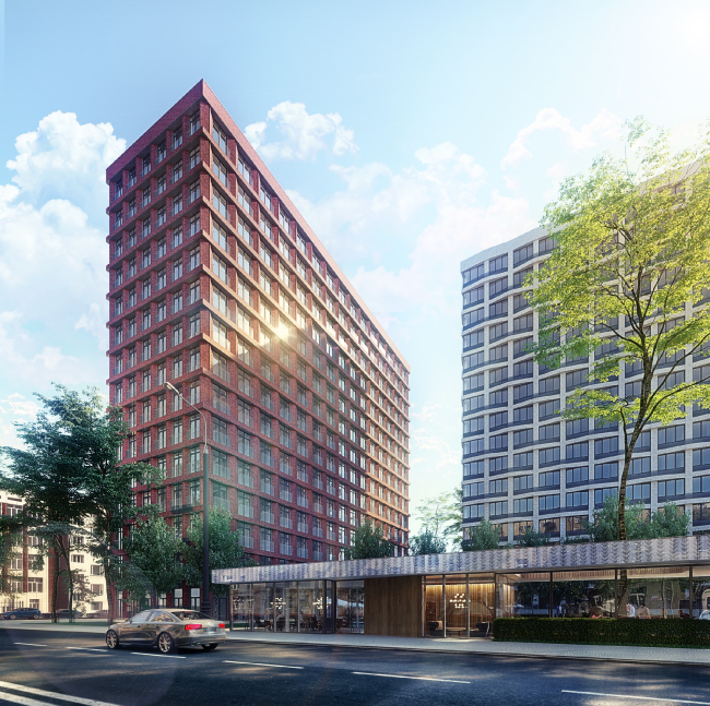
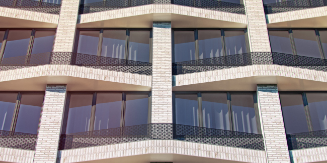
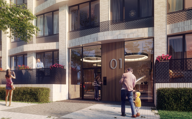
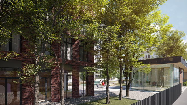
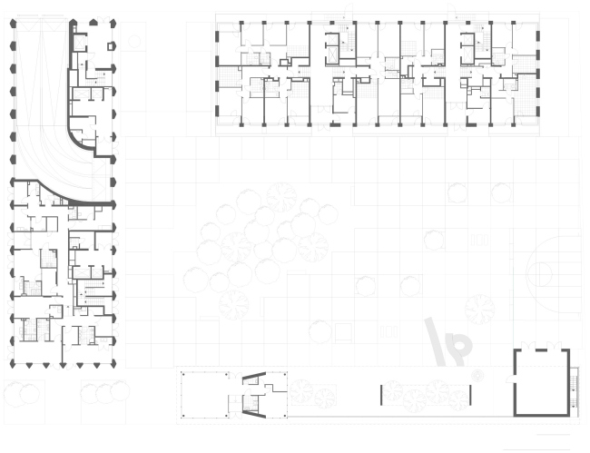
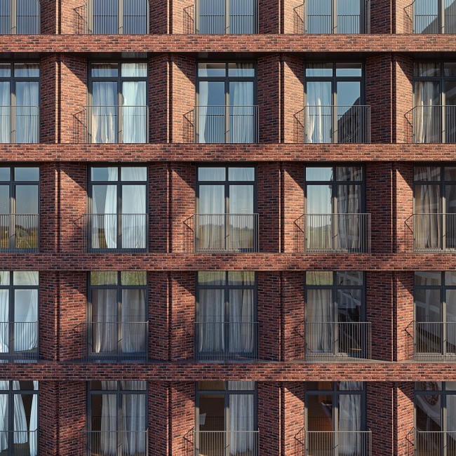
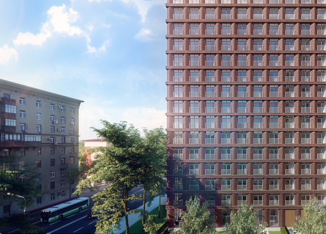
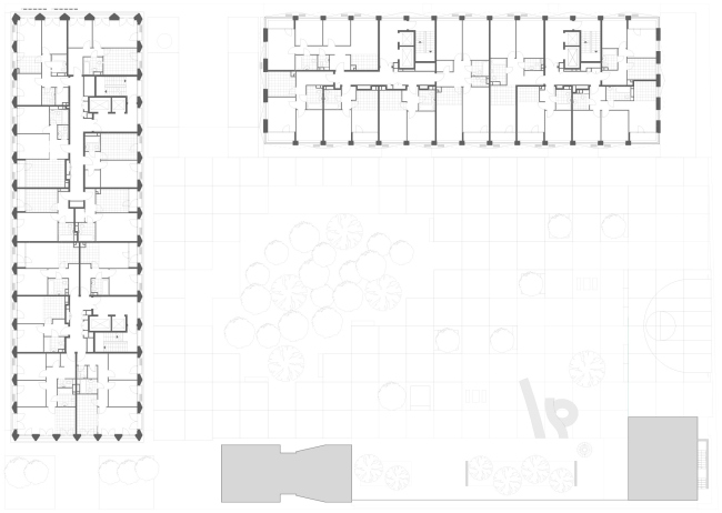
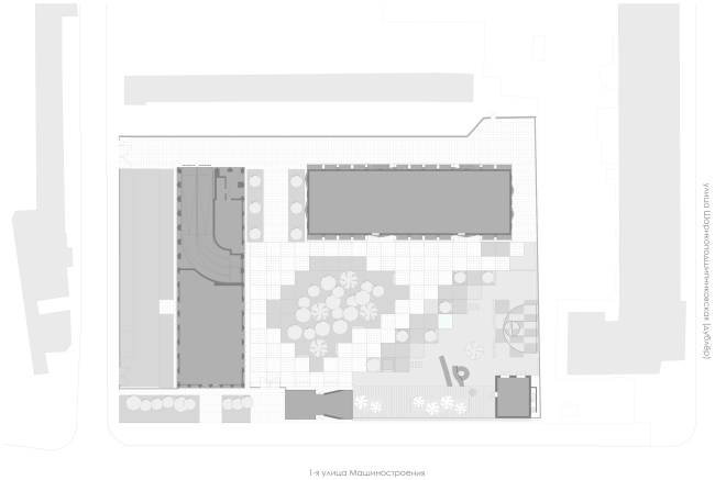
Next to the Dubrovka metro station, ADM has designed a Vitality housing complex with a polychrome mixture of Klinker brick on its ridged facades. The housing complex Vitality is situated behind the front of Stalin houses standing along the Sharikopodshipnikovskaya Street, and consists of two 15 and 16-story buildings: the position of one of them follows the construction line along the boulevard; the other stands at a right angle to the Mashinostroeniya Street. This composition came from the original L-shaped “open book” volume that the architects ultimately divided into two independent buildings. To close the yard perimeter, they also added a building equipped with a noise screen standing on the 1st Mashinostroeniya Street. Thus, the vacant place in the block housing construction of the mid-XX century got filled by another similar “cell” with a prominent yard and a street front. High-end residential complex VitalityCopyright: © ADMOn the other hand, this is the only thing that the new complex and the surrounding construction have in common. The new buildings “make no secret” of their modern language, demonstrating a fundamentally new scale and structure of facades. The ratio of the wall substance and the glazing part is rather modernist, which is further emphasized by the glazed side ends of the buildings, as well as by “taking away” the mass at the corners, where recessed balconies are added. On the other hand, the main facade decoration material used by ADM is Klinker brick, and the architects are using it abundantly in the “thick” plastique elements, such as triangular pylons and the “red” unit. And this “corporeality” is very Moscow in its nature. High-end residential complex VitalityCopyright: © ADMThe design of both buildings is based on ADM’s signature technique of articulating the modular grid. The scale and plastique of this modular grid is different on each of the buildings. In the “white” building, the wide triple windows are separated by thick wave-shaped fills, which forms an effect very much like a wicker basket. The brick pattern is the same all over the building, yet when it is viewed from the side, it creates a “meander” effect. “If you are designing a facade grid, you need to use very good materials” – Andrey Romanov says. The accentuated geometry of the “belts” is highlighted by different directions of the brickwork and by different types of brick being used: specially for this project, the architects, in collaboration with the German brick manufacturer, developed brick of unique designer tones. According to the leader of the company, working with the brick was particularly interesting; it was done at the German production facility, where new brick samples were created, together with a representative of the development company. High-end residential complex VitalityCopyright: © ADMThe full rich tone, the beauty of which one will only be able to appreciate when the building is finished, is further decorated by the bronze hue of openwork grilles. There are no balconies behind the grilles; these are recessions for the air conditioning units. Hiding the external air conditioning units inside the wall became one of the common construction decencies in this city about five years ago. Lately, this measure has also been appreciated by the residents themselves. “About six years ago, people who lived in housing of such class were not ready to stretch the air conditioning lines up to the public balcony. Now, however, in the housing that costs 200 thousand rubles per square meter and higher, people are ready to spend extra 50-60 thousand on a more powerful air conditioning unit, and not banter with the management company” – Andrey Romanov says. High-end residential complex VitalityCopyright: © ADMHigh-end residential complex VitalityCopyright: Photograph: Larus CapitalAt the client’s request, the first floor of the “white” building also includes apartments – apartments with balconies. These will ensure the residents’ privacy and help to avoid the “peeping” effect. “Designing balconies on the first floor, you are getting a buffer zone, a terrace. We’ve got the apartment floors raised above the ground level, and, when you are inside, the person is protected by the depth of this terrace, so you cannot see them from the outside, and neither can they. This is something like a bonus for the residents of the bottom floors because apartments on the first floor are always a little less popular” – the architect adds. Plan of the 1st floor. High-end residential complex VitalityCopyright: © ADMThe contrasting “red” building features a grid with more elongated vertical cells, “French” windows reaching to the floor, and sculptural pier buttresses of triangular section, whose sharp rib is accentuated by a thin graphical flute. All across the complex, the facades are composed of solid bricks, and, to compensate for the sheer weight of the brickwork, the architects are placing it on the intermediate floors, thus alleviating the load of the subsystem and making the whole construction safer and more predictable. In this building, the first floor is non-residential – the side end, facing the 1st Mashinostroeniya Street, includes commercial premises; the opposite end is occupied by the ramp of the underground parking garage. High-end residential complex VitalityCopyright: © ADMThe apartment range of the new complex is rather diverse and quite up to today’s standards: from single-room apartments about 40 square meters to three-room apartments about 91 square meters – the latter are double-sided, and can be aired through. From two rooms and higher, the apartments are equipped with two bathrooms. In many cases, the apartments feature a “kitchen / living room”; in some cases, especially in double-room apartments, there is a kitchen equipped with a recessed balcony, not really visible from the outside. High-end residential complex VitalityCopyright: © ADMThere are no dedicated reception desks in the buildings’ entrance groups – instead, they have a common lobby situated in the entrance unit. This entrance unit was placed by the architects in the street front, in the same row with the maintenance premises and the glass noise screen, which yielded a full-fledged green yard. To preserve the grownup trees on the land site, the entrance unit was designed in such a way as to form alcoves that “embrace” the tree trunks and crowns. 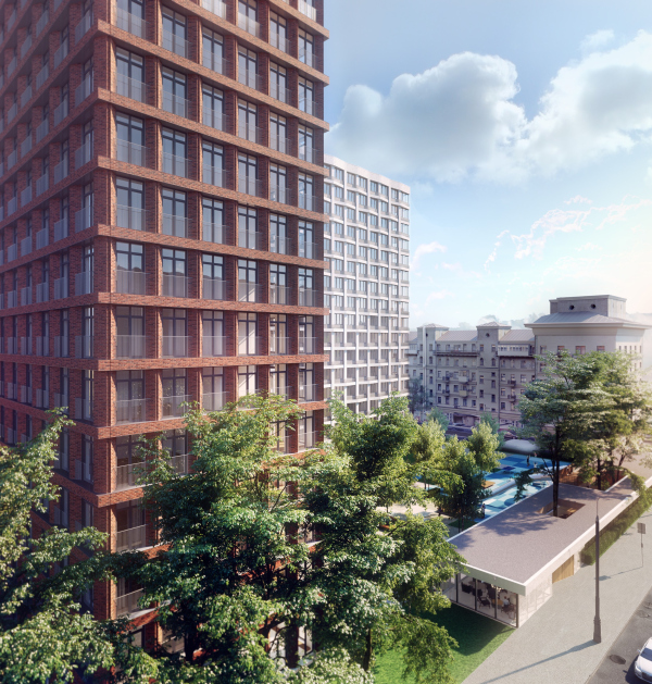 High-end residential complex VitalityCopyright: © ADM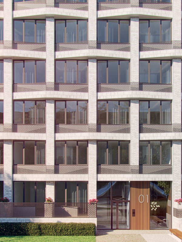 High-end residential complex VitalityCopyright: © ADM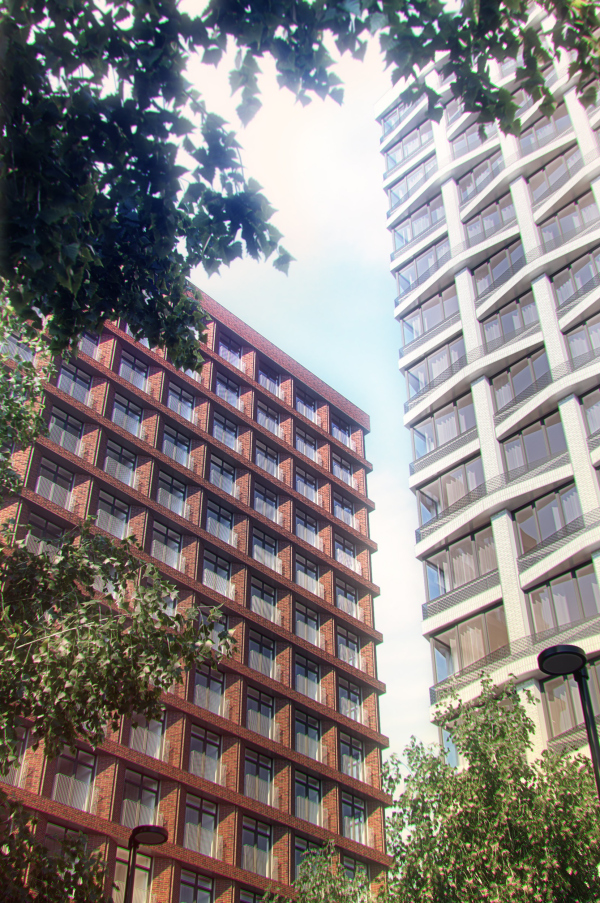 High-end residential complex VitalityCopyright: © ADM“The hot trend of the last five-seven years is high-quality landscape design, absolutely on the European level. Twenty years ago nobody appreciated this at all – the developer could pay some attention to the facades and then launch the sales without so much as saying a word about the vehicle-fee yard or the landscaping project. And now, if you don’t offer such things, nobody will buy your product” – Andrey Romanov says. In the Vitality complex, the territory of the yard rises in a hilly terrain, in which two main zones are formed – the recreation area and the playground. Above the parking lot, there is enough soil for planting large trees and making actual hills. The square paving pattern becomes the motif that unites the yard space. 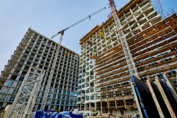 High-end residential complex Vitality: construction, 2020Copyright: Photograph: Larus Capital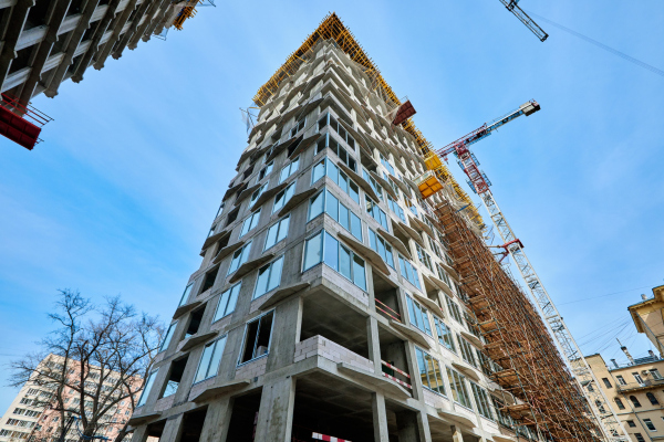 High-end residential complex Vitality: construction, 2020Copyright: Photograph: Larus Capital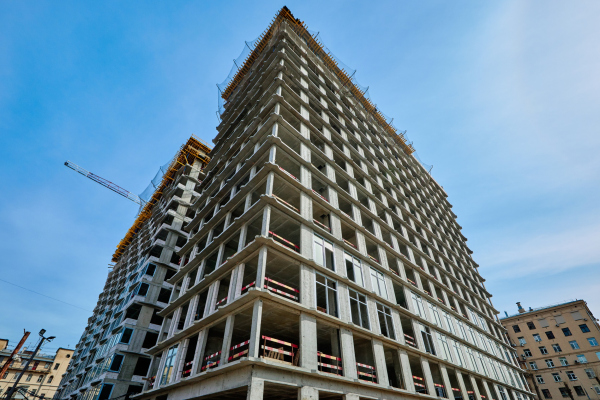 High-end residential complex Vitality: construction, 2020Copyright: Photograph: Larus Capital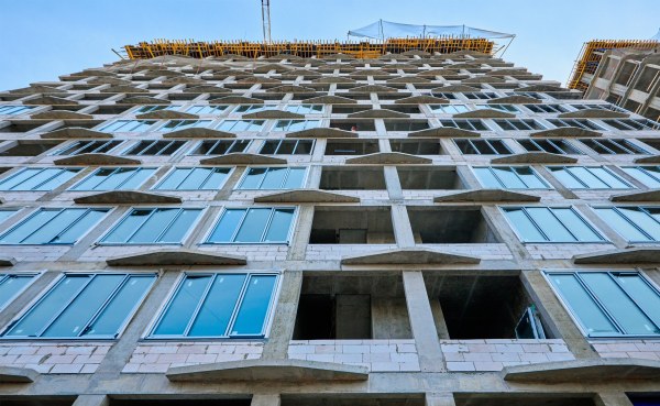 High-end residential complex Vitality: construction, 2020Copyright: Photograph: Larus Capital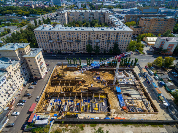 High-end residential complex Vitality: construction, 2020Copyright: Photograph © ADM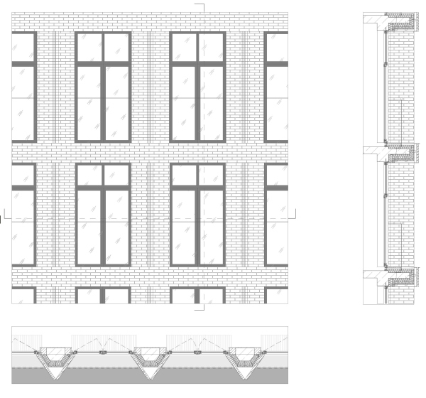 Facade. High-end residential complex VitalityCopyright: © ADM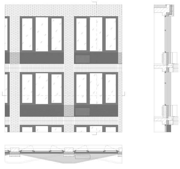 Facade. High-end residential complex VitalityCopyright: © ADMPlan of the 5th floor High-end residential complex VitalityCopyright: © ADMHigh-end residential complex VitalityCopyright: © ADM |
|
