|
Published on Archi.ru (https://archi.ru) |
|
| 03.03.2020 | |
|
A New Version of the Old City |
|
|
Julia Tarabarina |
|
| Architect: | |
| Andrey Romanov | |
| Ekaterina Kuznetsova | |
| Studio: | |
| ADM | |
|
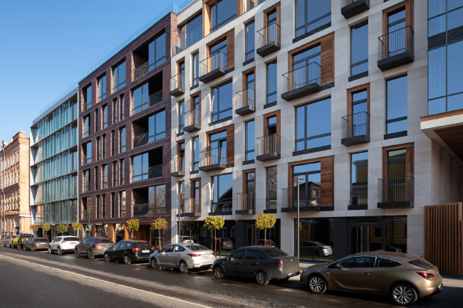
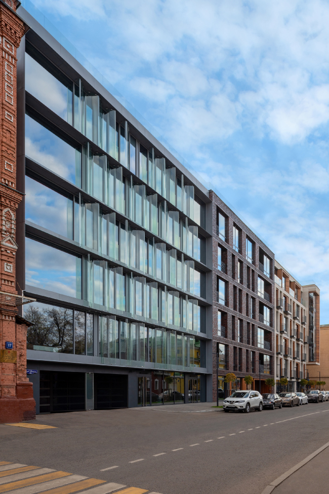
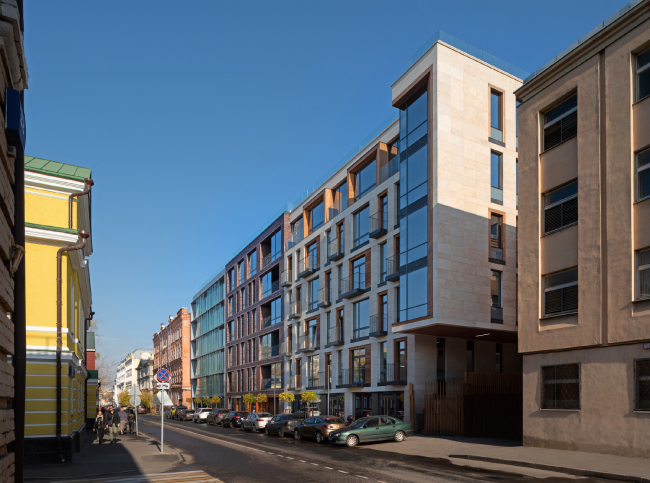
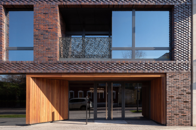
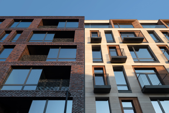
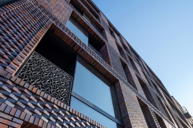
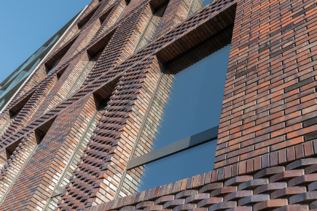
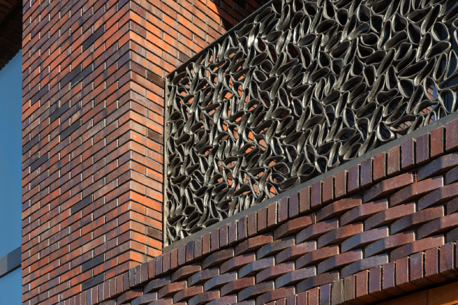
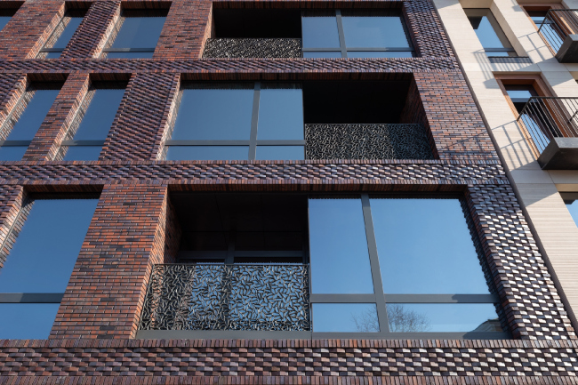
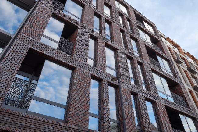
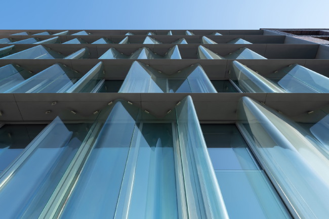
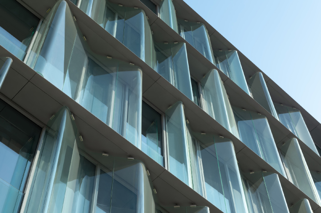
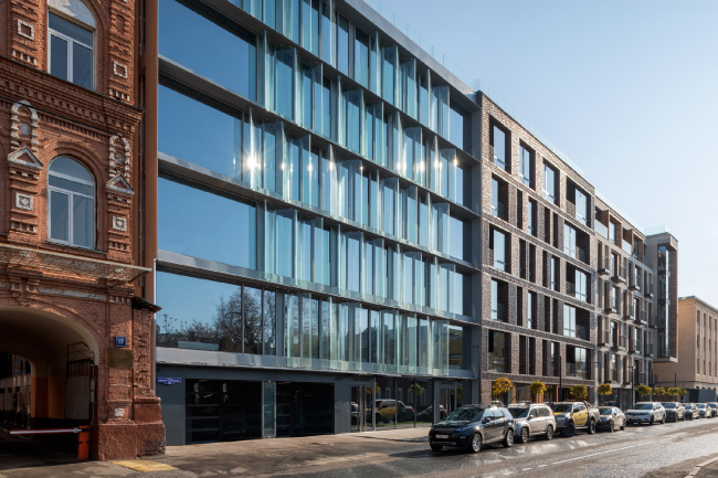
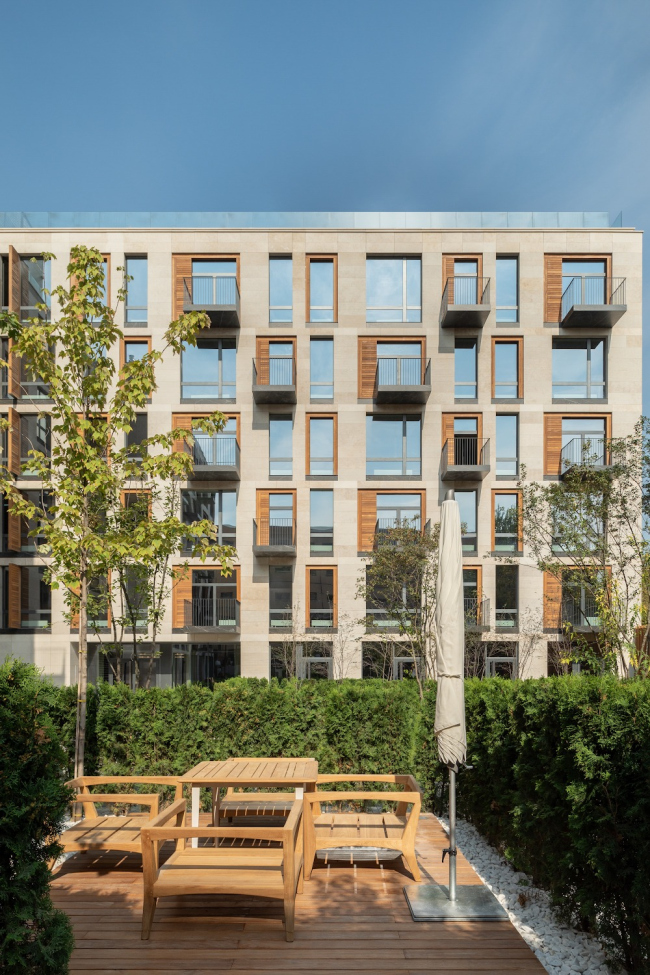
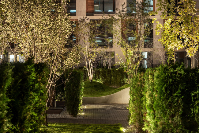
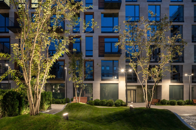
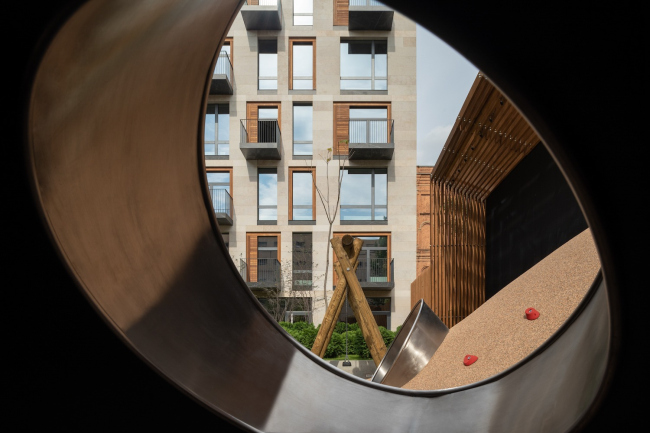
The house at Malaya Ordynka, 19, fits in perfectly with the lineup of the street, looking even as if it straightened the street up a little, setting a new tone for it – a tone of texture, glitter, “sunny” warmth, and, at the same time, reserved balance of everything that makes the architecture of an expensive modern house. Four years ago, we gave a detailed coverage of the housing project “”; now the project is complete. It is built by Developers on a quiet Zamoskvorechye street — a place so central and so right for the metropolitan high-end housing that you don’t even need a beautiful-sounding foreign name here: the address alone is enough. The housing project on the Malaya Ordynka StreetCopyright © ADMStrictly speaking, that wraps it up for the description of the main idea. Everything of the above allowed the project to easily pass through all of the board meetings and get all of the required approvals; luckily, the north block ultimately got a glass facade, instead of a beige brick one, which was proposed at some point in response to somebody’s requirement. The house rests on two tiers of an underground parking garage, which occupies the entire construction blueprint, the entrance being from the side of the Malaya Ordynka. The residential part is subdivided into three sections — but! — they do not quite match the division of the street facade, because the plan of the building is L-shaped: from the north side, the volume makes a sharp turn into the yard, and it is there that the third staircase and elevator nucleus is situated. From the south side, however, the house steps back from the neighboring office building erected back in the 1930’s, and overhangs in a giant cantilevered structure 6 meters high above the driveway for emergency vehicles. Otherwise, the yard is car-free. 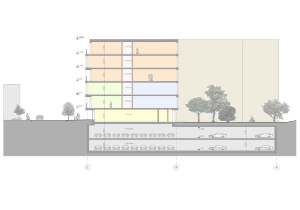 The housing project on the Malaya Ordynka Street. Section viewCopyright © ADM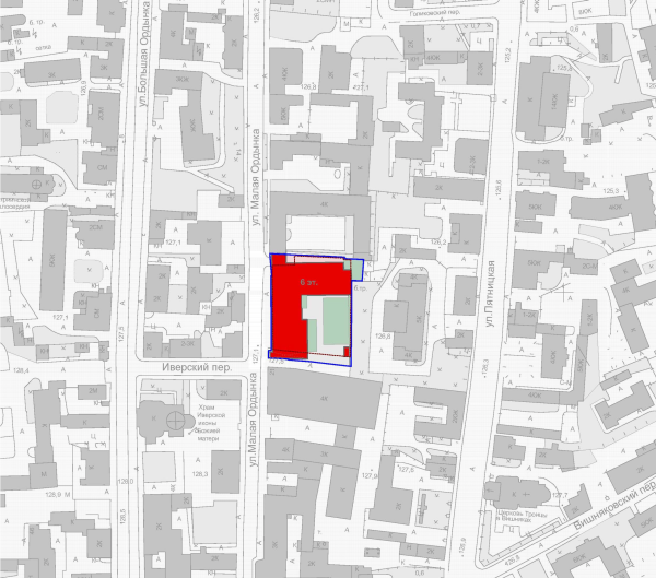 The housing project on the Malaya Ordynka Street. Location plan. Project, 2016 © ADMCopyright © ADM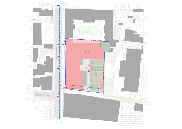 The housing project on the Malaya Ordynka Street. The traffic planCopyright © ADM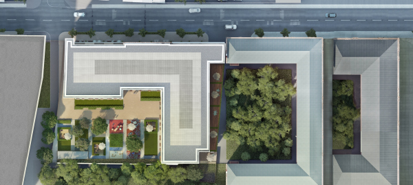 The housing project on the Malaya Ordynka Street. MasterplanCopyright © ADM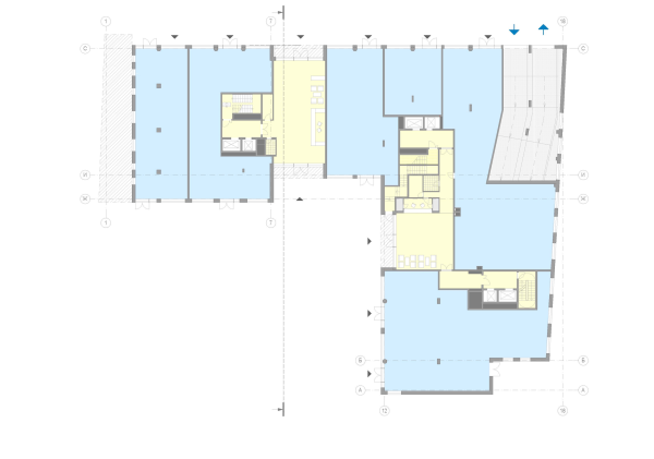 The housing project on the Malaya Ordynka Street. Plan of the 1st floorCopyright © ADM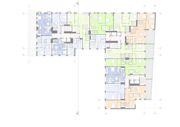 The housing project on the Malaya Ordynka Street. Plan of the 2nd floorCopyright © ADM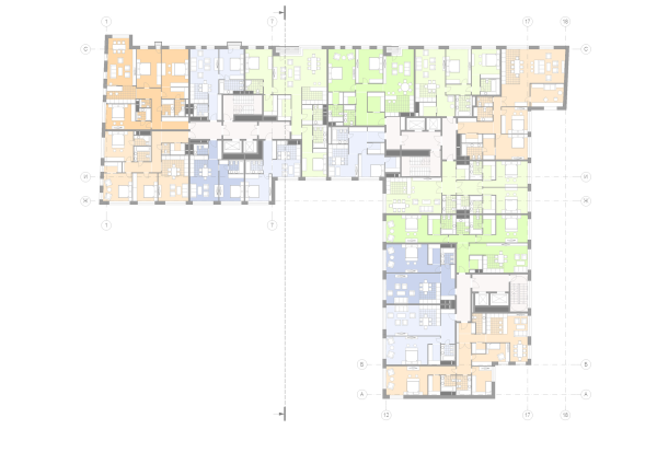 The housing project on the Malaya Ordynka Street. Plan of the 3rd-5th floorsCopyright © ADM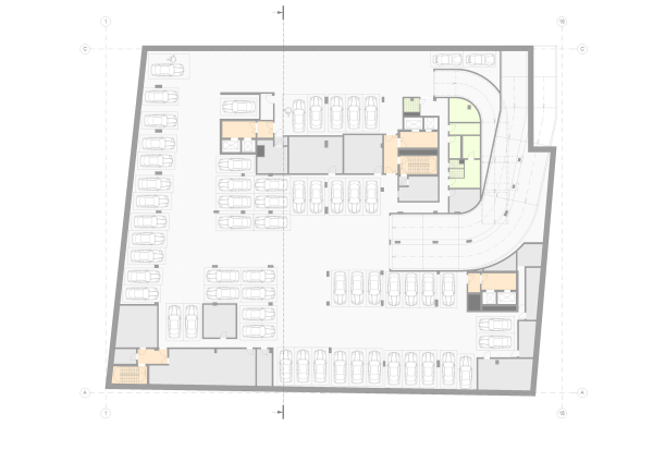 The housing project on the Malaya Ordynka Street. Plan of the -1st floorCopyright © ADM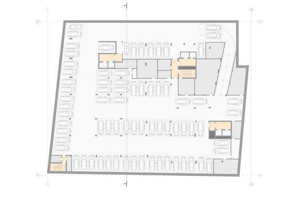 The housing project on the Malaya Ordynka Street. Plan of the -2nd floorCopyright © ADM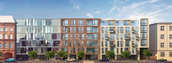 The housing project on the Malaya Ordynka Street. Facade. Version 2. Project, 2016Copyright © ADMThe range of apartments is quite diverse here; this class of housing can afford big square footage, up to 170 square meters. The penthouses on the top floors have their own exits to the operated roof that commands wonderful views of Zamoskvorechye and the Moscow Kremlin. 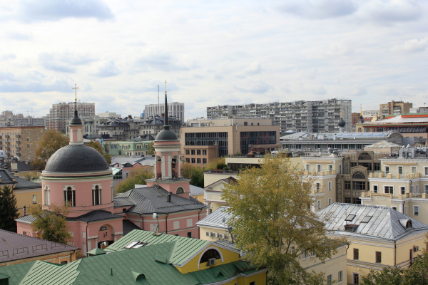 View of the operated roof of the Malaya Ordynka, 19 housing projectCopyright: Photograph: Archi.ru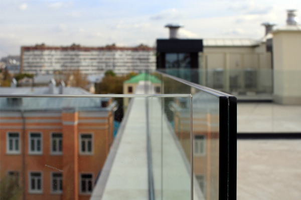 The housing project on the Malaya Ordynka StreetCopyright: Photograph © Yaroslav Lukyanchenko / provided by ADM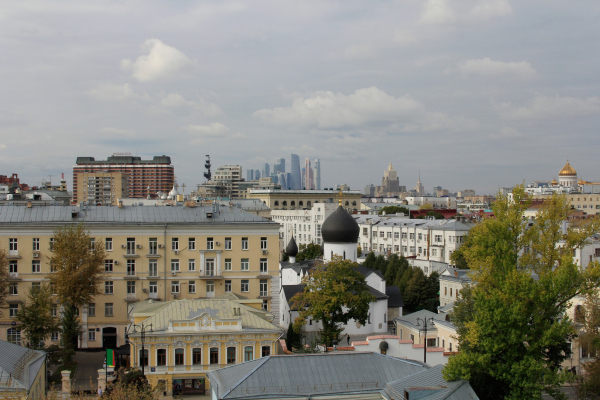 The housing project on the Malaya Ordynka StreetCopyright: Photograph © Yaroslav Lukyanchenko / provided by ADM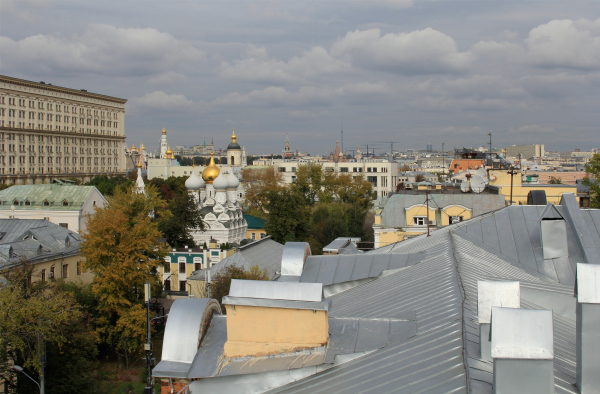 View of the operated roof of the Malaya Ordynka, 19 housing projectCopyright: Photograph: Archi.ruThe first floors are occupied by the lobby and the commercial and public functions, as is the custom nowadays, especially in the city center. Let’s hope that soon the first interesting tenants will appear in there. The outside border of the sidewalk is marked by maple trees with rather developed crowns. In short, the architects observed a lot of rules here — one can see both the necessary elements of high-end housing of the city center, the architects’ response to the construction requirements in historical context, and the characteristic techniques and approaches, chief of them being, of course, the fracturing of the total volume into separate houses: “Initially, we planned that there would be just two parts, which would correspond to the division of the street front into sections, but then we came to a more balanced tripartite composition” — explains the leader of ADM architects, Andrey Romanov. The housing project on the Malaya Ordynka StreetCopyright: Photograph © Yaroslav Lukyanchenko / provided by ADMAnother characteristic modern technique is the cantilevered structure that overhangs above the driveway, protruding slightly forward. It contains a certain degree of engineering courage that can surprise a casual observer: this corner fragment of the building casually “stuck out” from the overall volume and remained hanging in the air. On the one hand, the cantilevered structure is resonant with the traditional bay windows, yet at the break of the XIX and XX centuries the architects could not afford to build such a thing; rather, it is a technique from the arsenal of the constructivists, yet at the same time the fact that it belongs in the XXI century, is pretty obvious. The cantilevered structure “stops” the movement of the facade array, putting a comma in it, and making the building look more than just a part of the redline of tenement houses built in different times. Small and delicate, yet still noticeable, this highlight also responds to the Iversky lane that opens up to the Malaya Ordynka Street across from the bay window. The housing project on the Malaya Ordynka StreetCopyright: Photograph © Yaroslav Lukyanchenko / provided by ADMHowever, the value of this house probably does not come down to either of the two: neither to the contemporary character of the house nor to its obligatory contextual nature. The complexity of the task and the success of the result most likely rest on the balance between the reserved response to the city environment and the abundance of emotions: interesting details, texture, working with the scale and the line, and plastique ideas, literally jam-packed into the architecture of this house. It is these seemingly insignificant details that arrest one’s gaze, attracting the attention. Only upon closer examination of the house that the architects ultimately built, one can feel the full effect of the combination of different surfaces. For example, feel the contrast between the cool brick and the warm wood in the funnel of the perspective entrance. The housing project on the Malaya Ordynka StreetCopyright: Photograph © Yaroslav Lukyanchenko / provided by ADMOr feel the sharp contrast between the two materials, stone and brick, which can all but be considered polar nowadays, which helps to feel the “homely” softness of the former and the metallic rigidity of the latter — they really look like two very different houses, and they could have been ones, in fact. But then again, some lines, especially horizontal ones, are clearly joined, and the search for differences and similarities can become an exciting pastime indeed. The housing project on the Malaya Ordynka StreetCopyright: Photograph © Yaroslav Lukyanchenko / provided by ADMThe metallic glitter of the oxide scale on the brick of the central facade make this surface shine, particularly in the sunlight, with intense iridescence of terra cotta orange and silver purple, which puts one in the mind of Vrubel’s majolica pictures: they also are iridescent with all the colors of the rainbow. In this particular case, however, the picturesque glitter does not spread or disperse; it is encased in a framework of a rigorous system, as if crossed with something that is made of textile. All the more so because, instead of brick, the architects used in this case mullion transom tiles, because of which in the textured places the corners do not stick out, rather resembling ribbons of volumetric plaiting, which, in turn, rise up the facade in a large meandering pattern — one feels like saying: yes, here it is, meander of a city fabric, as if projected to the brick facade. The housing project on the Malaya Ordynka StreetCopyright: Photograph © Yaroslav Lukyanchenko / provided by ADMThe housing project on the Malaya Ordynka StreetCopyright: Photograph © Yaroslav Lukyanchenko / provided by ADMThe glitter of the brick surface resonates with dark, yet still glittering, metal of the balcony railings. Its pattern was custom-designed, and it changed in respect to the project becoming less floral and more abstract: the grid looks as if it consisted of metallic outlines of beach pebbles that got stuck together to become something like lace, with an effect of a moving surface, which distantly reminds (so as to avoid becoming a direct quote) about Art Nouveau, graphic-wise. The housing project on the Malaya Ordynka StreetCopyright: Photograph © Yaroslav Lukyanchenko / provided by ADMThe housing project on the Malaya Ordynka StreetCopyright: Photograph © Yaroslav Lukyanchenko / provided by ADMThe housing project on the Malaya Ordynka StreetCopyright: Photograph © Yaroslav Lukyanchenko / provided by ADMThe overall cold tonality of the central part is also matched by the glitter of the window panes, which, on the other hand, can be perceived as an “ambassador plenipotentiary” of the neighboring glass facade. Here, the panoramic windows are placed in a contour of a gray metallic frame with deep gabs. Between their horizontal “guidelines”, the architects placed a few figures of curved glass looking like semitransparent curtains. Strictly speaking, they don’t just look like curtains — they actually perform their function, protecting the bedrooms from the gazes of the passes-by. In addition, the curved glass covers the window frames as well, and in the places, which are devoid of curved glass, the architects used large pieces of seamless straight glass, which is quite a stunner: from a distance, it looks as if the floors were bound by a single-cut glass band, underneath which somebody grouped glass folds together, like the beads of an abacus. The housing project on the Malaya Ordynka StreetCopyright: Photograph © Yaroslav Lukyanchenko / provided by ADMThe housing project on the Malaya Ordynka StreetCopyright: Photograph © Yaroslav Lukyanchenko / provided by ADMThe folds of the curved glass are doubtlessly one of the brightest and most attractive elements of the project. They look like a precious crystal curtain. The agile and light-permeable “cold thread” draws the eye, at the same time catching the sunlight, casting specks of light into the street space. The housing project on the Malaya Ordynka StreetCopyright: Photograph © Yaroslav Lukyanchenko / provided by ADMOne cannot say that this is the first time ever that Moscow is witnessing such decorative “cold thread” or bent glass — in fact, both techniques have already been used in this city, inevitably drawing attention. However, this particular combination, when the curvilinear glass takes on a role of a sculpture, or a decorative partition, is definitely something that this city has not seen before, and it looks new and fresh. It also unambiguously indicates the contemporary character of the house, making one admire this technology-based crystal facade. At the same time, it does not turn into a declaration of a “fashionable” solution, it is not garish, it toes the line, and that is important. The third facade, as we remember, is made of stone and wood; it looks like the warmest one, and for a good reason — it is situated in the southernmost part, and, besides, it turns into the yard, getting further development in there, where a cozier and smaller-scale solution is appropriate. Limestone, the most traditional, not to say classic, material of Moscow’s high-end construction of the last twenty years, is covered with strokes of thin grooves, which gives its surface an ever-so-slight texture, an unobtrusive share of light and shade, which goes a long way to give it a really complete look. A multitude of wooden “frames” along the inside contour of the windows makes the facade look as if it consists of two layers, subdividing the window piers into five types (six, if we are to count the bay window), and forming a play that is complex, yet still subjugated to the general system. This is where balconies come into play: with a small overhang on the street side and a broader overhang in the yard, they lighten up the visual appearance of the walls, emphasizing the quietness around — because only in a quiet city you can walk out on a balcony not for business but for pleasure. 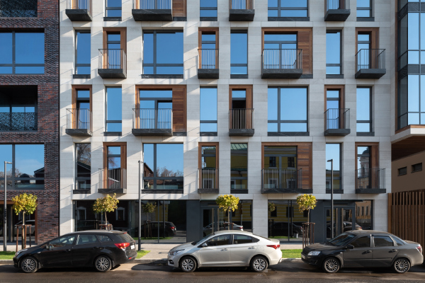 The housing project on the Malaya Ordynka StreetCopyright: Photograph © Yaroslav Lukyanchenko / provided by ADM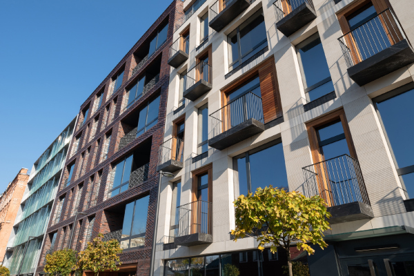 The housing project on the Malaya Ordynka StreetCopyright: Photograph © Yaroslav Lukyanchenko / provided by ADM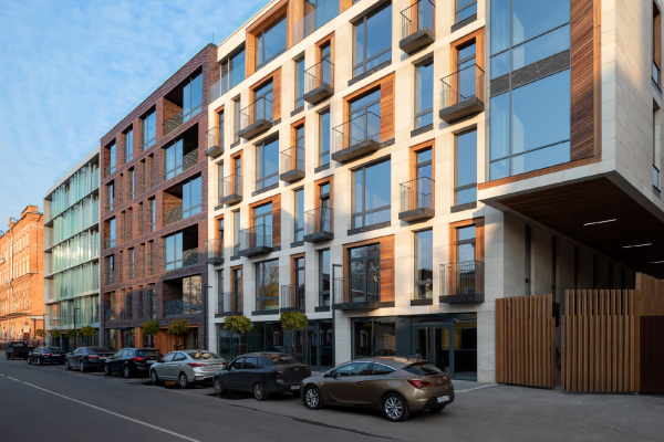 The housing project on the Malaya Ordynka StreetCopyright: Photograph © Yaroslav Lukyanchenko / provided by ADM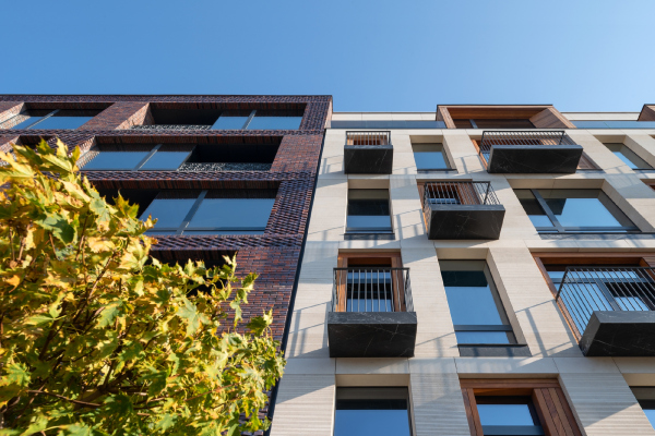 The housing project on the Malaya Ordynka StreetCopyright: Photograph © Yaroslav Lukyanchenko / provided by ADM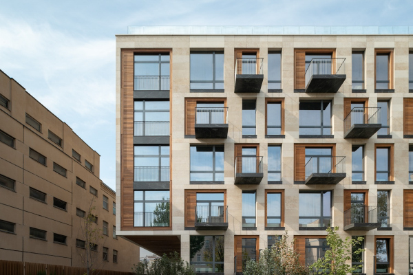 The housing project on the Malaya Ordynka StreetCopyright: Photograph © Yaroslav Lukyanchenko / provided by ADM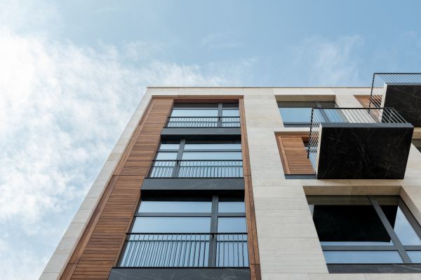 The housing project on the Malaya Ordynka StreetCopyright: Photograph © Yaroslav Lukyanchenko / provided by ADM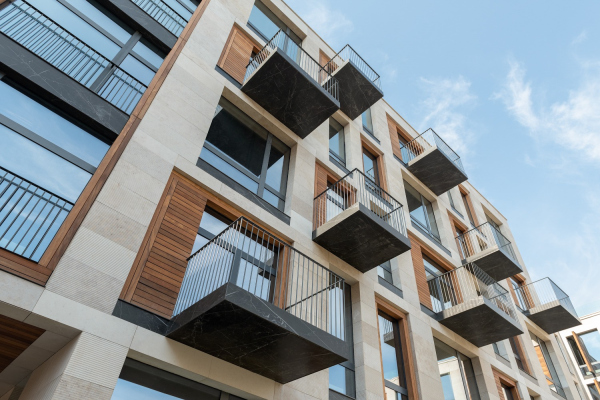 The housing project on the Malaya Ordynka StreetCopyright: Photograph © Yaroslav Lukyanchenko / provided by ADM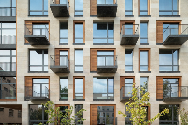 The housing project on the Malaya Ordynka StreetCopyright: Photograph © Yaroslav Lukyanchenko / provided by ADM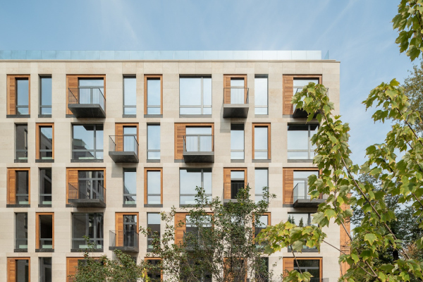 The housing project on the Malaya Ordynka StreetCopyright: Photograph © Yaroslav Lukyanchenko / provided by ADMOn the whole, the house is not just divided into three parts — they have some certain interaction and hierarchy, based, as it seems to me, on the movement from north to south, from icy glass to the merger of terra cotta and metal, and then to pale stone and yellow-orange wood: the sequence of the facades leads us from the beautiful, if somewhat cool, futurism, to the cozy “sunny” version of the house, which fully opens up in the yard. The yard is a separate story, the “fifth facade”, whose space at the same time works so actively that you involuntarily start thinking about “the fifth dimension” — so much its small area, 30 x 40 meters, is filled with various impressions. Like the chessboard in “Alice in Wonderland”, even though not as strictly, the yard is dissected into rectangles: two lawns, and three “studies for a quiet conversation”, surrounded by arborvitae bosquets, with wooden armchairs and tables. The housing project on the Malaya Ordynka StreetCopyright: Photograph © Yaroslav Lukyanchenko / provided by ADMThe most interesting part in the center is the elevated lawn with geo plastique hills, looking as if it were taken as a single piece up from the ground. This solution has a technical meaning as well: the yard, as we remember, rests on the roof of the underground parking garage, and a grown-up tree requires a hill to provide it with a little “margin” of soil. The solution is at the same time aesthetically pleasing: as if the yard got a volumetric inlay-work of hilly terrain or maybe some kind of “carpet” froze between these shores of granite. The housing project on the Malaya Ordynka StreetCopyright: Photograph © Yaroslav Lukyanchenko / provided by ADMThe housing project on the Malaya Ordynka StreetCopyright: Photograph © Yaroslav Lukyanchenko / provided by ADMThe picture is completed by two more elevated lawns with inbuilt benches, and, more importantly, a dry fountain of cells: one of them has marble pebbles in it, the others have stone “rings on the water”, looking like checkers. 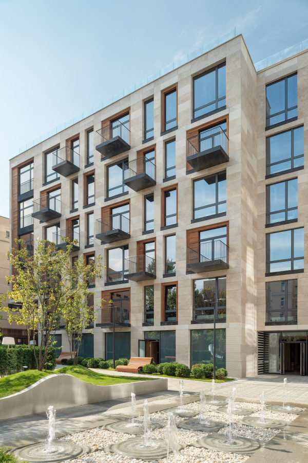 The housing project on the Malaya Ordynka StreetCopyright: Photograph © Yaroslav Lukyanchenko / provided by ADM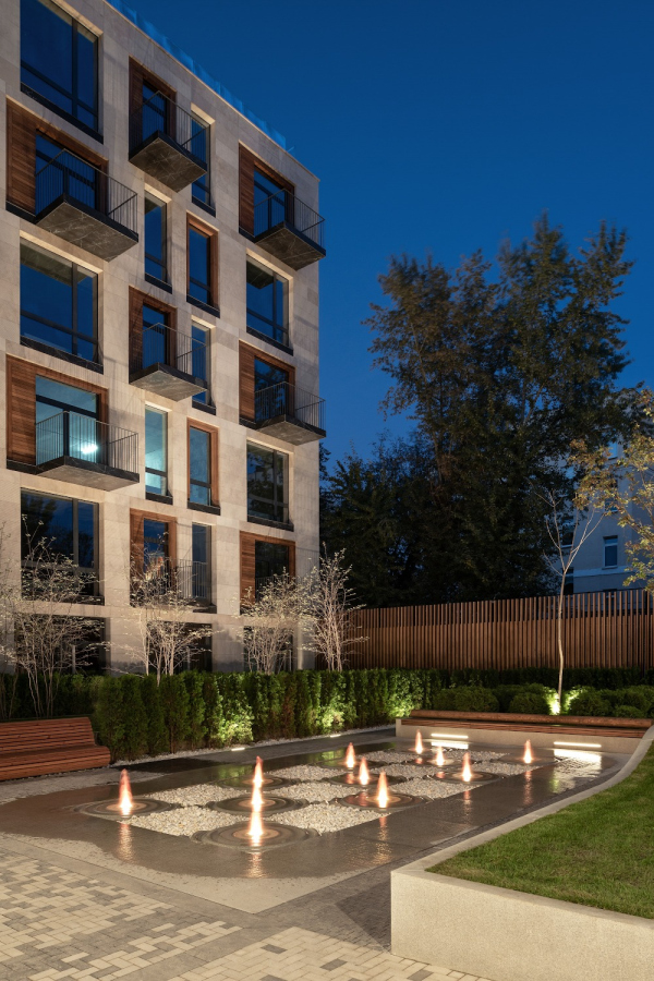 The housing project on the Malaya Ordynka StreetCopyright: Photograph © Yaroslav Lukyanchenko / provided by ADM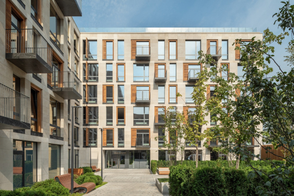 The housing project on the Malaya Ordynka StreetCopyright: Photograph © Yaroslav Lukyanchenko / provided by ADM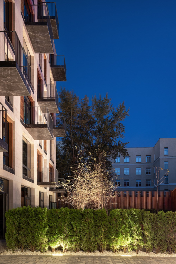 The housing project on the Malaya Ordynka StreetCopyright: Photograph © Yaroslav Lukyanchenko / provided by ADM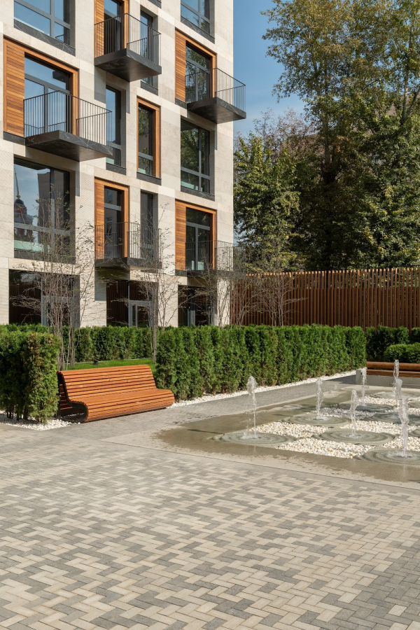 The housing project on the Malaya Ordynka StreetCopyright: Photograph © Yaroslav Lukyanchenko / provided by ADM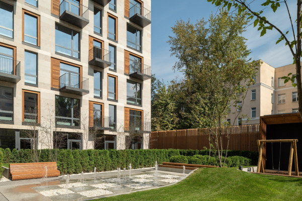 The housing project on the Malaya Ordynka StreetCopyright: Photograph © Yaroslav Lukyanchenko / provided by ADMAnd, finally, a small but sophisticated playground, designed by “Druzhba”, and combining slides, caves, a rock-climbing wall, and a drawing board, is placed up against the eastern wall of the yard. The housing project on the Malaya Ordynka StreetCopyright: Photograph © Yaroslav Lukyanchenko / provided by ADMYou cannot, of course, get lost in such a small space, but it still has elements of a park labyrinth. In spite of its small size, one cannot take full stock of it just standing on the ground level. It looks different when viewed from different vantage points, and it plays out a few different scenarios, both for children and adults — this is a compound space, designed in such a way that its complexity does not get to the point of being cramped. It looks very expensive, just like the facades of the house, not only because of the used materials but also because of the sheer amount of invested effort and the range of emotions that it evokes — however moderate and unobtrusive they are. Possibly, this is what makes this house so different: it creates a new image of luxury — the kind of luxury that is inherent to well domesticated and expensively decorated city space. Some of it even goes out free-of-charge to the passers-by, as the facade that the go past. The house responds to the well-known discourse that “high-end” construction in the city center is generally pretty expensive. Not always, however, the result look like a treasure trove — not something garish but something that confidently displays its value with its thought-out single elements, the appropriateness of their appearance on the whole, and the optimum balance that the architects have been able to find in this case. Which makes this house a very successful example of construction in the city center, a good case of a new “tenement house” that meets a pretty long list of requirements of this day and age. |
|
