|
Published on Archi.ru (https://archi.ru) |
|
| 19.11.2019 | |
|
A Logo Proposal |
|
|
Darya Gorelova |
|
| Studio: | |
| GrandProektCity | |
|
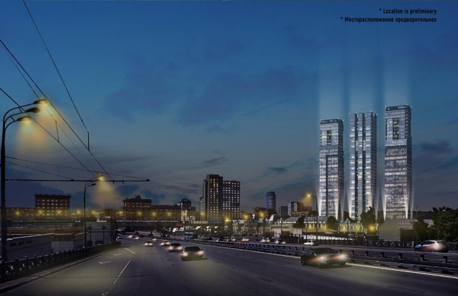
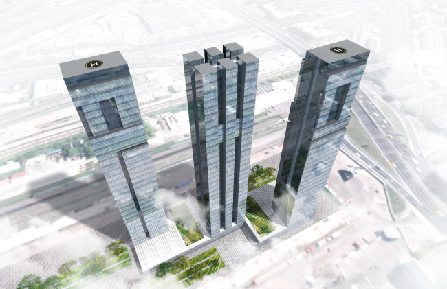
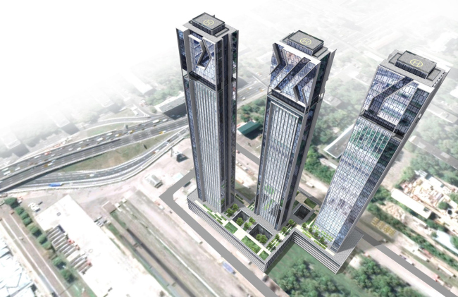
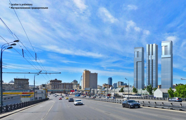
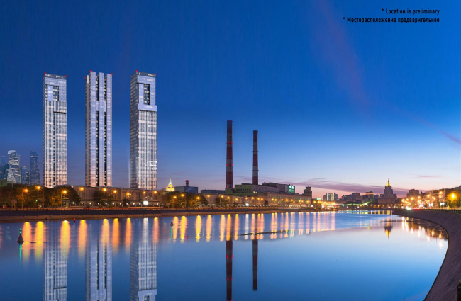
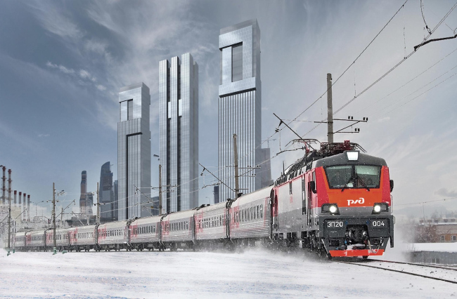
Karen Saprichyan proposed for the headquarters of the Russian Railways, which unveiled plans for the construction thereof on the territory of the Rizhsky freight terminal, three skyscrapers bearing the three letters of the company’s logo. Plans for the construction of “RZD-City” with an area of 450 000 square meters on the territory of the Rizhsky freight yard were unveiled March 20, 2019. Right about that time, a by an unknown architect was published, with an area of 600 000 square meters; it consisted of several “island” plinths with rounded corners, uniting group of towers 20 stories high max. Version 1. The sketch project of RZD skyscrapersCopyright: © GrandProektCityThe project is based on the author’s long-since-patented idea of a skyscraper that replicates, in this or that form, a signature letter or a group of letters: in this particular case, the acronym of RZD is divided between the three towers. The letters are placed rather high up in the air, and stylized in two different ways: in one version, they are ostentatiously “hacked” at 90-degree angles, in the other, diagonals prevail. Version 1. The sketch project of RZD skyscrapersCopyright: © GrandProektCityVersion 2. The sketch project of RZD skyscrapersCopyright: © GrandProektCityOtherwise, the skyscrapers are tall, slender, demonstrating laconic glass architecture, and looking pretty much like one another, which allows them to form a lineup for “carrying” the volumetric letters on their facades. The author specifically emphasizes: the letters will be seen from every conceivable angle, and, of course, from a distance. For example, while driving over the Rizhskaya flyover. Version 1. The sketch project of RZD skyscrapersCopyright: © GrandProektCityOr sailing a boat down the Moskva River. Version 1. The sketch project of RZD skyscrapersCopyright: © GrandProektCityIn spite of the fact that already in March they were talking about building the headquarters on the territory of the Rizhsky freight terminal, GrandProjectCity also considered one of “backup” versions – a freight terminal on the Kiev Railway Station. It was this terminal that made the river panorama possible. 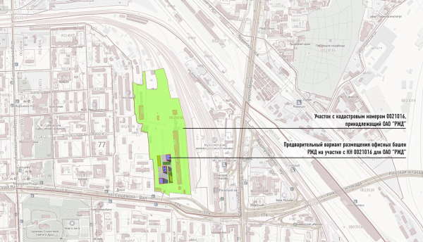 Land Site 1. Rizhskaya. The sketch project of RZD skyscrapersCopyright: © GrandProektCity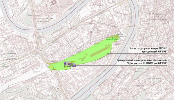 Land Site 2 | The proposal for RZD skyscrapersCopyright: © GrandProektCityIn the second version, the letters dominated by diagonals are backlit with red, which further indicates that what we are seeing is indeed the RZD headquarters. 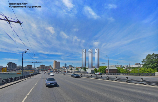 Version 2. The sketch project of RZD skyscrapersCopyright: © GrandProektCity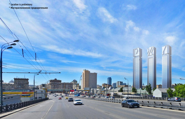 Version 1. The sketch project of RZD skyscrapersCopyright: © GrandProektCity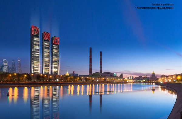 Version 2. The sketch project of RZD skyscrapersCopyright: © GrandProektCity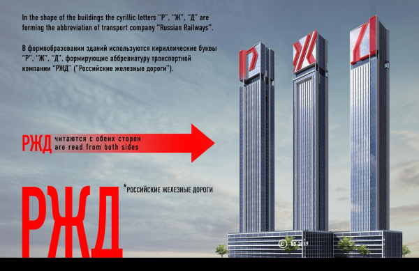 Version 2. The sketch project of RZD skyscrapersCopyright: © GrandProektCity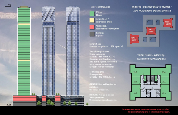 Version 2. The sketch project of RZD skyscrapersCopyright: © GrandProektCity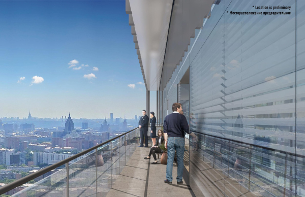 Version 2. The sketch project of RZD skyscrapersCopyright: © GrandProektCity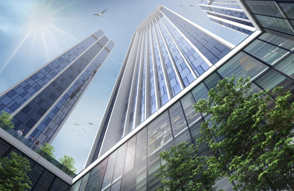 Version 2. The sketch project of RZD skyscrapersCopyright: © GrandProektCity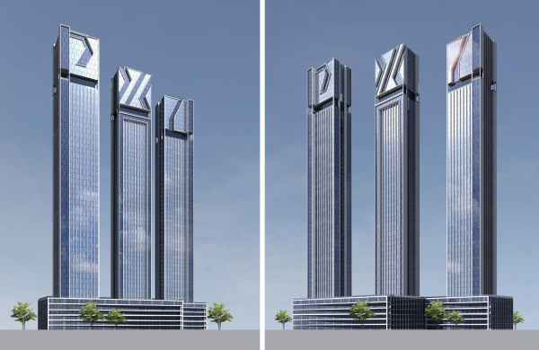 Version 2. The sketch project of RZD skyscrapersCopyright: © GrandProektCityThe first the main version, designed for the territory of the Rizhsky Terminal, looks more pristine and is based on the parallelepiped features, which allows the letters to “grow into” the volume, literally merging with the buildings. The letters turn out to be, in the one hand, easily readable, and, on the other hand, clearly stylized; they make the skyscrapers look like a complete jigsaw puzzle consisting of large elements with different types glass surfaces interconnected in a sophisticated way. 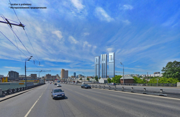 Version 1. The sketch project of RZD skyscrapersCopyright: © GrandProektCity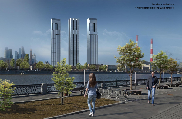 Version 1. The sketch project of RZD skyscrapersCopyright: © GrandProektCity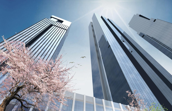 Version 1. The sketch project of RZD skyscrapersCopyright: © GrandProektCity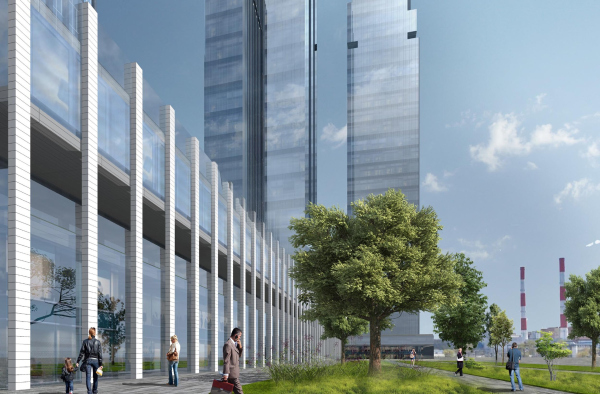 Version 1. The sketch project of RZD skyscrapersCopyright: © GrandProektCity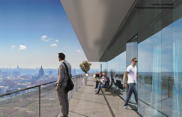 Version 2. The sketch project of RZD skyscrapersCopyright: © GrandProektCity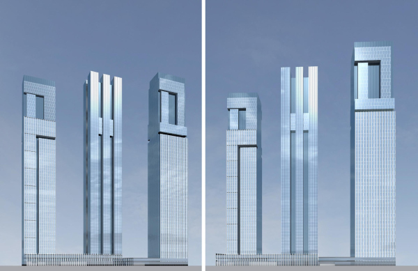 Version 1. The sketch project of RZD skyscrapersCopyright: © GrandProektCity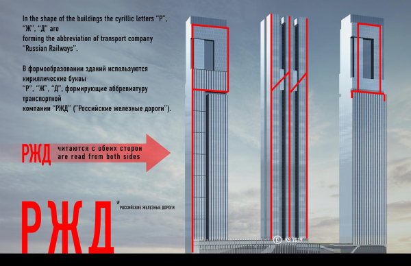 Version 1. The concept of form making. The sketch project of RZD skyscrapers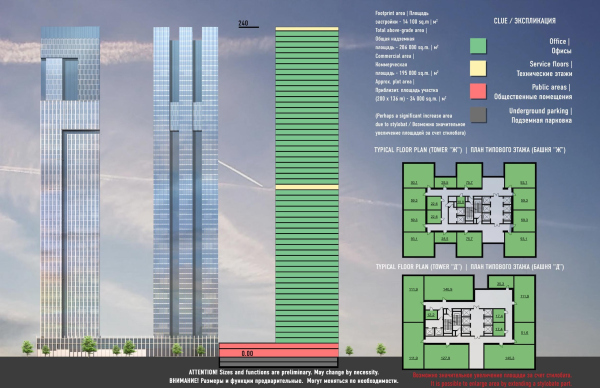 Version 1. The sketch project of RZD skyscrapersCopyright: © GrandProektCityThe surfaces step forward and recede, forming ledges, accentuating the complexity of the building’s shape, yet keeping up its austere character in the spirit of prototypes of the 1970s. In the cold glitter of the metallic stripes, one can see the glitter of rails polished by the wheels, as well as a general reference to the technological, “steel” specifics of the operation of this giant that runs all of the nation’s railways. Version 1. The sketch project of RZD skyscrapersCopyright: © GrandProektCityIn this case, the format of the towers has two advantages. First of all, this format makes it possible to group all of the useful floor space in a compact way – the construction plans clearly show that a considerable part of the considered sites remains undeveloped. Second, and maybe even more importantly, the tower is a classical headquarters typology, tried and tested by the architecture of the XX century, high-profile and conspicuous. In this case, it is also joined by an iconic meaning: the skyscrapers that thrust the letters upwards, can be read as a sign of representativeness, like an unambiguous “dotted i”, which, in the case of headquarters must be quite appropriate, and even honest in a certain sense. |
|
