|
Published on Archi.ru (https://archi.ru) |
|
| 22.07.2019 | |
|
The Warm Glow |
|
|
Alyona Kuznetsova |
|
| Studio: | |
| Anatoly Stolyarchuk Architectural Studio | |
|
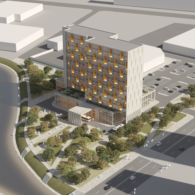
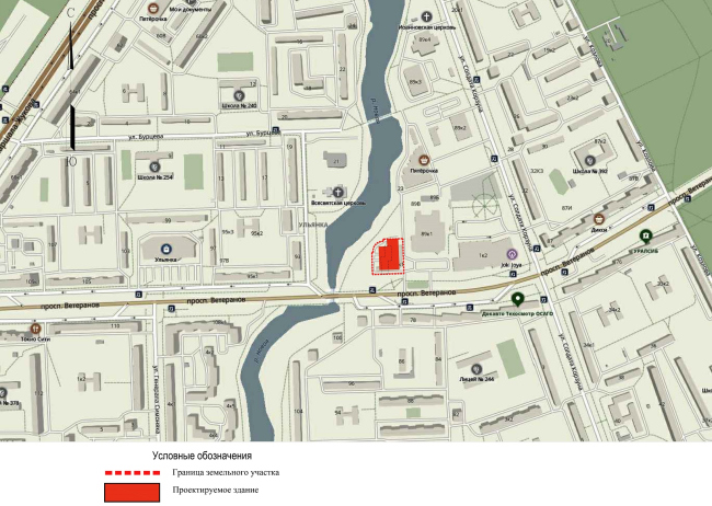
Neatly inscribed into a “sleeping belt” residential area of Saint Petersburg, this riverside hotel at the same time claims the status of a landmark that gives this place a taste of reserved yet nonetheless sophisticated architecture. 3-star mixed-use hotel complexCopyright: © Anatoly Stolyarchuk Architectural StudioThe 3-star hotel with 350 rooms will be built at the city’s southern suburb, not far away from the “Prospect Veteranov” metro station. The place is quite pleasant: the green bank of the Novaya River, and a church (still in construction) standing across from it. The opposite bank is occupied by residential houses, and, as for the future hotel, it will be built in the same city block with the “Tallinsky” shopping mall and a fitness center. Together, these projects will form a patch of public functions, which the hotel is meant to further augment and develop to whatever extent it can because it is planned that its bottom floors will host shops, cafes, and a fitness center as well. 3-star mixed-use hotel complex. Location planCopyright: © Anatoly Stolyarchuk Architectural StudioThe land site is rather convenient, its plan being close to the perfect square, a small part of which is a water protection zone. On the other hand, it is situated almost on the very bank of the river, which allowed the architects to propose, in addition to the hotel project, a few ideas of organizing the waterfront area – green slopes, boat ramps, new trees, and new pavement instead of the existing lawn with a single string of trees. The new little park will be meant to mark the place where the hotel guests can go for walks, at the same time attracting the local people to the area of shops and cafes, thus helping to develop the local businesses on this separately taken and comparatively small land site. 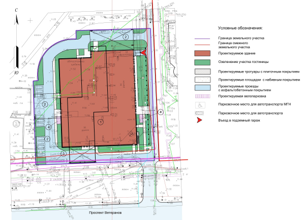 3-star mixed-use hotel complexCopyright: © Anatoly Stolyarchuk Architectural Studio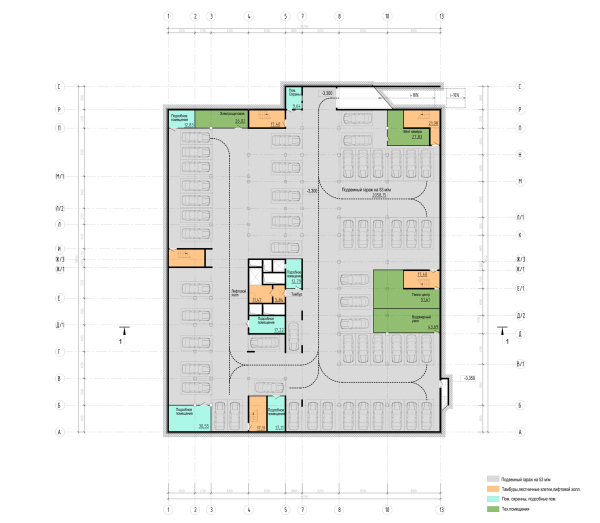 3-star hotel on the Veteranov avenueCopyright: © Anatoly Stolyarchuk Architectural Studio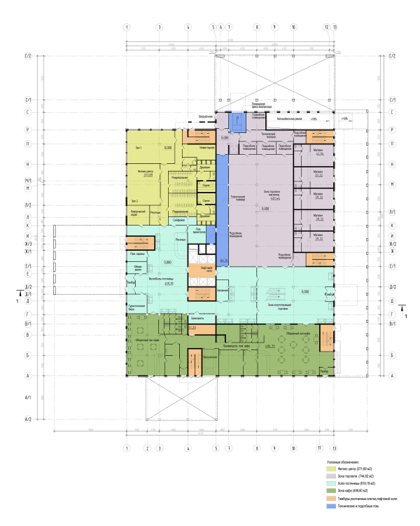 3-star mixed-use hotel complex. Plan at 0.000 elevationCopyright: © Anatoly Stolyarchuk Architectural Studio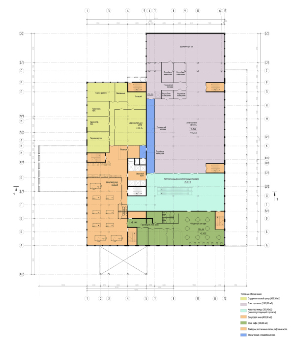 3-star mixed-use hotel complex. Plan at +5.100 elevationCopyright: © Anatoly Stolyarchuk Architectural Studio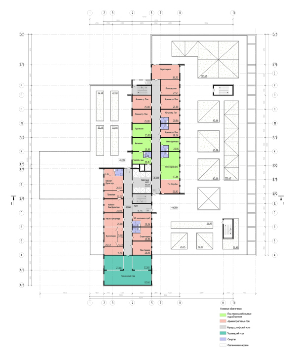 3-star mixed-use hotel complex. Plan of the usable roofCopyright: © Anatoly Stolyarchuk Architectural Studio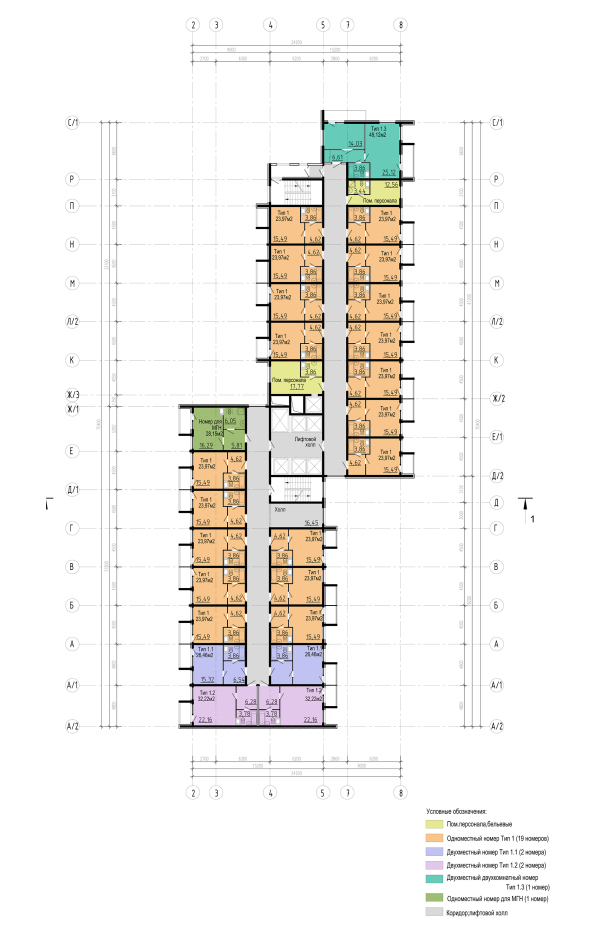 3-star mixed-use hotel complex. Plan of the standard floorCopyright: © Anatoly Stolyarchuk Architectural Studio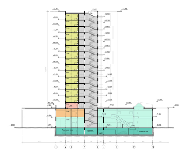 3-star mixed-use hotel complex. Section viewCopyright: © Anatoly Stolyarchuk Architectural StudioTracing the territory’s perimeter, the architects design a driveway; the rectangle of the main part is occupied by a podium resting on a single-tier underground parking garage, from which, in turn, two high-rise slabs of the hotel shoot up, united by one common nucleus of engineering lines but shifted in respect to one another: one closer to the river, the other farther away from it, which on the plan looks like a stylized blitz of lightning. Thanks to this, the building gets extra plastique, and a possibility to visually relieve its bulk by means of separating the two volumes, at the same time responding to the context: the Soviet pink-brick buildings standing alongside the Stachek Avenue are lined up here like a long “saw”, and the shift in the hotel building is also an interpretation of this technique that starts a dialogue with the surroundings. The “saw” of 1970 houses on the Veteranov Avenue: Probably the most interesting part of the project, however, is the plinth. First of all, interpreting, to a certain extent, the modern classics in the vein of David Chipperfield, it unites the two lower tiers situated on the side of the shopping mall, with a tall – almost 9 meters high – ethereal-looking gallery. Both hotel tiers on this side host cafes and shops, and the presence of the gallery is functionally motivated. Generally, if we are to close our eyes to the unassuming appearance of the neighboring “Tallinsky” shopping mall, one can safely say that a whole city market square appears here, the height of the covered promenade and the exquisite proportions of the pylonnade adding to the grandeur and setting the tone, as if calling on to the surrounding buildings to straighten up and become more upbeat. 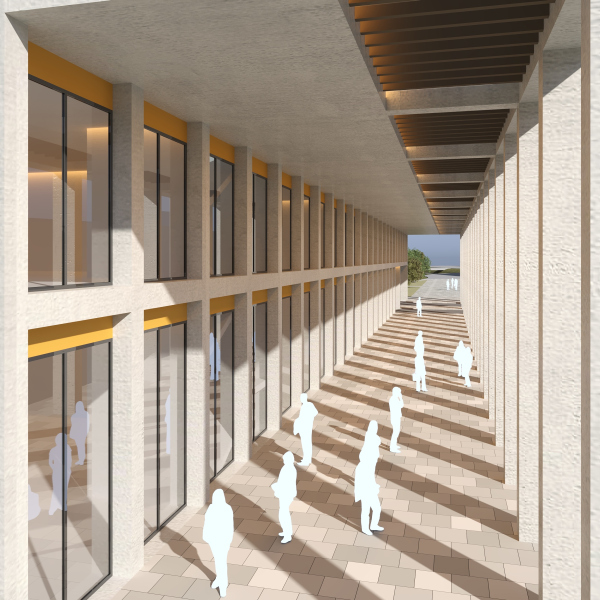 3-star mixed-use hotel complexCopyright: © Anatoly Stolyarchuk Architectural Studio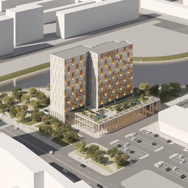 3-star mixed-use hotel complexCopyright: © Anatoly Stolyarchuk Architectural Studio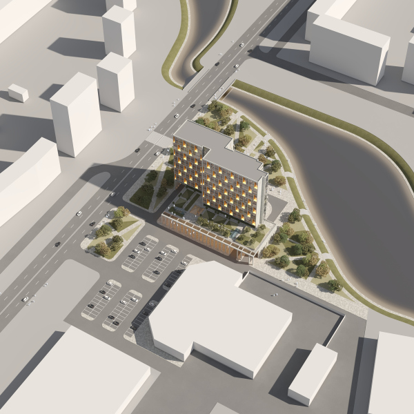 3-star mixed-use hotel complexCopyright: © Anatoly Stolyarchuk Architectural Studio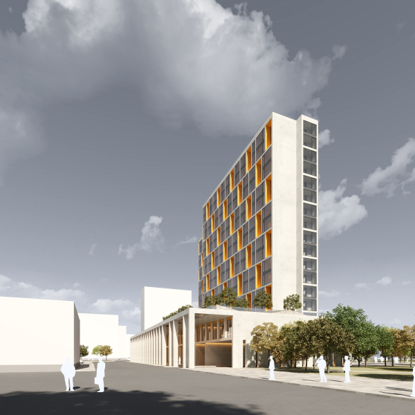 3-star mixed-use hotel complexCopyright: © Anatoly Stolyarchuk Architectural Studio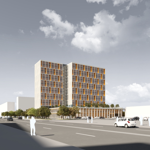 3-star mixed-use hotel complexCopyright: © Anatoly Stolyarchuk Architectural StudioThe façades of the plinth itself continue the theme set by the gallery: they are dissected with a grid of light-colored pillars and intermediate floors that casually “holds” large glass surfaces interpreting the volume of the podium as a slender and dainty framework. It turns out that the building is not without a “hovering” effect, yet at the same time it has its “feet” firmly planted on the ground. What is still more interesting, however, is the fact that the plinth, although generally rectangular, sprouts a few branches, which makes it asymmetrical, and the whole composition becomes quite an amusing sight to see. These “protuberances”, unlike the main structure and the gallery, are denser, with narrow slits and wide pylons. On the riverside, the main entrance is situated, covered by a cantilevered structure that gives shelter from the rain for the taxis with the guests (since the height is 9 meters, even a double decker bus can safely drive in here). The ledge in the northern part, at the side end of the hotel, provides driving access, and there is a tier of shops above. The south ledge, on the other hand, which is on the side end facing the avenue, carries some of the weight of the slab of the hotel – thus, the volumes not exactly grow up from the podium, it’s much more complex, the theme of the zigzagged shift is developed, and the building behaves in a rather relaxed way, which adds to the overall dynamics, and makes the picture more interesting. To some extent, all these galleries and ledges, in spite of their pristine geometry and immaculate facets, looks like the roots of this building, like it’s some sort of a giant tropical tree. One way or another, they do a lot to form the space on the level of the human perception, creating around the hotel an impression of a developed city space. 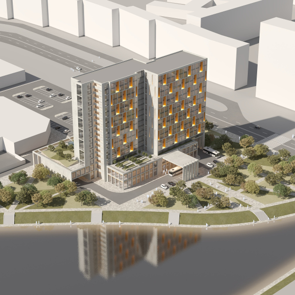 3-star mixed-use hotel complexCopyright: © Anatoly Stolyarchuk Architectural Studio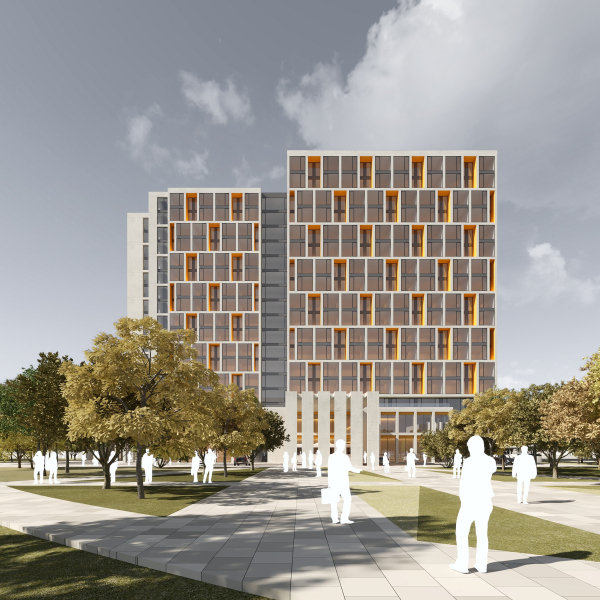 3-star mixed-use hotel complexCopyright: © Anatoly Stolyarchuk Architectural Studio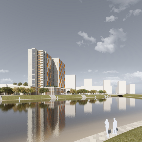 3-star mixed-use hotel complexCopyright: © Anatoly Stolyarchuk Architectural StudioIt is planned that the plinth’s roof will be green and usable: this is not just a way to get extra floor space and a point of attraction but also to improve the window views of those hotel rooms that do not overlook the river. Extra emergency exits are also situated here. 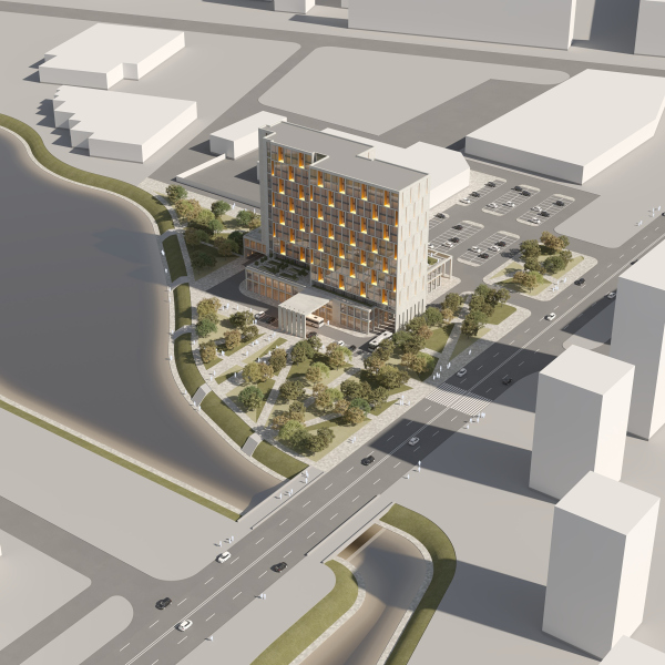 3-star mixed-use hotel complexCopyright: © Anatoly Stolyarchuk Architectural Studio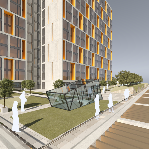 3-star mixed-use hotel complexCopyright: © Anatoly Stolyarchuk Architectural Studio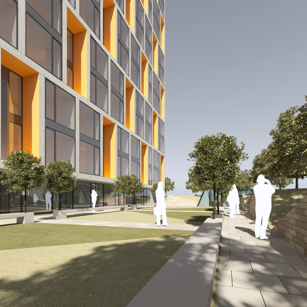 3-star mixed-use hotel complexCopyright: © Anatoly Stolyarchuk Architectural StudioThe façade is subjugated to the same fine faceting as the plinth but here the system is livened up by diagonals placed in a staggered order: following this pattern, a pair of glazed stanzas alternates with cavities that sport yellow splays, which, thanks to the ceramics, brass, and backlighting, glow with a warm light, looking like inclusions of precious stones, or maybe the light of a fireplace, or maybe slices of rock formation with streaks of copper or gold inside. This technique is peculiar and very cozy – it clearly indicates that we are seeing a place where one can take a rest and get warm, working with a warm window effect on a city night, with all the other attributes of home and peace. The effect is partially visible in the daylight as well – the whole building is permeated with yellowish inclusions, which are also present in the plinth. One must recognize that this “chessboard” geometry becomes characteristic for Anatoly Stolyarchuk – we can see a similar solution in the house on the Prilukskaya Street and in the multifunctional complex on the Sofiyskaya Street. 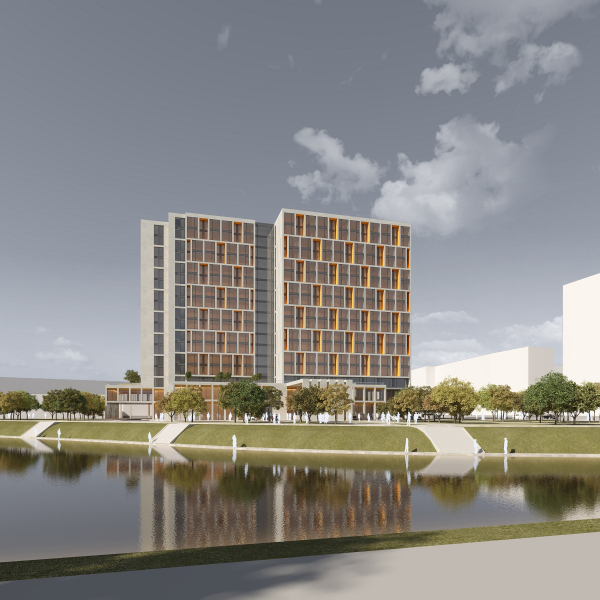 3-star mixed-use hotel complexCopyright: © Anatoly Stolyarchuk Architectural Studio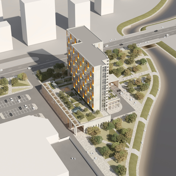 3-star mixed-use hotel complexCopyright: © Anatoly Stolyarchuk Architectural Studio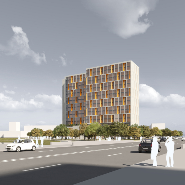 3-star mixed-use hotel complexCopyright: © Anatoly Stolyarchuk Architectural Studio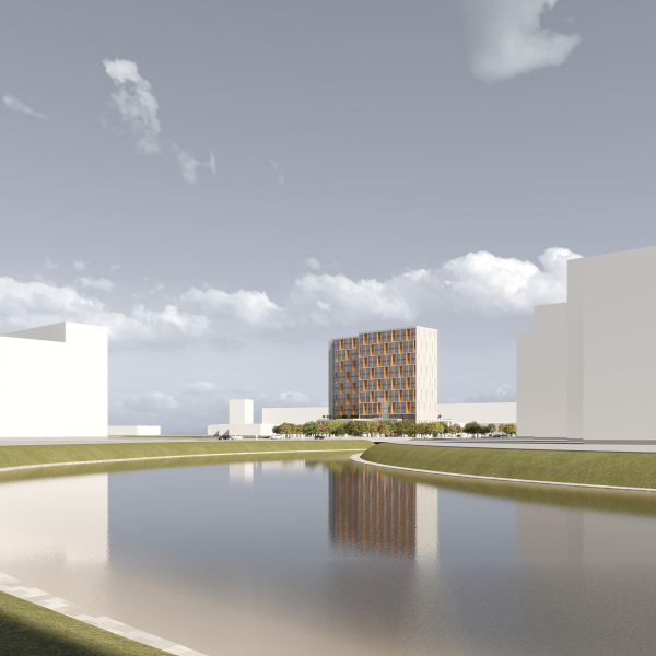 3-star mixed-use hotel complexCopyright: © Anatoly Stolyarchuk Architectural Studio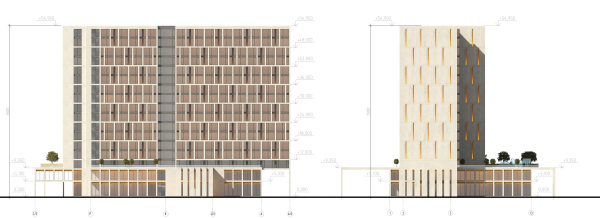 3-star mixed-use hotel complex. FacadesCopyright: © Anatoly Stolyarchuk Architectural Studio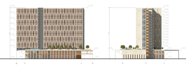 3-star mixed-use hotel complexCopyright: © Anatoly Stolyarchuk Architectural StudioThe height of the towers is the maximum allowed 55 meters, which is a bit lower than the nearby housing project on the Veteranov Avenue, standing across from the future hotel. Anatoly Stolyarchuk admits that the project could better if the towers were of different height. However, in order to do that, the company had to either sacrifice the square meters or brace itself for a time-consuming procedure of obtaining all the respective permissions. The project turned out to be “well-balanced and elegant” – these are the words that the experts of the city planning council use the most often when they discuss the sketch boards submitted by Anatoly Stoltarchuk studio. The new building matches the height of its surroundings, as well as their functions, and even their techniques of volumetric design, honestly meeting all the requirements and demonstrating a thought-out façade pattern not devoid of a certain amount of emotionality. This injection of new architecture to the sleeping belt area turns out to be painless, yet effective: the building sets a new approach and rhythm; after its appearance, one will hardly be able to build here in the vein of “Tallinsky”, in any case. |
|
