|
Published on Archi.ru (https://archi.ru) |
|
| 15.04.2019 | |
|
Dance of Verticals |
|
|
Alyona Kuznetsova |
|
| Architect: | |
| Aleksandr Popov | |
| Studio: | |
| Laptev and Partners | |
|
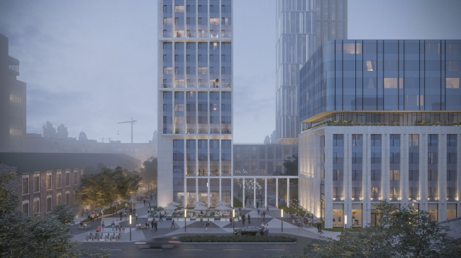
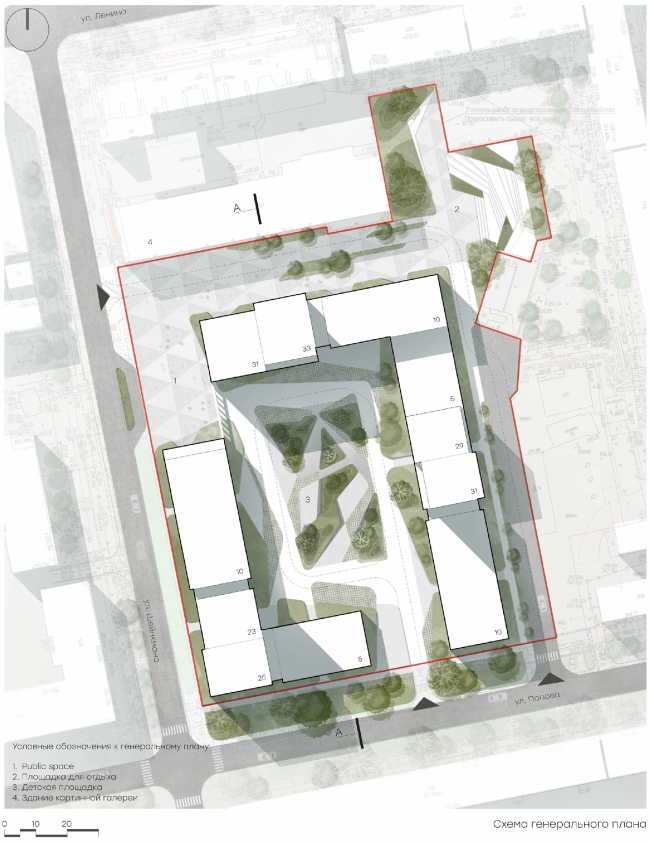
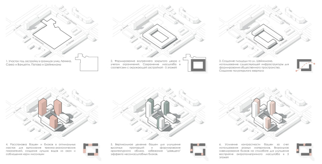
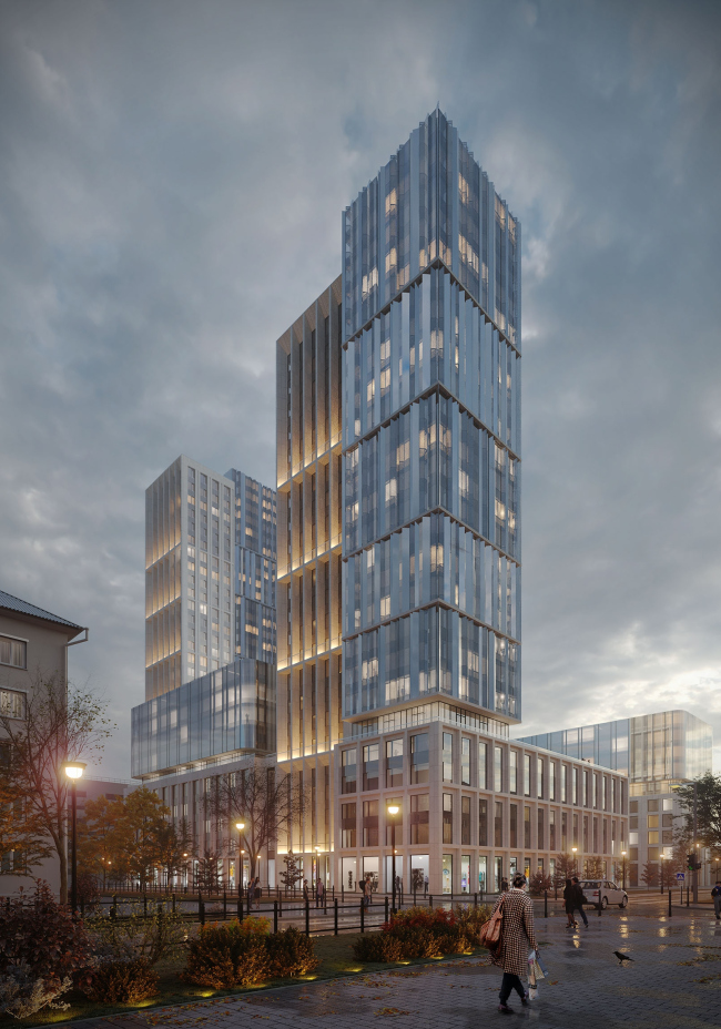
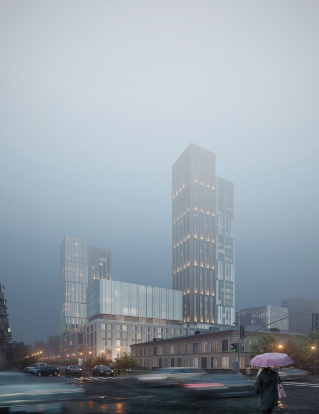
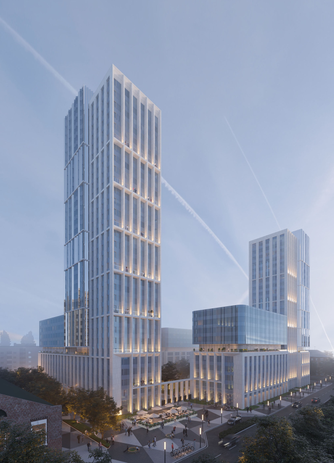
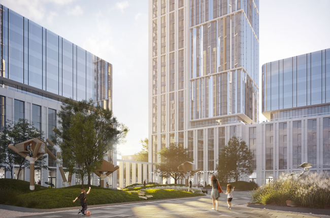
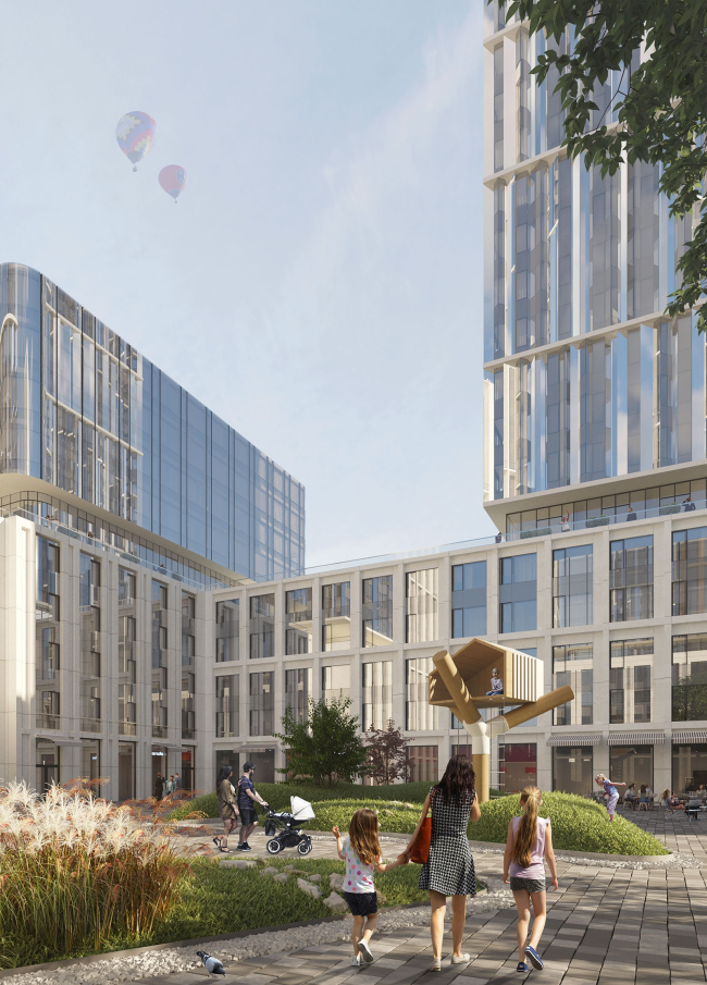
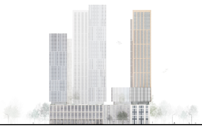
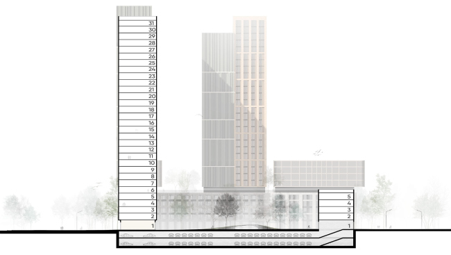
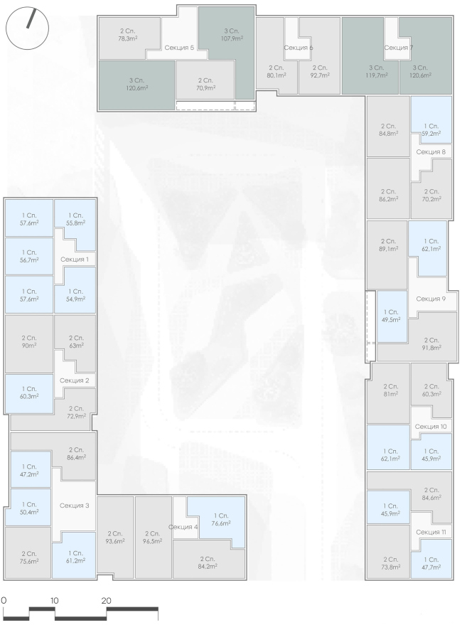
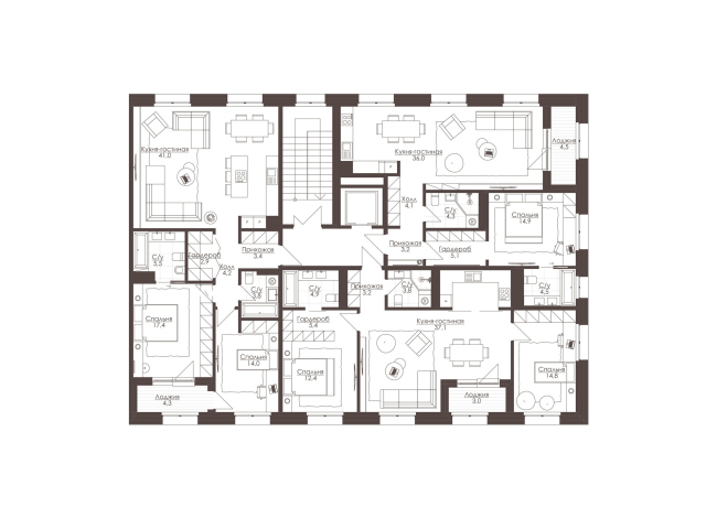
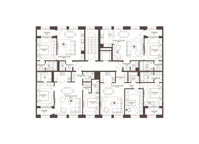
The concept of the housing complex named LVIII is all about graceful inclusion of towers into the historical part of the city, as well as organizing an orderly and at the same time intriguing rhythm of volumes. Essentially, this is an image of a city growing upwards step by step. LVIII housing complexCopyright: © ArchimatikaThe land site for LVIII is located in the central part of Ekaterinburg, on one of the city’s main avenues. At first site, the name of the complex can be interpreted as the Latin for 58, but in actuality this is an acronym for its prestigious address: L standing for “Lenina Avenue”, VIII signifying Building 8. In reality, several buildings are lined up along the Sheinkmana and Popova streets, as well as along the in-block Sakko-I-Vantsetti Street that runs parallel to the main ones, the buildings being separated from the noisy avenue by a curious architectural symbiosis. These are two former buildings of the linked by an atrium: the more modern office building was reconstructed into a premium residential complex; the other one, a monument of architecture, was turned into a picture gallery. Also, the city block had kept a few standard houses from the 1960’s, and a wing of the Eliseevs Estate of the late XIX century. Such a diverse low-rise environment belonging to different epochs is characteristic of this whole area, the city’s main high-rise landmarks being located pretty far away from here. LVIII housing complex. SilhouetteCopyright: © ArchimatikaThe territory allotted for the construction of the housing complex is rather large and almost perfectly rectangular: only one of its sides “shoots out” protuberances of an intricate configuration. The architects line up the buildings as two corner sections, which provides solutions to several tasks at once: the city is getting a new scale of the city block, the future residents are getting a yard of an impressive size, the corner of the Sheinkmana and Popova streets is organized, and, finally, the jagged part of the site is merging with the neighboring territories and turns into a full-fledged public space in front of the picture gallery: with a square, a promenade, and a playground. LVIII housing complex. Master planCopyright: © ArchimatikaDue to the fact that there are no height restrictions in this part of the city, the architects were able to offer to the client three compositional options to choose from: one with buildings of equal height, one with two towers that accentuate the new square, and one with three towers. The developer opted for the latter: one with the most picturesque silhouette and with the greatest height difference. In addition, among other things, this version makes it possible to diversify the number of floors and hence the residents’ lifestyles, thus making the complex attractive to different buyers: some prefer to live no higher than the fifth floor, and some like to see the city from the birds-eye view. LVIII housing complex. Shape formation schemeCopyright: © ArchimatikaFurther on, responding to the context, the architects divided the entire complex into two parts: a five-story “podium” and a few buildups with a maximum height of 33 floors, which must be included into the system of the city’s high-rise landmarks. The chosen tectonics led the architects to a decision to interpret the powerful podium as some sort of a monumental pedestal: hence the stone coating, wide piers, and large-span fracturing. The towers, on the hand, must become light and ethereal – which became the “cherry on top” of the whole complex. LVIII housing complexCopyright: © ArchimatikaTrying to make the towers look as elegant as possible, the architects visually divided each of their volumes into two vertical parts, creating an impression of two volumes “glued” together – the feeling is created at the expense of the materials, the rhythm and even the height. In each of such pairs, one tower grows up from the ground and looks akin to the volumes of the podium, while the second expressly rests on a podium with a break marked by a sunken-in “lintel” glass floor. Similarly, with a “buffer zone”, the five-story podium has laconic glass volumes standing on top of it – ten floors total. What it essentially comes down to is a compound image of a city that consists of different types of buildings that, very much like a jigsaw puzzle, come together to become a single whole. The overall impression is of a slightly “Singapore” kind: the city is growing upwards, highlighting its tiers, playing with its heights and directions, vertical in the towers and horizontal in the glass volumes of the buildups. The effect is strengthened by the verdure of the “hanging gardens” on the terraces in front of the sunken-in intermediate tiers. The rhythm is clearly readable, even though it is by no means a “one-two” but a “one-two-three” at least. But no more than that: the last thing you will see here is garishness; rather, it is some strictly systematic waltzing of shapes. There is in fact such a dance – square waltz – it is rather simple but it serves as the basis for all classic dancing education. And it looks as though it was played out for the three landmark towers here. LVIII housing complexCopyright: © ArchimatikaIt is worth mentioning that in the initial stage the architects proposed to give the entire complex a coating of red bricks, thus throwing a conceptual “bridge” to the neighboring building of the nearby refinery, and the whole industrial history of this city. However, the way the client saw it, brick was not the kind of material that created an impression of high-class and brought up associations with “business class” housing. Ultimately, the architects had to replace the brick with light-colored stone, granite, and glass. Such a combination delivered quite an optimistic result – as Alexander Popov confesses, the replacement of the material was not a forced measure but quite a natural thing to do. LVIII housing complexCopyright: © ArchimatikaSince the future residential complex belongs with the “business” class, Archimatika took care to form an appropriate environment. In all of the versions that they developed, the architects also included a square situated on the Sheinkmana Street. Together with the gallery, it could have become the point of attraction for the residents and guests of the city, which would ensure an inflow of visitors to the local businesses that occupy the bottom floors. The playground on the vacant space is also a strategic move because mothers who are looking after their children are definitely the right kind of people, “eyes on the street”, by Jane Jacobs. The inside yard is car-free; for the cars, the architects designed an underground parking garage. LVIII housing complexCopyright: © ArchimatikaPossibly, looking at the Ekaterinburg experience with its unique skyline, the other Russian cities will also learn to appreciate the idea of skyscrapers. This concept by Archimatika shows that a high-rise landmark can arguably be the best solution to the problem of monotonous mass construction. In the case of the LVIII complex, the towers not only deliver the required square footage, insolation and panoramic views but also solve a few town planning tasks: one accentuates the crossing of two streets, another marks the square, and a third sets off the entire composition, the three of them creating a dramatic and beautiful silhouette. Which, incidentally, would not have worked anyway, had not the architects been smart enough to offer the residents a fair share of urban comfort. And here there is plenty of it: in the highly developed infrastructure of the central part of the city and in the system of public and private spaces designed by the architects. Oh, and by the way: recently, the judging panel of “House on the Brestskaya Invites...” recently awarded this project with the first prize in the nomination “Architecture of Public Buildings” (see the news item on the company’s channel). LVIII housing complexCopyright: © ArchimatikaLVIII housing complex. The facade along the Popova StreetCopyright: © ArchimatikaLVIII housing complex. The section viewCopyright: © ArchimatikaLVIII housing complex. The apartmentsCopyright: © ArchimatikaLVIII housing complex. Section 1Copyright: © ArchimatikaLVIII housing complex. Section 2Copyright: © Archimatika |
|
