|
Published on Archi.ru (https://archi.ru) |
|
| 13.12.2018 | |
|
The Story of One Identity |
|
|
Alyona Kuznetsova |
|
| Architect: | |
| Aleksandr Popov | |
| Studio: | |
| Archimatika | |
|
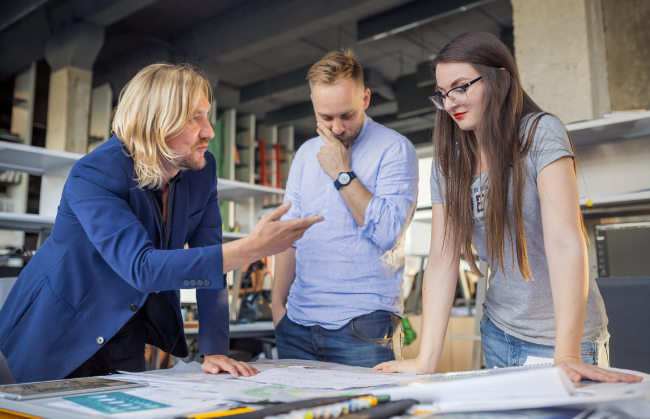
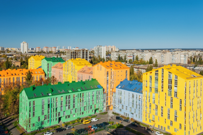
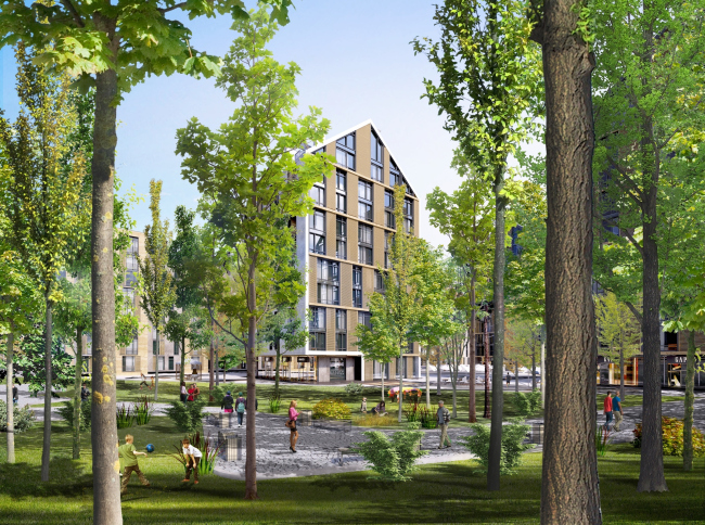
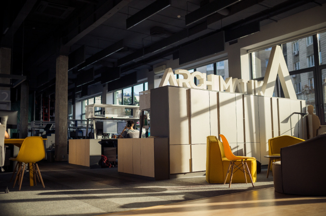
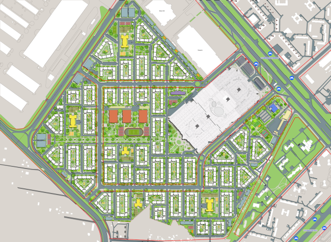
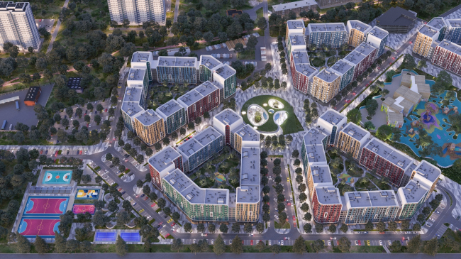
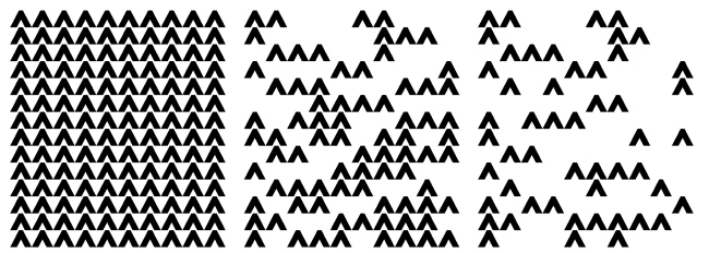
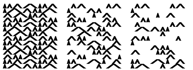
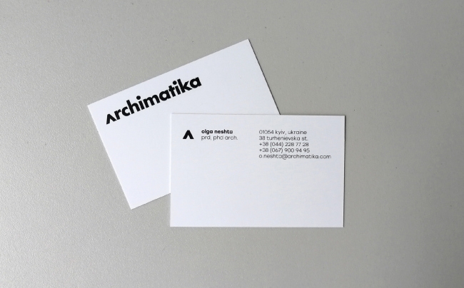
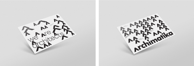
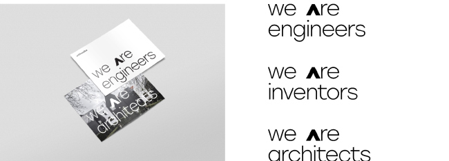
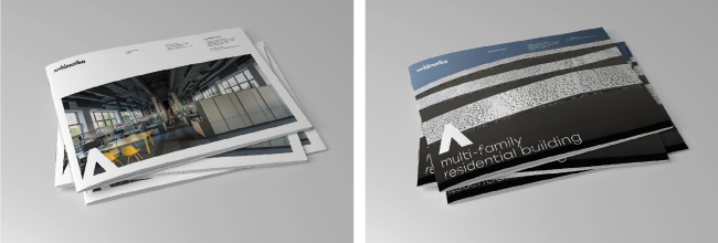
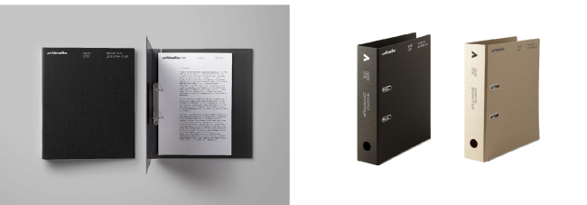
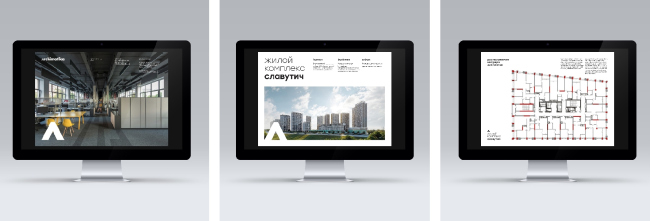
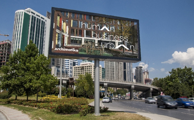
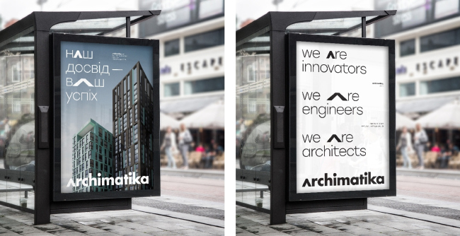
The architectural firm Archimatika is sharing about its experience of developing a new brand image – still recognizable yet fresh and reflecting the company’s main values: humanistic character, versatility, and a systematic approach. Archimatika office © ArchimatikaIn two years, Archimatika will celebrate its 15th birthday. The company boasts square kilometers of built projects, as well as offices in Moscow, Kiev, and New York. Why would a company with an established reputation and a recognizable image want to change its brand identity, and how is brand identity created in this branch in general – we talked about these things with the cofounder of the company Alexander Popov and his graphic designer Sergey Mishakin. Know Thyself The very first logo for the company was drawn by the architects themselves. It was at that time that the uppercase lambda (Λ) appeared instead of all the “A” letters, which in actuality is not a “” at all, but the roof of a house, an archetype, or one of the most basic architectural elements. Oh, and by the way, Archimatika does use the pitched roof oftentimes in its projects. "Comfort Town" residential area. Construction, 2015 © ArchimatikaA residential complex on the Stryiskaya Street in Lviv. Park. Project, 2016 © ArchimatikaArchimatika office © Archimatika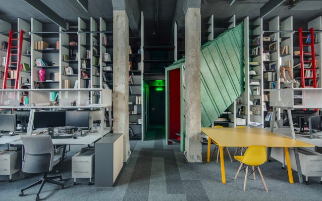 Archimatika office © Archimatika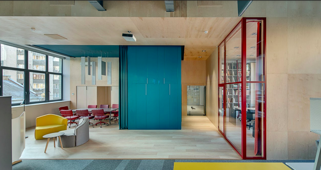 Archimatika office © ArchimatikaOver the years, the company has developed its own style and its own creative method, which, a couple of years ago, the architects decided to put into theory – for themselves, for the new employees, for the clients, and for the end consumers. Alexander Popov believes that finding the answers to the questions “who are you”, “what do you want”, and “how do you want to achieve that” is absolutely crucial, well, for everything. Otherwise, the architect turns into a mindless tool in someone else’s hands, who creates a “random compilation of ideas”, or even a dangerous tool if he conceals his inner approach, which can prove inappropriate for solving this or that task. Still, at first there were implemented projects that proceeded from the specific task, context, mood, and inspiration. Looking back at their numerous works, the architects got “stuck” for a few months, transforming all of these data into identity formation, philosophy, and a few words of their credo. "Respublika" shopping and entertainment center. The master plan © ArchimatikaSqueezing the whole Archimatika into one category turned out to be a tough call, although there was an attempt that came really close – “human oriented architecture”. At first, the architects liked the wording but then it seemed to them too wide and too narrow at the same time. The company’s brand manager, Evgeny Timchenko proposed to use the formula: Archimatika = Human+Urban+Business. Archimatika works first of all with humans, and not with some incorporeal abstractions, at the same time making sure that the city and the company’s business are getting their benefits. The community center in the residential complex "Respublika" © ArchimatikaThen revolutionary changes were made to the : now the home page starts not with specific projects but from this key formula and its detailed explanation, which, at the same time, does not replace the classic menu with a catalogue. This way, the viewer inevitably gets exposed to the company’s approach. 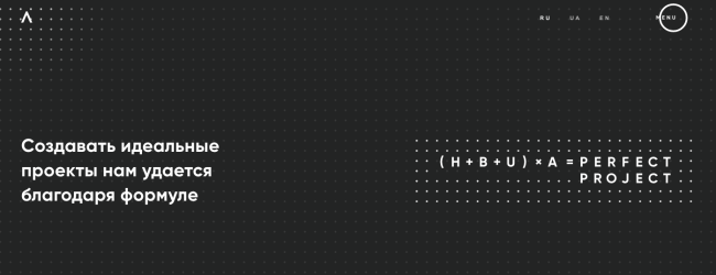 A page of Archimatika corporate websiteThe bravery of not being great / strong minuscules The stages of identity formation and website reorganization were followed by the development of new graphic design. Initially, the architects planned to keep the original ΛRCHIMΛTIKΛ logo. According to Alexander Popov, these capital letters broadcast the message: we are big, we are classy, we are brave, and we are not like anyone else. It was clear that over the years of the company’s existence the architects grew used to this spelling. This is why they asked of Sergey Mishakin, Tanya Borzunova and Dmitry Verevkin to only design the corporate identity on the basis of the existing logo. Which the designers did – but they still offered a new logo, and were able to convince the architects that it conveyed the values of Archimatika much better. 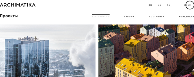 A page of Archimatika corporate websiteAccording to 3Z Studio, the old spelling of ΛRCHIMΛTIKΛ was too geometric, too rigid, too authoritative, and allowing of no compromise. It makes you be always uptight, dressed in a suit and tie, and wearing a serious facial expression. All of these descriptions are in conflict with the values of the company that cares about people and their possible needs. The designers put before themselves a task of coming up with a more humane typographic treatment, without trying to suck up the public and keeping up the affinity with the old logo. The previous Archimatika logo © ArchimatikaThe new logo. Archimatika design guide 2018 © 3Z StudioArchimatika design guide 2018 © 3Z StudioThe most precious part – the Λ – remained as a very humane sign: “a roof above one’s head”, a shelter that architects give to people. The triple repetition of this character in the previous version of the logo dilutes its value – Sergey Mishakin comments – This is why the new version of this symbol is only used once – in the beginning of the word. At the same time, being a capital letter in its spirit, it keeps the height of the minuscule и and remains a lower case character in its form, this enhancing the humane character of the logo”. The spelling was to preserve the original clarity, resonance, and the “architecture-friendly” look. A font from the Futura Bold family perfectly matched this idea: it was created by the German designer Paul Renner, influenced by De Stijl and Bauhaus. Stolzl is a minimalist font based on “pure” geometric shapes, well readable and functional. At the same time, in spite of the constructivist ideas, the lowercase “futuras” remind the grotesques. This font has already become a time-tested classic – from time to time it was used by such giants as IKEA, Volkswagen and other iconic brands. Archimatika design guide 2018 © 3Z StudiobFor the trademark patterns, the designers are using the same uppercase Λ but in three versions: the width of the characters and the spaces between them are subjugated to a system based on the . The pattern can be continuous or with spaces, depending on the context. This numerical game is also a response to the “architectural” client. Archimatika design guide 2018 © 3Z StudioArchimatika design guide 2018 © 3Z StudioArchimatika design guide 2018 © 3Z StudioAlexander Popov shares that initially the new logo got an “effect of overturned chairs” but it gradually grew on the architects: “it works, and it truly expressed our philosophy, our inner world, and it shows what makes us different”. Acceptance is a matter of time Not everyone, however, was ready to adopt these “humanistic ideas”. Few people, for example, like their name to be written on the business card starting with a lowercase letter. This idea was also borrowed from Bauhaus: they decided that giving up the uppercase letters saved up an hour on an average when making documents. But then again, it only holds true for the German language, in which every noun is capitalized. Archimatika design guide 2018 © 3Z StudioArchimatika design guide 2018 © 3Z StudioAt first, the Russian and American partners of Archimatika rejected the new brand identity with various degrees of finality. Our partner, Mick Verret believes that a company with such a logo does not look like company that counts on much: “There are fashionable trends, and there is business that is ultimately all about developing, expanding, fighting and winning. The larger the teeth, the larger the letters, and there's nothing to be ashamed of”. Alexander Popov has a different opinion, though: “Archimatika is not just about business – it’s first of all about architecture. The purpose of our branch in the USA is conveying the “European feel”, and the rules are set by the humanistic values and the logic of city planning. That’s why Archimatika needn’t be copying the style of American corporations, with which it competes”. Archimatika design guide 2018 © 3Z StudioArchimatika design guide 2018 © 3Z StudioArchimatika design guide 2018 © 3Z StudioArchimatika design guide 2018 © 3Z StudioCurrently, the team of architects and designers is working on defining the boundaries of the proposed style so that each of the employees could find a meaning that’s specifically resonant with him: instead of just one canonic spelling, there will be a certain “coordinate system”, within the limits of which “deviations” are allowed. As Alexander Popov says, “we are so controversial that you cannot bring us to one common denominator without bumping into graphic contradictions”. And there is also a fair share of humanism about this confession. Archimatika design guide 2018 © 3Z StudioArchimatika design guide 2018 © 3Z StudioArchimatika design guide 2018 © 3Z Studio |
|
