|
Published on Archi.ru (https://archi.ru) |
|
| 27.11.2018 | |
|
Rhythmic Etude |
|
|
|
|
| Architect: | |
| Andrey Romanov | |
| Ekaterina Kuznetsova | |
| Studio: | |
| ADM | |
|
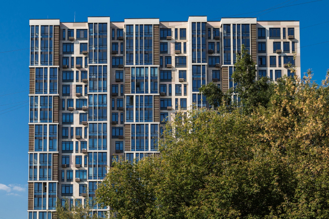
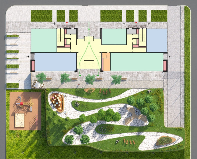
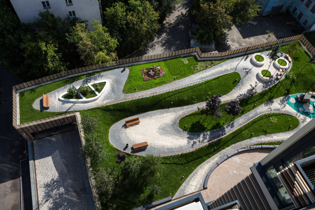
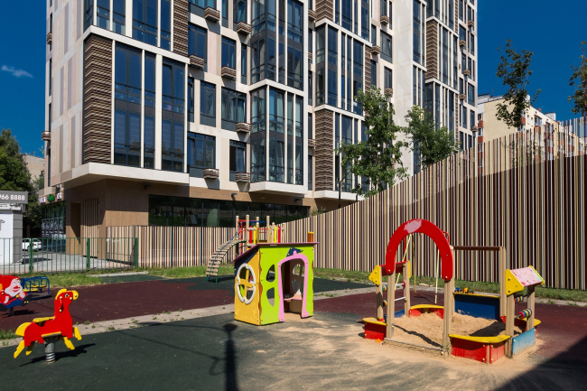
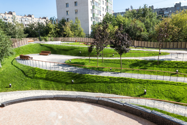
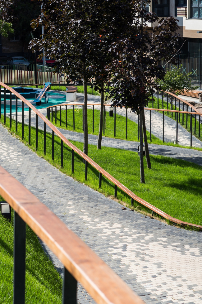
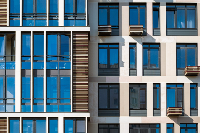
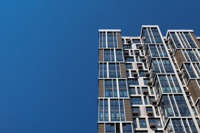
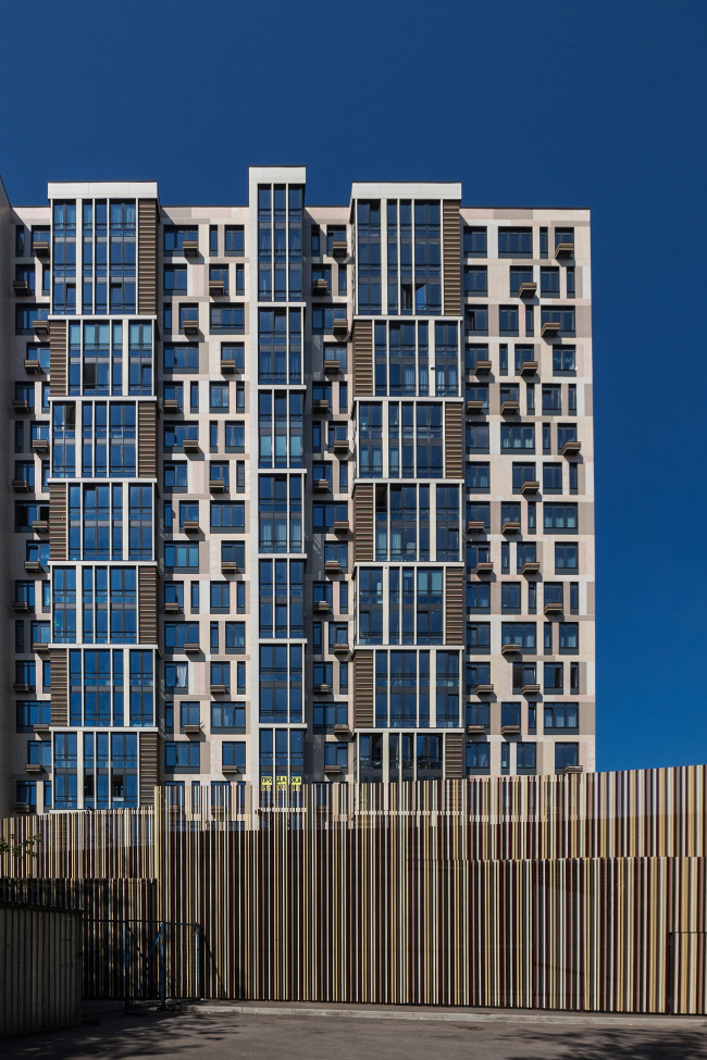
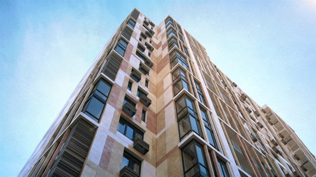
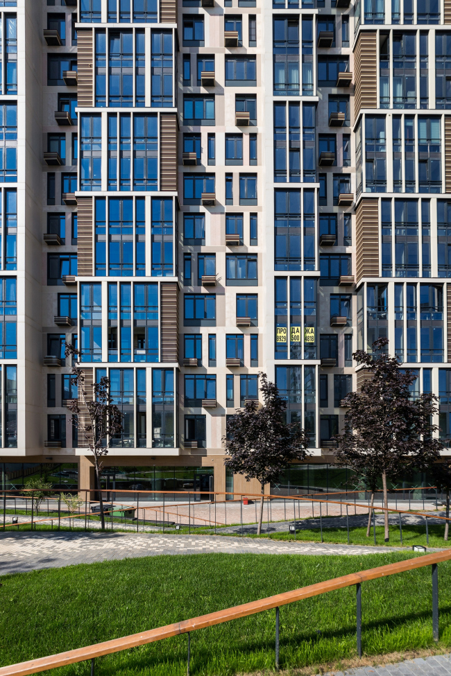
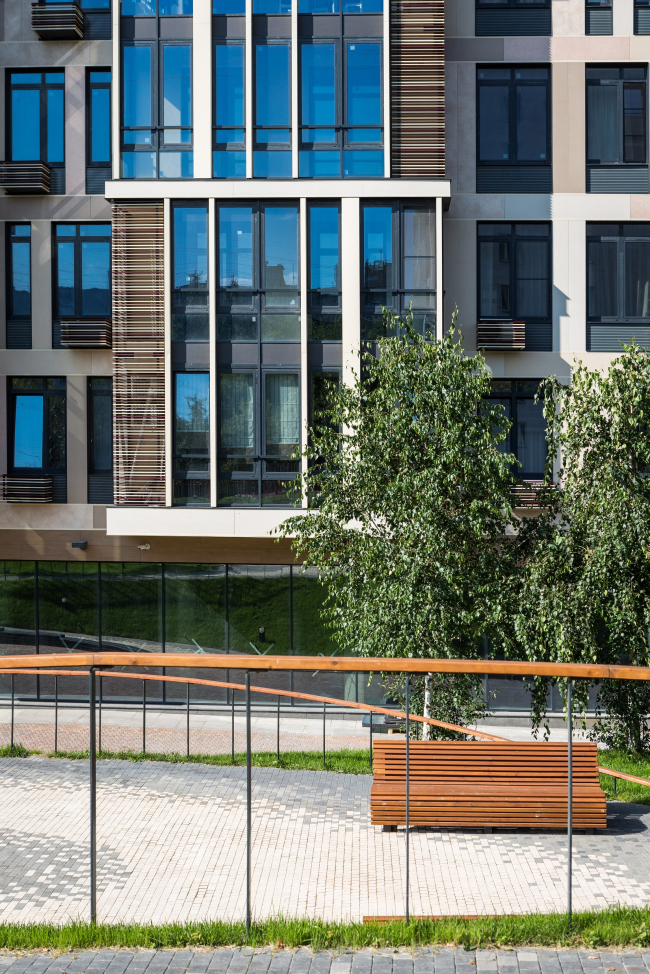
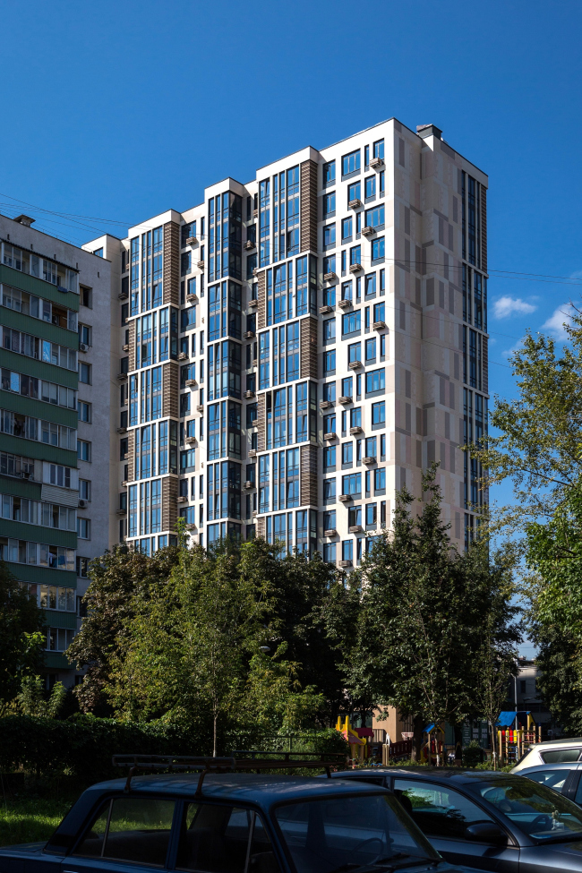
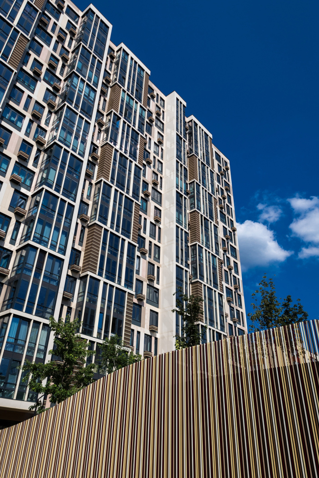
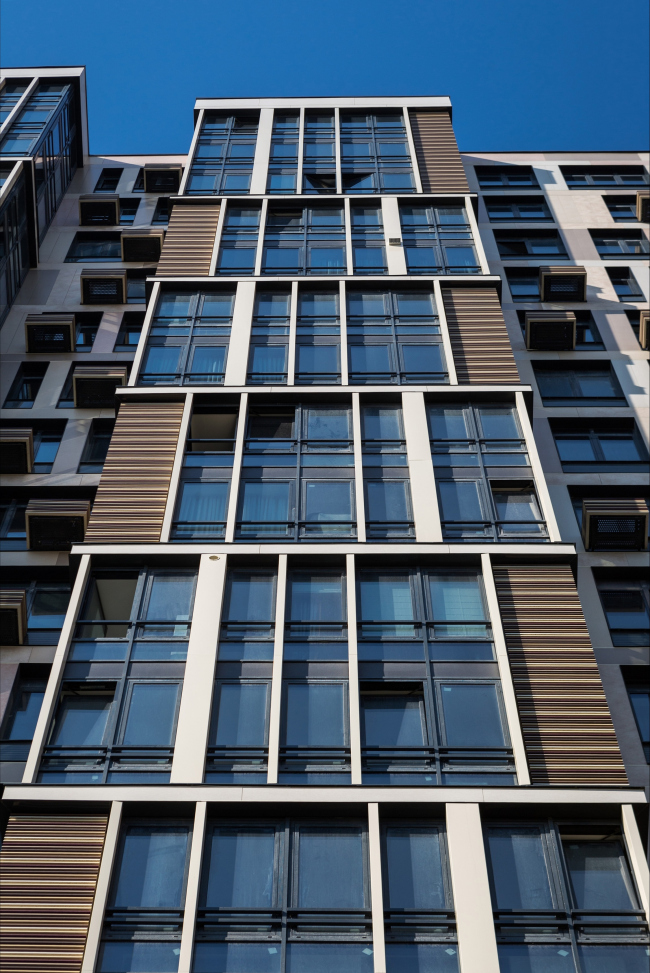
Situated in the north of Moscow, the housing complex “Caramel” was to have one outboard balcony per each apartment. Such a composition inevitably creates a “thermometer look” – but ADM Architects were able to “kill” this undesirable effect by introducing a play of planks of every conceivable hue of the chocolate color. "Caramel" housing complex © ADMWorking in the conditions of dense city construction – and the space between the Nizhnyaya Maslovka, Butyrskaya, and Bashilovslaya street has long since been formed – is always about facing a great number of restrictions. However, when you happen to “inherit” a house with its intrinsic “genes” presented by the construction blueprint and the number of floors (and, at the same time, with a few prominent “inherent vices”), this takes challenge you have to face to a whole new level. What you have to do is make a high-precision surgery on a living and breathing organism – and then hold your breath that complications will not set in. In the case of “Caramel” housing complex, this was exactly the situation described above: the construction had already begun, the position of the building and its yard had been settled, and at the same time the project needed some major revisions to be done without altering either configuration or number of floors. ADM architects completely redesigned the two underground levels and the first floor, took on the function of the master designer, redid the project and the working documentation stages, passed expert review, and got the architectural and urban planning permissions. And – the miracle did happen: even at this early stage, the architects were able to get rid of the “inherent vices” by changing both structure and (to a certain extent) ideology of the complex. For example, while in the old project the hallway entrances were situated on the inner side of the house, and there was a free driving access to them through the yard, in the new version there is just one central entrance with a spacious lobby. Now the entrance is organized from the outside, and one can either proceed to the residents-only yard or to one of the two elevator groups, each of which leads to its “own” section of the house, or to the shops that occupy a considerable part of the ground floor and “look” outside with their windows and doors. As for the cars, the driving is organized as follows: immediately from the 2nd Kvesisskaya Street, they drive into a double-level underground parking garage, and the yard gets inaccessible to them. "Caramel" housing complex. Construction, 2016 © ADMFurther on, the architects had to find an acceptable solution for the concrete ramp situated on the west border of the land site – joined with the ventilation chambers and other mechanical rooms, it turned into a bulky object more than 3 meters high and almost 10 meters long – this volume “ate up” all but the whole territory of the yard. What the architects did was integrate it into a manmade hill covered with grass and trees, and singled out some of the concrete surface for playgrounds, flowerbeds, and recreation zones with benches. As a result, they got a two-level yard with active and interesting kind of geoplastics, full of not only functions but also impressions that people will be getting from the height differences and the effect of a hilly terrain. Not only was the yard saved from going to waste but it also got an extra emotional value by turning into a terrain cure spot. "Caramel" housing complex © ADM"Caramel" housing complex © ADM"Caramel" housing complex © ADM"Caramel" housing complex © ADMHowever, probably, the main challenge that the architects had to face were the balconies, originally designed virtually for each of the apartments; and at the time the project was revised the apartments were already being sold – the architects had to work “on the fly”, first of all, thinking about the way to eliminate the effect of a thermometer, which inevitably shows through when identical glazed balconies are stacked on top of one another giving a recognizable intrepid taste to the buildings of our cities. In spite of the fact that the balconies could not be removed, Andrey Romanov and Ekaterina Kuznetsova were able to mitigate this effect to a large degree – or at least divert people's attention from it. "Caramel" housing complex © ADM"Caramel" housing complex © ADMThe “plastic surgery” was done along several lines at once: surface-wise, the architects solved the issue by introducing transparent and nontransparent rectangles of varying width; volume-wise – by introducing elements of different scale standing out, from air conditioning unit casings to vertical blocks of balconies. And, finally, as far as the entire façade is concerned – by using different colors and textures: the thin broad ceramic tiles of various shades of pale, looking like plaster, create a grisaille watercolor background, making the slab of the house look indeed like a gigantic candy and justifying the gastronomic name of the complex. On the glazed balconies, they turn into brittle, almost white, lintels that bravely dissect the glass massifs. Here, on the stanzas, the floors are grouped in twos, and a different rhythm appears – as if one house grows through the other, as if we are seeing two genetic codes here, one more on the thicker side, the other totally gothic. "Caramel" housing complex © ADM"Caramel" housing complex. Construction, 2016 © ADM"Caramel" housing complex © ADMAnd, finally, this whole multilayered, yet still clearly readable, structure, alternates with inserts made up of aluminum planks of all shades of chocolate – from milky white to bitter dark. They conceal the air-conditioning units installed next to the stanzas, forming a staggered rhythm that is meant to offset the vertical effect. The same ribbons adorn the individual casings of the air conditioning units scattered across the walls in a deliberately asymmetrical fashion, also for the sake of livening up the view and making the building look less predictable. On the façades of the house, the planks are responsible for the horizontal: fractured, decorative, and full of color, like a pretty little scarf. They balance out the vertical, which is doubtlessly dominant here, because it is responsible for making the house look slender and neat, just like a modern building should. The slenderness is achieved through the lines of the stanzas, the vertical proportions of the windows, which, after the 120-centimeter fire safety break regulation was observed, got in their bottom parts gray silk-printed inserts that visually “stretch up” the contour, especially when viewed from a distance. The walls are interpreted as a broad grille of lintels between the window apertures, which also enhances the visual “fitness effect” for the building. As for the vertical, it is enhanced by the numerous grilled on the yard side, which support the stroke pattern of the thin planks. "Caramel" housing complex © ADM"Caramel" housing complex © ADM"Caramel" housing complex © ADM"Caramel" housing complex © ADMOne should hardly mention the fact that ADM are the perfect masters of such rhythmic bel canto, these multilayered, volumetric and graphic façades, where the architect’s main task is to stay within the framework of the grid that holds the volume together, adding, at the same time, a twist of picturesque asymmetry that livens up the whole thing. In this specific instance, it is obvious that the task was to “rock” the monotonous and predictable volume, yet, as true professionals, the architects were able to resist the temptation of overdoing it. Besides, one can easily notice the similarities between the solutions used in this project and the architecture of the Hilton Doubletree Hotel on the Leningrad Avenue: the same combination of picturesque spots and punctured lines, the same play of window apertures, sometimes broad and sometimes narrow, the same sophisticated “knot” of verticals and horizontals that nonetheless makes perfect sense. What is different here is the scale, the function, and the materials – the hotel project used plaster and ceramic planks, and here we see ceramic walls and aluminum planks. But still, the set of techniques is very close to that, which is perfectly normal: the authors keep on developing their method, applying it to a new task. Therefore, from a rank-and-file high-rise with monotonous rows of balconies and potentially oppressive yard, “Caramel” turned into a business-class housing complex with all the “ensuing consequences”: a recognizable architectural image, a green vehicle-free yard, a public ground floor, an underground parking garage, and panoramic glazing in apartments from 54 to 228 square meters. No complications did set in. |
|
