|
Published on Archi.ru (https://archi.ru) |
|
| 12.12.2018 | |
|
A Change of Image |
|
|
Alyona Kuznetsova |
|
| Architect: | |
| Rostislav Zaiser | |
| Stanislav Belykh | |
| Tatiana Zulkharneeva | |
| Studio: | |
| OSAArchitects | |
|
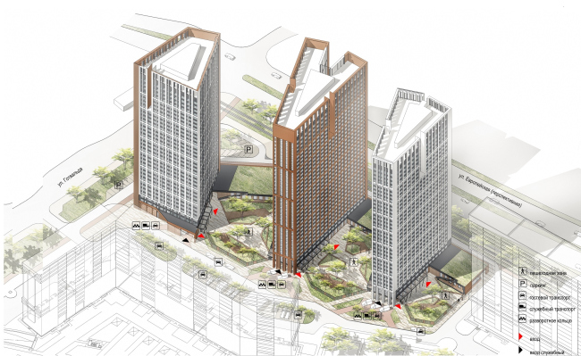
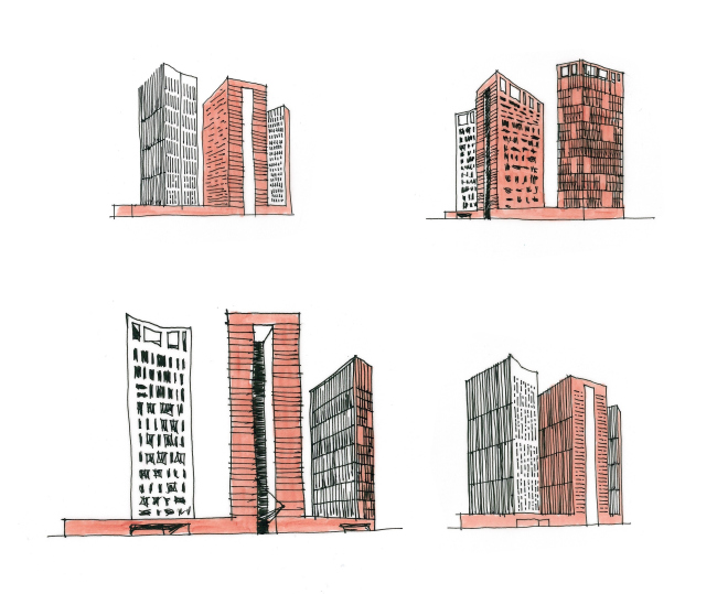
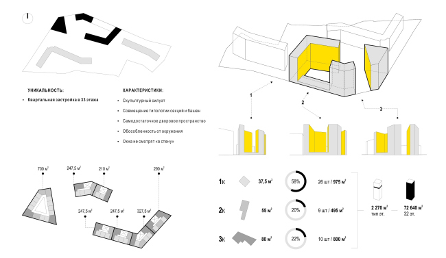
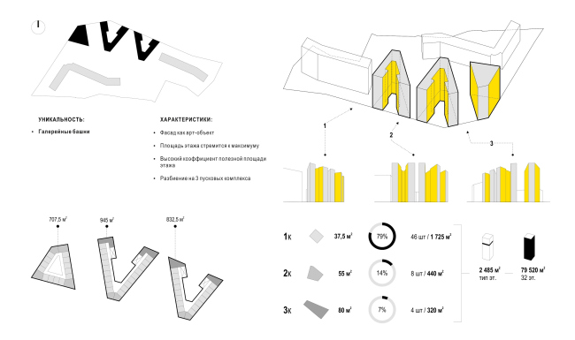
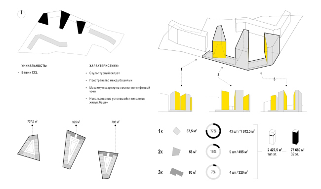
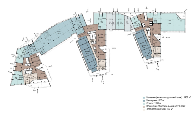
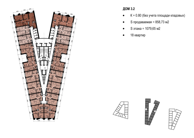
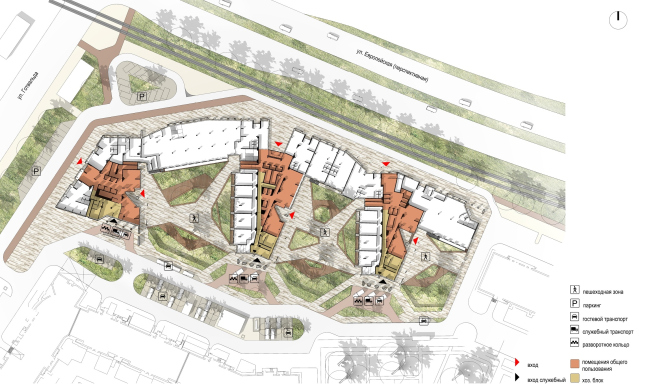
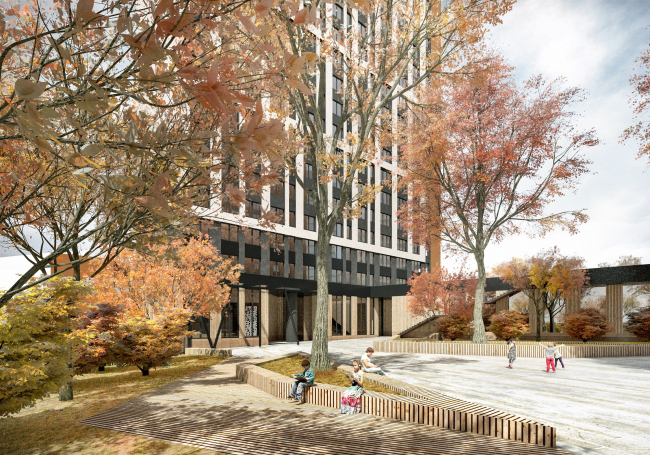
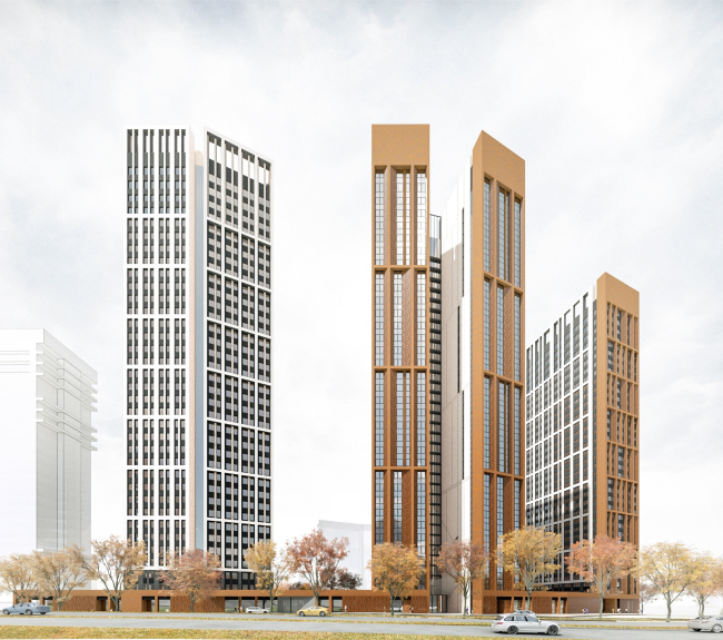
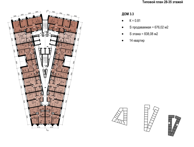
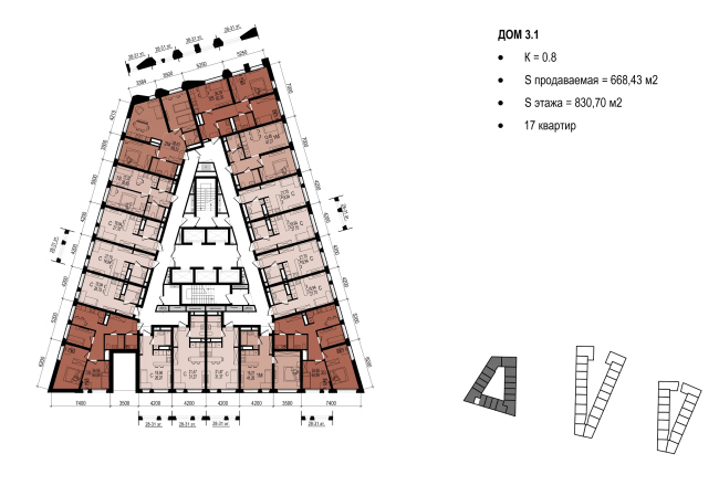
The OSA Group created a new version of high-rise towers in order to restart Ekaterinburg’s unfinished construction, at the same time trying to make the super-dense housing environment as comfortable as possible. Top view © OSA GroupThe three towers resting on a single podium are essentially a new version of the ambitious residential complex “First Nikolaevsky”, which is under construction in the north of Ekaterinburg. The OSA architects got into the project when the first construction stage was completed that consisted of two elongated buildings 14 and 25 stories high. According to the original design, these two were to be complemented by two skyscrapers with spires in the spirit of the Stalin empire style and two “candles” each one hundred meters tall. However, the developer, NP "Uralenergostroykompleks", went bankrupt. The construction was continued by the company Prinzip and their partners, the design office “R1”. The new developers decided to change the concept and turned to OSA, since Prinzip already had an experience of working with this architectural firm on the Malevich residential complex. The marketing management renamed “First Nikolayevsky” 2.0 into “Tatlin” by association with the Tower named after Third International. After the publication of the concept on the city forums, some people began to write that the complex “turned from an ugly duckling into a swan”, while the opponents of such super-dense development remained unconvinced and called the new project “another anthill”. The architects were facing a difficult task: to keep up the number of apartments, their minimum required floor space, not to go beyond the height mark of 100 m (despite the fact that the height of the previous “Stalin towers” was just a little under 150–200 m), and also to avoid window-to-window views. The architects supplemented this list with yet another self-imposed requirement – to make absolutely sure that the super-dense housing environment becomes comfortable for the residents of the complex. "Nikolaevsky" residential complex © OSA GroupAs for the compositional options, there were several of them. A grid plan consisting of buildings 35 stories high would have yielded a large courtyard with plenty of “air” between the buildings. The strong point of “semi-gallery” towers were beautiful-looking facades and the highest technical and economic performance indicators. However, the customer opted for the “XXL format” towers with the maximum numbers of apartments per floor. There are wide gaps between the towers, so the complex does not look like “the Great Wall of China”, while its silhouette still remains recognizable. Version 1. A unique city block © OSA GroupVersion 3. A unique city block © OSA GroupVersion 2. Unique towers © OSA GroupThe towers are built at the intersection of Gottwald and Cherepanov streets. Trapezoid in plan, they “open up” to the outskirts – warehouses, railways and the Zavokzalny microdistrict. But most of the windows one way or another overlook the central parts of the city – the Iset River and the City Pond will be seen from many of them. Due to the habitual traffic jams, getting to the center either by car or on foot is about twenty minutes. After the houses are put into operation, the traffic is likely to become even heavier. From this point of view, the concept of the podium, which unites the towers, is very attractive. In addition to the usual retail businesses, cafés and a fitness center, the podium will also accommodate for social and business spaces: there will be a meeting room, a co-working room, and a lecture hall for master classes and seminars. Some of the residents will not have to go to work in the city center during the rush hours, and perhaps the whole pedestrian and traffic flow will be redistributed – some people will be coming in the opposite direction to work in the Tatlin towers. Plan of the first floor © OSA GroupOn the outside, the towers are unlike one another: each has its own axis, plan and facade. The developer emphasizes this individuality in the decoration of public spaces: certain façade materials will dominate in each tower – gold, platinum or bronze. But the principle of organizing space is the same in all of them. The quintessence of all the techniques is the middle tower, in which the response to the “gallery” option is visible, since its powerful “wings” slightly diverge, like lithospheric plates. It is also worth noting that the windows in the depth of this “cleavage” belong to the staircase and elevator platforms, and the side ends are cut by narrow bathroom windows. "Nikolaevsky" residential complex © OSA GroupIn the heart of the trapezoid there are staircase and elevator sections and utility lines, along the perimeter there are apartments, there being 18 of them on each floor. In order to make sure that the residents will not wait too long for the elevator, the architects divided the corridors into four segments that lead to two staircase and elevator halls. Building 3.2 © OSA GroupEach tower has three entrances: two main entrances that overlook the street or the courtyard garden, and an auxiliary one for bulky loads from the side of the in-block passage. That is, if the residents do have to load and unload furniture or decoration materials, they do not use the yard for that (which is meant for recreation and communication) but use the loading platform. Such deconfliction of flows can be traced in other OCA projects, but here the architects made it as explicit and even as declarative as possible. Simplified master plan + 1st floor © OSA GroupOn the ground floor there is also a lobby, which unites all of the three entrances, a place for wheelchairs and bicycles, a restroom, and a special room where you can wash your dog’s paws after a walk. If you have a go-cart, you just walk out into the vehicle-free yard, without any thresholds or any other obstacles. Three-level underground parking can accommodate 1350 cars, the entrance to it is located in the courtyard. "Nikolaevsky" residential complex © OSA GroupIn the long run, the towers slightly overstepped the 100-meter mark, at the request of customers, OSA enlarged them from 33 floors to 35. The distance between them is 40-45 meters, so even if the windows do look at the wall of the neighboring tower, they still capture some air and sky. This allowed the developer, for example, to sell the 28-square-meter studios as “coming with a sunset view”. The floor space of single, double, and three-room apartments ranges from 40 to 100 square meters. "Nikolaevsky" residential complex © OSA GroupThe walls and intermediate floors dissect the facades into powerful blocks, simple and clear: in the side ends the strokes are oriented vertically, on longer planes – horizontally. In the “dense” places there are “serifs” made at the height from 28 to 35 floors, which also helps to avoid monotony. Standard plan of floors 289-35 © OSA GroupNoneArchitect Vasily Krapivin says: “As in many other complexes, we tried to keep the façade from playing the main part – what we wanted to do was repeat and strengthen the proportions and the silhouette. The facade fabric is simple, geometric and it works when viewed in perspective. From the center of the city and on the distant panoramas, the complex draws a silhouette that is not trivial for our city, and from close ranges it makes a dynamic sculptural composition: some towers stand out, and some hide back. We also made the most of the colors – the red tint of the central tower spreads all over the podium and goes to one of the neighboring towers, uniting all the buildings into a single complex”. The towers will be built one by one; the first one is to be put into operation in 2020. |
|
