|
Published on Archi.ru (https://archi.ru) |
|
| 31.07.2018 | |
|
Nikita Yavein: “We work on the architecture of streams” |
|
|
Julia Tarabarina |
|
| Studio: | |
| Company: | |
|
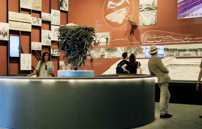
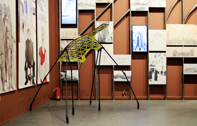
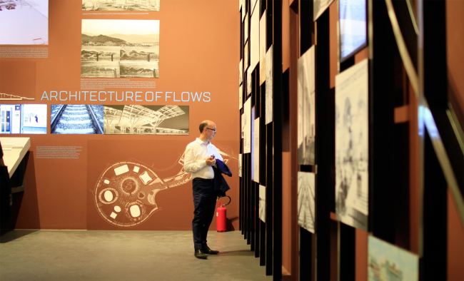
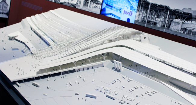
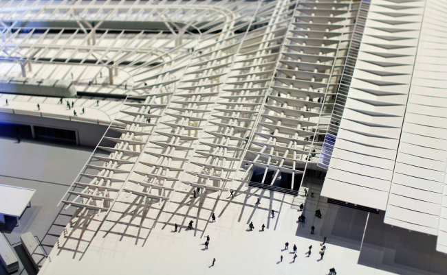
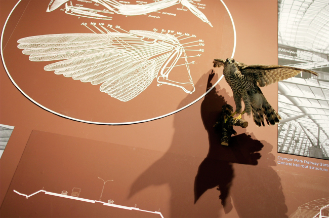
The Venice Biennale lasts for half a year, until the 25th of November, so I don’t think it’s too late to speak about the Russian pavilion as well. We chose two of its expositions for closer examination, and in this issue, we are talking to (as it turned out) an honorary railroad man, Nikita Yavein. The Russian Pavilion, Venice, Architectural Biennale. Photograph Arhi.ruSimon Mikhailovsky, the commissary and curator of the Russian pavilion at the Venice Architectural Biennale, responded to the theme of “FreeSpace”, which was proposed by the Irish, with an exposition entitled “Station: Russia”, dedicated to the Russian railways. The exposition is, of course, predictably sponsored by the Russian Railways. On the first floor, a video by Daniel Zinchenko is played, in which a seven-day train ride from Moscow to Vladivostok is jam packed in seven minutes. Next to it, there is a “cloakroom” that contains “surprises” hidden behind the doors standing ajar, as well as a heap of vintage suitcases. The second floor showcases the history of the Russian railways through a series of old railroad stations and terminals, their future through the project by Citizenstudio, and their present – through drawings and models by Nikolai Shumakov and through the Sochi Railway Terminal designed by Nikita Yavein with extended commentary on the project presented in the form of a few videos, a model, and even a stuffed bird – the wall is called “Architecture of Streams”. The Russian Pavilion, Venice, Architectural Biennale. Photograph Arhi.ruThe Russian Pavilion, Venice, Architectural Biennale. Photograph Arhi.ruThe Russian Pavilion, Venice, Architectural Biennale. Photograph Arhi.ruThe participation by Studio 44 comes as no surprise, considering the fact that the company’s portfolio includes such grand-scale railroad projects as the Ladozhsky Train Station – the first ever new railway terminal built on the post-soviet territory in 2003 – the Astana Train Station (Kazakhstan), and the recently-completed Russian Railway Museum in St. Petersburg, Russia. We talked to Nikita Yavein, and it turned out that all this “railway terminal”, or, in a broader sense, “railway” architecture means to him the embodiment of “architecture of streams”, the objectification of the theories of functionalists, one of the bright representatives of which was the father of Nikita and Oleg Yaveins, the famous architect of Saint-Petersburg constructivism, Igor Yavein. Archi.ru: What were the conditions of your participation in the exposition, how did it all begin? Nikita Yavein: I think inviting us was the obvious choice – after all, several recent high-profile railway terminals were designed by our company. I even have the title of an “honored railway man”; they once asked me what kind of award I would prefer, and I chose this specific thing – it’s very convenient, you know. As far as the work on the pavilion is concerned, we were allotted a wall [in the main hall, right of the entrance – editorial note], and we only worked with it, knowing almost nothing about what was going to be there next to us; we only knew that it would be a railway track. I thought that there would be more room in front of the wall; in actuality, because of the close viewing range our wall is falling apart a little bit... But it’s still OK. The exposition was developed Ivan Kozhin, although he didn’t participate in the project itself. And why was it the Sochi Railway Terminal that was chosen? This is the latest large-scale project, and, besides, it vividly demonstrates the ideas of streams influencing the architecture, which I’ve recently been into. You are sure to know that flow arrangement and deconfliction of streams inside the building was one of the main points of concern for the architects of the first third of the XX century – this was something that my father also was into. Ever since I was a child I remember all these arrows showing various directions, and he shared with me a lot about that: here is the train, people alight from each of the cars, they make a turn, go in one direction, and now there is a lot of them, so you need to widen the platform in this place, and so on. During my whole life I’ve been working on this topic, re-reading my father’s thesis; he wrote a book about railroad stations, it was published 1938, and he upheld his doctorate thesis in 1964. For some time, we worked together, won the competition for the railway stations of the Baikal-Amur Mainline (but then again, the whole project went nowhere), and I also contributed to designing the Dubulti Station in Latvia; this is one of my father’s latest high-profile projects. To me, ever since I was a kid, the stream has been like a living being that lives a life of its own. I perceive the stream of people like a stream of water: it runs into obstacles or cascades down like a waterfall, or when it has to turn, it boils over because it’s “angry” How did you take these ideas of streams to a new level? For the functionalists, deconfliction of streams was a very important, yet still technical, task, while we, based, of course, on the same principles, turn these streams into architectural plastique as well. As for the Sochi Terminal, we illustrated it with a few animated diagrams: one of them shows the passenger stream that we slightly sped up for the viewing convenience – people exit, then there is more and more of them, the space widens, then they make a turn, and here the roof bulges. We also showed the real train arriving schedule. Another diagram shows the density of the passenger stream in columns: one can plainly see how the dimensions of the platforms react to this parameter; where the wave reaches its peak, and where the stream, figuratively speaking, stands up on end, and then where it ebbs. All of these diagrams were not created fait accompli, either – we worked with them well in advance, double-checking every figure. The Sochi Railway Terminal. The video shows the calculation of the streams and their density: "Olympic Park" train station, Sochi. Model. The Russian Pavilion, Venice Biennale of Architecture. Photograph Arhi.ru"Olympic Park" train station, Sochi. Model. The Russian Pavilion, Venice Biennale of Architecture. Photograph Arhi.ruThe terminal was built with the use of the BIM-technologies because all of its 112 thousand elements are completely different, no two corners being exactly alike, the difference sometimes being as little as a fraction of a degree but they are still different, and each fragment of the roof and each steel pipe was to be manufactured individually. How come? We received the designing order rather late in the day. By that time, the curvilinear geometry of the railways and platforms had already been formed. Besides, we had to tie it in with the plans of the Olympic Park, which is also rather irregular. Our terminal was born at the joint of two curvilinear plans and it joined them together. This is why all the shapes are so flowing and streamlined there; I call this “Zaha Hadid circumstantial”. You also tested your model in a whirl tube, what did you do that for? Yes, we did, and there is also this airflow video – here is the thing, the place where the terminal is situated is prone to hurricanes and air turbulence. This test showed that the building was unlikely to get blown away altogether but it also served to show us a few of weak spots that we corrected later on. In a word, our wall demonstrates the entire cycle of working on the project – from inspiration to calculation. About this "fly-away" issue – why is there a bird image in your composition? Some sort of a predator, too? The body of this bird, just as the shape of our terminal, is the result of the outer forces and the inner life circle coming together. In both cases everything is ergonomic, and there is not a single thing that came by accident. According to our design, the bird that was going to be there in the composition was an albatross, and we even tried to arrange it with the university that they would let us use the stuffed bird for the exhibition. However, it later turned out that it would be too much of a hassle to carry it over beyond the confines of the university, so we had to buy a stuffed buzzard in Austria. Here you will also see pictures of LeTatlin that embody the idea of flight. The Russian Pavilion, Venice, Architectural Biennale. Photograph Arhi.ruWe demonstrate how we design this building like a bird in flight: it’s got the construction framework, like a bird’s spine, wings of the awnings above the platforms, and even the wind-killing trailing-edge flaps… Thus, our bird image comes as much from associations as from the project calculations. This way, we showed different stages of meditating on the project and the development of the form: calculations, images, and associations. We reveal and explain our creative process. I am sure that professionals saw what the whole thing was about. There is an idea to repeat this composition as part of our anniversary exposition when we celebrate the 25th anniversary of our company (and the 30 birthday of the creative studio that came before it) in the end of 2019. And I hope that this will be the time when we finally show the albatross. Addition: Nikita Yavein’s lecture on designing railroad stations. |
|
