|
Published on Archi.ru (https://archi.ru) |
|
| 25.07.2018 | |
|
Social Network |
|
|
Lilya Aronova |
|
| Architect: | |
| Sergey Trukhanov | |
| Studio: | |
| Т+Т Architects | |
|
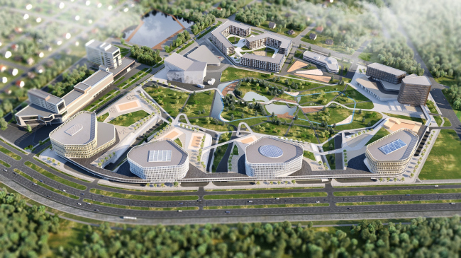
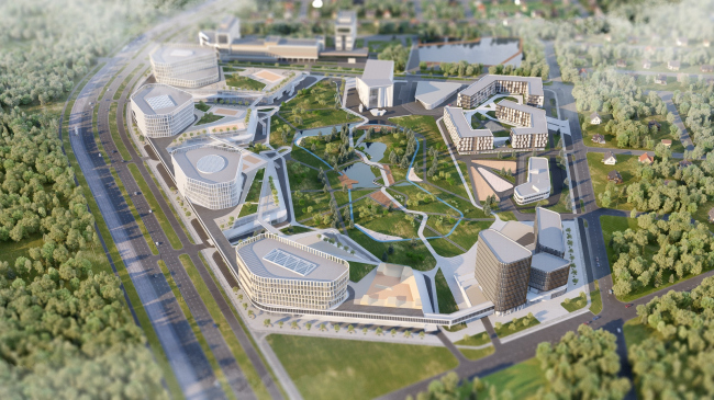
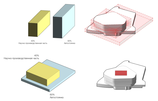
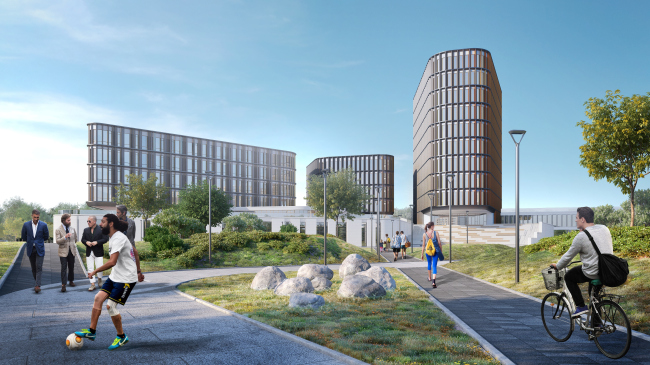
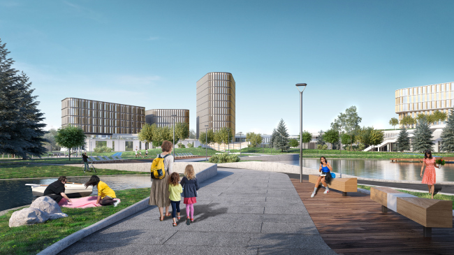
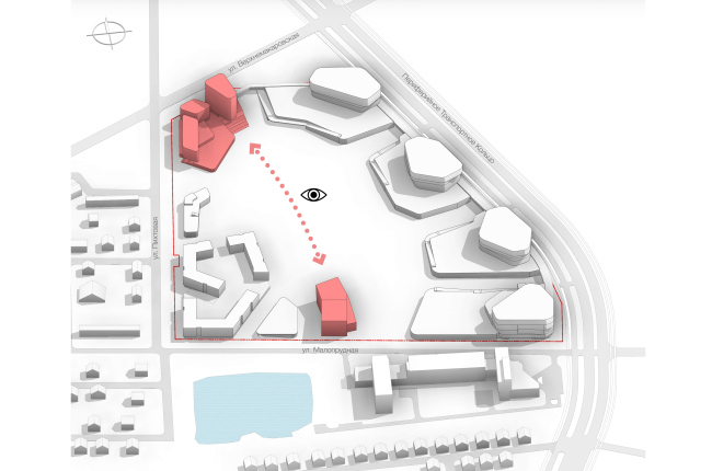
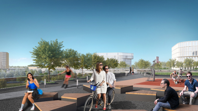
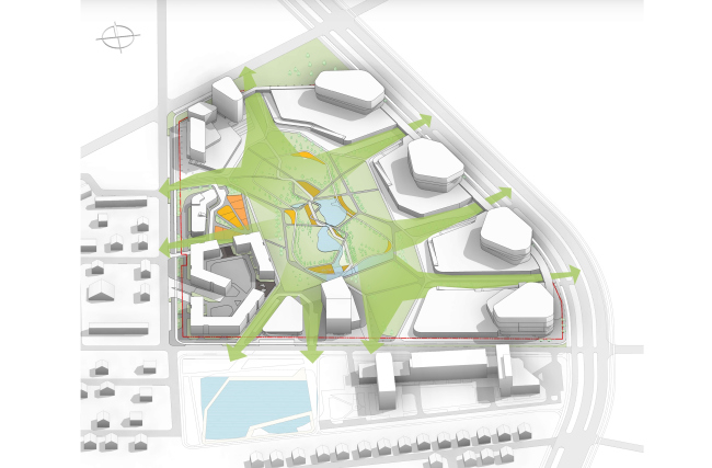
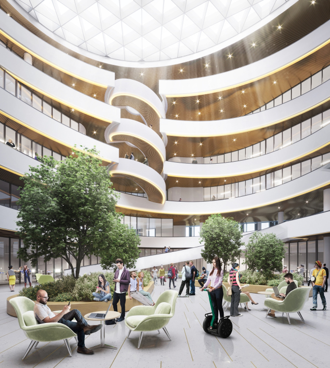
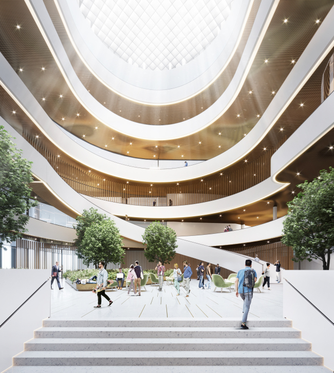
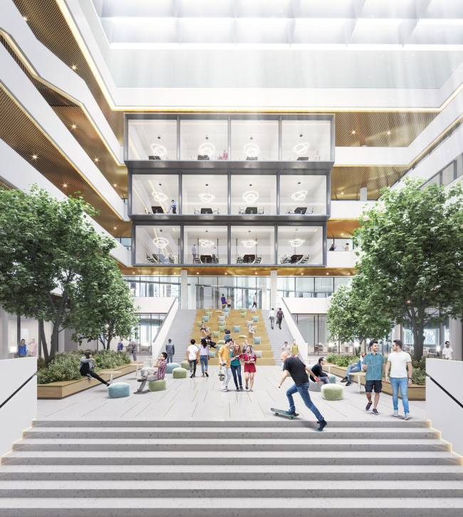
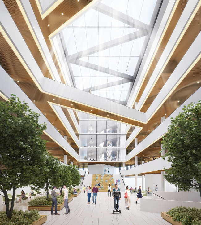
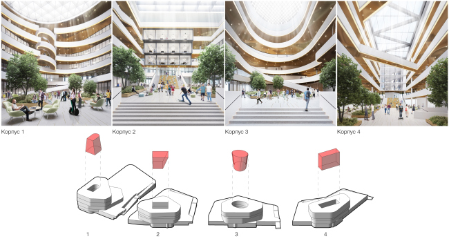
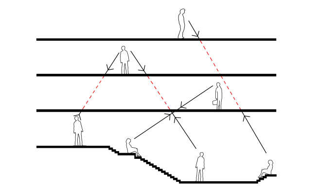
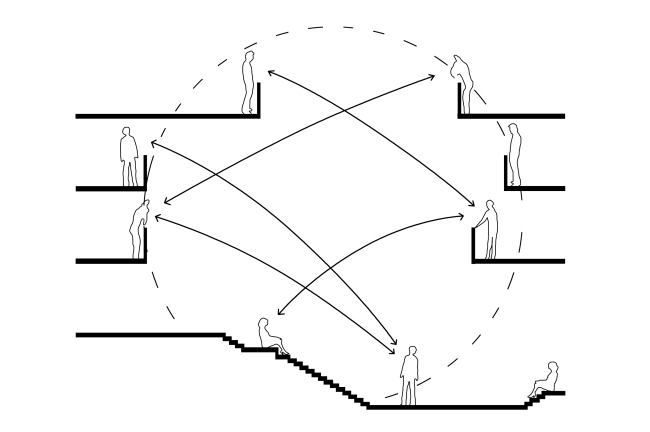
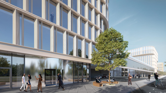
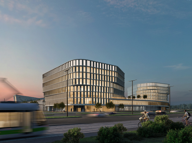
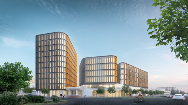
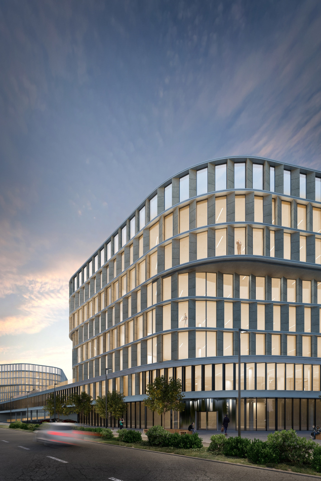
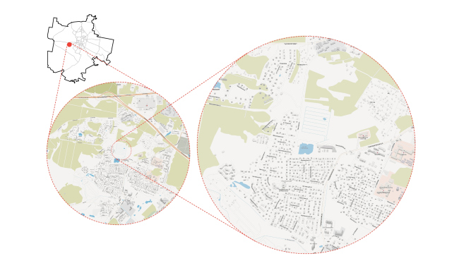
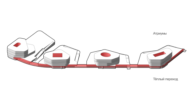
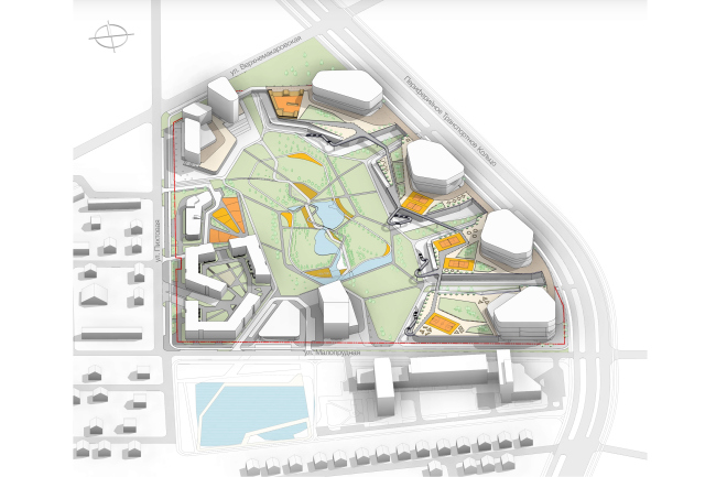
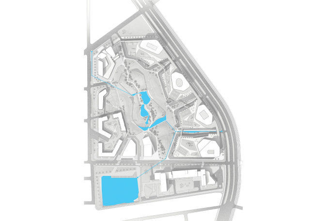
T+T Architects has won the contest for designing a research and development cluster in Ekaterinburg with a project that was all about enhancing the spirit of one of the most dynamically developing companies on the Russian market. Kontur-Park © T+T Kontur Park, Ekaterinburg © Т+Т ArchitectsCopyright: © T+T architectsFor this country, the Ekaterinburg-based company SKB Kontur is a truly distinctive phenomenon. Established in 1988, it has been rapidly growing ever since, not losing momentum even during the economic crises, and currently it is the nation’s leader in the field of software development. Coming a while ago to the idea of a necessity of creating its own cluster where it could gather in one place all of its structural divisions currently scattered all over the town, the company started developing a large-size land site located in a new district of Ekaterinburg named “Shirokaya Rechka” (“Broad River”). The first stage of construction of the complex, a ten-story office building, was finished two years ago but the growth of the company significantly exceeded the construction tempo, and by the time the building was completed it became it became obvious that the company was out of room again. It was for this reason that a competition was announced for developing the 16.8-hectare adjacent land site. The competition was won by Moscow’s T+T Architects. Kontur Park, Ekaterinburg © Т+Т ArchitectsCopyright: © T+T architectsAccording to the client’s brief, the almost-trapeze-shaped territory was to host from three to five office buildings meant to provide about 5000 workplaces, as well as an educational center, an apart-hotel, a corporate kindergarten, a shopping center, and a roofed rock-climbing wall. Of course, a parking garage was also designed, the number of car stalls being calculated as one car per two employees, which means that if one is to imagine buildings of similar volume, the parking garage would be half again as tall as the main building. Kontur Park, Ekaterinburg © Т+Т ArchitectsT+T Architects solved this problem by “spreading” the parking garages over the ground, i.e. making a lot of two-level podiums of irregular shape with usable roofs, above which the new buildings are towering. The garages that trace the terrain in this way are practically unseen to a casual observer, which was the designers’ end goal – the last thing they wanted to get was rows of cars apologetically covered by lamellae meeting the visitors of the complex. Kontur Park, Ekaterinburg © Т+Т ArchitectsUnlike the other competitors, T+T Architects proposed to place the four office buildings around the rounded base of the trapeze, where a segment of the city’s peripheral transport ring will be built. This, of course, will be done in a remote future but the Shirokaya Rechka district is rapidly developing now, and the architects took care about the compositional rhythm and harmony of their project well in advance. Kontur Park, Ekaterinburg © Т+Т ArchitectsIn the quieter corner of the trapeze, closer to the residential area, the architects are placing an apartment hotel, in another – an educational center and a kindergarten between them. From the side of the road that separates the complex from the first stage of construction, there is an imposing volume of the rock-climbing facility. And, as for the central part of the territory, a whopping 10-hectare chunk out of the 16.8 – it must be occupied by a spacious park, the arrangement of whose promenades will enhance the diagonal compositional axis of the complex – from the educational center to the rock-climbing facility, both of which tower above the overall compositional framework. Kontur Park, Ekaterinburg © Т+Т ArchitectsCopyright: © T+T architectsKontur Park, Ekaterinburg © Т+Т ArchitectsCopyright: © T+T architectsKontur Park, Ekaterinburg © Т+Т ArchitectsIn the center of the park, the architects have designed a pond – an advantageous landscape element by default – which in this specific instance is supported by the practical considerations as well: the land site in question is pretty swampy, and the artificial pond will also perform the drainage function. And in the spaces between the office building the “tentacles” of the green vegetation will reach out towards the future highway, breaking the rhythm of the city verticals in a green punctured line. Kontur Park, Ekaterinburg © Т+Т ArchitectsCopyright: © T+T architectsKontur Park, Ekaterinburg © Т+Т ArchitectsThe Moscow architects came up with a solution that is logical, convincing, and functional – which definitely impressed the organizers of the competition. However, in addition to that – as is always the case with T+T Architects – this proposal also has a philosophy of its own. The very notion of “IT-company” is all about something modern, communicative, creative and dynamic; all the more so with SKB Kontur with its rapid development rate and unprecedented care for its employees, whose value the leadership of the company unflaggingly stresses! That’s why the architects designed the complex as a huge space for communication that develops on several levels simultaneously. The park, with its radial trails that stream from every building towards the pond, became the largest one here but, in addition to it, there are at least two other minor ones. All the buildings are connected by a common underpass that stretches along the second level of the parking garage, so one will not have to go outside in order to get from one building to another. And the most interesting, from the architectural standpoint, communicative space is the atriums that form the nuclei of each of the buildings of the complex. Kontur Park, Ekaterinburg © Т+Т ArchitectsThe plans of the four buildings are anything but standard rectangles. The façades do not repeat the bionic forms, rhyming with the silhouettes of the garage-containing podiums instead. The absence of any straight corners is also some sort of a tribute to the company’s philosophy, one of whose main corporate values is freedom: the employees have a non-standardized workday, and they are not chained to their desks, it’s not a problem if an employee spends his whole workday in the park one on one with his laptop. As an option, the employees can also sit working in the atrium where the connection between the floors, divisions and departments is expressed in a particularly vivid way. Kontur Park, Ekaterinburg © Т+Т ArchitectsCopyright: © T+T architectsKontur Park, Ekaterinburg © Т+Т ArchitectsIt was important for the architects that the original list of corporate values stipulated for the contest – these being dynamics, creativity, and respect for the employees – should be augmented with an element of prestige. And such a flashy architectural device as an atrium, in spite of all the difficulties that it presents for the developers due to the fact that it inevitably leads to significant losses of useful floor space and an increase in the building’s power consumption, goes a long way to enhance this particular quality. It is planned that the volumes, which are going to be “taken out” of each of the buildings, will be different in shape, and the resulting space will also be designed in different ways: at some places this may be a spiral ramp, at some places – crossing overpasses, at some places – a broad staircase, or skylights in the meeting rooms. “In a usual building, the employees are usually locked up in their office, or in their corridor or on their floor – explains the chief architect of the project, Nikolai Makarov – and such an atrium is conducive to communication. This is some sort of an offline version of a social network that encourages people to plug in to the social pipeline”. Kontur Park, Ekaterinburg © Т+Т ArchitectsKontur Park, Ekaterinburg © Т+Т ArchitectsKontur Park, Ekaterinburg © Т+Т ArchitectsKontur Park, Ekaterinburg © Т+Т ArchitectsWhile in the competition stage, designing the façades was out of the scope of the architects’ task – but they took care of that part as well. The façade design solution of the office buildings is based on the total glazing alternating with non-translucent piers. At some places, the floors get a horizontal shift, the combination of dark and light tones of the façade panels on the piers’ facets enhancing the textured effect. The design of the façade of the rock-climbing center is based on the imposing silhouette of the Manaraga mountain that is commonly known as the most beautiful peak of the Urals ridge. The building is coated with perforated panels that repeat the famous shape of the famous Manaraga mountain ridge (which translates from one of the local languages as “a bear’s paw”): in the daylight, the silhouette of the mountain is formed at the expense of the black dots set against the white background, while in the evening, when the lights are on inside, the network becomes sort of translucent, and one can see from the outside everything that goes on inside. The rock-climbing complex in the Kontur Park is designed not only for the physical training or the employees alone: this will be quite a serious facility even capable of hosting international competitions. “We tried to create not just a research and development center but a creative space, a home for talents, and make it as effective, as monumental, and as imposing as possible” – concludes Nikolai Makarov. It is this kind of project that most adequately answers to the atmosphere and the needs of Russia’s largest international software company, in whose walls creative juices flow, and the main asset is the people that work here. Kontur Park, Ekaterinburg © Т+Т ArchitectsCopyright: © T+T architectsKontur Park, Ekaterinburg © Т+Т ArchitectsCopyright: © T+T architectsKontur Park, Ekaterinburg © Т+Т ArchitectsCopyright: © T+T architectsKontur Park, Ekaterinburg © Т+Т ArchitectsKontur Park, Ekaterinburg © Т+Т ArchitectsKontur Park, Ekaterinburg © Т+Т ArchitectsKontur Park, Ekaterinburg © Т+Т ArchitectsNone |
|
