|
Published on Archi.ru (https://archi.ru) |
|
| 19.06.2018 | |
|
Russian architects talk about biennale |
|
|
Dmitry Leonov |
|
|
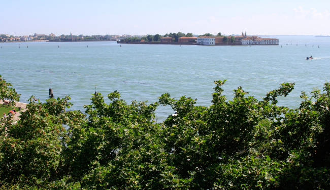
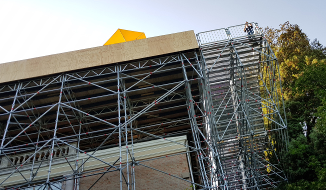
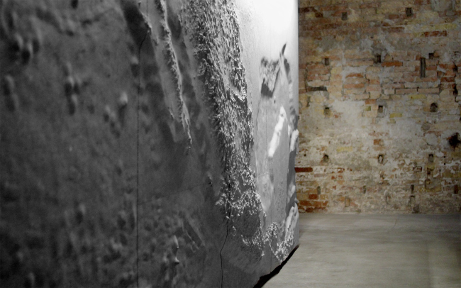
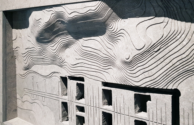
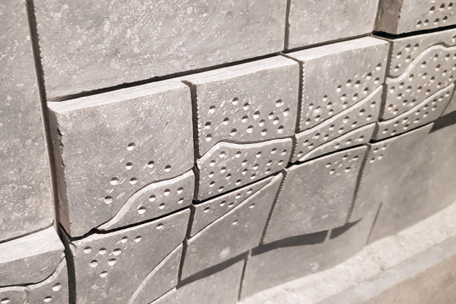
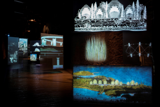
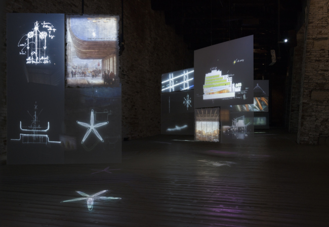
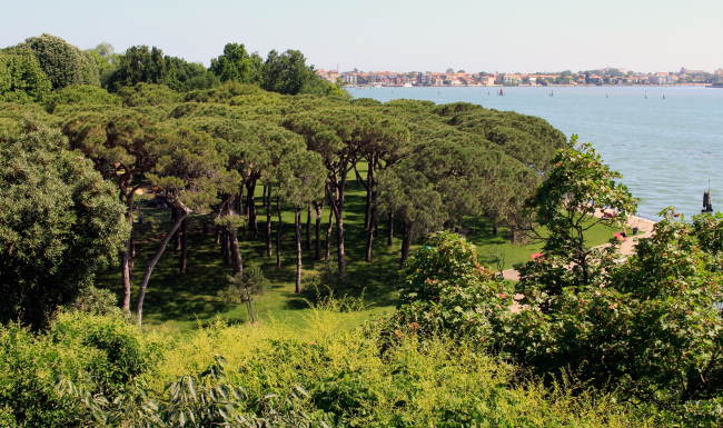
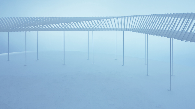
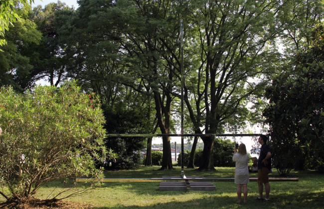
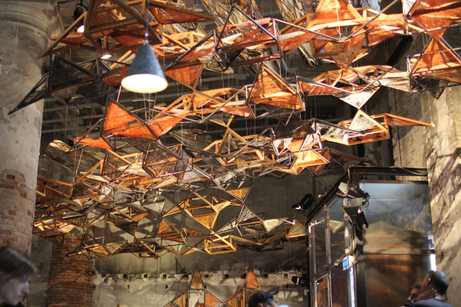
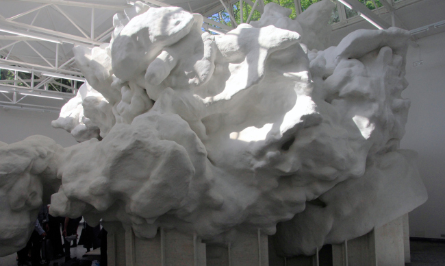
Thoughts and recommendations from different architects. The exhibition, it's advantages/disadvantages and of course the best pavilions. Laguna's view from the terrace on the top of the British pavilion. Photo: J. Tarabarina, archi.ruWe asked: What do you think about biennale' theme and it's influence; what are the best biennale's exhibitions; what influenced you personally?  Nikita Yavein This year biennale’s theme is a very widely formulated, you can connect almost anything to the subject. Hence there is a great deal of stairs and empty pavilions which I think denotes a kind of "flattening" of the world, a result of a universal desire to achieve instant success. And this trend towards simplification appears depressing to me. I thoroughly enjoyed Biennale of Aravena, there were a lot of moments that I well understand; I believe that only regional schools are worthy of interest now, while the mainstream ones are a bit dull, regional studios were shown then. Structure of the British pavilion. Photo: J. Tarabarina, archi.ruPavilion of Nordic countries. Photo: J. Tarabarina, archi.ruSwiss pavilion. Photo: J. Tarabarina, archi.ruMexico pavilion. Photo: J. Tarabarina, archi.ruMexico pavilion. Photo: J. Tarabarina, archi.ruMexico pavilion. Photo: J. Tarabarina, archi.ru"Renzo Piano. Progetti d′aqua". Fondazione Emilio e Annabianca Vedova. Venezia, 2018. Ph Studio Azzurro, 2018"Renzo Piano. Progetti d′aqua". Fondazione Emilio e Annabianca Vedova. Venezia, 2018. Ph Studio Azzurro, 2018Perhaps, undeniably the most interesting architectural experience is the Swiss pavilion, and I totally support the jury which has awarded them the first prize. Japanese Pavilion is always cute, with its hand graphics. Renzo Piano exhibition is really interesting. The projects on display are clear and very well known, but the script and the directing behind the show is genial and create new feelings; I recommend visiting it to everybody, it's a fresh new way of demonstrating architecture, although there is so much more scenography there than information. ***
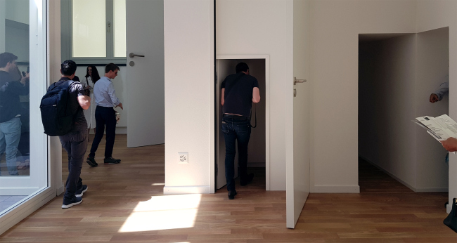
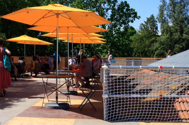
 Sergey Kuznetsov From my experience of participation in Biennale, I believe that the theme offered by the curators is very abstract, and to be honest, the vast majority of the participants hardly follow it. Any exhibition can be tied up to a certain subject one way or the other. Of course, curators' manifesto declares the general trends of the architecture today, and shows that the Venice Biennale sets the tone in the world. Nevertheless all national pavilions are made by curators the way they see fit. As a result, we have interesting installations which are more tied to the current events in the countries that take part in biennale, than to the general theme. Laguna's view from the terrace on the top of the British pavilion. Photo: J. Tarabarina, archi.ruBritish pavilion. Photo: J. Tarabarina, archi.ruHolland pavilion. Photo: J. Tarabarina, archi.ruI agree with the choice made by international jury and I think that Switzerland and the United Kingdom have presented the best pavilions. The English have presented the theme of this year (freespace) literally, they left empty space inside, but have erected the observational rooftop with magnificent views onto the Giardini gardens and the lagoon. The Swiss had an element of a game, they demonstrated how different can be dimensions of living quarters. I can also name the Dutch, really liked their pavilion. Chili pavilion. Photo: J. Tarabarina, archi.ruChili pavilion. Photo: J. Tarabarina, archi.ruI think that it is only right to invite bright interesting curators. Architects should see the entire exposition to understand which direction the whole thing is going. And this is the main task of the Biennale. Architects visit it, take note that things can be done this way, or that way, and then use it in their work. ***
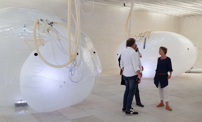
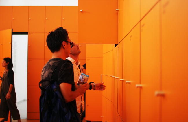
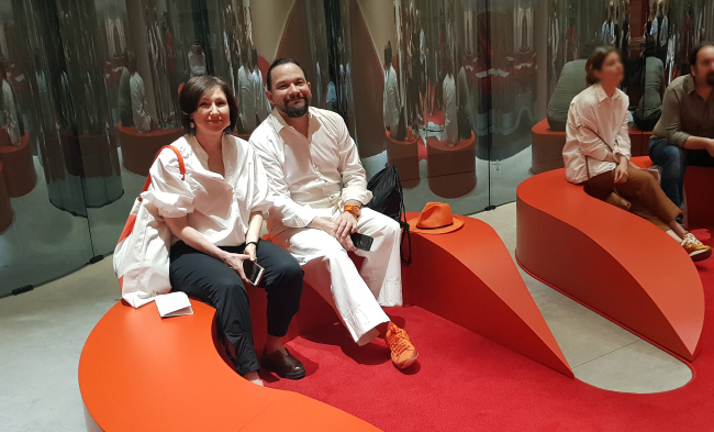
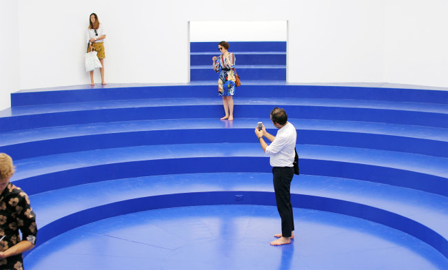
 Vladimir Kuzmin Do the exhibitions fully reflect the theme of Biennale? Perhaps they do, insofar as it appeals to such a global term like "freedom." "Free space" is understood as much widely as possible, from a literal emptiness to detailed projects of "liberation" of spaces: of their functions, characteristics, of materials and formation technologies. Tatiana Chelyapina and Vladimir Kouzmin. Photo: J. Tarabarina, archi.ruBelgian pavilionDorte Mandrup, Arsenal. Photo: J. Tarabarina, archi.ruMy absolute favourite is the Swiss Pavilion! The real game with physical scale of living spaces and their scales impressed me, and forced to literally to feel the effect of "Alice." Dutch Pavilion - Orange cells with "secrets" in them, and behind them. Giant "bubbles" in the Pavilion Scandinavian countries ... Blue podium-amphitheater in the Belgian Pavilion ….. virtual "window in the universe" in the Hall of Venice... ***
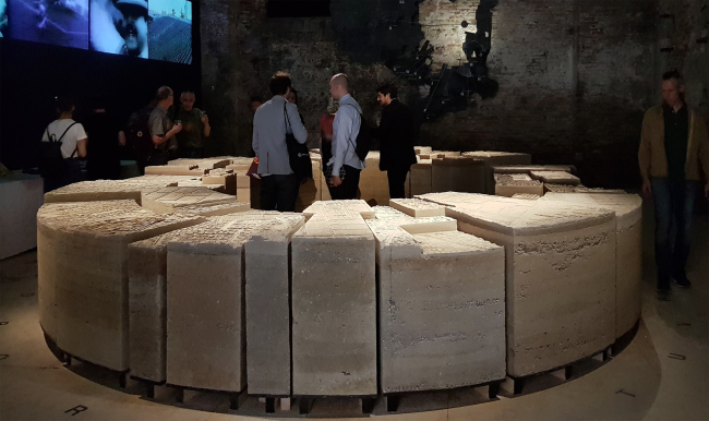
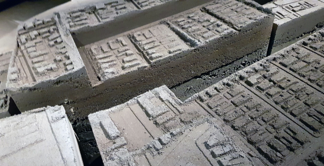
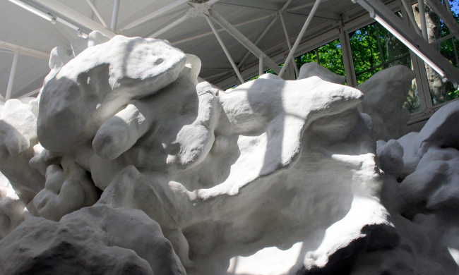
 Natalia Sidorova and Daniel Lorentz The Swiss Pavilion concept of playing with scale, is simple. Quality implementation and attention to detail including the size of parquet boards and door handles made the actual experience very convincing.Also the Japanese Pavilion with various formats and techniques of art graphic on urban spaces is something to stare at for a long time. Japan pavilion. Photo: J. Tarabarina, archi.ruVatican pavilion. Carla Juaçaba, A bench and cross. Photo: J. Tarabarina, archi.ruPeter Zumtor, biennale exhibition, pavilion of the Biennale. Photo: J. Tarabarina, archi.ru***  Anton Nadtochiy We were able to visit Arsenale with a guided tour – and maybe this is the reason why we liked Arsenale most of all, particularly the part that demonstrated various artistic and space organization strategies from architectural firms that were invited by the curators – from Benedetta Tagliabue to Olgiati. Biennale 2018, Corderi. Photo: J. Tarabarina, archi.ruBiennale 2018, Corderi, SANAA project. Photo: J. Tarabarina, archi.ruBiennale 2018, Corderi, project by Valerio Olgiati. Photo: J. Tarabarina, archi.ruIn Giardini, as always, the Swiss pavilion looked great – last time this place featured a powerful project by Christian Kerez, and this time around the pavilion was just as interesting and conceptual; it deservedly won the first prize. Biennale 2016, Swiss pavilion. Photo: J. Tarabarina, archi.ruBiennale 2016, Swiss pavilion. Photo: J. Tarabarina, archi.ruBiennale 2018, Swiss pavilion. Photo: J. Tarabarina, archi.ruBut I must say that I was still more impressed by the pavilions located beyond the confines of Giardini: the Catalonia pavilion, which was made by RCR, was a fantastically beautiful installation. Filippines pavilion. Photo: J. Tarabarina, archi.ruFilippines pavilion. Photo: J. Tarabarina, archi.ruThe pavilions of the so-called “new countries” deserve more and more attention, being very carefully executed in a high quality manner – the pavilions of Mexico, the Philippines, and Luxembourg. China made an enormous installation that was made with a 3D printer and it veritably worked as a landscape object. It is clear that this is an unmistakable hot trend of today that will develop very quickly. ***
 Mikhail Beilin The first Pavilion that I saw was the Swiss Pavilion. It remained the most striking, interesting and elegant. Most of the time I spent in the main pavilion of Biennale, which was my major impression. I think is was all about texts, not images. It was incredible pleasure to read all of this. I especially liked the exposition dedicated to Luigi Dominioni of whom I have never heard before. I very much liked the breadth of the "free space" interpretation. The exhibition is much less gearing towards social aspects as compared to "The reports from the front" of 2016. And, in my opinion, is much more devoted to architectural search, including in the past. To simply put it "free space" - is generally speaking everything that surrounds us. This Biennale is about architecture as a whole which is rather original in my opinion. Cino Zucchi, pavilion of the Biennale. Photo: J. Tarabarina, archi.ruBiennale is always interesting. The indescribable pleasure of diving into architecture as a science and pure art which is lacking in everyday life. And special pleasure in Giardini and Arsenal-to read texts -descriptions to the exhibits. In lieu of a quite a bit of professional literature. ***
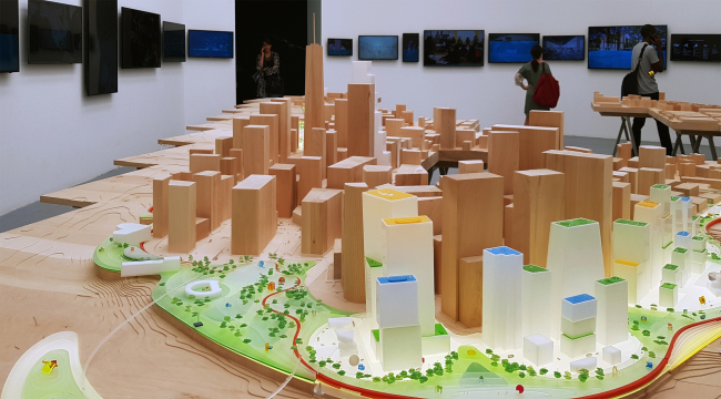
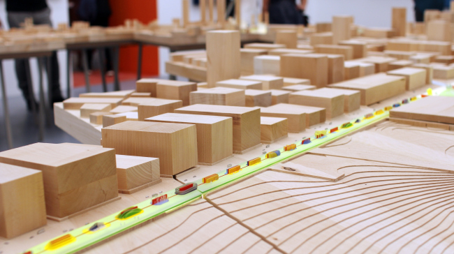
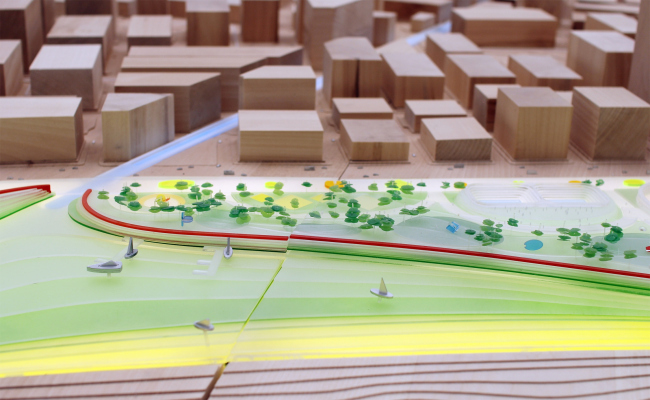
 Amir Idiatulin In some of the national pavilions, the biennale theme – free space – is interpreted at its face value, literally as an empty void, the way the British did, to name but one example. Meditating on a given theme sometimes brings about a pavilion with a swing set (Pakistan), or sometimes a pavilion with a ping-pong table and merry-go-rounds (Romania). Considering a dwelling unit as a free space, the way it was done by the winning Swiss, is a controversial approach – for a modern human being, the very notion of “home” has drastically changed. A modern housing complex is programmed to perform a lot of functions, and we spend less and less time in our apartments; we need more of a “free space” in the city that’s outside. Bjarke Ingels, Humanhattan 2050, pavilion of the Biennale. Photo: J. Tarabarina, archi.ruBjarke Ingels, Humanhattan 2050, pavilion of the Biennale. Photo: J. Tarabarina, archi.ruBjarke Ingels, Humanhattan 2050, pavilion of the Biennale. Photo: J. Tarabarina, archi.ruIt is clear that some of the pavilions were designed not with the architects in mind but to impress the mass audience. In my opinion, at such events one shouldn’t make such populist and specific statements, and should be laying more stress on the concepts and ideas that change the city and the people’s lives. Singapore pavilion, Arsenale. Photo: J. Tarabarina, archi.ruThe biennale theme gets me thinking about the necessity of creating free spaces in the modern high-density urban construction, about searching for opportunities to use the architectural and town planning tools to form such oases for the city people. The architect’s challenge is to create and program such spaces, making them attractive to people. An instance of this is the statement that BIG made on this subject – the Danish showcased the project named Humanhattan 2050, an innovative system that is being proposed as a way to protect New York and other cities from rising sea levels and future storms. ***
 Magda Cichon To me, the best pavilions in terms of getting across the architectural message were the curators’ pavilions – the Irish Grafton Architects, Shelley McNamara and Ivonne Farrell – where they presented their unique vision of the biennale’s main theme of “free space”. Thanks to the thorough preparation, it was great to spend inside all the three days. As an architect, I can only highly appreciate the tremendous preparation work: they were able to fill the spaces with light and air, and make them comfortable for the guests, without overloading them. Curator's exhibition, Arsenale. Photo: J. Tarabarina, archi.ruAmong the national expositions, I would like to note the Nordic Countries Pavilion: three countries (Finland, Sweden and Norway) joined efforts to present an inspiring minimalist exposition that included moving objects exploring the theme of balance between nature and architecture. Translated by Irina Vernichenko, Anton Mizonov |
|
