|
Published on Archi.ru (https://archi.ru) |
|
| 25.06.2018 | |
|
The Hornets’ Nest |
|
|
Lara Kopylova |
|
| Architect: | |
| Vera Butko | |
| Anton Nadtochiy | |
| Studio: | |
| ATRIUM | |
|
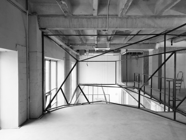
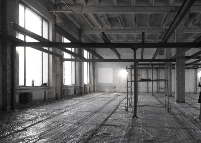
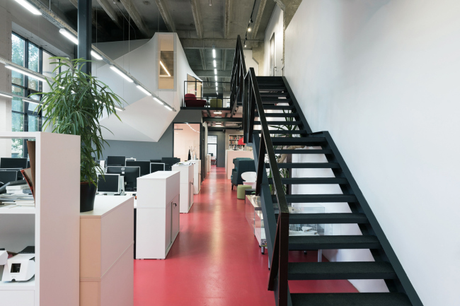
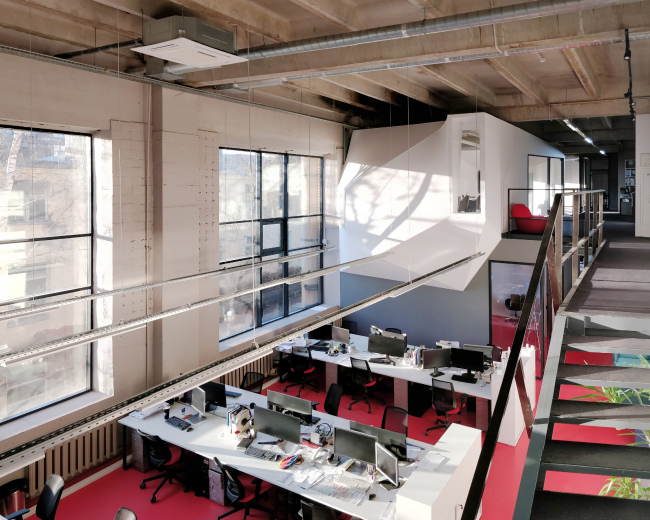
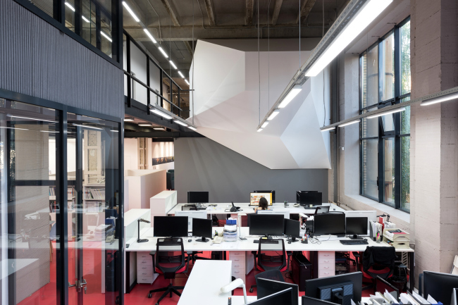
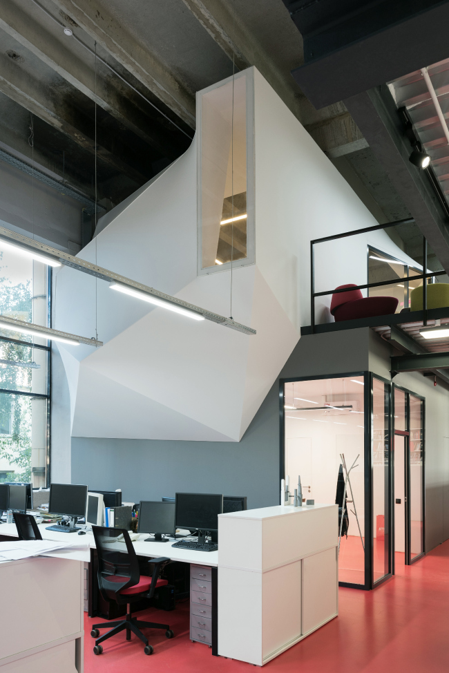
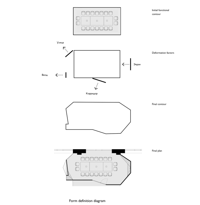
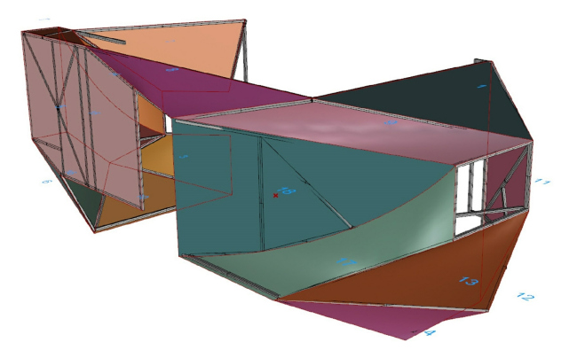
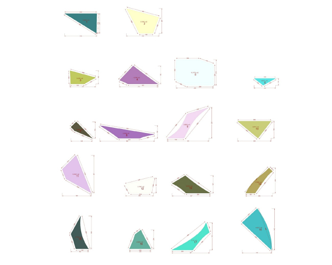
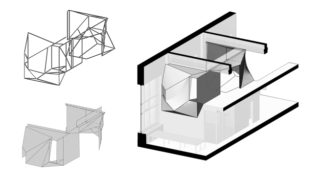
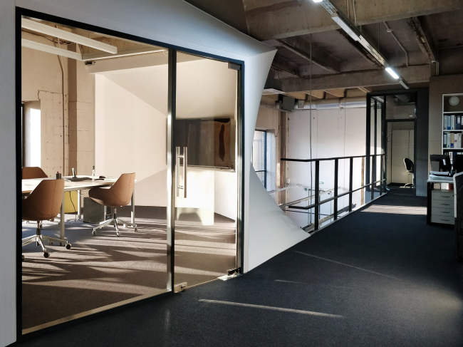
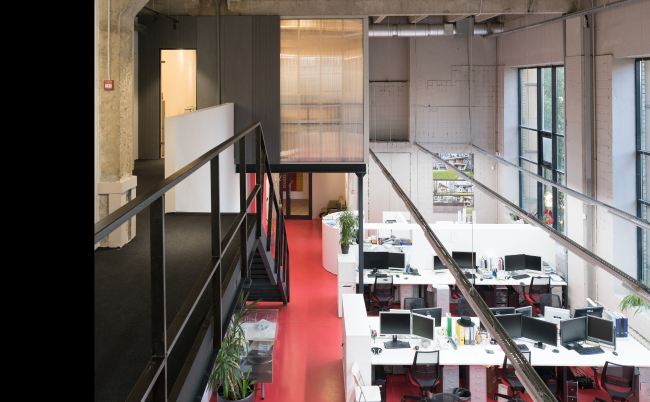
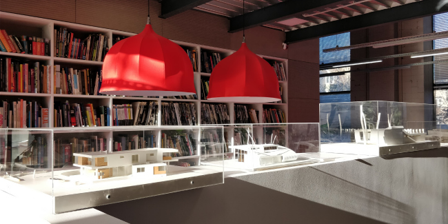
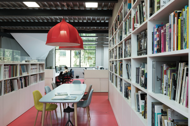
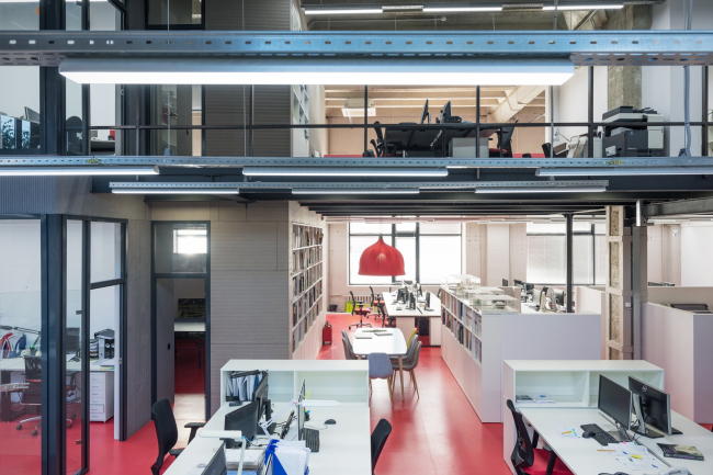
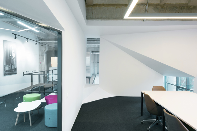
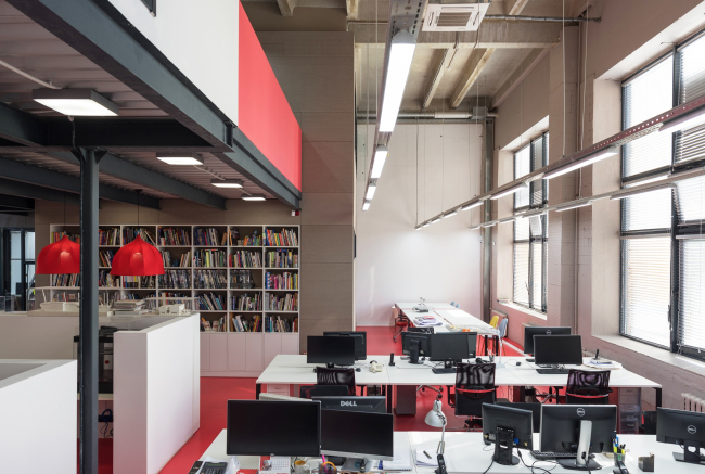
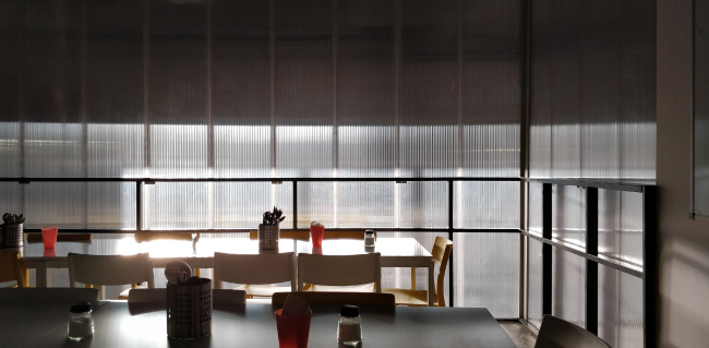
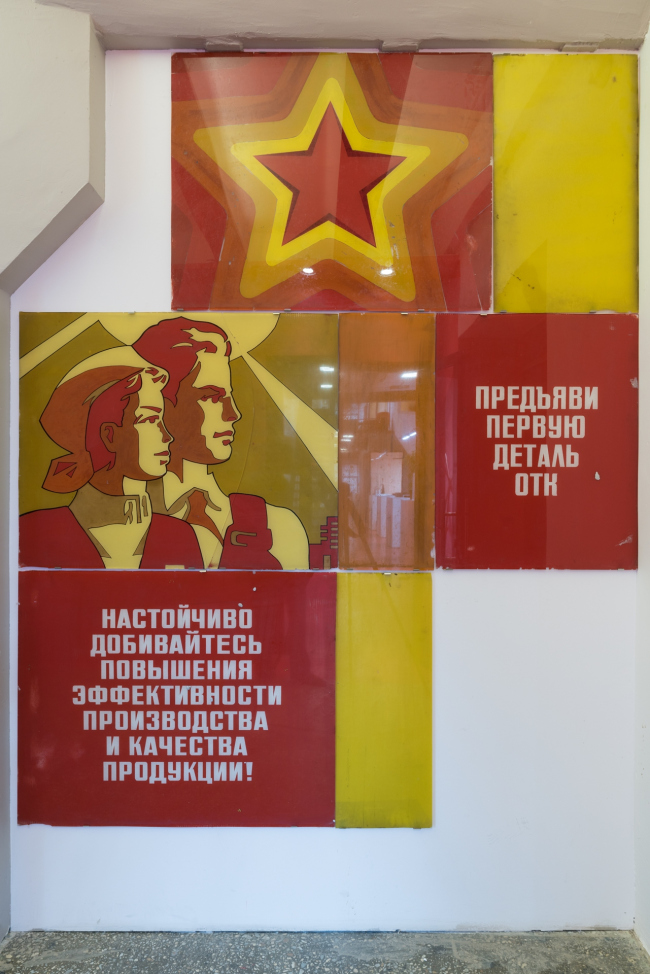
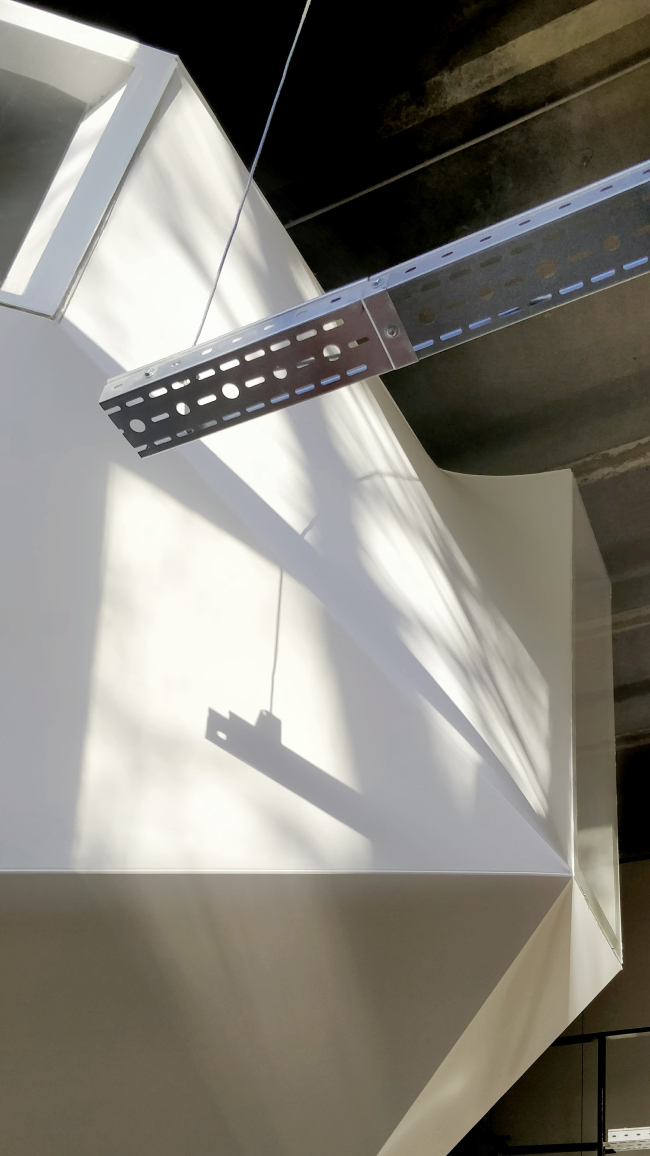
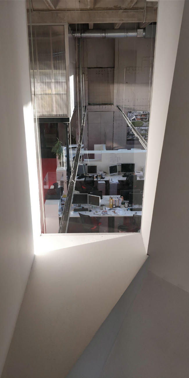
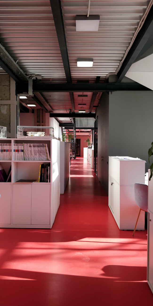
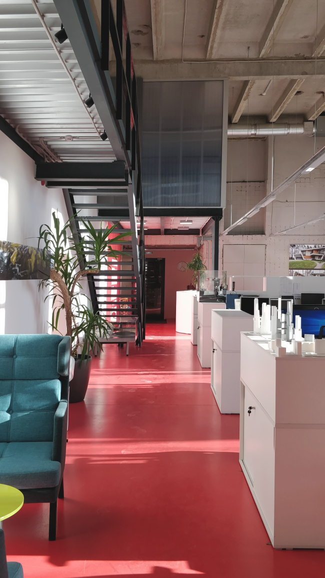
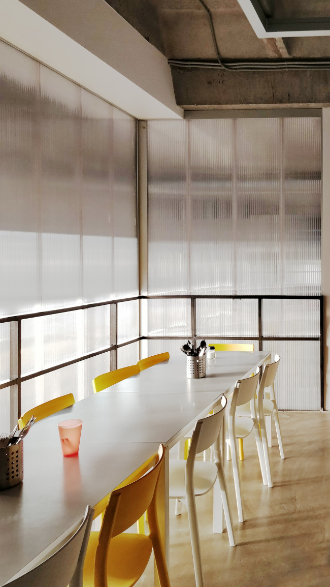
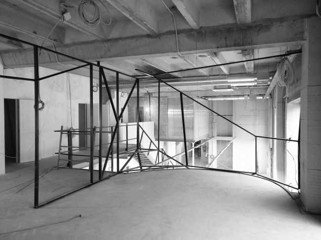
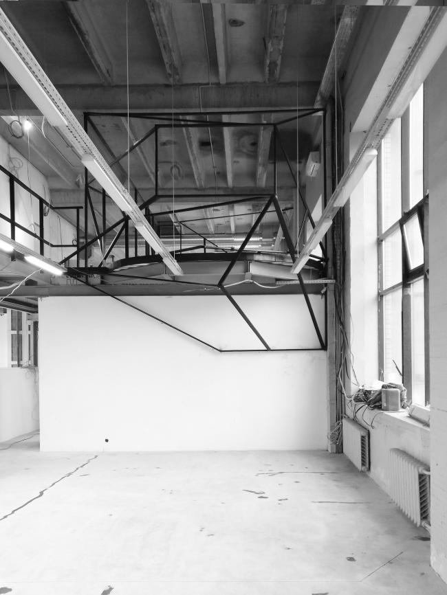
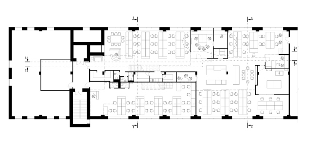
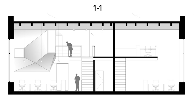
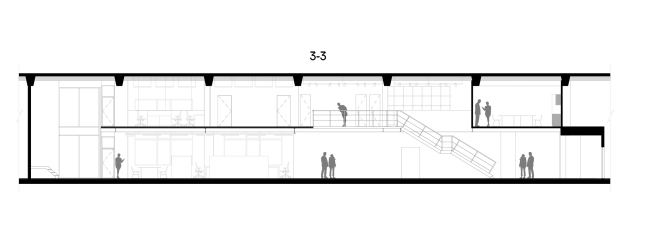
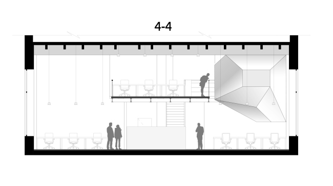
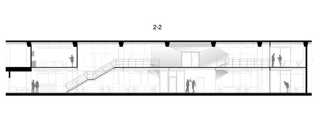
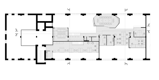
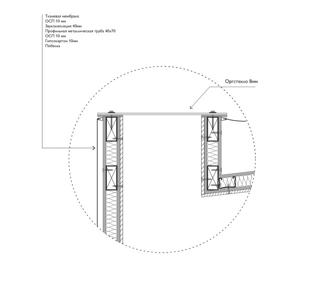
The new office of the architectural firm ATRIUM reflects the original concept by Anton Nadtochiy and Vera Butko. There is an art object hanging in the center of a double-height space: it is at once a meeting room, the nucleus of the composition, and the presentation of the creative method. ATRIUM office. Photograph © Sergey Nadtochiy / ATRIUMThe new office of this architectural firm is situated on the territory of the “Rassvet” factory (earlier known as “Muir & Merrilies”) in the “Krasnaya Presnya” district of Moscow that is now being actively renovated and developed upon the concept of the friends and colleagues of ATRIUM – DNK ag. ATRIUM rented here a large double-height space in one of the old production buildings of the 1970’s with their 6-meter ceilings and huge windows. The premises were completely reconstructed: they redecorated the place, replaced the floors and the stained glass windows, added new intermediate floors and organized a loft floor. The surpluses of the area were also redecorated for subleasing. ATRIUM office: in the process of construction. Photograph © Sergey Nadtochiy / ATRIUMThe authors tried to create the kind of interior that would be as open as possible, filled with light and air. The inbuilt loft space makes it possible to look at the whole space from up above, and creates extra visual angles. Its black framework, like a veritable picture frame, holds the geometric volumes of the premises, which are articulated by the colors and materials used (cement decorative panels and cell polycarbonate). ATRIUM office. Photograph © Sergey Nadtochiy / ATRIUMThe original “shell” is left undecorated: the ceilings are de-dusted, and the walls are just painted, thus exposing the history of the place. The artifacts from the soviet times, which were discovered in the course of the remodeling process, have also been carefully preserved – now they are exhibited in the entrance hall. And this is but one of the techniques, through which the architects develop the loft-aesthetics, as the most appropriate kind for creative spaces and the kind that makes it possible to streamline the costs. The brightest accent is the self-leveling floors; of ATRIUM’s trademark red color – a deliberate reference to the aesthetics of the Russian avant-garde. However, the compositional and conceptual centerpiece of the interior is the volume of the main meeting room. Built upon the principle of minimum surfaces, the sculptural form that literally hangs down from the ceiling became the face of the whole project – it embodies the latest trends of modern architecture. The form is based on articulated windows that create unexpected visual links not only to the inside space of the office but also to the street outside. The form optimally adapts to the surrounding situation and its features, and quite surprisingly changes its outlines when viewed from different angles. ATRIUM office. Photograph © Sergey Nadtochiy / ATRIUMATRIUM office. Photograph © Ilia Egorkin / ATRIUMATRIUM office. Photograph © Ilia Egorkin / ATRIUMAnton Nadtochiy: “What we did was taking this parallelepiped origin and transforming it depending on the function and the specific situation. The meeting room was to be, on the one hand, isolated, and, on the other hand, it was to have a fair share of transparency and openness. We decided to make several apertures and several planes: one provides visual connection to the entrance zone, another, on the floor level, overlooks the territory, and the glass partition with an entrance door looks as if it were meeting you as you walk down the corridor and invites you to come in. In these places the form stretches out, and, reacting to the TV screen inside the meeting room, looks as if it were dented in the opposite direction. As a result, we are getting a new sculptural shape, functional in its nature and a perfect match for the context”. ATRIUM office. The meeting room © ATRIUMATRIUM office. The meeting room © ATRIUMATRIUM office. The meeting room © ATRIUMATRIUM office. The meeting room © ATRIUMJust as the whole interior design concept is based on the idea of “minimum optimum intrusion” that is all about the efficient usage of funds and resources, the volume of the meeting room, in spite of its geometric complexity, is very simple construction-wise – it is essentially a metal framework covered on both sides with plasterboard with soundproof padding and и covered with PVC fabric. As a result, the form that the architects got looks very much like a hornets’ nest stuck to the outer wall between the intermediate floor and the ceiling. One at once gets a vision of the employees swarming in at the beginning of a busy day. The similarity is, of course, only conditional. Run through the futuristic filter, the volume has optimum facets and surfaces because it was built by human beings who are certainly familiar with the geometry of plains and the aesthetics of suprematism. In addition, the white planes, exposed to the slanted sunbeams falling from the window, will for sure put every alumnus of Moscow Institute of Architecture worth his salt the faceted model head that everyone would draw as a student. And the demonstration of ATRIUM’s method is all about the fact that this object is as multifaceted as it is “multi-faced” – it is perceived differently when viewed from different angles, opening up its new sides every time; violating the modernist principle of a match between the form and the content, the inside and outside shells are created independently from each other. ATRIUM office. Photograph © Sergey Nadtochiy / ATRIUMATRIUM office. Photograph © Ilia Egorkin / ATRIUMATRIUM office. Photograph © Sergey Nadtochiy / ATRIUMATRIUM office. Photograph © Ilia Egorkin / ATRIUMATRIUM office. Photograph © Ilia Egorkin / ATRIUMThe architects designed the shape of this sophisticated “flexible crystal” in the Grasshoper software environment that allows its user to work with complex geometry and mathematically model bicurved surfaces. With its help, the cutting out of the PVC fabric was made and the geometry of the bearing framework was defined. ATRIUM office. Photograph © Ilia Egorkin / ATRIUMATRIUM office. Photograph © Ilia Egorkin / ATRIUMATRIUM office. Photograph © Sergey Nadtochiy / ATRIUMThe large meeting room is not only an outwardly conceptual object but a consolidating space as well. On Fridays, the whole team gathers there for lectures and general communication. What is interesting is the fact that, in accordance with the formal logic of building office spaces, this could be the perfect spot for the director’s office – one can see everything from the top, and the place is in the very center of the premises. But the company has two leaders in fact, and they democratically placed their office on the first floor, closer to the entrance and the other employees. The numerous zones for work and communication, a special projects zone, a spacious kitchen, a library, and a gym with a tennis table – all this the architects designed with regard to the fact that the team spends a lot of time in the office, particularly when the project is about to be submitted to the client. In this interior, the architects fully implemented their idea of the perfect workspace – a place where new ideas are born and fostered. ATRIUM office. Photograph © Ilia Egorkin / ATRIUMATRIUM office. Photograph © Sergey Nadtochiy / ATRIUMATRIUM office. Photograph © Sergey Nadtochiy / ATRIUMATRIUM office. Photograph © Sergey Nadtochiy / ATRIUMATRIUM office. Photograph © Sergey Nadtochiy / ATRIUMATRIUM office. Photograph © Sergey Nadtochiy / ATRIUMATRIUM office. Photograph © Sergey Nadtochiy / ATRIUMATRIUM office. Photograph © Sergey Nadtochiy / ATRIUMATRIUM office. © ATRIUMATRIUM office. © ATRIUMATRIUM office. © ATRIUMATRIUM office. © ATRIUMATRIUM office. © ATRIUMATRIUM office. © ATRIUMATRIUM office. © ATRIUM |
|
