|
Published on Archi.ru (https://archi.ru) |
|
| 22.03.2018 | |
|
Building Blocks for Gulliver |
|
|
Lilya Aronova |
|
| Studio: | |
| de Architekten Cie. | |
| West 8 | |
| APEX Project Bureau | |
|
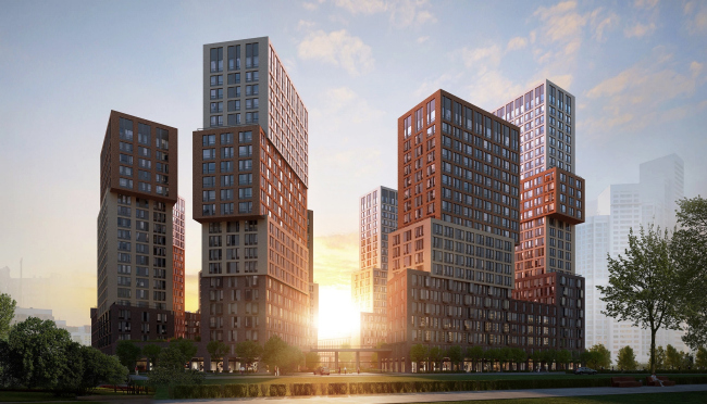
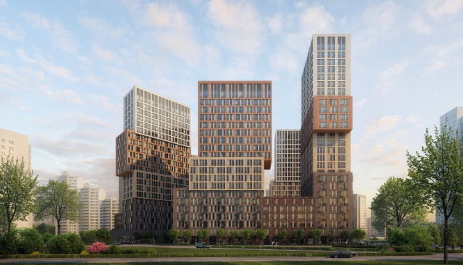
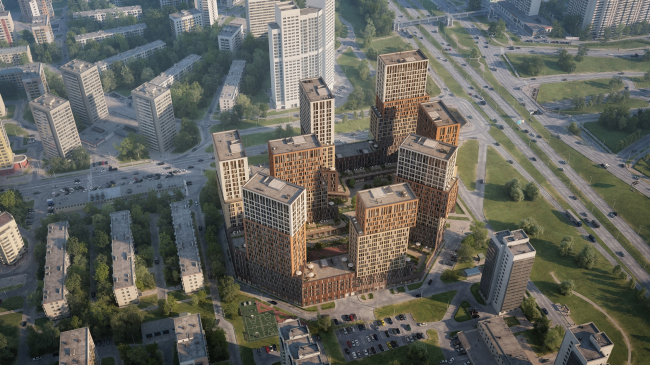
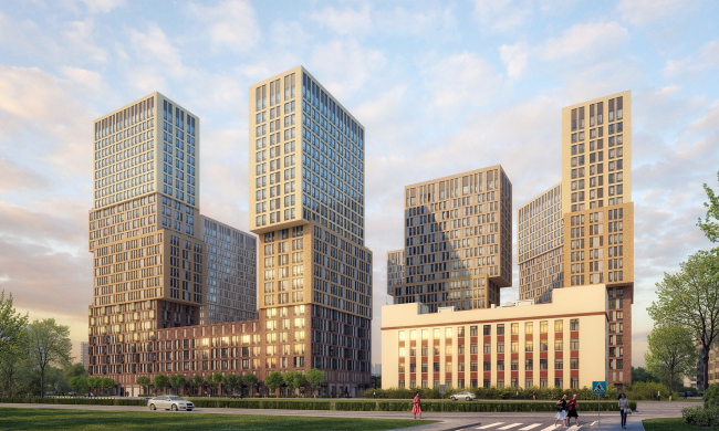
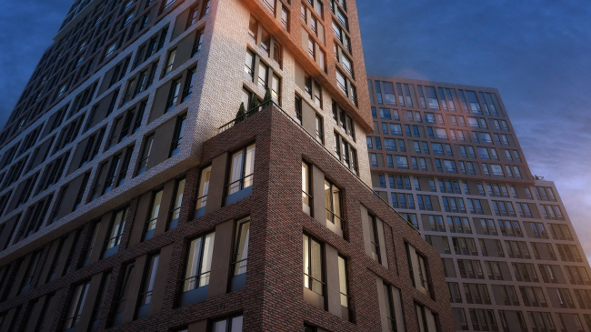
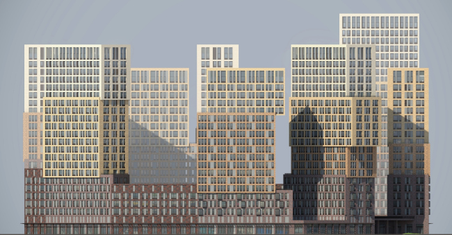
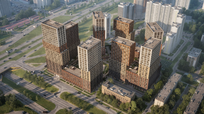
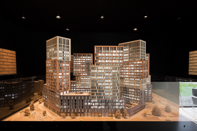
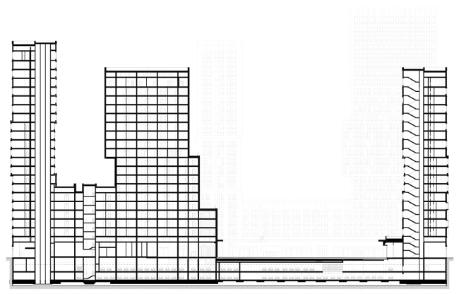
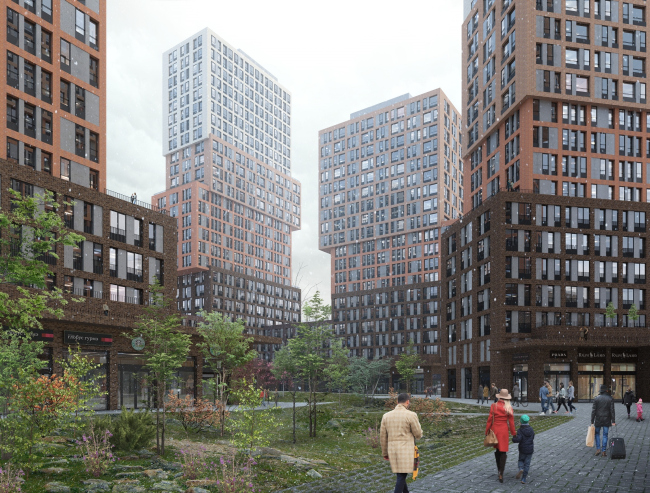
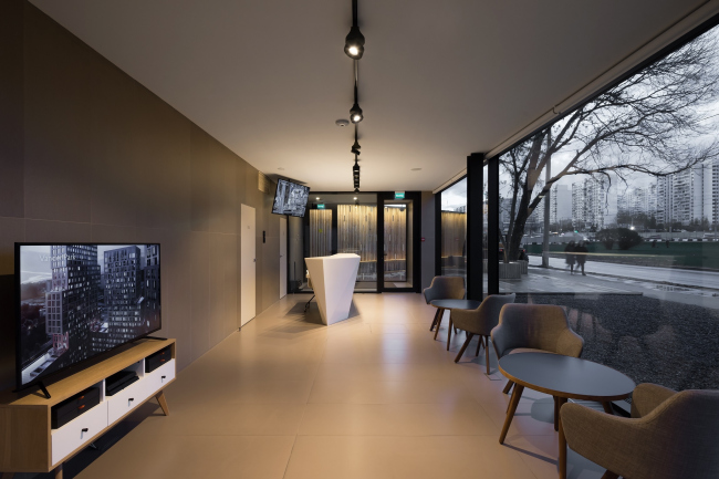
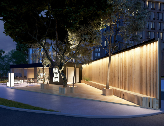
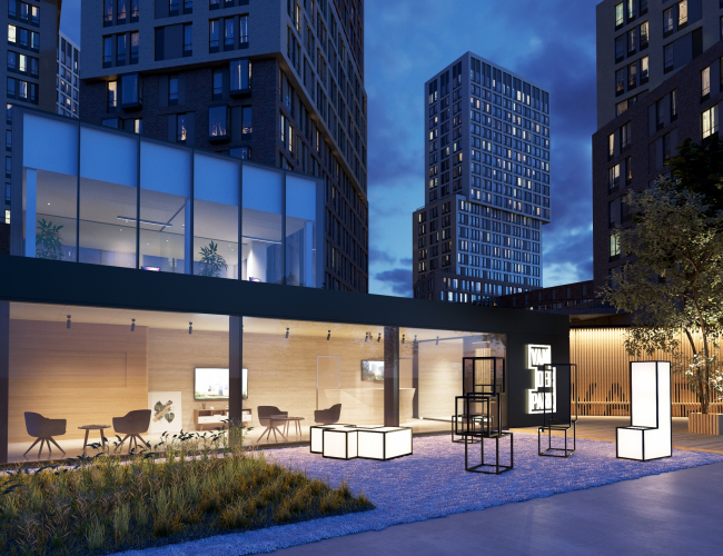
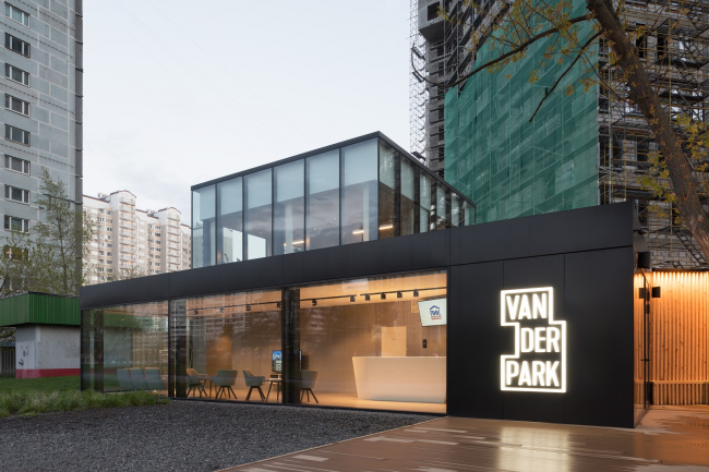
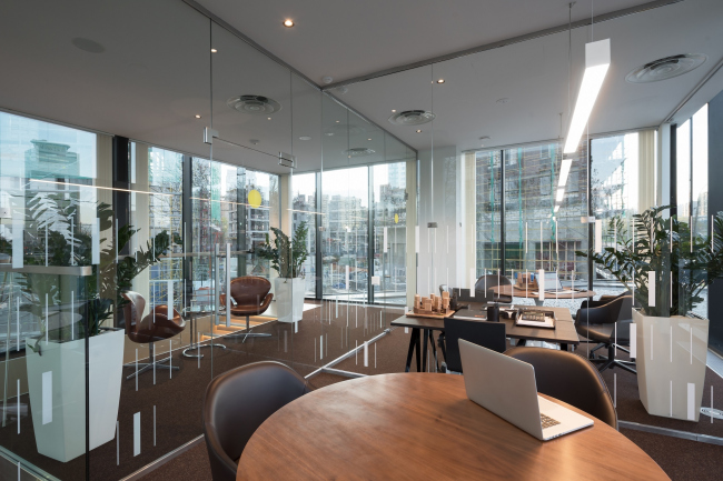
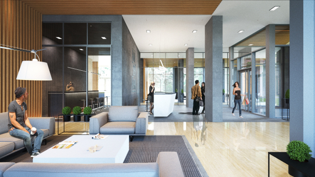
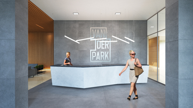
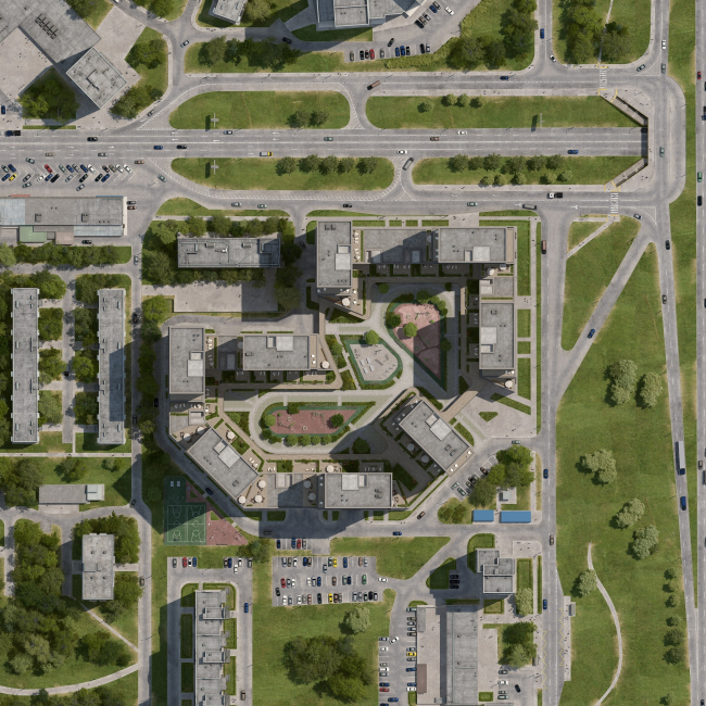
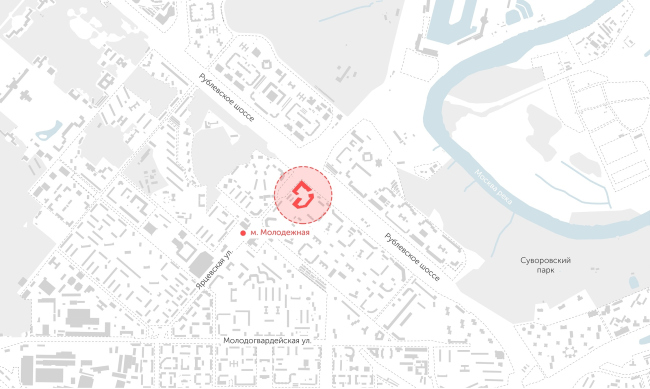
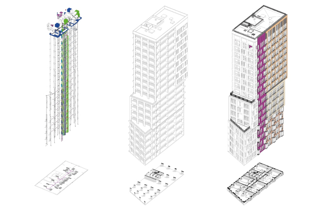
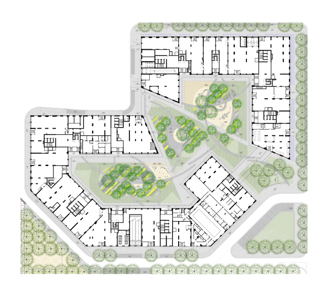
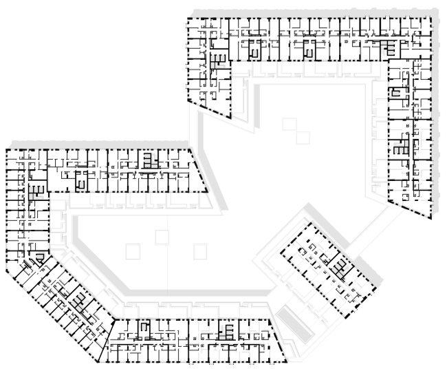
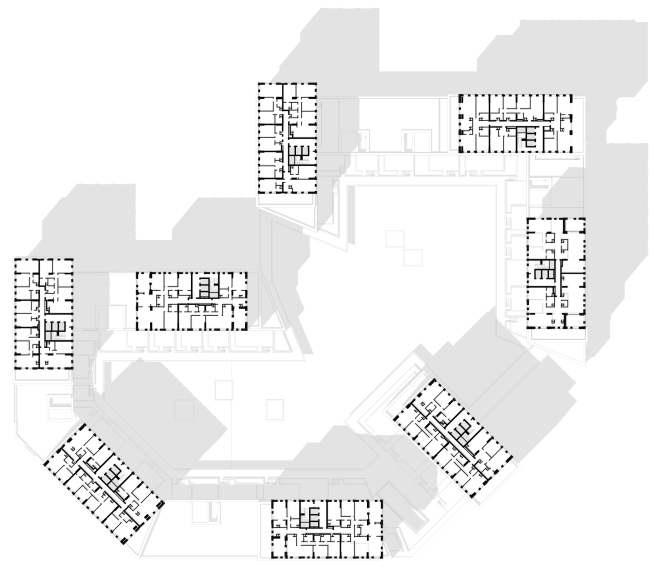
On the crest of the Krylatskie Hills, a housing complex is being completed, unprecedented in its diversity of architectural solutions employed in its construction and in its constructional complexity. The answers to these challenges were found by the Dutch architects de Architekten Cie in collaboration with the Russian bureau APEX. "Vander Park" housing complex © PIK GroupThe housing complex Vander Park is an edifice noticeable in any respect. Located at the strategically important crossing of the Rublev Highway and the Yartsevskaya Street at the top of one of the Krylatskie Hills, it looks a rather imposing volume in itself, arising from the ratio between the area of the land site and the square footage target figures set by the developer. The site got into the spotlight of the architectural community’s attention in 2013, when a closed competition was announced with a rather impressive lineup of contestants. The competition was won by Sergey Skuratov ARCHITECTS but shortly after that the developer changed his mind and invited for designing the complex the Dutch company, which already had some experience of mastering the Russian vast expanses of land. Today’s name of the complex is a tribute to the national origin of the company, which evidently hints at a touch of aristocratic quality of the project: the prefix “van der” signifies the aristocratic origin of its bearer, which corresponds to the class of the project that in the process of work grew from business class to business premium. "Vander Park" housing complex © PIK GroupIn spite of the notorious prestige of the Rublev Highway, the area in question has been developing rather chaotically, and, according to the APEX leader, Anton Bondarenko, there was not much in that area that could be used as a starting point, with which the architects could interact. What can be considered as a closest conditional centerpiece is only a 150-meter tower on the opposite side of the Yartsevskaya Street; all around, there are five-story houses (soon to be demolished), further on, down the Rublev Highway, there is an array of low-rise prefabricated buildings shifted slightly deeper away from the highway. Meaning – like it or lump it, but the new complex inevitably is taking on the role of the centerpiece. Peculiar is the fact that, in spite of all of the conditions described above, the last thing that the designers of Vander Park had to worry about was obscuring the sunshine to one building or another – rather, they themselves had to solve the task of running away from the long shadow stretching as long as up to the Molodezhnaya metro station, next to which yet another 150-meter tower stands. Otherwise, the city fabric is pretty sparse here, and the issues of density and insolation were only to be solved inside of the complex. However, it was these requirements that to a large extent influenced the volumetric solution: the towers and the shifts in the volumes allowed the architects to essentially “mold” the form that provides for all of the insolation requirements. "Vander Park" housing complex © PIK GroupThe curvilinear uneven land site, inscribed in a conditional square, includes ten towers of different height – from 19 to 26 stories high – set at different angles to one another. The towers rest on a podium that occupies the entire area of the land site – beneath it, there is a parking garage – plus, these towers are connected with low-rise sectional blocks from four to six stories high. All of these are grouped into two macro-units connected by a gallery that runs all along the entire inner side of the yard at the level of the first floor. The bottom floors host retail and local businesses – these include a supermarket, a fitness center, a children’s club, a medical center, and a beauty salon. Each of the towers, in turn, consists of modular blocks that are placed on top of one another in a seemingly haphazard fashion – as if some giant toddler unskillfully, yet diligently, was building here his town from gigantic toy building blocks. "Vander Park" housing complex © PIK GroupWhen developing the concept of this housing project, the designers drew inspiration from the image of Moscow as a modern megalopolis with a high construction density inherent to it, which you cannot deny as an architectural fact, but which you can mitigate by architectural means and make it more human-friendly. Therefore, each block is perceived as a housing module that is accessible to the human perception, i.e. one of the self-sufficient residential buildings, which cannot be placed next to one another because of the area constraints, but which can still be grouped together by being placed on top of one another. In terms of visual perception, such a solution allowed the architects to avoid creating an effect of some oppressive monolith mass, while from a practical standpoint it yields yet another curious bonus – thanks to the shift of the blocks in respect to one another, there appears enough room for spacious terraces that give some extra advantages to a number of apartments. Similar bonuses, by the way, will go to the residents of the apartments that open up to the roofs of the low-rise blocks, and also by the owners of the premises on the second floor of the complex – these come with terraces with an area of about 150 square meters, overlooking the inner yard and separated by large green zones. “This is yet another way to show that even in a highly urbanized environment you can create a quite comfortable space beyond the limits of your apartment, and a custom-designed place, too” – comments Anton Bondarenko. Elements of the facade © PIK GroupFor each of the blocks, the architects chose an individual type of windows. At the same time, all of the façades are organized by a rigorous brick framework, whose rhythm stays unchanged all along the entire square, only on the topmost level, where the cells cover also the mechanical room, they turned out slightly more elongated. However, within this framework, in each of the modules, the window apertures are arranged in a different way: while in the low-rise sections the windows stand without significant spaces between them, in the high-rise blocks they can be arranged in groups, like, for example, three windows of equal height or one narrow window and one wide one, and so on. The spaces between the uncommonly high apertures – because of the fact that the height of one story in these buildings is more than average, the windows sometimes being as much as 2.3 meters tall – are covered by hanging composite panels of two shades of gray: it is darker beneath the windows in order to accentuate the shape of the window aperture, and a more neutral shade is used on the panels placed between the window panes, these latter only serving as a background. Incidentally, this is the rare instance when the corrections of the building materials (which took place after the project was approved) did the building a good turn – originally it was planned that the piers would only be filled with stucco. Facade of the complex © PIK GroupThe decoration of the buildings uses six types of brick, the general principle being from darker chocolate brown in the lower blocks to light-beige in the upper ones. The material, which is produced by the company Hagemeister, is notable for the gradient of shades within the limits of a single brick; the brickwork isn’t plainly smooth either – some of the bricks step forward in ledges, while in the decoration of the low-rise sections, the vertical brickwork is mixed with the horizontal type. As a result, the façades turned out to be very textured-looking, visually complex and vibrant – yet another architectural technique that goes a long way to “dilute” the volumes. "Vander Park" housing complex © PIK GroupBasically, no two stories of Vander Park are exactly alike. De Architekten Cie proposed 73 types of apartments with an area ranging from 23 to 230 square meters. Such unprecedented complexity of apartment typology required from the Russian partners some serious work on searching unconventional interesting solutions in this area. To begin with, they were faced with the necessity to relocate the wet zones, which, according to the Russian rules and regulations, are to be placed strictly on top of one another, while in the Dutch project they would freely wander all over the place. In addition, it was not without corrections having to do with insolation issues – for example, under the four-meter cantilevered structures, which were formed as a result of shifting the housing modules – it would be more appropriate to place the spacious apartments in order to let more sunshine in. Accordingly, the apartments with an access to the terraces were to be big ones – a studio combined with a 150-meter terrace would have hardly been of significant value on the Russian market. "Vander Park" housing complex. Photograph © Ilia IvanovAnd, of course, there were construction difficulties. APEX developed a whole number of unique engineering solutions specifically for this project. For example, the architects proposed to install slanted pylons that relieve the load from the cantilevered structures at the transition from one block to another, without “eating up” the square footage of the apartments. Yet another unconventional technique is the mechanical room situated immediately above the podium less than 1.8 meters tall that includes all of the utility lines that would have otherwise occupied some considerable room in the entrance halls and premises for rent on the first floor. The mechanical rooms are also there on the top floors – thanks to this solution, the roof has no elevator units sticking out of it. "Vander Park" housing complex. Section view © APEX project bureauThe team of APEX also worked in close cooperation with the Dutch company West 8, which developed the landscaping project. The yard of Vander Park, in accordance with the concept proposed by de Architekten Cie, is only open to the residents of the complex. The people get inside through an electronic control system, the buildings having no end-to-end lobbies, it only being possible to enter the hallways from the yard. “Our Dutch colleagues think that a person must not lock himself up within the four walls of his apartment, that he needs more space for walking and talking to his neighbors, meaning, we must ensure total security for children and adults inside the yard” – Anton Bondarenko comments. Together with the landscape experts from West 8, the architects selected the plants that are authentic to our northern latitudes; they also designed a special sort of foundation that would support the heavy gazebos proposed by West 8. Functionally, the yard is divided into three thematic zones – for outdoor activities, for peaceful recreation, and the so-called “transition” zone, in which the main flows of the visitors and residents of the complex meet. The playgrounds are divided by the age brackets – under 5 years of age, 5 to 10 years old, and for children 10 years or older – which will also help distribute the flows and also ensure the safety of the children – the playground for toddlers is placed in the zone of peaceful recreation. In spite of the fact that the yard rests on the roof of the podium, the project still provided for planting large trees, even if at the cost of losing a few parking places because of drilling special openings all the way down to the minus first floor. "Vander Park" housing complex © APEX project bureauThe interiors of the lobbies and the public groups were completely done by the APEX architects. The sales office – a minimalist volume of glass and metal masked as wood – was also designed by them, just as the navigation systems on the residential floors and in the parking garage. “Today, Vander Park is our company’s signature project, its visiting card” – Anton Bondarenko confesses. And it’s not just a matter of this project being a really high-profile one – as one of the first large-scale projects of the company, it not only determined its key values and operating fundamentals but also went a long way to take the team to a whole new level by evicting the unique competences of its members working under tight schedules, in the conditions of rigorous cost/performance ratios, and the necessity to use unique and smart technological solutions. "Vander Park" housing complex. Photograph © Ilia IvanovSales office. Photograph © Ilia IvanovSales office. Photograph © Ilia IvanovSales office. Photograph © Ilia Ivanov"Vander Park" housing complex. Photograph © Ilia Ivanov"Vander Park" housing complex. Photograph © Ilia IvanovInterior of the main lobby of the complex © APEX project bureauInterior of the main lobby of the complex © APEX project bureauMaster plan © PIK Group"Vander Park" housing complex. Location plan © APEX project bureauEngineering, constructional, and architectural solutions of the building © APEX project bureau"Vander Park" housing complex. Superimposed master plan © APEX project bureau, West 8"Vander Park" housing complex. Plan of the 2-nd floor © APEX project bureau"Vander Park" housing complex. Plan of the 19-th floor © APEX project bureau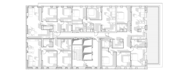 "Vander Park" housing complex. Plan of the section of the 11-th floor © APEX project bureau |
|
