|
Published on Archi.ru (https://archi.ru) |
|
| 19.02.2018 | |
|
Boundless Reserve |
|
|
Elena Petukhova |
|
| Studio: | |
| Creative Union ‘Reserve’ | |
|
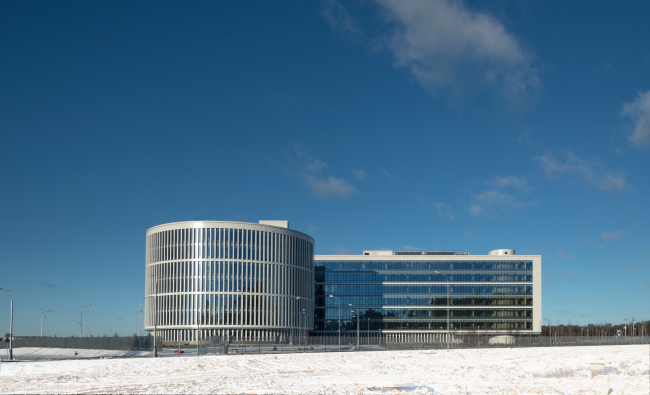
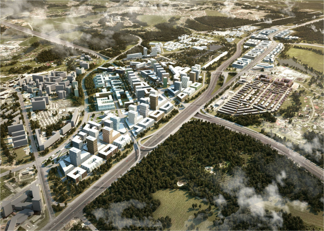
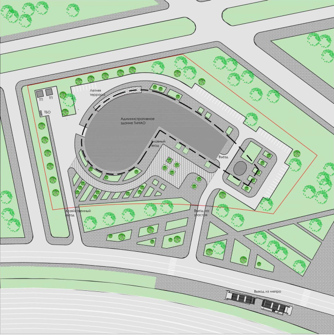
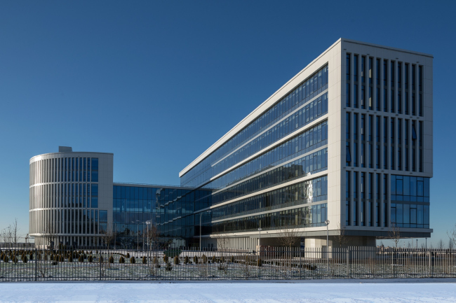
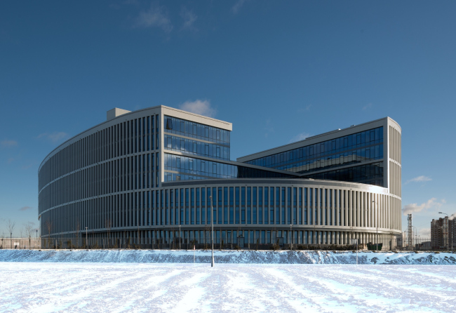
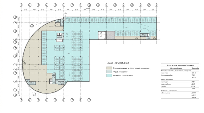
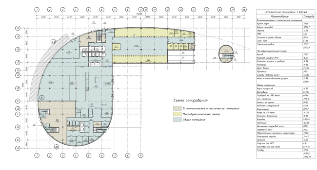
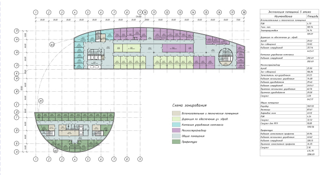
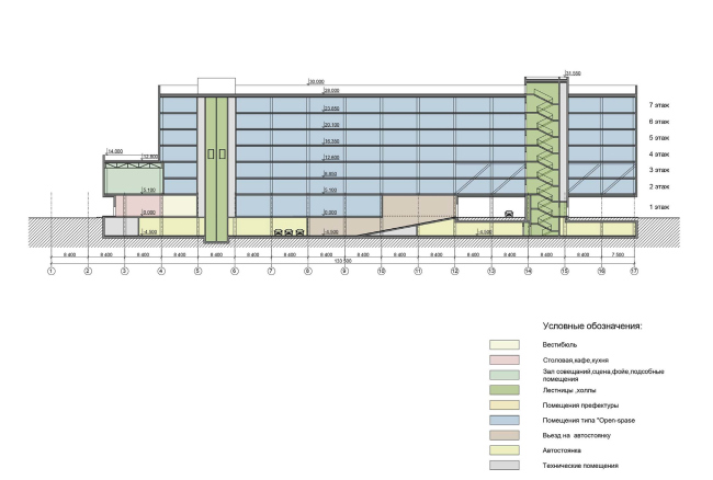
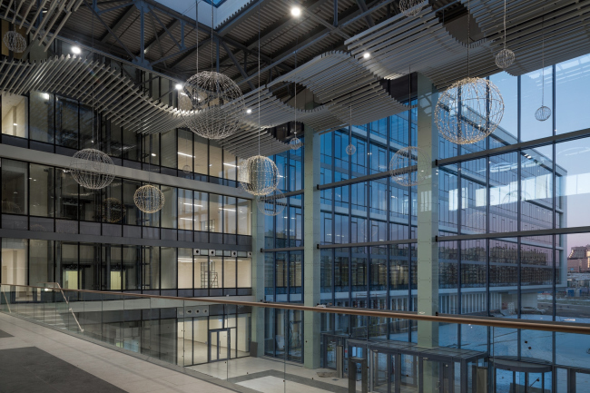
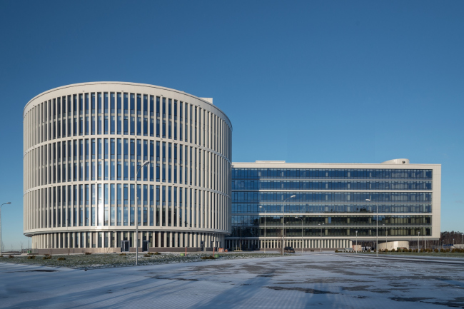
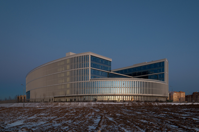
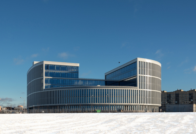
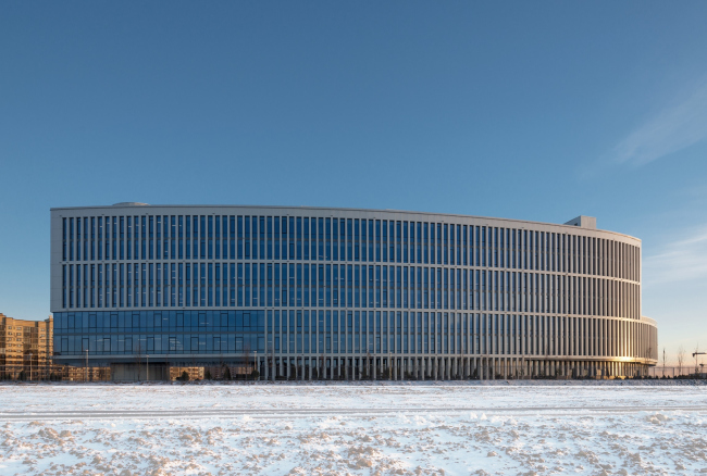
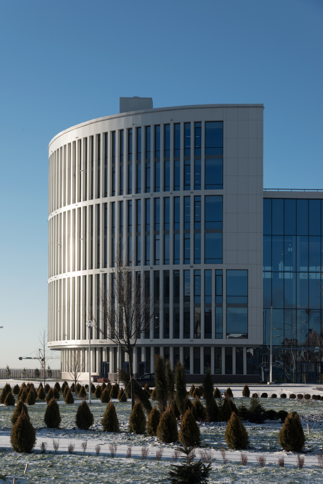
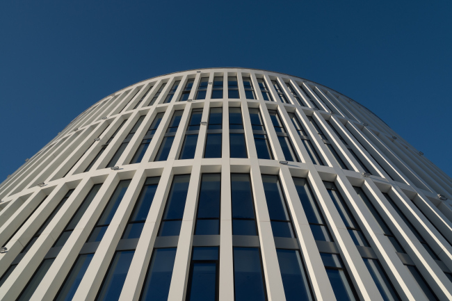
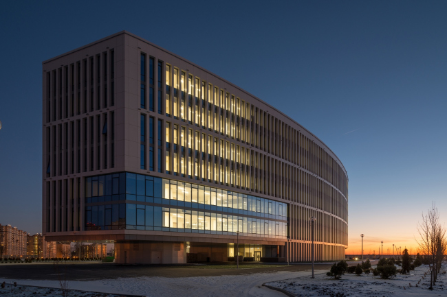
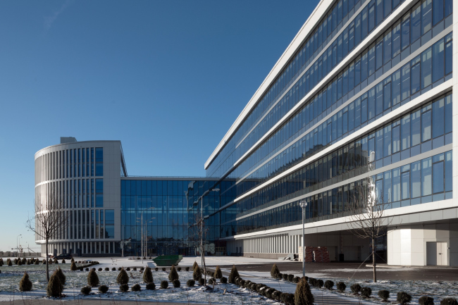
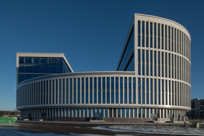
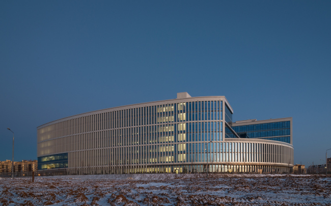
Demonstrating the characteristic of Creative Union ‘Reserve’ aesthetic attention to the form and rhythm of the façade design, the elegant building of the administrative center of the New Moscow looks like a UFO in the otherwise disorganized Kommunarka fields. The administrative and business center of the Troitsky and Novomoskovsky administrative districts of Moscow. Photographs by Aleksey Naroditsky © Creative Union ‘Reserve’At the Dawn of a New Era The notions of how the construction of the New Moscow could have looked like in accordance with the concept proposed by advocates of annexing new territories lying in the southwest direction between the Moscow Ring Road and the Kaluga Region will now remain a mystery forever. What has happened in the last five years on the almost 150-hectare chunk of the former “Moscow area” goes to show that systematic planned implementation of sophisticated large-scale projects of urban settlements like Magnitogorsk, built upon the project by Ernst Mai, is the art that has fallen into oblivion in these parts. And, if we still have any grounds to hope for any breakthroughs in this field, these only lie in the realm of possibility of attracting Russia’s top architectural companies to designing future buildings and complexes. The history of New Moscow had a strange start and is now getting a just as strange continuation. The very issuance of the decree about expanding the area of Moscow surprised a lot of people. The avowed purpose of addressing the issue of Moscow being a “monocentric city” and creating new gravity centers capable of drawing the workforce away from the city center and thus relieving the downtown transport infrastructure, come right down to it, did not require transferring this land to the metropolitan jurisdiction. Everything could have been achieved on the level of agreements between the governments of Moscow and Moscow region but “we took a different path”, more than doubling the area of the city, its map taking on a weird shape. The grand-scale contest “Bolshaya Moskva” (“Big Moscow”), which was aimed at developing the Moscow agglomeration, also did not help much in specifying the constructive structure of the “castles in the air”. The strategies that it developed were to remain on paper. First of all, thei refers to the plan for building the new Government Center in the settlement of Kommunarka. In 2013, it became clear that the government officials would not leave their cozy workplaces in the center of Moscow, and the plans on developing the land, still free of the quickly growing residential areas, had to be corrected. The authors of the project had to refrain from the idea of the high-profile government center in favor of a more modest administrative and business center, which must be situated between the reconstructed Kaluzhskoe Highway and Kommunarka, and to try to demonstrate, as best they could, the sustainability of the political concept. It is planned that the territory of about 300 hectares will host the campus of Moscow Institute of Steel and Alloys, various public and business centers, as well as transport infrastructure projects, including two stations of the Moscow metro “Kommunarka” and “Stolbovo”, as well as the government buildings of the Troitsky and Novomoskovsky administrative divisions. Out of the long list of the multifunctional projects, it was the prefect’s office that drew the lucky lot of being designed and built first. The honor of designing the compact administration center of the dispersed New Moscow was bestowed upon Creative Union ‘Reserve’ headed by Vladimir Plotkin. Concept of developing the territory of the administrative and business center next to Kommunarka settlement © Creative Union ‘Reserve’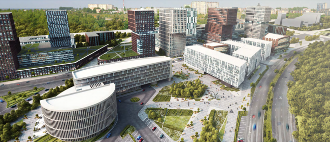 Concept of developing the territory of the administrative and business center next to Kommunarka settlement © Creative Union ‘Reserve’Putting It There The whole above history of the administration building in the fields of Kommunarka is more than a simple introduction to the town planning context – it is a direct explanation of how the design process was organized, and which factors influenced the image and the volumetric composition of the building. When back in 2014 Creative Union ‘Reserve’ started designing the concept of the future center, the general project of building on the 300-hectare territory did not yet exist. What was there were the approximate (not yet finalized) “red lines”, the route of the gas pipeline, and the main access driveways leading to this place from the Kaluzhskoe Highway and the Kommunarka settlement. The location of the future building was indicated as “plus-minus in this neighborhood”. This was the real town-planning emptiness. One might think that in such a situation, with zero context dependence, one could design as he pleased but, in actuality, this false freedom turned out to be rather a hindrance than a stimulus. Here is how Vladimir Plotkin comments on the situation connected with the location of the building: “The difficulties were immense. It is much easier to design a project when there are some certain restrictions in place, when you understand the context, and when you just know what you should be doing. And here we were doing a task with hundreds of unknowns. We were to create a building that was to answer the tasks of the future construction, which were not yet formulated, and we could only make guesses as to how we should place our project. Without the main visual connections it was very difficult to zero in on its volumetric solution and compositional accents”. The administrative and business center of the Troitsky and Novomoskovsky administrative districts of Moscow. Master plan © Creative Union ‘Reserve’The building of the future prefect’s office was “washed by the waves” of barely marked communication lines and contours of the yet-to-be-designed administration and business center. These gradually served to influence the location of the building – at a junction of several roads – and its rounded shape that responded its compositional role as some pivot connecting its residential and commercial areas. This “rounded shape”, however, was not a perfect circle but rather a comma, which consisted of a rounded and an elongated part, its arc gazing in the direction of the Kaluzhskoe highway, and its sophisticated point of connection of the two main blocks and the main entrance gazing in the direction of the neighboring residential area and a triangular square in front of the road leading to Kommunarka and the yet-to-be-opened metro station. “We worked with simple shapes, not trying to create any high-profile town-planning accent. The building was to be rather compact, of the low-rise type, and it could not by any means claim the status of a centerpiece. This is why what we decided to do was make the most out of its reserved plastique and the contrast between straight and curvilinear surfaces. The idea of the general shape came to us very quickly. This “comma” was the most “daring” one of all of our sketches. We were not even sure that the customer would put his seal of approval on it. I think that in this case we took as much of “volumetric liberty” as we possibly could” – Vladimir Plotkin explains the choice of the building’s shape. The administrative and business center of the Troitsky and Novomoskovsky administrative districts of Moscow. Photographs by Aleksey Naroditsky © Creative Union ‘Reserve’The administrative and business center of the Troitsky and Novomoskovsky administrative districts of Moscow. Photographs by Aleksey Naroditsky © Creative Union ‘Reserve’A Twin-hull Principle In addition to the absence of any surroundings, the shape of the building was also conditioned by its functional program, and, specifically, the fact that by definition it was to consist of two parts. In spite of the considerable size of the territory occupied by the Troitsky and Novomoskovsky administrative districts, the prefect’s office, meant to “run things around here”, could not, by all the estimates, occupy more than a third of the planned 30 thousand square meters of its total area. The remaining part was to be filled with all the main functions expected from a modern business center: offices with an opportunity for organizing open spaces and separate blocks with individual studies, and service infrastructure with cafés, meeting rooms, and a conference hall. The “comma-shaped” plan was the best possible solution for the task that the architects were facing. The prefect’s office as such was allotted a part of the comma’s “dot”, while the business center (mean for renting the offices out) got the comma’s “long tail”. The administrative and business center of the Troitsky and Novomoskovsky administrative districts of Moscow. Plan of the underground parking garage © Creative Union ‘Reserve’The administrative and business center of the Troitsky and Novomoskovsky administrative districts of Moscow. Plan of the 1st floor © Creative Union ‘Reserve’The administrative and business center of the Troitsky and Novomoskovsky administrative districts of Moscow. Plan of the 5th floor © Creative Union ‘Reserve’These techniques of working with binary compositions have been used by Creative Union ‘Reserve’ before. This typology, which can be conditionally termed as “twin-hull” can be seen in the project of the HQ of the Zhukovsky United Aircraft Corporation and the office complex of Aeroflot – Russian Airlines. In each of these projects, however, the authors come up with a new individual style, creating unique volumetric compositions, varying the proportional fracturing, using combinations of different materials, and providing a new structural solution of the building’s outward appearance. The administrative and business center of the Troitsky and Novomoskovsky administrative districts of Moscow. Longitudinal section © Creative Union ‘Reserve’The administrative and business center of the Troitsky and Novomoskovsky administrative districts of Moscow. Photographs by Aleksey Naroditsky © Creative Union ‘Reserve’The two parts of the complex, of the same 7-meter height, are separated by a two-story block, occupied by a spacious atrium. This joining pivot of the complex contains public premises and those functions that can come in handy for both employees of the prefect’s office and their future neighbors. The outline of the building follows a tense arc, and all the changes in its shape run by clear-cut straight surfaces, as if sliced by a giant blade that cuts off from the initially monolith volume those chunks that are in the way of its function. The first floor of the prefect’s office (the “dot” part of the comma, as we remember) is sunken into the body of the building, which creates an impression as if the cylindrical volume hovers over the ground. Besides, a third of the elongated part is torn off from the ground and rests upon an oval-plan “leg” that contains the fire escape stairway and technical rooms. This design solution does not have any specific utilitarian function or purpose. This is a purely utilitarian gesture dictated by the form-making laws within the given compositional frame. What is interesting is the fact that this technique, which was actively used in the architecture of the XX century, fits in so nicely and so easily with the building created in accordance with the hottest trends of today. The administrative and business center of the Troitsky and Novomoskovsky administrative districts of Moscow. Photographs by Aleksey Naroditsky © Creative Union ‘Reserve’The volumetric and the territorial composition of the administration and business center demonstrates the recognizable features characteristic of the Creative Union ‘Reserve’ architecture. With all the outward simplicity and laconism of the form, it demonstrates a competently stages struggle of contrastive opposites: compactness and elongation, straight lines and curves, heaviness and hovering lightness. Thanks to this “inside conflict” swirling in an ostentatiously reserved casing, the architects achieve the necessary level of “emotional” architecture. The administrative and business center of the Troitsky and Novomoskovsky administrative districts of Moscow. Photographs by Aleksey Naroditsky © Creative Union ‘Reserve’Multiplicity of the Façades Working on the façade design took the Creative Union ‘Reserve’ architects almost as much time as the search for the exact position of the complex. The reason for that was the necessity of finding the one and only perfect solution, which would be at once simple yet variable; rhythmic yet not monotonous; respectable yet inexpensive; contemporary yet not overly hi-tech; at the same time making the most of the contrast between the straight and curvilinear surfaces. Yes, and it had to be white or almost white. Yes, and one more thing: it had to essentially be the signature latticed structure that significantly simplifies recognizing the buildings designed by Creative Union ‘Reserve’ in the chaotic Moscow construction. The administrative and business center of the Troitsky and Novomoskovsky administrative districts of MoscowCopyright: Photograph © Aleksey Naroditsky / provided by Reserve UnionThe sheer number of façade versions is truly impressive. It is not so much the fact just how many façade options you can come up with for such a relatively small building (this is not a problem at all), but the fact that the architects were able to ultimately stop and objectively choose abs settle on one final version. But then again, this final version makes such perfect sense and it fits in so nicely with the shape of the complex that it leaves no grounds for suspecting it in undeserved victory. The administrative and business center of the Troitsky and Novomoskovsky administrative districts of Moscow. Photographs by Aleksey Naroditsky © Creative Union ‘Reserve’The two-stories light-gray lattice with narrow apertures and narrow piers wraps around the building, following its rounded outside surfaces. The rhythm of slender vertical pilasters accentuates even the slight bend of the elongated part, working pretty much like the colonnades in the wings of the Kazansky Temple in Saint Petersburg. And their double height makes the façades look truly monumental, even if at the expense of visually lowering its height (the building starts looking not seven but four stories high in this section). Unlike the outside façades, the inside straight surfaces are made of glass. The huge stained glass planes, like section cuts, reveal the insides of the building. Here is how Vladimir Plotkin explains the principle underlying the façade design solution: “From the tectonic standpoint, everything is clear here – there is this rounded body of this building that is dissected by straight plains. All of the surfaces that look as if some chunks had been sliced off here – these are glass. What remains of the curvilinear part is only the outward casing”. The administrative and business center of the Troitsky and Novomoskovsky administrative districts of Moscow. Photographs by Aleksey Naroditsky © Creative Union ‘Reserve’The administrative and business center of the Troitsky and Novomoskovsky administrative districts of Moscow. Photographs by Aleksey Naroditsky © Creative Union ‘Reserve’The introduction of extra material marking of surfaces of different geometry works great without destroying the integrity of the composition, which would have been incomplete if the authors had not introduced into it an accent that seemingly violates the overall principle but in fact boosting its effectiveness. From some of the façade of the elongated section, the grid of piers is removed. In the points where the building rests on a cylindrical column with a staircase, some of the façades of the second and third floors are left completely made of glass. Without the protective framework of pilasters, the stained glass surface looks particularly ethereal to the point of brittle and serves as a curious finish sign marking the end of the structural stripe. The administrative and business center of the Troitsky and Novomoskovsky administrative districts of Moscow. Photographs by Aleksey Naroditsky © Creative Union ‘Reserve’Formal Lessons Consisting of a number of simple forms – a cylinder and a segment of parallelepiped, and designed in light-gray, almost white, color, the composition of the building looks very much like academic exercises that are extremely popular in the first-year courses of architectural universities. In these exercises, the student is supposed to convey this or that emotion by using solely pieces of cardboard and paper. And, only looking at the finished building, feeling how the conjunctions of simple forms work on the real scale, one begins to understand just what knowledge the professors want to impart on their light-minded students. Probably, this is what design and architecture is all about – not just making a box for this or that function but evoking an emotional reaction by means of structuring the space. And in our case – creating an aesthetic paragon, upon which one will be able to verify all the future construction of the geometric center of the “Big Moscow”. Only, it is important to make sure that this paragon does not stay the one and only example of decent architecture amidst the Kommunarka fields. The administrative and business center of the Troitsky and Novomoskovsky administrative districts of Moscow. Photographs by Aleksey Naroditsky © Creative Union ‘Reserve’The administrative and business center of the Troitsky and Novomoskovsky administrative districts of Moscow. Photographs by Aleksey Naroditsky © Creative Union ‘Reserve’The administrative and business center of the Troitsky and Novomoskovsky administrative districts of Moscow. Photographs by Aleksey Naroditsky © Creative Union ‘Reserve’ |
|
