|
Published on Archi.ru (https://archi.ru) |
|
| 09.02.2018 | |
|
The Patriarch’s Crown |
|
|
Lara Kopylova |
|
| Architect: | |
| Sergei Tchoban | |
|
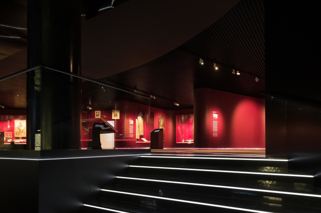
In late December, the new museum complex of “New Jerusalem” opened a permanent exposition designed by Sergey Tchoban and Agnia Sterligova. It is devoted to the history of the monastery. The permanent exposition of the Moscow area museum complex "New Jerusalem". Photograph © Ilia IvanovThe permanent historical exposition of the “New Jerusalem” museum is situated in a building that was built upon the project by “City-Arch” in 2013. Sergey Tchoban and Agnia Sterligova opened it in December 2017. As is known, this is not the first time they worked on an exhibition project together – it is enough to recall the Museum of Rural Labor in Nikola-Lenivets, “ProYavlenie” in the Tretyakov Gallery, and many others. The permanent exposition of the Moscow area museum complex "New Jerusalem". Photograph © Ilia IvanovThe XVII and XX centuries were chosen as the most dramatic ones in the Russian history. During the Second World War, the monastery held the fort and was eventually blown up by the occupants. The XVII century is, of course, the most important because of the Patriarch Nikon, whose longsuffering personality (that also caused suffering to many others) is in the center of the exposition. The life of Nikon is still full of blank spots up to this day. The church dissent that he initiated is a hot piece of history that is still incomplete. Was Nikon right in starting his reforms and bringing the Russian and the Greek spiritual books to one common denominator? What was the patriarch’s end game? Theological? Political? Why did he accurse those who disobeyed him on such a trifle? Making the sign of the cross with three or two fingers does not make that much difference for the Evangelistic standpoint! Whom should we consider to be the Old Believers that were burned alive – martyrs of faith or dangerous heretics? Nikon was tried, disfrocked from the patriarch’s status and they even left him devoid of a priest’s status when he fell from grace; many years later he was pardoned and they gave him a permission to get back to the New Jerusalem monastery that he had founded. He died on the way there but around his relic healings were happening. Indeed, a Shakespeare character! Nobody can tell what he really wanted. What was his true motivation – absolute power or quest for the ultimate truth? We will never know. The New Jerusalem monastery is just as mysterious as its founder. The very name of “New Jerusalem” (for which they also gave Nikon a hard time back in the day) has something symbolically eternal about it, the architecture of the main temple trying to replicate the Church of the Holy Sepulchre. Its main message is absolutely clear: we are building Heaven on Earth. The New Jerusalem museum complex that recently appeared next to the monastery is also an unusual edifice, huge in territory and alien in architecture. The building looks as if it was dug into the landscape but it steel gives you a feeling that, like the Maya pyramids, it is turned upwards into space. This is a hill with a crater, whose bottom is the central square. Possibly, this design solution came not without a dialogue with the vortex of the Guggenheim museum in New York. What it ended up being is a temple turned upside down. The monastery temple reaches for the sky, and here we see a downward movement, as if cutting through the tectonic planes. Inside the museum, the space is very large and sophisticated. Its rooms display the collection of paintings from Rokotov to Isaac Brodsky, and various exhibitions are organized. ***
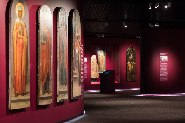
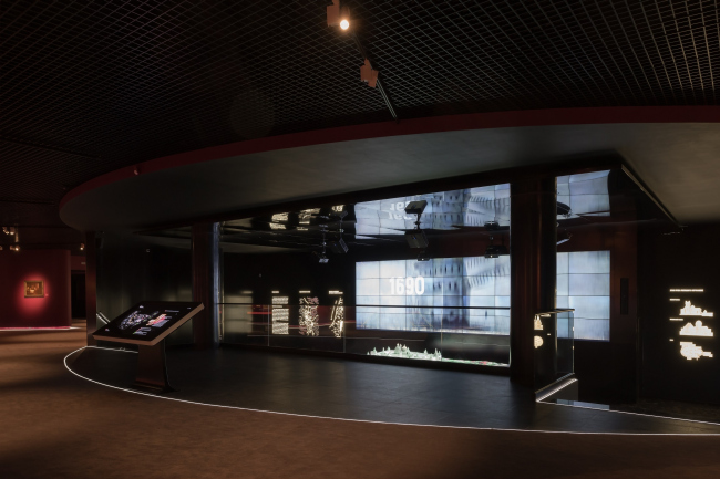
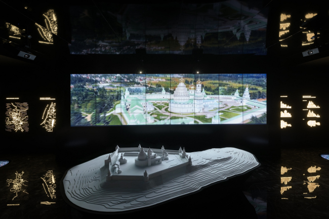
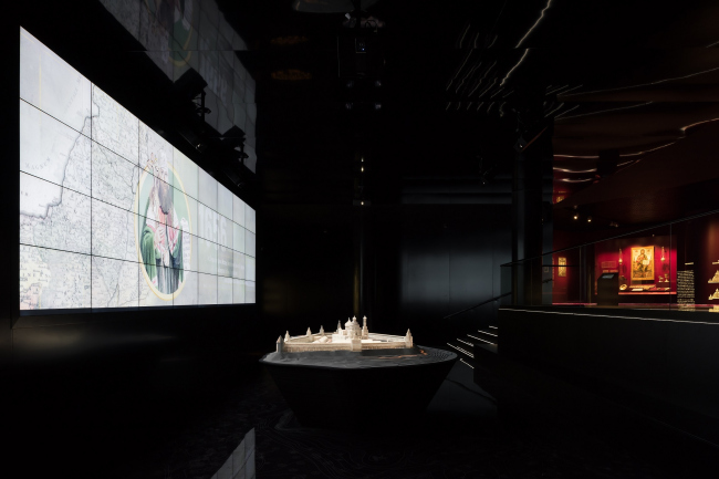
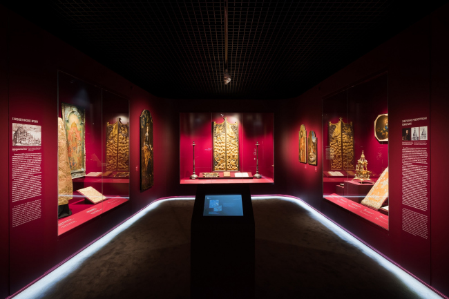
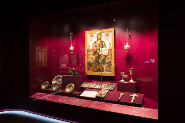
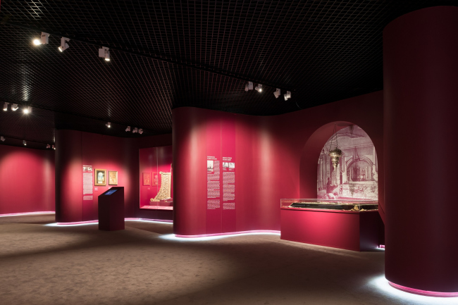
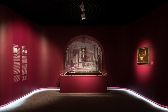
The museum moved from the monastery into the new building in 2013, and part of its permanent exposition from its collection – the halls of Russian art of the XVII-XIX centuries and church art – has been open for a while already. The considerable area – 28 000 square meters – also hosts conventions, conferences; there is also a lecture hall. After it got its new building, the museum increased its activity even more. However, the exposition “New Jerusalem – a monument of history and culture of the XVII-XX centuries”, devoted to the history of the monastery, stayed in the frater longer than all the others. It occupies but 5% of the total area of the 1500 square meters but its meaning is nonetheless the most important of all. Accordingly, it got the key place in the center of the lower tier, underneath the platform of the museum yard, next to the symbolic “root” of the museum building. It also comes as no surprise that for this venue a special competition was organized, which was won by Sergey Tchoban and Agnia Sterligova, who then implemented their project at a really short notice, within four months. The nucleus and the starting point of the composition is a multimedia installation in an amphitheater with a pitch-black floor and walls meant to enhance the central role of this space. But then again, the broad screen that plays a short video on the monastery’s history arrests one’s attention at once. In front of it, there is a white model of the monastery architectural ensemble, livened up by colorfully video mapping that is synchronized with the video on the screen: color spots keep highlighting this or that fragment of the model, which presents an exciting and informative spectacle. On the sides, there are backlighted explanatory diagrams, and for those who want to know even more, there is an impressive size touchscreen installed in the balcony. The permanent exposition of the Moscow area museum complex "New Jerusalem". Photograph © Ilia IvanovThe permanent exposition of the Moscow area museum complex "New Jerusalem". Photograph © Ilia IvanovThe contrastive multimedia nucleus is surrounded by broad recessions, separated by two-meter-deep partitions. These contain showcases that display the main exhibits of the monastery’s history: Nikon’s personal belongings, things from the из vestries of the New Jerusalem and the Valdai Iviron monastery – Nikon’s second most important project. There are also icons, authentic glazed tiles, books and paintings on display here. The permanent exposition of the Moscow area museum complex "New Jerusalem". Photograph © Ilia IvanovThe permanent exposition of the Moscow area museum complex "New Jerusalem". Photograph © Ilia IvanovThe permanent exposition of the Moscow area museum complex "New Jerusalem". Photograph © Ilia IvanovThese recessions, which the authors of the project call “portals”, became their response to the necessity to artistically fracture the extended and single-piece space of the hall. “In a large hall, it is difficult to maintain the necessary permanent temperature and moisture mode, and create the correct lighting – shares Sergey Tchoban – You cannot exhibit anything in its center, and at the same time you don’t have too many walls to hang your exhibits upon. It is hard to combine, within the framework of a single project, a video installation, mapping, and artifacts”. The recessions also created an intimate atmosphere, and helped to draw the visitors’ attention to the exhibits, these being chiefly not too large. The permanent exposition of the Moscow area museum complex "New Jerusalem". Photograph © Ilia Ivanov“We were required to arrange about 450 artifacts, different in their volume and character – says the founder of the company Planet 9, Agnia Sterligova – We measured all the objects, thought out all the podiums that they would rest upon, and the schedule of changing the exposition. Considering the fact that ninety percent of complaints coming from museum visitors usually have to do with the labels, we carefully designed the information tablets at the bottom of the showcases. As a result, the exhibits and their labels can be replaced without the use of any special equipment. A lot of school trips come here, and it was also important to create entertaining exhibits, such as the holographic image of Nikon’s horse-drawn carriage, thanks to which, hopefully, the children will ultimately pay attention to more serious things”. The corners of the “portals” are rounded, their walls painted a rich cherry color. “In our color design solutions, we proceeded from the collection. The hot trend of today is colorful walls used for hanging pictures. The dramatic colors are a great background for paintings and drawings alike, for the exception of modern painting school, which looks great against white” – Sergey Tchoban says. The permanent exposition of the Moscow area museum complex "New Jerusalem". Photograph © Ilia IvanovUnlike the color that you would normally expect to see in a modern museum – terra cotta, like in the Russian Museum or in Wien’s Kunsthistorisches – the color here is slightly brighter and colder, closer to the purple of the Jacquard walls of the Palazzo Pitti, and, quite possibly, it hints at the patriarch’s ambitions, who is ascribed the famous phrase “priesthood above kingdom”, just as the scenario of the repentance of the Czar Aleksey Mikhailovich at the coffin of Philip, metropolitan of Moscow, for the sins of Ivan the Terrible. In other words, the recessions around the central installation form a semblance of the “patriarch’s crown”. In addition, the purple color also echoes the color of the walls of the “cup of the yard” of the museum building designed by Valery Lukomsky, which also goes a long way to develop the volumetric and conceptual narrative. The exhibits are caught out in the spotlights, there is darkness around them, which helps one to focus on specific things and allows the visitors’ peripheral vision to take a rest; up above, it is darker still, which visually expands the space. At the joint of the walls and the floor, there is a stripe of bright-white backlight - something like the Ariadne’s thread that helps the visitors to easily find their bearings in the museum space. The second and third parts of the exposition, dedicated to XVII and XX centuries respectively, are situated in arc-shaped enfilades around the center. “What we got to work with was a large arc-shaped space with slanted walls, not really fit for placing exhibits on them – Sergey Tchoban shares – This is why we fractured the space into individual halls, proposing a concept of “eternal museum” with an enfilade – this is how Rastrelli’s baroque palaces were built. The exposition starts off with a central nucleus, from where, without having to get back, the visitors can keep on moving through the circular enfilade”. Initially, the management of the museum was rather wary about the idea of breaking the space into individual halls, worrying about the transparency and fire safety issues. This is why the architects designed the floor plan in such a way that the museum attendant who sits in one hall can see the next attendant – thus minimizing the necessary number of employees. “Large spaces are generally required for large paintings, but what we have here is a lot of small-sized exhibits that invite people to come up closer – says Agnia Sterligova – There will be hardly be an onslaught of visitors at any time, that’s why the intimacy in displaying the exhibits, and the human-friendly scale are very important. What we got to work with was a huge “bagel” with a seven-meter distance from wall to wall. Now what we’ve got is portals two meters deep plus the passage between them. And the space became proportionate to the exhibits”. And for those, for whom examining the icons, books, and paintings is still not enough, and for those who has a habit of moving their finger over the screen, there are touch screens that provide more detailed information. The resulting space is filled with data as much as with emotion, which is great because this space has been allotted the role of the symbolic “spring” that is meant to fill the museum exhibits with energy sufficient for studying such a prominent, and, at the same time, very controversial phenomenon of the Russian late Middle Ages, as Patriarch Nikon’s New Jerusalem. The monastery itself is an unalloyed masterpiece, a monument of culture and history that is both interesting and unique. But the ancient Russian history and art are controversial themes that require a special angle of vision and interest. For people who do not have special background, a visual impulse is sometimes required. The exposition looks rather “tightly knit” and deserves to be implemented. Because it will draw the interest of the visitors to other museum expositions that are placed around this central one in both conceptual and material “circles”. |
|
