|
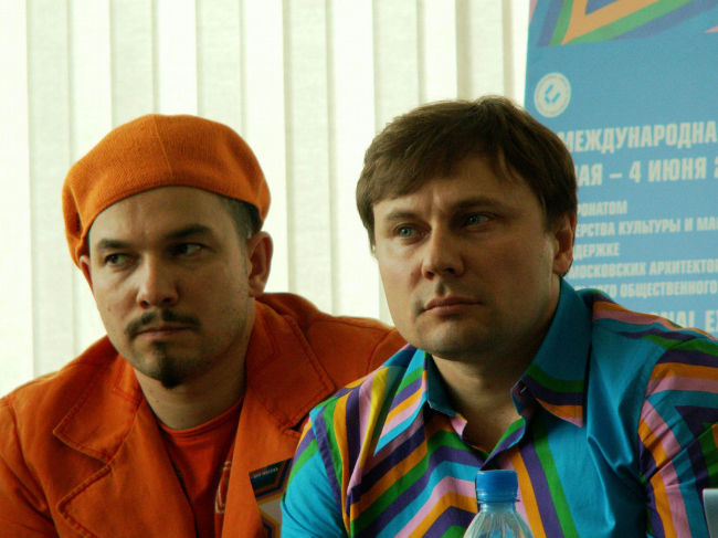
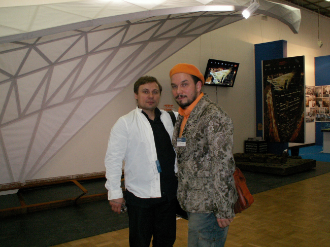
Vladimir Kuz’min and Vladislav Savinkin are the authors of design of an exposition of the Russian pavilion on XI Venetian biennial
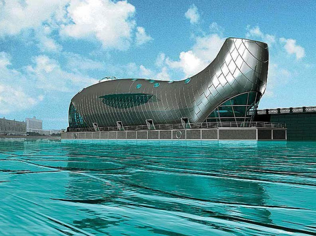
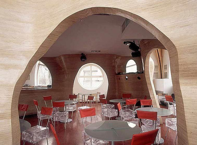
You are the designers of the Russian exhibition at the Biennale, but you are also very well-known Moscow architects. To begin with, a question for the architects. Your projects include quite a few that are relatively literal, unambiguous in terms of image – exactly like Frank Gehry’s Binoculars Building. Take your fish house, for instance, or the interior for the Cocoon Club. So while most architects try to create maximally formless, abstract architecture, you produce this kind of ‘literalism’. What are the reasons for it? It is a deliberate attempt to shock?
Vladimir Kuz’min: My God, this is the first time for several years that I’ve been asked a question that I actually want to answer! Yes, of course, this is an absolutely deliberate policy. And you’ve already given the explanation for it yourself. The thing is that one of Vlad’s and my favourite architects is Frank Gehry. I think I won’t be exaggerating if I say he’s our polestar: we even study him as a special subject with our students at MARCHI. He essentially embodies what Vlad and I are trying to promote: the synthesis of modern architecture and modern art.
And what does modern art mean for you? And how can it be transformed into architecture? I find that very difficult to get my head around.
Vladislav Savinkin: For us modern art is, above all, ironic reflection on the most pressing problems of the current moment. For us it’s important that modern art uses the maximum number of artistic media – from collage to video – to express these thoughts. We in our turn want architecture to become one of these media, a kind of conductor for modern art. Roughly speaking, we are representatives of the design movement in modern art, along with people such as Donald Judd and Claus Oldenburg. The latter, incidentally, is a co-author of the Binoculars House.
V.K.: However, we take our bearings not only from the people just named. The list of those whom we regard as authorities contains a vast number of people connected with the Russian tradition, with folklore, and folk art. But folk art and modern art have a common trait. You called it ‘literalism’, and this, I think, is a very good definition. It is this ‘literalism’ that we find attractive. Our idea is to draw the attention of the general public to everyday, quotidian things which they have seen so much of that they no longer notice. This was where pop art began. People living in megalopolises see nothing – or wish to see nothing – except their own problems. Trees, fish, birds are for them empty sounds. And we want to get them to see these things.
By blowing up a fish to the size of a two-storey house?
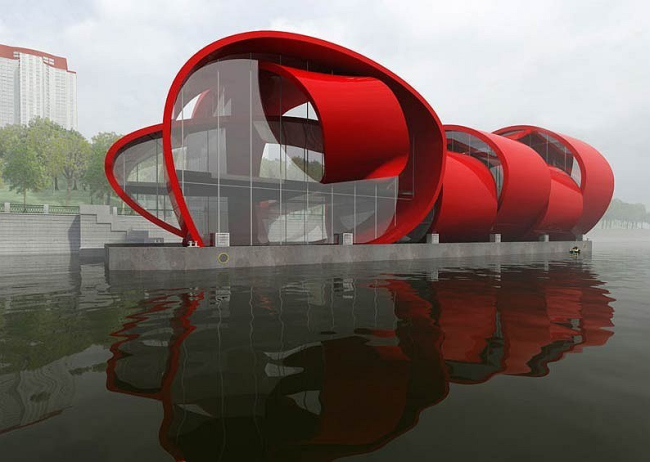
V.K.: Precisely. When we confront someone with houses in the form of fish or snakes and, even more importantly, when we name these structures after their prototypes – ‘fish house’ or ‘snake house’ – we remind him or her that there are hundreds of pleasant small things apart from work; we for a second take him or her back to the world of childhood. We are trying to create a kind of sign system whereby the sign really does mean what it means – without any second, third, or fifth meanings. Our buildings have no subtexts. The way we see things, this kind of childish directness based on pure instinct and associated with the desire to touch and climb all over everything may serve as the basis for a concept of architectural space.
V.S.: So for us the artistic aspect of design takes priority. That is, in our work we manage to create an architectural environment, but at the same time the impulse for its creation comes from a system of artistic images partly borrowed from figurative art and partly from our own memories.
While we’re on the subject of the link between architecture and art… I know that at MARCHI [Moscow Architecture Institute] your teacher was the famous artist and designer Aleksandr Yermolaev. Did studying under him influence your creative development?
V.S.: He’s responsible for my being unable to marry…
V.K.: And in my case, it’s thanks to him that I married. And that was 15 years ago. I married a student of his. To be serious, though, we are obliged to Aleksandr Yermolaev for almost everything. We’ve adopted his creative method, his outlook on the world. He introduced us to contemporary art and to the work of people who have remained our guiding lights to this day.
V.S.: It is Aleksandr Yermolaev who has always supported us at difficult moments and found time to listen to our grievances. We are so used to following his opinion on everything that if we run into difficulty or suffer creative failure or crisis, we already know in advance what he would say on the subject. Regrettably, we see him only rarely these days.
V.K.: Another important point is that we now teach at Moscow Architecture Institute at the same faculty as Aleksandr Yermolaev. Which is to say, we were initially his novice pupils, but now we are his ideological associates and populizers of his ideas.
When studying your architecture, I discovered three utterly distinct aesthetic lines in your work. The first is a kind of early-Gehry-type Postmodernism. The second is kitsch à la Philippe Starck. And the third is Minimalism. Which do you regard as your main line?
V.K.: You’re correct to say our work contains several lines. Only instead of Starck I would name Sottsas. As for Minimalism, we were never interested in pure Minimalism. Some of our interiors may be laconic, but not to that extent.
V.S.: We never aimed to pick out for ourselves any one aesthetic line to follow unwaveringly.
In other words, you like being different.
V.S.: We like being as different as the world itself, as our clients. Clients, you see, also vary enormously. We like being as different as our students.
V.K.: The main thing Yermolaev taught us was not to get hung up on national characteristics but to respond to and love nature.
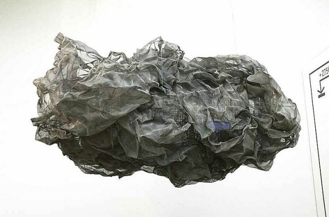
V.S.: Which is why we do nature sculptures such as our Nikola’s Ear installation for Archstoyanie.
While we’re on the subject of installations, it’s worth pointing out that you have quite a bit of experience in this field. Did this experience come in handy when you designed the exhibition for the Russian pavilion at the 2008 Biennale?
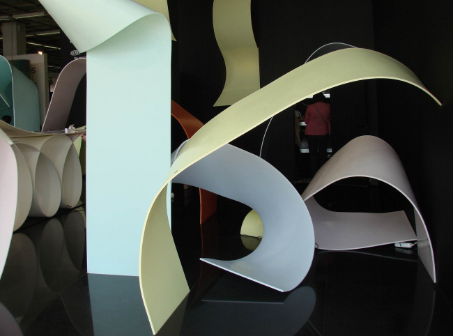
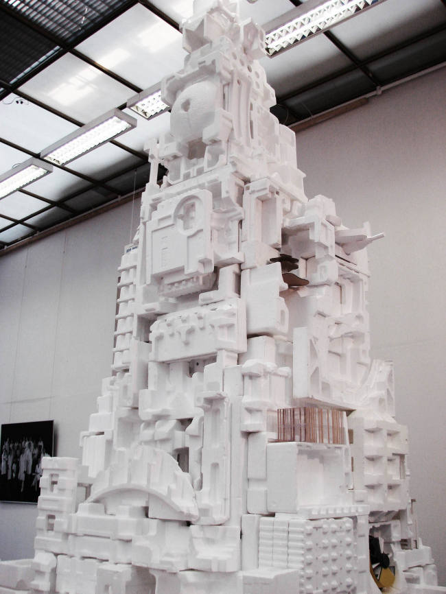
V.S.: We’ve been doing exhibition design since 1992. And if you were to count everything we’ve done in this field, I think you’d find there are more than 50 such installations. We were delighted that the curators of the Venice Biennale called upon our expertise. But we realize that here we are merely executors of the curators’ will; essentially, our job is technical realization of their ideas. At the same time, the curators listen to what we have to say: it’s by no means a one-sided process. For instance, initially we proposed four options which, even if they didn’t receive a standing ovation, nevertheless provoked intense discussion. The curators likewise made several curious proposals concerning not just the ideology behind the exhibition, but also details of the actual design.
V.S.: We make no claim to take the lead ideologically. Or rather, it’s not a matter of claims, but of an elementary lack of time. We are practising architects. As practising architects, we agree that there really is a problem with foreigners seizing control of our market. So we accept this ideology. And even more than this, we are keen to explore it, are eager to understand it and eager to match its standards.
V.K.: We realize only too well what part we are to play in this exhibition. We are the hands; the heads belong to other people. Our job is to execute the curators’ ideas.
V.S.: At the beginning of April we made a trip to Venice. When we got there, we simply walked through the Russian pavilion from room to room and literally started designing, together with the curators, as we walked. This feeling of teamwork is a good feeling. We have joint discussions, everyone gives each other advice, and at the same time each is a connoisseur of his own subject.
How do you think foreigners will receive the concept for the Russian pavilion? It’s a risky theme. A play on possession of the architectural market in Russia. Foreigners think they’re helping us here, teaching us good sense.
V.K.: Who’s helping whom is a good question. You think their motives for coming here are purely altruistic? They’re missionaries? They come here to earn money. And the sums involved are usually very large. They have very specific aims. So the ideology of our exhibition is spot on, as it turns out. Whatever anyone may say, it all amounts to a genuine battle for a market in sales. It’s a kind of crusade – only not a religious one or one that aims to bring new standards to Russian culture. Everything that we need we’ll take from them without any fuss. But for that there’s no need for them to come here. Whatever else, we live in an age of information. Here the only part of the crusade that’s survived is the idea of plentiful booty. So let each and everyone interpret the concept of our Russian pavilion as they wish. Some will see in it something positive – that we Russians are becoming Europeanized at least with regard to culture; others will agree that the influx of foreigners into Russia amounts to an occupation. As authors of the exhibition, it should really be a matter of indifference to us who sees what in it and whether foreigners like our concept or not.
Indeed, the question of who this exhibition is aimed at has no clear answer. Who comes to the Biennale? Who is the most important figure in this game? To try to calculate in advance how someone – curators, foreign architects, the press, in the light of the present political situation – will evaluate the Russian pavilion is, in my opinion, a waste of time.
What is the most important thing in this story? For the first time in many, many years, the Russian pavilion will feature not one or two architects, but more than thirty. For the first time the Russian pavilion will show not the activities of one person but the real state of things in our architecture. Everything that has occurred in the Russian pavilion until now has been more artistic gesture than a proper conversation about architecture. This in itself makes the exhibition worthy of interest. None
None
None
None
None
None
None
None
|
