|
Published on Archi.ru (https://archi.ru) |
|
| 28.12.2017 | |
|
Outline of the Market Square |
|
|
Alla Pavlikova |
|
| Studio: | |
| Blank | |
|
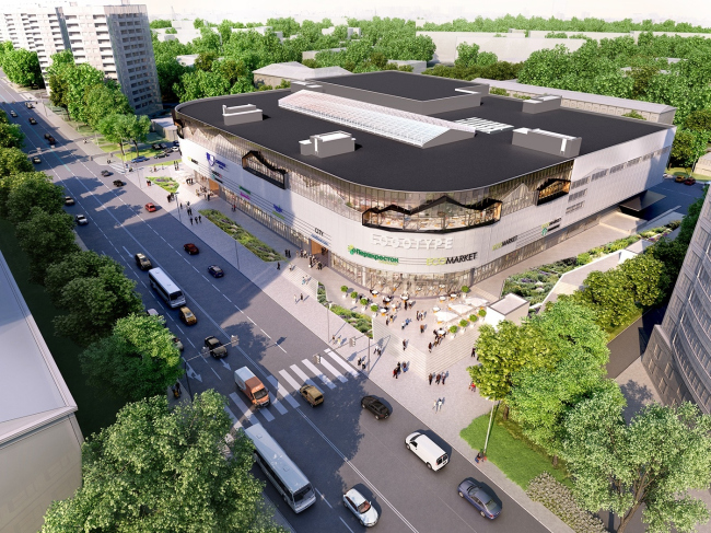
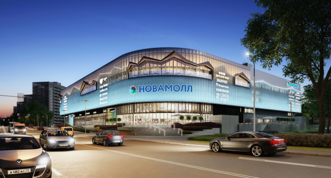
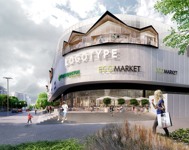
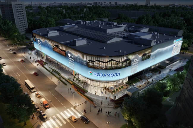
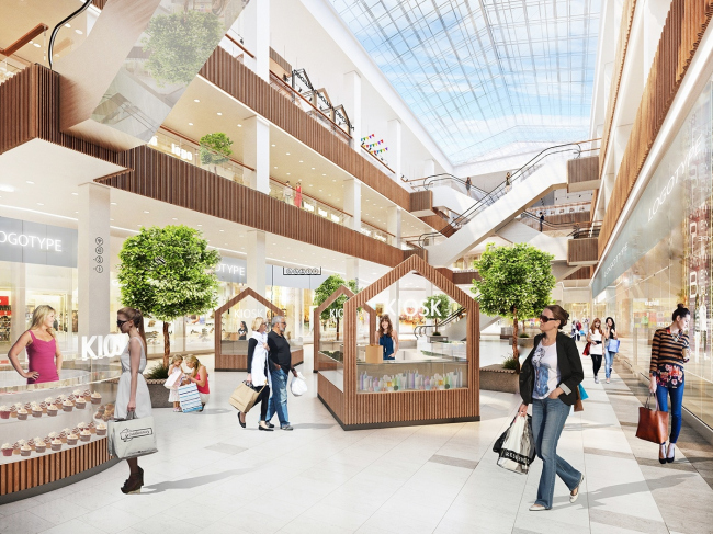
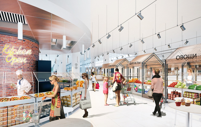
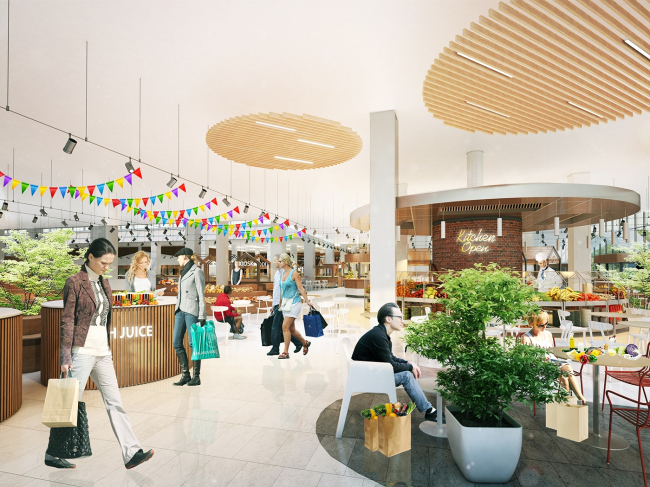
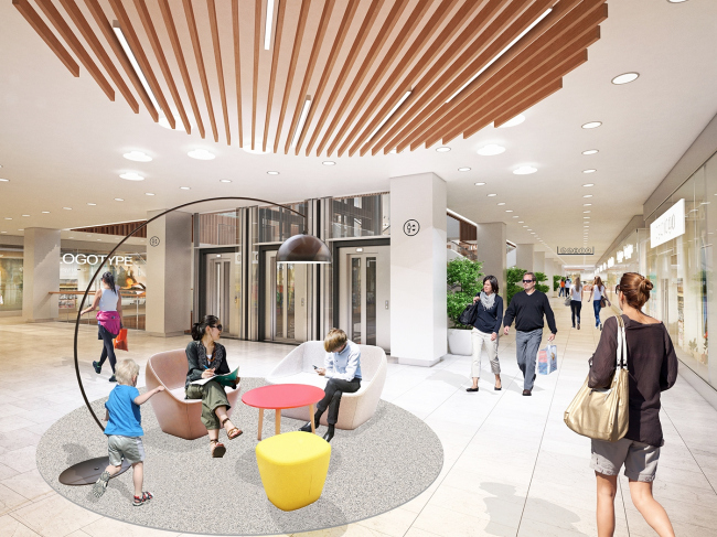
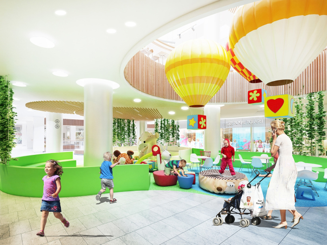
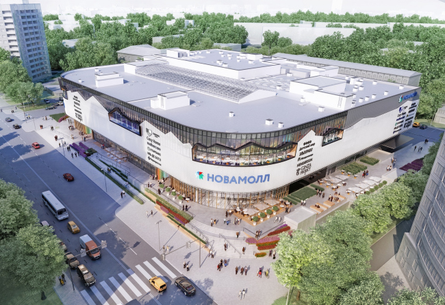
Developed by “Blank Architects”, the renovation project of the “Fifth Avenue” shopping center includes rebranding, broadening of the set of functions and services, as well as giving the building a new façade that will reflect the presence of a farmers market inside on the mall’s top floor. Renovation of the "Fifth Avenue" shopping center © Blank ArchitectsThe land site between the Marshala Biryuzova and Marshala Rybalko streets has always been about retail. At different times there were markets and kiosks here, and during the soviet years the place was occupied by a shopping center built of prefabricated panels and taken down in the early 2000’s. In its stead, in 2003-2004, ABD architects designed and built the “Fifth Avenue” shopping center – with rounded corners, black-and-red interior, and an atrium, whose boldly crossing escalators allow the center’s guests to quickly make it across the shopping gallery. After the years of operation, the interior, and particularly the façade, mostly covered by multicolored advertising banners, began to look as if they had seen much service and required renovation – it should be mentioned that this is quite normal; the market experts recommend renovating shopping centers almost every five years. The client turned to Blank Architects with a request not only to change the outward appearance of the building but also to come up with ideas for rebranding: come up with a new name and logo, and make a complete makeover of the image. This is how the “Fifth Avenue” turned into “Novamall”. Renovation of the "Fifth Avenue" shopping center © Blank ArchitectsThe surroundings of the shopping center, as was already said, are rather mottled, but pleasant at the same time. A couple of parks (one larger, one smaller), a couple of residential high-rises, a few five-story houses... The main pedestrian route runs along the Marshala Biryuzova street and leads to the “Oktyabrskoe Pole” metro station. However, the needs of the local people grow – they have long since needed new forms of public spaces, so, renovating the shopping center, Blank Architects decided to turn it into something more than what it used to be: what became the main idea of the project was a wide range of functions, diversity of services, and attention to the interests of different consumer groups, thanks to which, from a mere shopping mall it must grow into a sort of community center. As for the concrete framework of the existing building, the architects decided to keep it intact. “We tried to bring out the best in this building by creating an eye-pleasing image, free of obtrusive advertising, and terminally open – shares a partner of Blank Architects Lukasz Kaczmarczyk – The original compact shape with rounded corners looks great in the visual span of the street, softening the perception of this volume both from a pedestrian’s and a driver’s viewpoint”. It was also decided to keep the atrium with a “spider web” of escalators that cuts through all the three floors. Renovation of the "Fifth Avenue" shopping center © Blank ArchitectsThe architects decided that on the first floor they would keep most of the operating retail stores, including a large supermarket, a children’s cafe, and a public zone in the atrium. However, the project also got a lot of extra services: an atelier, a dry cleaner’s, a bank, and even a post office. On the street side, there will be a coffee shop with an independent entrance – in the morning, it will open earlier than the rest of the complex, allowing the people going to the metro station have a quick breakfast on their way to work or just get a coffee to go. On the second floor, a lot of attention was paid to the children’s zone which includes specialized stores, theme playgrounds, and an education center. Renovation of the "Fifth Avenue" shopping center. Lighting design © Blank ArchitectsOne of the main novelties is a food market on the topmost third floor, the hot trend of today. According to the authors’ plan, one will not only be able to buy food there but also ask to cook it and then have it on the spot – this way, the market, located next to the movie theater, will essentially become a substitute for the standard food court but with an accent on individual and healthy food. Renovation of the "Fifth Avenue" shopping center. Interior of the atrium © Blank ArchitectsFrom the outside, practically the whole third floor is covered in glass, which allowed the architects to fill it with ambient light creating a feeling of a traditional open-air market square. The same association is carried over to the façade, where hanging panels on the third floor level play back the silhouette of pitched roofs and awnings above the shopping arcade. “We wanted to depict the silhouette of the market square directly on the façade – says Lukasz Kaczmarczyk – So that the building would arouse interest and would at once give a hint that there is a market up there”. The panels pass through the plane of glazing, forming a zigzag-shaped awning of imaginary pitched roofs not only on the outside but also on the inside. Earlier versions of the project provided for an open-air terrace under the awning which could be used as a cafeteria in the warm seasons. Ultimately, however, it was decided that the awning would be a purely decorative one. Renovation of the "Fifth Avenue" shopping center. Interior © Blank ArchitectsRenovation of the "Fifth Avenue" shopping center. Interior © Blank ArchitectsIt is planned that the main part of the façade will be covered with white expanded metal mesh with a corrugated surface, a material that is up-to-date, flashy-looking and adaptive to weather changes; somehow, it is rarely used in Russia yet. The mesh is meant to protect the interior from the direct sunlight, at the same time letting the ambient light in; it must be light and ethereal, at the same time enshrouding the building and making its image complete and coherent. The authors of the project believe that this mesh is a great background, and they create a multilayered pattern of the walls playing with transparent and non-transparent surfaces. The reserved image of the building is diluted by inclusions of natural wood that the architects are planning to use in the decoration of the second floor. The wooden elements frame the showcases and the entrances to the shopping center, from where they smoothly flow into the interior decoration. The main heroes of the project are people, the future visitors of the center – the architects say. Particular stress is laid on comfort, functionality, and accessibility. The project provides for a baby care room where mothers will have an opportunity to cook some food and take a rest, the center will also have places where people can just sit down and talk, waiting lounges coming with fresh newspapers and magazines, and children’s playgrounds, safe and at the same time interesting for different age brackets. Renovation of the "Fifth Avenue" shopping center © Blank ArchitectsRenovation of the "Fifth Avenue" shopping center. Interior of the children's zone © Blank ArchitectsOn the inside, light colors and natural materials prevail: wood and stone, livened up by greenery and light-colored furniture. The atrium, which used to be black and red, now becomes white, reflecting and amplifying the light coming from the skylight. The black escalators will also become white. The children’s playgrounds will be executed in the Angry Birds style, with the use of sustainable and recyclable materials designed to be often replaced as the new game figures come along. An important part of the project is the lighting design. This part of the project Blank Architects did in collaboration with a Copenhagen firm. In addition to utilizing the ambient light, the architects thought out the artificial lighting system with soft backlights for the rest zones and cafe tables and bright backlights for the shop windows. The visitors must not get tired of bright lights so often found in shopping malls. Renovation of the "Fifth Avenue" shopping center © Blank ArchitectsThe architects also had a task of livening up the territory around the shopping mall – and, first of all, accentuating the entrances. “Novamall” stands higher than the level of the traffic way and the sidewalk due to a considerable height difference – around 2 meters – and the project makes the most out of this peculiarity as well. The entrances are accentuated by the floor to ceiling glazing; they are accessed by broad staircases and ramps. In front of the main façade, two levels of pedestrian flows appear: the first one running along the traffic way, and the second one, more comfortable, running closer to the mall itself, under a broad awning that gives protection from the rain. The first floor of the complex must be active and open to the street with entrances to some of the stores; in the summertime, cafe tables can be placed here. The strip of land that slopes down towards the road will get flowerbeds, and a lawn, while street lights and furniture will form some rest zones on the way to the metro station. The mixture of functions and special attention paid to creating public spaces both indoors and outdoors is a positive trend of recent years which gradually spills over the Garden Ring and slowly but surely reaches the city’s outskirts. While in the early 2000’s a shopping mall was pretty much a thing in itself, now it is making an unprecedented attempt to open up to the city, enriching its environment and trying to revive, as in this particular instance, the all-but-lost-in-a-megalopolis tradition of buying food at a farmers market chatting with the salesman. Over the last summer, Blank Architects did more than one project of modernizing Moscow’s shopping malls – besides the one described above, three more malls – two “Golden Babylons” (in the districts of “Otradnoe” and “Yasenevo”) and the “Hudson” on the Kashirskoe Highway will be renovated in accordance with their projects. Possibly, they will all set the new trends for developing the typology of the city’s shopping malls – because, admit it or not, currently they seem to be the obvious gravity centers for the city’s public life. |
|
