|
Published on Archi.ru (https://archi.ru) |
|
| 21.11.2017 | |
|
Considerate Guest |
|
|
Alyona Kuznetsova |
|
| Studio: | |
| Anatoly Stolyarchuk Architectural Studio | |
|
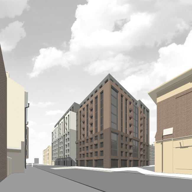
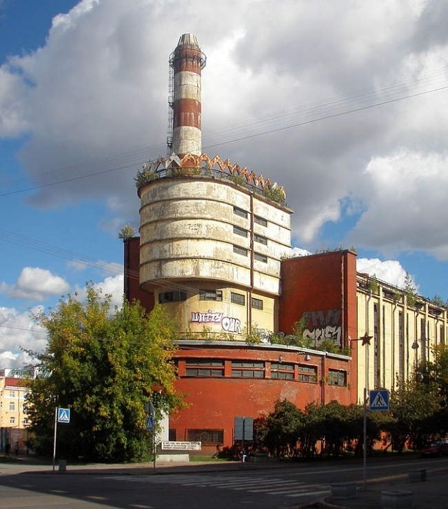
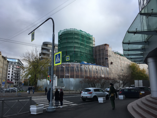
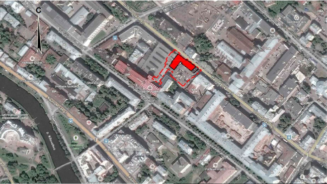
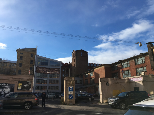
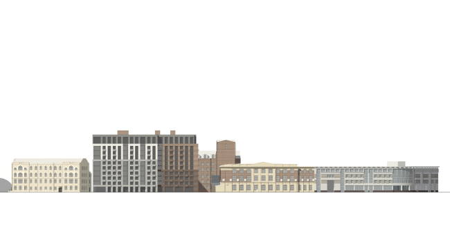
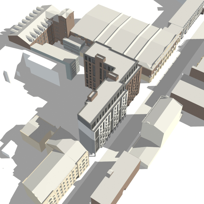
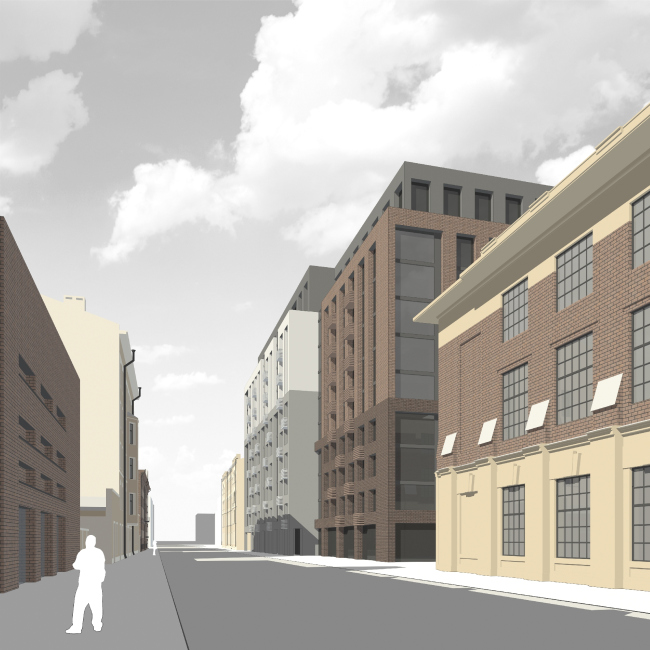
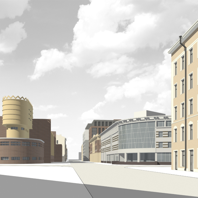
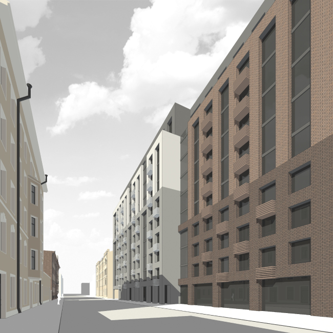
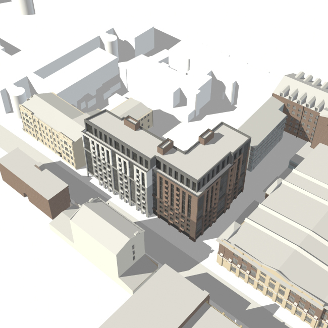
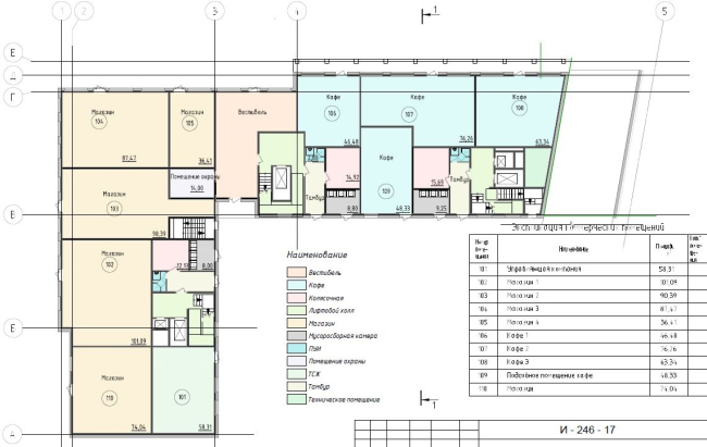
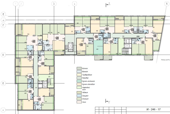
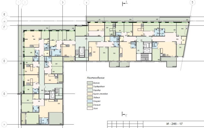
In the historical part of Saint Petersburg, Anatoly Stolyarchuk has designed a residential building with an attitude, yet still friendly towards its neighbors. The city block in which this house is being built is part of one of the historical industrial parks that survived into the present on Saint Petersburg’s Petrograd Side. In the 1920’s, a knitting factory was built here by the project of Erich Mendelson. The factory was named “Krasnoe Znamya” (“The Red Banner”), and today it is chiefly known for the expressive silhouette of its power station: the architect himself compared it to a “flagship that tows up all the production cycle”. The building influenced the development of the Leningrad avant-garde, and, for some time, it was a symbol of the Soviet industrialization and even a symbol of the city (in the 1930’s its picture was on the cover of the tourist guide). Perspective view © Anatoly Stolyarchuk architects, 2017Up until this year, the building of the station, as well as the factory and its surrounding territory were in a state of suspended animation: the land went from one owner to another, some predicted that one day this place would become the Russian Tate Modern, while others had serious misgivings about its future fate. In 2016, they started building a housing complex named “Mendelson” literally window to window with the power station upon the project of Evgeny Podgornov, and this drew a serious responce: a lot of local preservation activists demanded that the new construction be stopped and the building be taken down; the International Council on Monuments and Sites looked into the matter, and the Smolny finally OK’ed the beginning of the restoration work. The power station is the doubtless centerpiece and the “star” of this suburban area of the Petrograd Side. Currently, all of its surroundings are changing together with it: buildings get restored and adjusted to fit new functions; voids get filled with office buildings and housing projects, and even the historical buildings of the nearby Mozhaisky Military and Space Academy are clad in scaffolding. Power substation of the "Krasnoe Znamya" factory in Leningrad (Saint Petersburg). Photo: Sav-1667 via Wikimedia Commons. License: Creative Commons Attribution-Share Alike 3.0 UnportedThe land plot that Anatoly Stolyarchuk got to work with is located across from the road and diagonally from the power station. Currently, it is a wasteland with rather mottled surroundings: factory buildings alternate with houses of unknown origin and brand-new business centers. The main goal that the architects set for themselves was making sure that they do not violate the historically formed surroundings and make sure that there is no dissonance. However, another goal, just as important, was to avoid copying the style of the surrounding houses, and make a unique architectural statement of one’s own. Power substation of the "Krasnoe Znamya" factory, the present day © photo by Alena KuznetsovaLocation plan © Anatoly Stolyarchuk architects, 2017The plan of the land site prompted dividing the building into two major volumes. This way, the architects got a rectangular “white” unit and a slightly sunken-in “red” one that turns round into the depth of the city block. If we are to look at the façade from the Pionersksya Street, we will find that these two volumes are fractured horizontally with color and the window pattern in such a way as to pick up the height of the surrounding buildings. The resulting “cascading” pattern creates an unusual effect: as if the house already “lived” for some time, and at some point a buildup of a few extra floors. In this narrative, even the mansard, which was the client’s special request, becomes appropriate. Essentially, the façade projects to the street the architectural “herbage”, which is hidden in the yard, but in a slightly “combed-up” stylized manner. It is spontaneous yet at the same time pristine, like a guest who is dressing up for a party with carefully thought-out carelessness. The land site on the Pionerskaya Street, on which the new house will be built © photo by Alena KuznetsovaCopyright: © Photograph by Alena Kuznetsova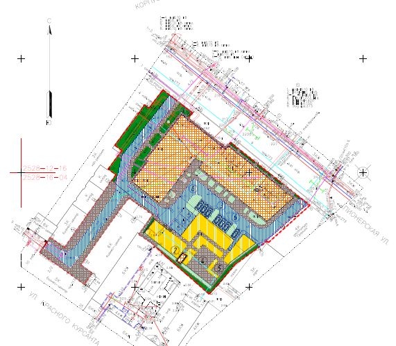 Master plan © Anatoly Stolyarchuk architects, 2017Development drawing along the Pionerskaya Street © Anatoly Stolyarchuk architects, 2017Rather lengthy (around 40 meters), the façade is dissected vertically as well: the broad bands of the stanzas refer us to the stained glass windows of the factories and alternate with “perforation” of the square windows and narrow glazing strips. The neat rows of balconies in the top part of the building turn into a “staggered” order in the lower part. These little balconies are meant for the air conditioning units, the chaotic installation of which by the tenants is, according to Anatoly Stolyarchuk, something that causes architects inevitable pain. The color and the material (the decoration is fully executed from brick) also drop a courtesy to the surrounding houses: the conditionally red building is “clad” in the same tones with the neighboring factory buildings, while the white one picks up the colors of the other neighbors. Perspective view © Anatoly Stolyarchuk architects, 2017Ultimately, the building, although slightly higher than the power station of “Krasnoe Znamya” (its cornice height is 28 meters, and its total height is 33), does not make a parade of its height and does not look as if it wants to dominate. On the contrary, it pays all kinds of visual homage to its surroundings, without losing its dignity. Anatoly Stolyarchuk is hoping that there will be no antagonism here: “The power station has a strong plastique language of its own, with which it makes a bold statement, while what we’ve built is a background-type reserved-looking house”. This is proven by the visualization of interaction points between the power station and the future house developed by the Committee on State Control, Use and Protection of Historical and Cultural Landmarks. Perspective view © Anatoly Stolyarchuk architects, 2017The first floor is occupied by shops and restaurants. Because of the slight breakaway of the “red” building, the edge turned out to be a “living” one, making this part of the street interesting for the passes-by. The architects enhanced this effect by making in the “white” building a gallery that leads to a broad pavement with large shop windows of the “red” one. Between these, there is a hidden entrance to the building; two other entrances are situated in the yard, where the façade grows even more reserved yet by no means monotonous. Perspective view © Anatoly Stolyarchuk architects, 2017Perspective view © Anatoly Stolyarchuk architects, 2017Floors from 2 to 10 include apartments – their layouts were handed down to the architects “pre-packed” from the marketing experts of the project, which doubtlessly complicated their work. The basement floor includes a parking garage, the entrance to which is situated on the Pionerskaya Street from the side of the “white” building. Perspective view © Anatoly Stolyarchuk architects, 2017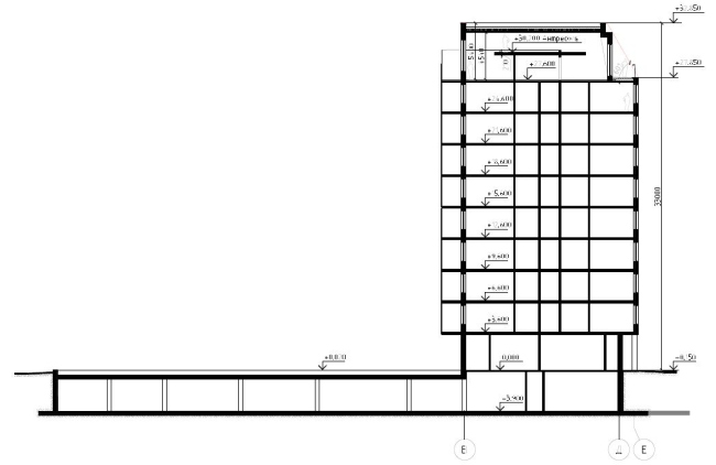 Section view © Anatoly Stolyarchuk architects, 2017Plan of the 1st floor © Anatoly Stolyarchuk architects, 2017Plan of the standard floor © Anatoly Stolyarchuk architects, 2017Anatoly Stolyarchuk stresses that simplicity and laconism are what the architects were about working on this project. This means not only the architects’ respect to the city and their predecessors but also a fair amount of confidence – they were able to design something simple yet at the same time flashy-looking. What also helped was the understanding that the architects achieved with the client whose notion of beauty matched the authors’ project proposal (it would be appropriate to recall here the project of another building designed by this architectural firm, which was built amidst a similar context on the Mira Street yet with bigger difficulties). This building not only “fixes a hole” in the street – it “takes root” in its new place, intertwining with everything that was there before it came around. Such examples can hopefully change the people’s attitude towards new construction carried out in the historical areas, of which most of Saint Petersburg people are still pretty wary, and for a good reason, too. Plan of the mansard floor © Anatoly Stolyarchuk architects, 2017 |
|
