|
Published on Archi.ru (https://archi.ru) |
|
| 02.08.2017 | |
|
With a Swedish Accent |
|
|
Julia Tarabarina, Natalya Muradova |
|
| Studio: | |
|
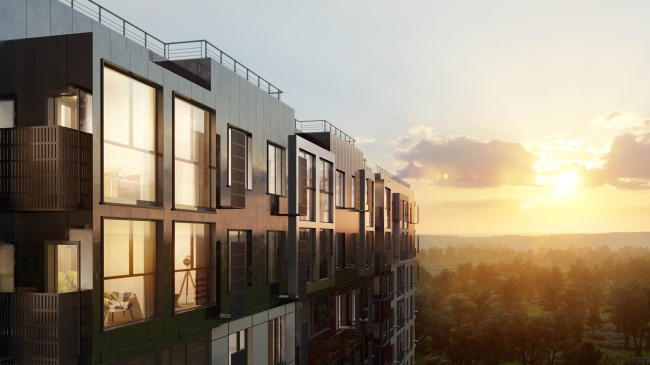
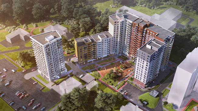
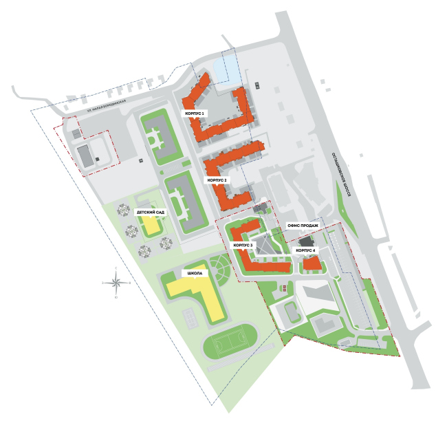
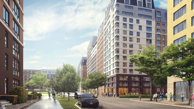
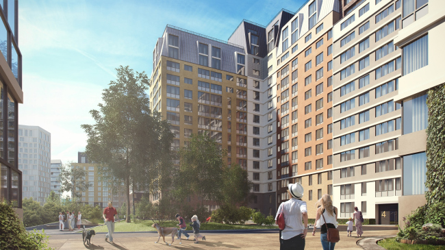
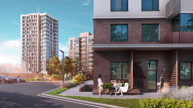
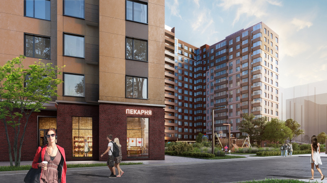
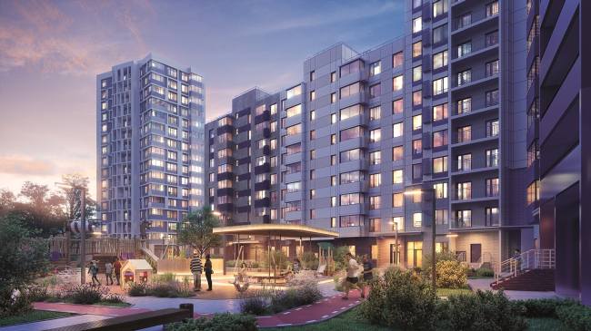
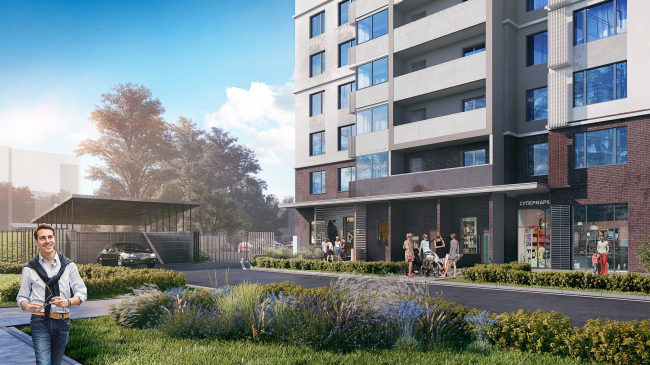
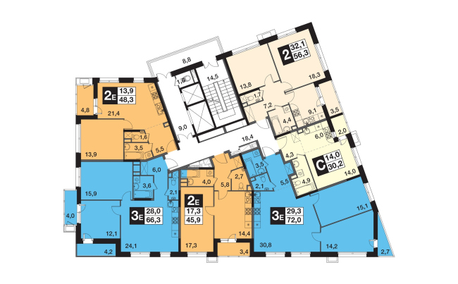
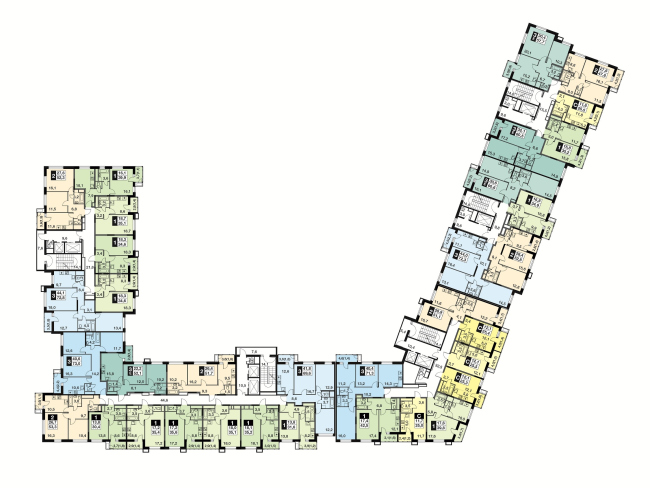
To design “Skandinavsky” UP-quarter, FSK “Lider” invited a Swedish architectural firm Semrén & Månsson. UP-quarter "Skandinavsky" © Semrén & MånssonThe UP-quarter “Skandinavsky” is being built three kilometers outside of the Moscow Ring Road, northwest of Mytishchi, on the territory of the former village of Borodino (just one of the several Russian namesakes of the famous village that witnessed the Napoleon battle in 1812). This place is but a 15 minutes’ bus ride away from Medvedkovo metro station. And, although Mytishchi, as is known, is already densely overbuilt, just outside the confines of Moscow’s satellite we see quite a different picture: this land is dominated by villages filled with private residences and forests that are quite abundant despite the proximity of the megalopolis. If we are to broaden our gaze, Mytishchi’s Borodino is but six kilometers away from the Pirogovskoe Lake; next to the village we will find the Khlebnikovsky and Pirogovsky parks, but the closest woodland is a forest belonging to the Mytishchi Forestry Station. As we can see, in spite of its proximity to the Moscow Ring Road (which is definitely a downside by Moscow standards), this place is still quite green and – due to the proximity of the famous Pirogovskoe Lake – almost boasting a resort status. Nearby, a few shopping malls have been built already, and new ones are being built as well. So it comes as no surprise that the FSK “Lider” developers chose this place for the construction of a large housing complex belonging to a new housing format that this company has been recently promoting on the market: formally referring to the comfort-class, it is endowed with a range of extra features that are sure to become a pleasant surprise for the consumer. To design this housing complex, FSK “Lider” invited the Swedish firm Semrén & Månsson – hence the name of “Skandinavsky”. Still, though, there are also Russian architects working for this firm. Thus, on the twelve hectares of land stretching from north to south alongside the Ostashkovskoe Highway (incidentally, it is this highway that leads to the Pirogovskoe Lake), some forty to ninety meters away from the highway itself, there has already begun the construction of two residential buildings out of planned four, designed to house 80 000 square meters of apartments. These apartments constitute the first stage of construction. The second stage of construction will include another two buildings, a school and a kindergarten. “This will be a small town yet completely self-sufficient” – says Maria Broman, the chief project architect of Semrén+Månsson. Three large sectional buildings are designed as blocks with an open-circuit plan. “As is known, blocks or “quarters” are becoming a hot trend in Moscow – the architects explain – But in Sweden they never seemed to lose popularity at all. So, in a sense, this is a Scandinavian trait”. However – and this is also common knowledge – the “pure” version of the block town planning is only good for houses no higher than 6 or 8 floors, which makes perfect sense because in this particular instance the planning is of mixed type. The circuits of the blocks are open; the night of the sections varies from 8 to 16 floors making the skyline uneven. It is planned that there will be underground parking garages beneath the three buildings. In front of the side wall of the third building, there is a 16-story centerpiece tower that faces the highway with its slightly tapering southeast corner. There is a two-story property sales office behind it – together with the overland guest parking lot they complete the image of the housing complex as seen from the highway. UP-quarter "Skandinavsky". Building 4 (tower) and Building 3 (which are already being built) make up the first stage of construction © Semrén & MånssonFurther on north, the highway is separated from the complex by other private residences. One should say that in this particular instance this separation is a rather lucky circumstance. “Skandinavsky” is chiefly oriented toward its own internal boulevard that starts at the tower of Building 4 on the south side and stretches inside the housing complex forming its inside axis. The boulevard is open to vehicles but only ones belonging to residents and their guests. It separates a row of residential buildings and the territory that will be occupied by the second stage of construction: two residential buildings, a kindergarten, a school, and a stadium. In addition, the closed parts of the block are turned on the boulevard and form a city-type building front stretching along it, with cafés, shops, and – this was expressly specified – beauty salons in the first floors. There are no arches in the buildings but the entrance lobbies are designed in such a way that they can be entered from either side: one can enter such a lobby both from the yard and from the street, which significantly increases the porosity of the complex and provides a number of convenient shortcuts. The entire territory will be security guarded, so there will be no risk of evil-meaning strangers penetrating the complex. Also important is the fact that the first stage that is currently under construction is bordering (almost side by side) on a small coppice, while in its north part there is a small natural creek. In the land organization project, there is a path leading to it which is accessible to all residents. This way, it turns out that the axis of the public space of the UP-quarter “Skandinavsky” is strung between the coppice and the creek – which must provide a diverse range of experiences here. UP-quarter "Skandinavsky" © Semrén & MånssonWorking with the façades, the architects tried to “customize” the space as much as possible: the sections are not only of different height but their façades are also designed in different colors – from a reserved “north-European” tone varying from white to gray to yellow beige and brick red. However, the architects stopped short of taking this fashionable technique of imitating a city street to its limit: the façades are laconic and subjugated to a single common theme. “We had sort of a toolbox of different elements: windows, balconies, colors... We would mix them up, and then each section would get its own identity – explains the chief architect of the project Maria Broman – We think that it is important for the residents to be conscious of living, let’s say, in this particular brown house. Second, this individuality of separate buildings is important for the scale of the complex. This way, an impression is created that the complex is a lot smaller than it actually is”. The reduction of scale is also partially enhanced by the fact that the top and bottom floors are designed differently than the façades of the main part. The buildings get a brick base, this base including three tiers on the side of the boulevard and offering a comfortable city scale to the pedestrian’s eye: a shop window plus two stories. However, the height of the base varies, just as the design of the upper floors does: in Building 3, they are only highlighted with color, and in Buildings 2 and 1 (which are to be built later) the two top floors are united by a slanted metal-sheet wall that gives them a likeness to a somewhat overblown mansard. At some points, the mansards form an elevated ledge, and at some places they alternate with recessions of modernist terraces, which also help the authors to create an illusion of a spontaneously developing city street. Inside the mansard stories, two-level apartments are designed. UP-quarter "Skandinavsky" © Semrén & MånssonUP-quarter "Skandinavsky" © Semrén & MånssonThe tower of Building 4, which, as we remember, is situated closer to the highway than the other buildings are, is significantly different: it is completely devoid of the light retro-fleur that is distinctively felt in the “quarter” buildings, and, while the quarters are reservedly conservative, the tower can be described as “reservedly innovative”. Its façades are “shrouded” by a mesh of white network – its slim ribs, otherwise sparse but dense where the staircases are, make this volume particularly slender and elegant. The gray color of the sunken-in surfaces forms a background – all this looks a bit like the Renaissance scratch-work technique of adoring façades, only on a significantly greater scale. UP-quarter "Skandinavsky" © Semrén & MånssonThe authors also paid a lot of attention to the organization of the adjoining territory. The trees on the boulevard, the children’s playgrounds, the benches and flowerbeds – all this became the “101 kit” of our days, just as vehicle-free yards. The pedestrian zone – the bottom parts of the façades abs the hallway entrances – are elaborated down to the last detail, which is meant to render the immediate, almost tactile, perception of the territory by the people both comfortable and rich in emotion. In addition, the architects also provided for a lot of pleasant little things – for example, the entrance lobbies have not only rooms for go-carts and strollers but also places for washing the pets’ paws after the walk. UP-quarter "Skandinavsky" © Semrén & MånssonUP-quarter "Skandinavsky" © Semrén & MånssonUP-quarter "Skandinavsky" © Semrén & MånssonAs for apartment layouts, the salespeople call them “typically Scandinavian”: square rooms and inbuilt closets. The apartments range from studios to three-room ones, each having a stanza balcony, either sunken in or standing out and glazed. The stanzas come with boxes for air conditioning units – it should be said that their grilles, looking as if they were made of wood, serve as a nice façade decoration. In sectional buildings small corridors are inevitable, while the tower, according to the architects, boasts particularly Swedish layouts: without corridors, with a large kitchen-and-living-room, from where one can get into the bedrooms. None of the apartments have either beating walls or columns inside of them – which will make any possible planning changes much easier. UP-quarter "Skandinavsky". Building 4. Plan of the 2nd floor © Semrén & MånssonUP-quarter "Skandinavsky". Building 3. Plan of the 3-14 floors © Semrén & MånssonIt is pretty obvious that in Sweden such huge housing complexes are a rare thing to be seen. But if we are to speak about the realities of the Russian cities, and particularly the realities of the Moscow area – it IS built with large-scale housing complexes, and any attempt to give their appearance a noble touch and organize their inside space is already something worth noting – just as the development of the housing market in the direction of UP-quarter ideas, the meaning of which, as proceeds from the very self-explanatory term, consists is “raising” a certain class of housing. |
|
