|
Published on Archi.ru (https://archi.ru) |
|
| 15.09.2008 | |
|
Gates to the other side |
|
|
Maria Fadeeva |
|
| Architect: | |
| Pavel Andreev | |
| Studio: | |
| Paul Andreev | |
|
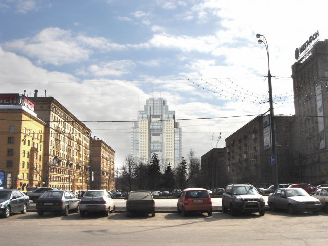
For a few years now Kutuzovsky prospect has been growing in its height: "Edelweiss", “Miraks-plaza”, there emerge foundation ditches for realization the concept of overlapping of the Kiev railway. Though there are no clear results of the contest, organized by Moskomarchitecture in 2006, there are real construction works are being executed. Among them there is also the project of a hotel and business complex on the crossing of Poklonnaya street and 1812 goda street, designed by the studio of Pavel Andreev
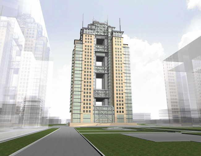
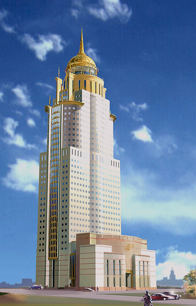
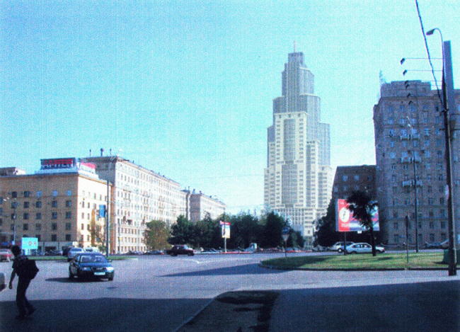
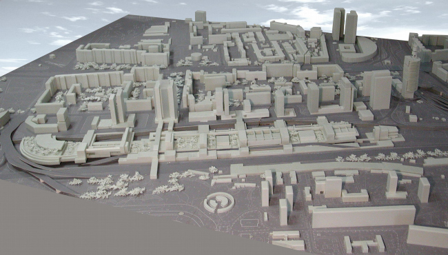
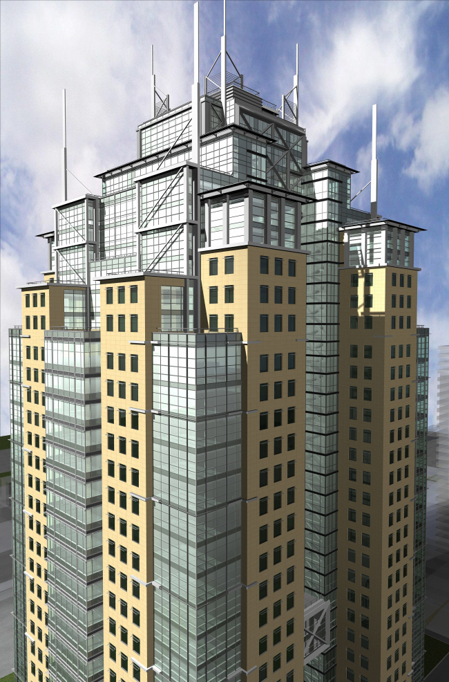
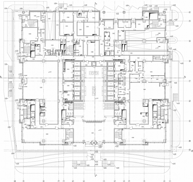
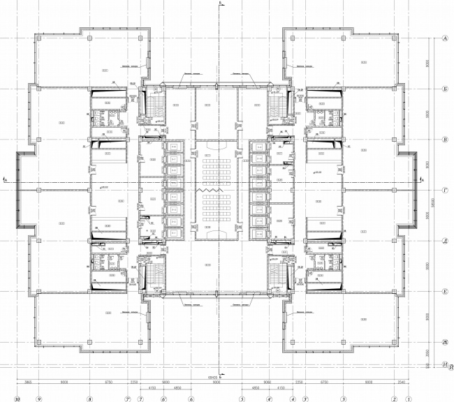
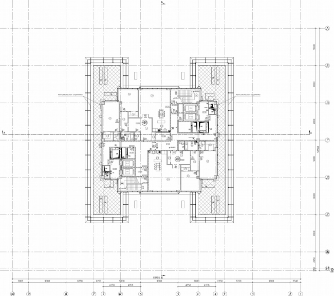
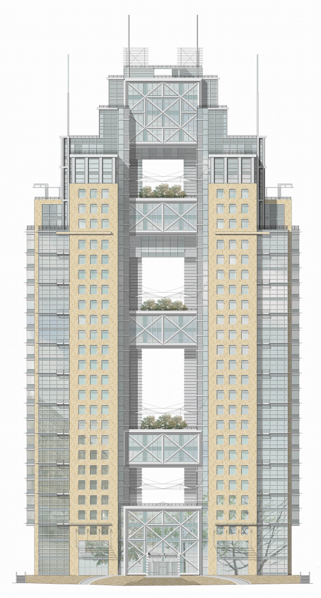
Since the times when churches and their bell towers were the highest buildings, muscovites got used to the fact that those dominants mark a specific "spots" in the city. Whereas architects in St.Petersburg could – sometimes, on Nevsky – bring the church under the line of prospect, Moscow, up to Stalin, was mostly guided by dominants – just remember Dvorets Sovetov [The Palace of the Soviets] and the ring of high-rise buildings. After the war, however, they started building even high-rise buildings in lines (the project of Lusinovskaya street) and started construction of large buildings in prospects. Now Moscow is torn between the option to have dominants and unwillingness to have spot developments. Project of the tower in the end of 1812 goda street traces back to the middle of 1990’s and its first version was projected by the architect Boris Palui. It was the impressive tower – (refrain of the City that was in plan that time) with the gold church dome a little bit like the George church on Poklonnaya Gora. Construction was started but stopped at "zero" level, and till this year, for no less than 7 years, it remained so, and have changed three clients-developers. The idea to locate here a high-rise dominant remained, and Andreev’s studio had to deal with solving problems concerning coordination of number of floor applied in the preliminary permissions and the total area of the object with the constructed 5-level underground car-parking which are inappropriate according to the layout and arrangement specifications and load-carrying ability of the done constructions. For the past time there have been worked out a lot of architectural-planning and construction variants expressed in the image and arrangement solution. In comparison with the golden dome project of 1990’s, appearance of the high-rise building has become much more modern and less pompous. The final for the moment variant according to which they are already making working drawings and construction is in process, represents an arrangement of the two towers joined at different levels, including the top 5 floors, or a portal – the towers with a huge gap in the middle, this depends on view angle. In total there are 32 storeys and the shape of layout comes from the maximal bearing ability of the basis and the construction of made earlier underground part; height of the building is lowered from 200 m up to 25 m and meets the requirements of Moskomarchitecture. In the plan size of the building – 54х63 m, made the volume too massive and uneconomical for commercial purposes and in the result that was the main point for the final composition solution and presence of the central gap. By tradition the first two storeys of the stylobate are given for social needs (a restaurant, a canteen, a branch of insurance company and shops), and above, up to the 22th storey there are offices, in the top crosspiece there are apartments. Up there goes separate from office lifts the group of panoramic lifts, together with those located outside on walls of the gap between the towers. Towers are connected by 2storey (and more) special constructions of bridges – crosspieces where there are not only office rooms but conference-halls, and on their roofs there are open "hanging" gardens. Architectural image of the building is shaped by the walls made of light beige granite with strict lines of windows and glass-metal constructions with hanging gardens. These two elements are usually seen as opposite – the first takes to the "Stalin" Kutuzovka. The other part – hi-tech – demolishes that context. To be exact, it moves apart by its technical mechanisms, as if controlling some details inside. And even more exact - it creates a picture of that moving apart process by architectural means. As if that is an advanced theatrical scenery during transformation. It played role of a high-rise building of Stalin times art-deco hiding behind boards of stone plates. But performance has come to an end – or to the other scene – someone has pressed the button and the mechanism is moving, unfolding stone plates and is putting forward the glass wings, is showing metal frameworks and it appeared they have overgrown with trees. Feels like making a remark - haven't the performance been lasting for ten years, since 90’s? Enough time for trees to grow. The idea of movement hidden in stir of architectural masses is one of the most popular today. Architectural idea tastes the dynamics in every way: modern volumes explode, or bend, or wind themselves into a screw, break apart, or unfold – as if arranging a new stage of technical revolution after which houses will be smart and mobile like huge robots. This idea of mechanical movement is new and seems to be Andreev's favorite one. We have already written about at least two projects where it is clear: the building in the beginning of Entuziastov highway and on Yakovoapostolsky in the residential tower. Large bearing elements of construction of crosspieces are deliberately shown open and tough, in every possible way they show out themselves by units of metal designs and display – this is the glass and metal mechanism that bears boards of stone planes imitating architecture close for people of those ages. But performes that only if it is necessary, on people’s wish. But if it wants It will take it down. Or curve. Or unfold. In the project for 1812 goda street, the mechanism obviously plays part of a high-rise building. Plays openly, has a mask, and doesn’t avoid features of transformation – gradualness and broken attics with hints on pilasters which look interesting in metal. During the game this – very theatrical – mechanism is transforming the image, from the art-deco "mask" there appears hi-tech. But the main thing is that there appears a gap. For Stalin style (and for is pompous Moscow of 1990’s) such giant gap destroying the middle, is inconceivable. Arches there never reach such unbelievable height. Nowadays, on the contrary, it is native – now it is very popular to connect two neighboring houses with passages, placed preferably higher. The center becomes unfilled, pierced with strains of metal forces. That is fine for the location, if consider from the town-planning point of view. The street is deadlock, it comes to railway tracks. The original project closed it completely. And this is marking the breaking point, the "watershed", inviting the opposite part of the city which has been cut off by tracks of the Kiev direction to reunion. In the end face of the street the building forms another, theatrical kind of perspective, shows the sky, increases scale. Specifies the border and at the same time unambiguously shows there is something behind it. And not only shows. The second stage of construction is building of a 3storeyd transport and pedestrian bridge with lager parking area at the level of the third floor by which it will be possible to pass over the railway to the alternate Kutuzovsky prospect, to Mosfilmovskaya street and Setun. So, the building not only shows permeability, but makes it real. The image turns out true. NoneNoneNone NoneNoneNoneNoneNoneNoneNoneNone |
|
