|
Published on Archi.ru (https://archi.ru) |
|
| 03.07.2017 | |
|
Destroying Stereotypes |
|
|
Julia Tarabarina |
|
| Architect: | |
| Daniel Lorenz | |
| Natalia Sidorova | |
| Konstantin Khodnev | |
| Studio: | |
| DNK Architectural Group | |
|
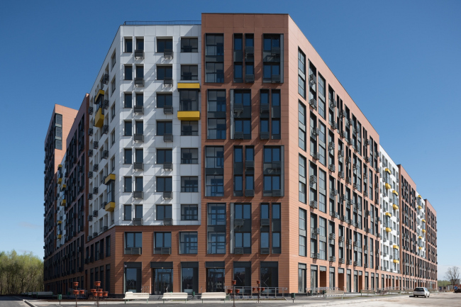
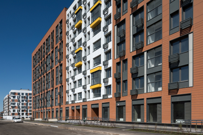
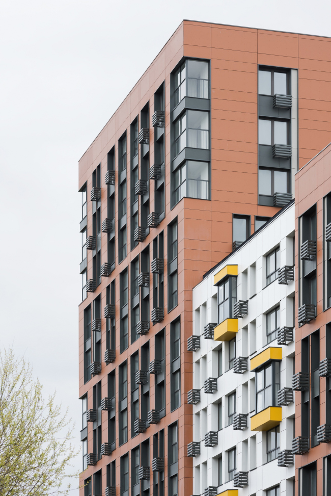
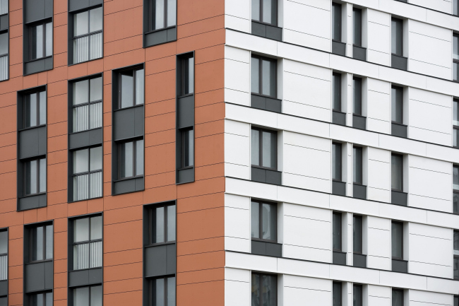
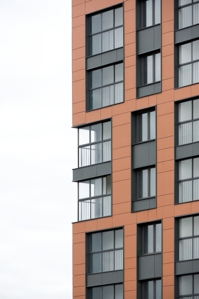
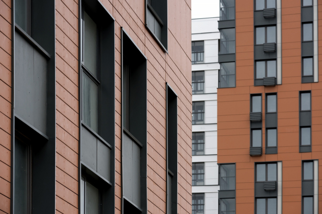
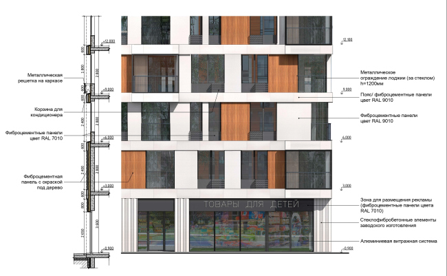
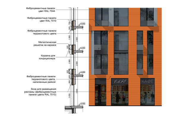
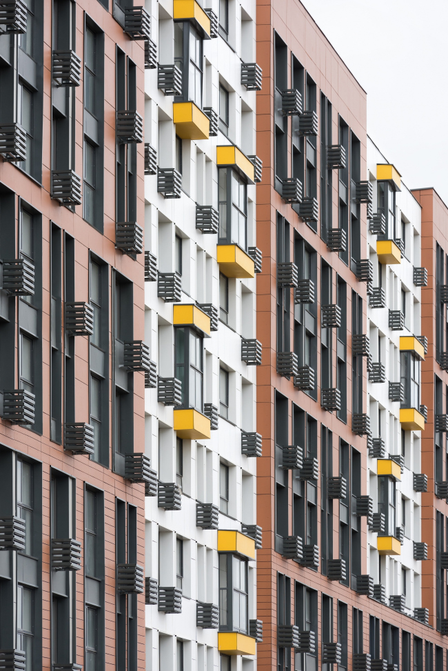
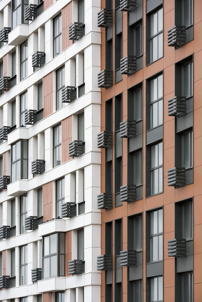
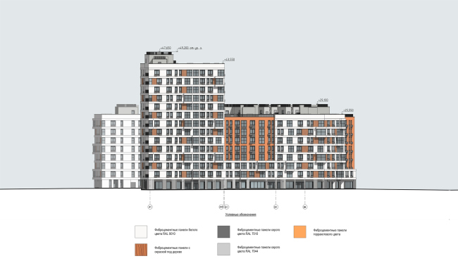
The architects of DNK ag approached the task of doing a comfort-class housing project as a super-objective. They were ultimately able to break the frame of “inexpensive housing equals standardized blocks of flats” staying, at the same time, within their budget constraints. Their customized and professional approach to mass housing construction allowed the architects to create a comfortable and human-friendly urban territory. "Severny" housing project. Units 7,8. Photo © Ilia IvanovThe housing complex “Severny” (meaning – “Northern”) is being built on the strip of land that formally belongs to Moscow but lies beyond the Moscow Ring Road; if one is driving out of Moscow, the complex will be situated to the right of the Dmitrivskoe Highway. Just as the land lying immediately beyond the Ring Road should, this place looks mottled and brand-new, yet, at some points, surprisingly peaceful and harmonious. Again, if one is gazing north, on the left they will see the huge “mega-crates” of the local shopping mall and the typical residential high-rises; the territory on the right is chiefly occupied by 3-story townhouses that form the housing complex “Severnaya Sloboda”, and even some of the houses of the villa community that surrounds the surviving fragment of the park of the “Arkhangelskoe-Tyurikovo” estate, whose conservation zone defined the low-rise character of the new construction *(…“recently, in the course of digging a construction pit for yet another house, the builders unearthed a marble statue of the Ancient Greek goddess”).
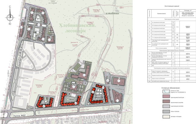
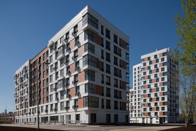
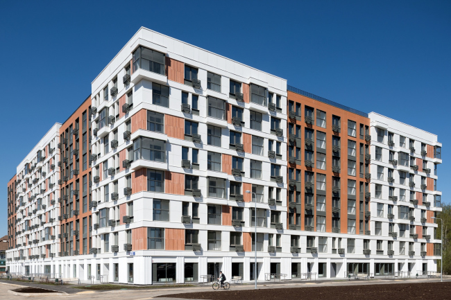
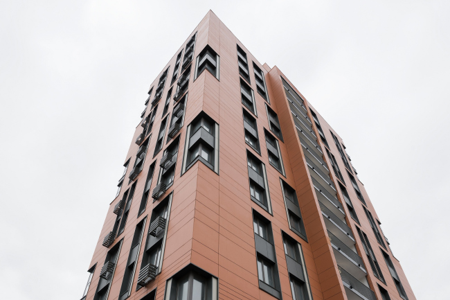
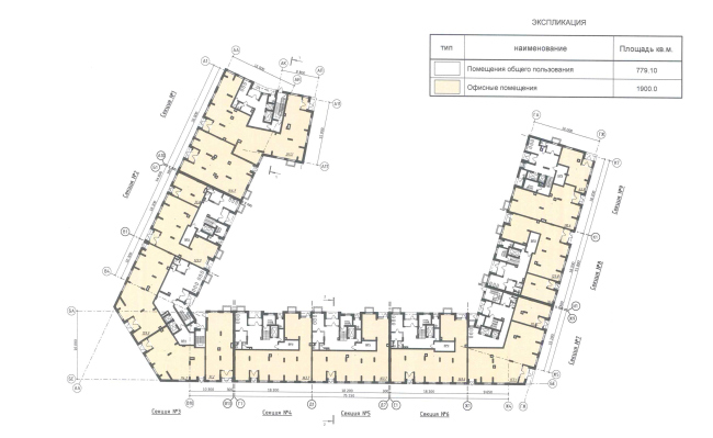
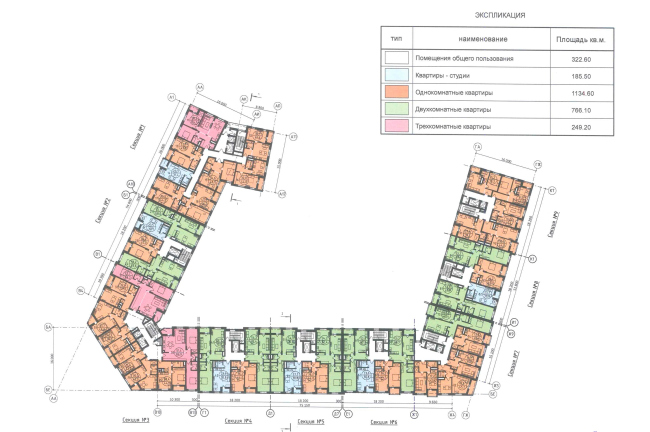
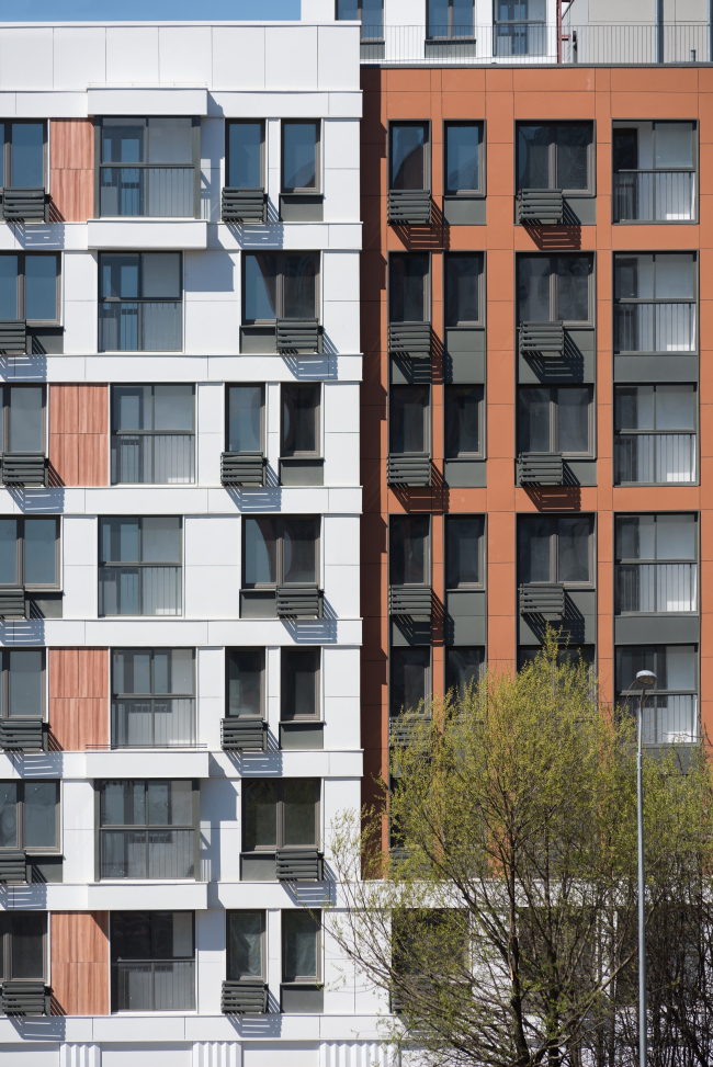
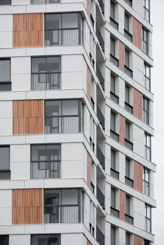
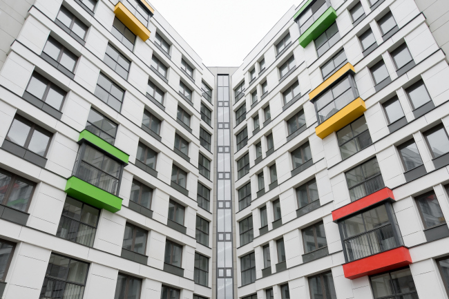
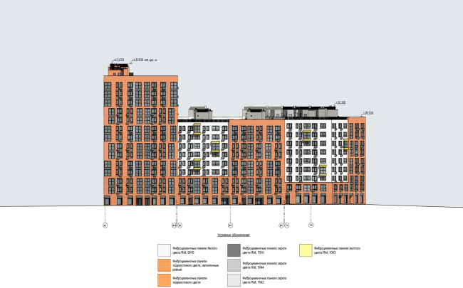
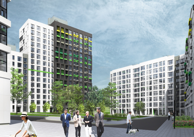
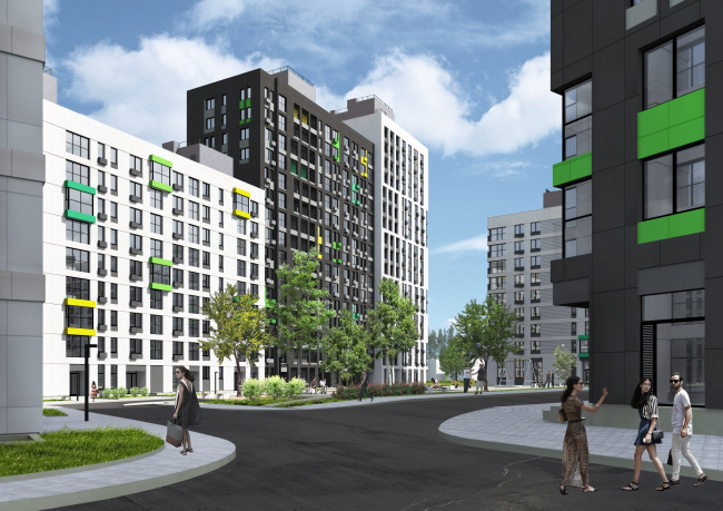
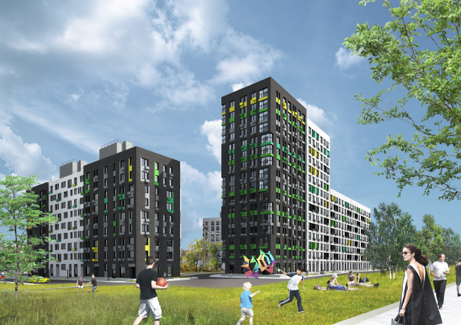
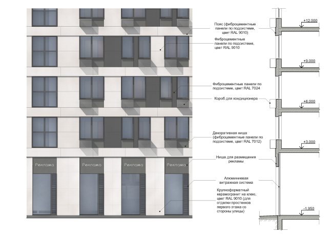
The construction here takes place on two independent land sites: to the west and to the south from the Khlebnikov or “Northern” Park. As for the western fragment, we do not know anything about it, while the architects of DNK ag are working on the south territory stretching between the park and the Landau Boulevard, the construction being realized in two stages: the first one – which has already been built – consists of Quarters 7 and 8 which are located on the west side; the second one is the neighboring west-side Quarter with a pilot name of 9.10. Quarters 7 and 8 are complete; the construction of Quarter 9.10 is beginning. "Severny" housing project. Location plan © DNK agWhen viewed from this vantage point, the 14-story tower in the depth looks almost the same height as the 8-story residential building. "Severny" housing project. Units 7,8. Photo © Ilia IvanovDNK ag was invited to work on the project at the point when all the volume parameters and even the floor plans of the apartments of the Quarters 7.8 were defined – in fact, as is often the case nowadays – their task was to draw the façades. The architects liked the surroundings and the set scale of the house – it was expected that the average height of the buildings would be about 8 stories, this being the accepted comfortable city magnitude. However, the architects pushed the limits of the task as much as possible. From the conditional “do the façade design”, their task turned into a full-scale architectural project that included revising the flats’ layouts and creating an individual image in spite of all the restrictions including the financial constraints: the architects were able to work with the plastique of the walls in such a way that the outward appearance of the volumes became the basis for a comfortable urban environment around the boulevard with three floors on one side and eight on the other. They were also able to fracture the façade surface in such a way that now it has on it lots of things that catch the eye, to think out the difference between the two blocks or “quarters” but in such a way that their likeness would also be apparent, and, most importantly, to use – in the comfort-class genre – the solutions of a truly architectural kind, taking the outside appearance of the buildings (and, partially, some of the apartments’ layouts) outside the viscous circle of the standard monotony. “It’s not about the visual class improvement, or, rather, not about the visual class improvement alone – the architects – We wanted to get a full understanding of how, by using architectural and engineering techniques, but, above all, “plastique” stylistic devices, and being strictly limited by the stipulated construction volume and budget constraints, one could create decent architecture and decent living environment, very different from what is usually associated with «comfort class»”. "Severny" housing project. Units 7,8. Photo © Ilia Ivanov"Severny" housing project. Units 7,8. Photo © Ilia Ivanov"Severny" housing project. Units 7,8. Photo © Ilia IvanovSo, the 8 and 9-story brackets of the blocks are stretched along the boulevard, while their “side strokes” point to the yard side and end in 14-story towers. “In a regular “comfort class” housing project, they would just end in blind side walls, even if the house was not built of prefabricated blocks (which is usually the case) but was based on a monolithic framework (which is our case – shares Konstantin Khodnev – Such blind walls at the end are a stereotypical solution, and we don’t have stereotypical solutions here. Some of the apartments also got windows in their bathrooms – which also increased the diversity of their layouts”. Although not very large, the apartments are rather diverse: from studios to three-room apartments. The architects added a number of improvements, such as the already-mentioned windows in the bathrooms, or rooms with two windows – and this innovation proved to be a success, the apartness selling like hotdogs, and Quarters 7 and 8 being built ahead of schedule. "Severny" housing project. Unit 7. Plan of the 1st floor © DNK ag"Severny" housing project. Unit 7. Plan of the typical floor © DNK ag"Severny" housing project. Units 7,8. Photo © Ilia IvanovEchoing the towers, the surfaces of the 7 and 8-story façades boast alternating large slabs of risalits with ledges hinting at a street composed of different houses. Here, however, one will not see a popular copy of a fractured city of different sectional façades: at the bottom, the ledges merge together into a single base, forming a city front with the shop windows and cafes. The façades are coated with fiber cement panels which were stipulated in the project specifications. For Quarters 7 and 8, the architects of DNK ag chose the respectable-looking “warm” white-and-brown color palette: the panels of terra-cotta colors look as if they were truly ceramic, while the white color is a sure-fire choice in all cases. What they ultimately got is two basic kinds of matter: the white broad-rhythm façades are rather horizontal, covered by textured zigzagging verticals in their first floors. The terra-cotta façades, on the other hand, are more on the vertical side on the large scale and unite floors into couples; on the small scale, they are covered with panels decorated with horizontal rock-face grooves. The buildings are inversive: in one of them the white matter stands out, in the other – forms a backdrop, which underscores the connection between them. "Severny" housing project. Units 7,8. Photo © Ilia Ivanov"Severny" housing project. Units 7,8. Photo © Ilia IvanovAll the yard façades are flat, white, and devoid of any outstanding ledges; they are the “inner” matter, the white color slightly helping to visually broaden the semi-confined space. In addition, the yards are turned north, and each spec of sunlight is of great value here. "Severny" housing project. Units 7,8. Photo © Ilia Ivanov"Severny" housing project. Units 7,8. Photo © Ilia IvanovStriving to overcome the stereotype of the “glass thermometers” of the stacks of stanza balconies, characteristic of the comfort class housing, DNK ag sank in the stanzas making them look like French windows when viewed from the outside. It is only an occasional bay window that one will see standing out, and these are not vertically aligned either; they are marked by sometimes bright and sometimes “wooden” inserts. "Severny" housing project. Units 7,8. Photo © Ilia Ivanov"Severny" housing project. Units 7,8. Photo © Ilia IvanovYet another visual stereotype to be dispelled was in fact a consequence of construction rules and regulations: according to them, the space between the windows must be no less than 1.2 meters. In order to make the so-called “French windows” running all the way down to the floor, it was not only necessary to hide in that same floor the heaters (which is a rather expensive thing to do) but also come up with special Project-Specific Design Code – which also would incur expenses incompatible with the notion of “comfort class” construction. Hence, having no opportunity to make the real thing, the architects simulated them from the outside by using sunken-in metallic bands of dark gray together with the boxes of the air conditioning units. "Severny" housing project. Fragment of the facade. Unit 8 © DNK ag"Severny" housing project. Fragment of the facade © DNK ag"Severny" housing project. Units 7,8. Photo © Ilia Ivanov“The building’s plastique is developed on both large and small scale, especially if you look at it from different angles going down the street: the risalits and the air-conditioning units – working together, they form a rather powerful rhythm. Another thing that we were able to avoid was this unpleasant feel of a single-chunk box – continues Daniel – a person will feel as if the house that they live in has volume and it's material”. "Severny" housing project. Units 7,8. Photo © Ilia Ivanov "Severny" housing project. Development drawing © DNK agActually, one will probably agree with the statement that “rank-and-file solutions” begin in our heads, in anywhere. Social housing projects (or just comparatively inexpensive housing projects, for that matter, as was our case, the project being of quite a commercial nature) boasting elegant architectural solutions that we admire in the European countries, are indeed quite a common and affordable thing, and its success directly depends on the architects’ determination to do a decent job in this inexpensive market segment. “We must admit that today our project is not one of its kind – but when we started working with “Severny” back in the day, it was pretty much the only one around” – DNK ag explain. In this case, in addition to the individual custom-designed architecture, to which the architects deliberately resorted in order to avoid typified solutions and even visually “raise” the housing class, unique conditions came together, and, as a consequence, a unique environment was formed. Natalia Sidorova describes it as “part countryside, part urban”. She also compares it to European cities where small-sized buildings can stand alongside with townhouses and “multistory buildings, but not of a giant scale”. Indeed, the broad boulevard – that may even be possibly improved in the – separates three-story houses, and, at some places, two-story villas and the eight-story construction front with shops and cafes on the first floor. Architects often compare the atmosphere that the architects created here to the “Sokol” district and its surroundings – which is indeed a rare thing by Moscow standards, vastly different from 25-story anthills built out in the fields. This is a very demonstrative example in many respects. This scale of urban construction is being talked a lot by many experts in connection with numerous renovation projects: we would be happy to have six-eight floors of basic housing with an odd tower here and there. There is a lot of talk to this point going on but the architects of DNK ag have already built an example to the contrary. It’s not that it’s one of a kind but it’s one of the few. Nearby, they have begun the construction of Quarter 9.10 that is chiefly built on the same principles but with a slightly cooler and contrastive black-and-white design, with green accents. "Severny" housing project. Facade, Unit 7 © DNK ag"Severny" housing project. Facade, Unit 8 © DNK ag"Severny" housing project. Unit 9.10 © DNK ag"Severny" housing project. Unit 9.10 © DNK ag"Severny" housing project. Unit 9.10 © DNK ag"Severny" housing project. Unit 9.10 © DNK ag |
|
