|
Published on Archi.ru (https://archi.ru) |
|
| 08.02.2017 | |
|
Impromptu Speech on a Given Topic |
|
|
Anna Starostina |
|
| Architect: | |
| Polina Voevodina | |
| Sergey Trukhanov | |
| Studio: | |
| Т+Т Architects | |
|
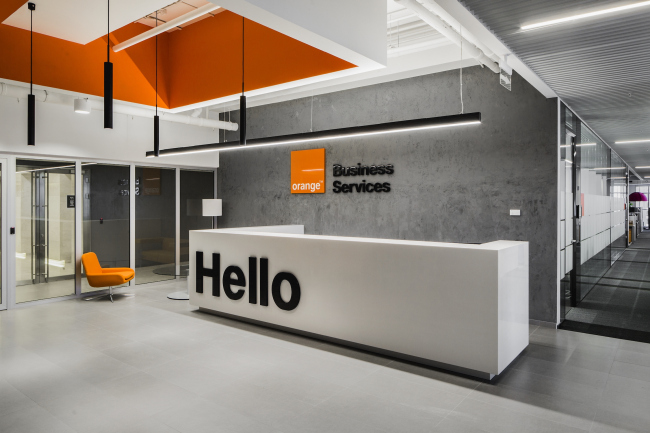
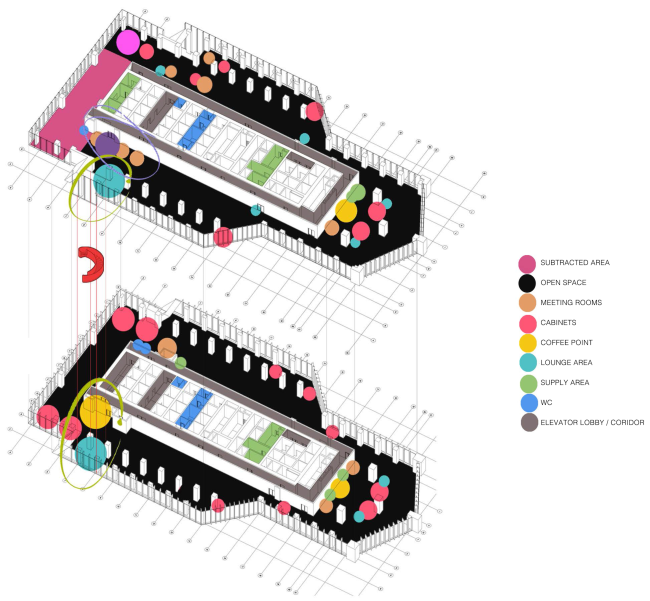
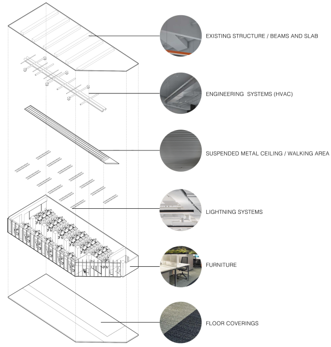
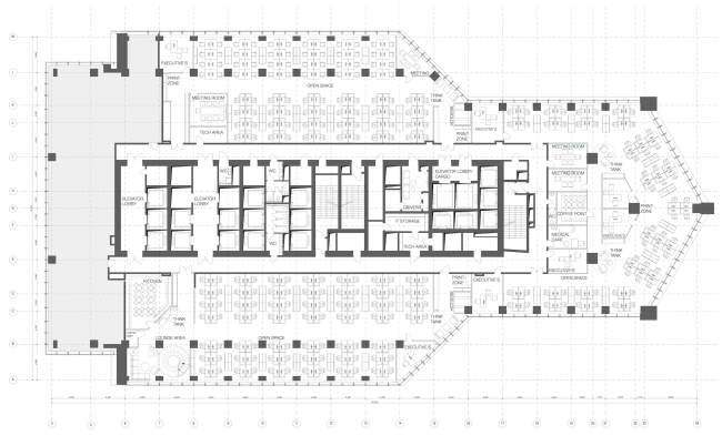
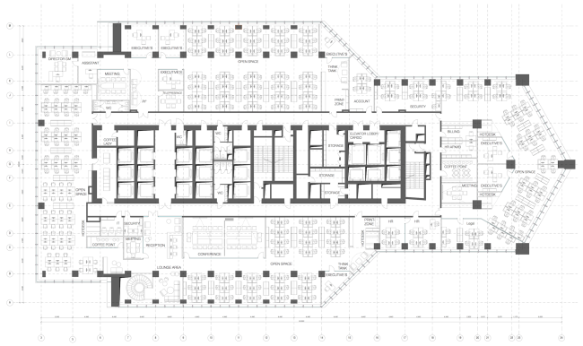
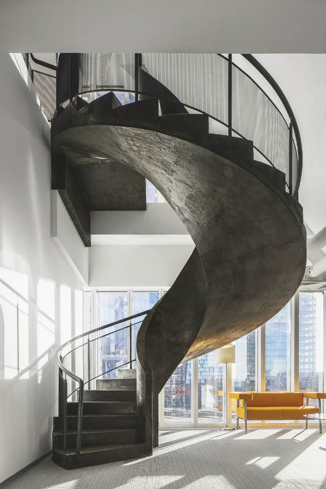
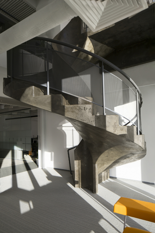
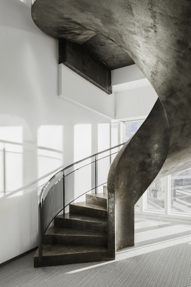
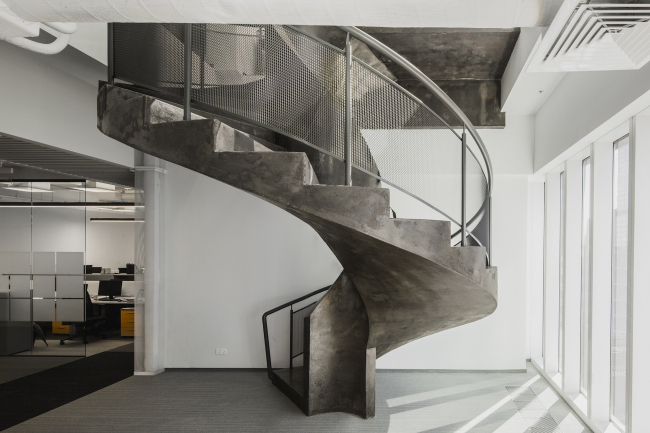
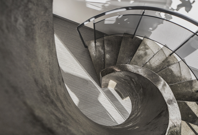
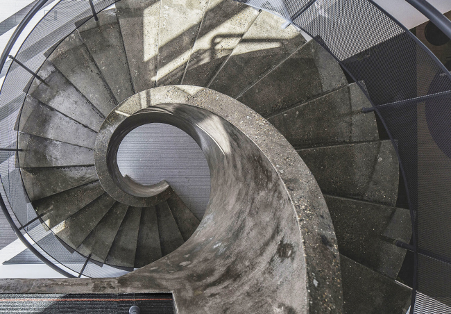
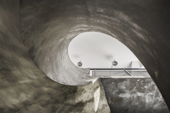
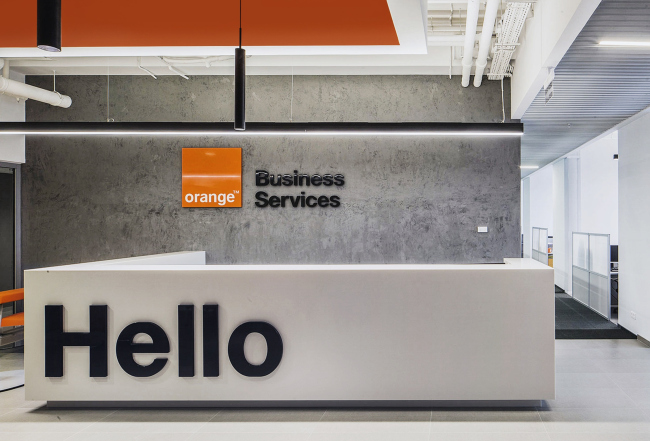
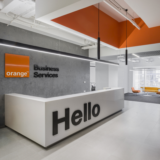
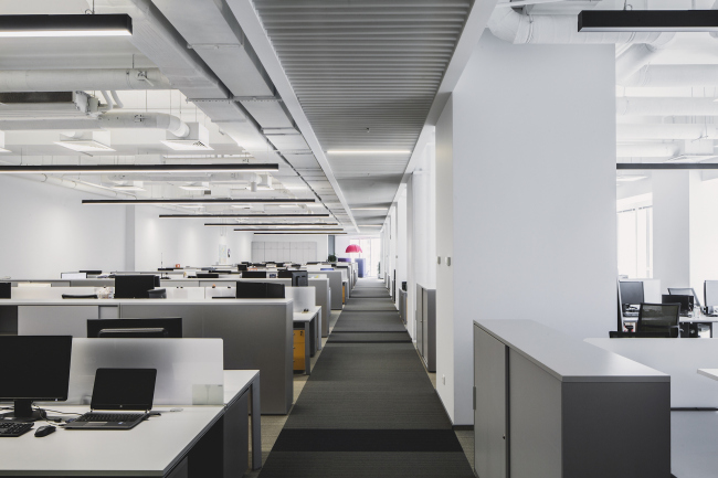
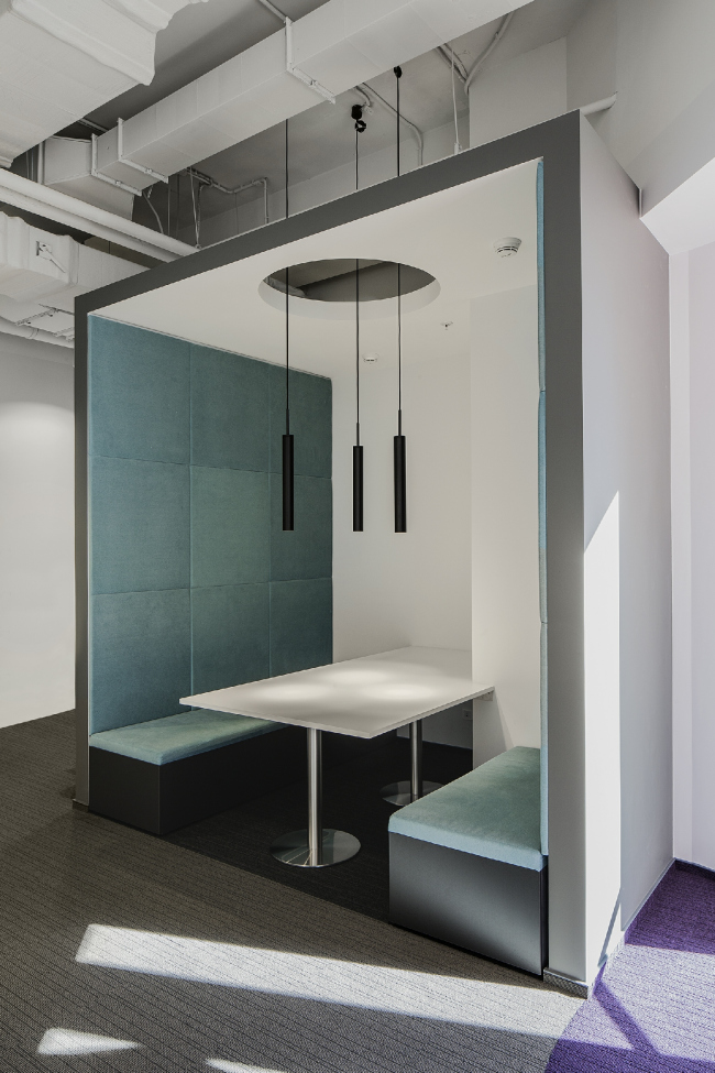
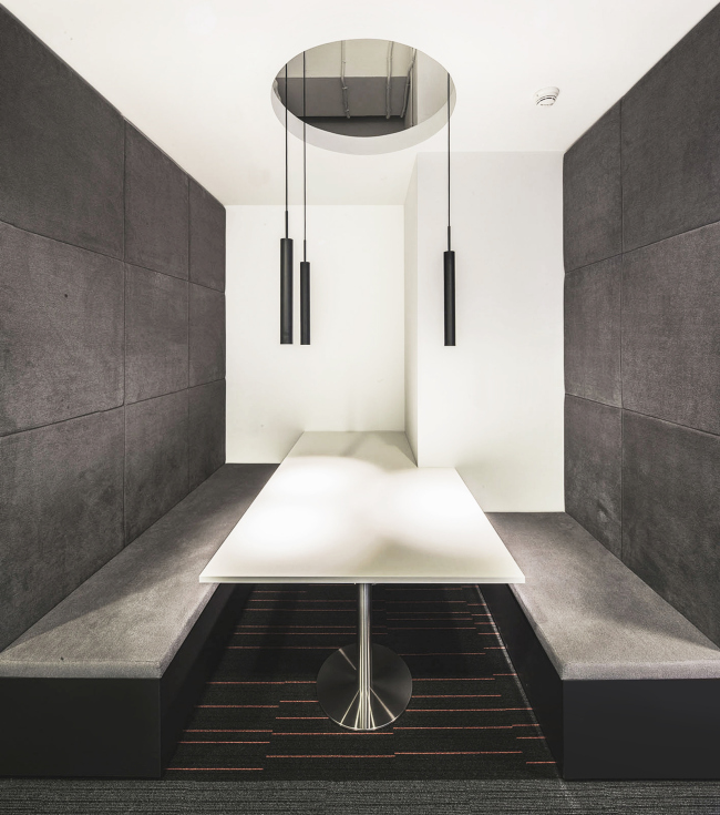
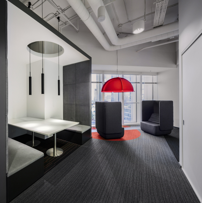
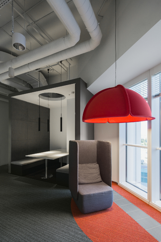
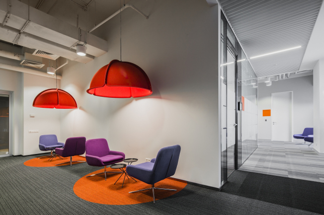
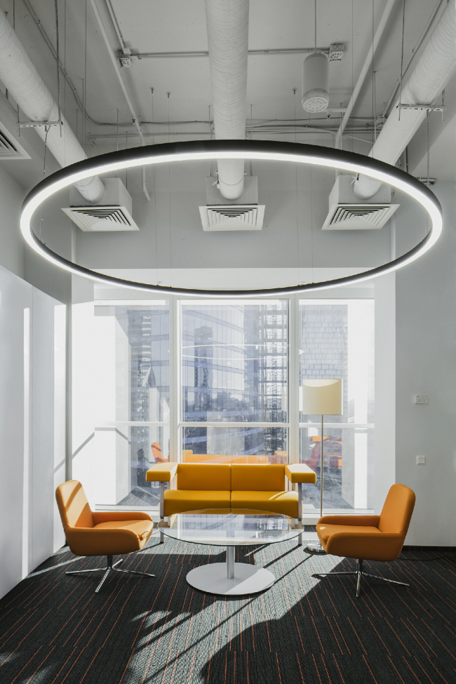
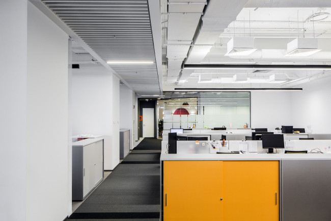
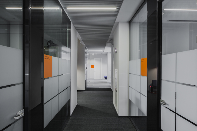
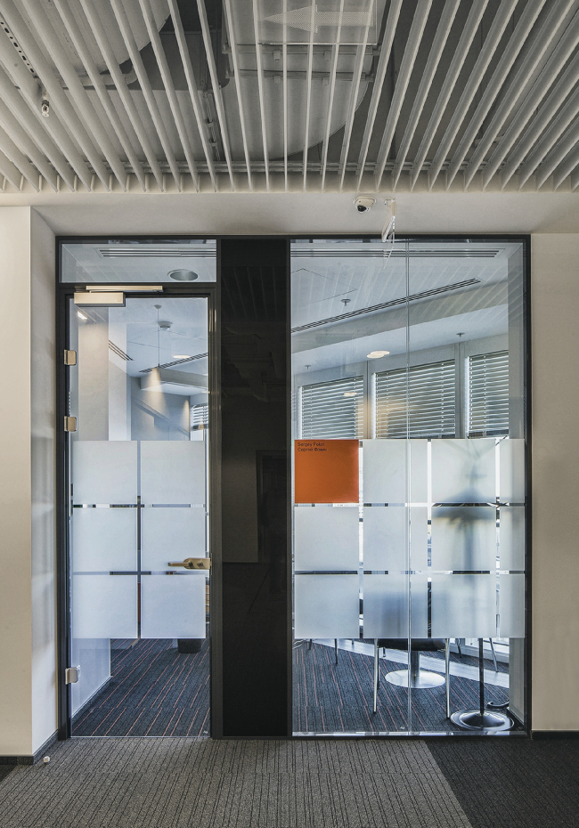
Rigorous prescriptions of the customer’s corporate style did not stop T+T Architects from coming up with individual solutions for the Moscow office of the French company Orange Business Services. Office of Orange Business Services in the Mercury Tower. Implementation, 2016 © T+T ArchitectsAt a first glance, the task of designing the new Moscow office of the international connection provider promised to be quite standard: two floors of a modern business center, a usual set of functional zones, and a classic open space that includes dedicated areas for communication and secluded work; the habitual European democracy of style, reserved and comfortable for employees of any age and lifestyle. The minutely detailed brand book left very little room for experiment. Nonetheless, the 5300 square meters of office premises turned out to be quite capable of housing a few custom-designed solutions, and the place took on a functional yet highly individual character. For its new office, the management of Orange Business Services picked the 10th and 11th floors of Mercury City Tower in “Moscow City” business center. On the plan, each of them remotely resembles a sketchy drawing of a rocket. The resulting striking-looking chamfers became one of the most important elements of the entire inside space but achieving the maximum planning efficiency in such conditions was by no means an easy task. The architects chose a habitual and, given the circumstances, the only possible option: a massive nucleus with all expected engineering lines is surrounded by a single-chunk open space stretching along the entire light front. Due to the fact that the customer, while still at the initial specifications stage, had a very clear vision of the way different subdivisions and departments of the company would interact with one another, they all are aligned into a single chain, so that, upon entering the office, any task is promptly routed through the necessary solution stages, smoothly flowing from one department to another. At the same time, each of these departments remains quite a self-sufficient operating unit with its own zones for communication, brainstorming, recreation, and dedicated work. Office of Orange Business Services in the Mercury Tower. Functional diagram. Implementation, 2016 © T+T ArchitectsOffice of Orange Business Services in the Mercury Tower. Functional diagram of the open space. Implementation, 2016 © T+T ArchitectsOffice of Orange Business Services in the Mercury Tower. Plan of the 10th floor. Implementation, 2016 © T+T ArchitectsOffice of Orange Business Services in the Mercury Tower. Plan of the 11th floor. Implementation, 2016 © T+T ArchitectsHowever, what got in the way of the intended organization of the workflows was the absence of internal connection between the two floors: the public staircase and the overloaded elevators of the high-rise fell short of providing the necessary level of interaction between the divisions. “We at once thought of building an extra private staircase – shares the chief architect of the project Polina Voevodina – Luckily, the two floors had openings in the intermediate floor, and we were able to get the owners’ permission for the construction of a staircase. We considered many options and ultimately settled for a monolith chunk of concrete. From the very start, we planned to leave the material exposed, only covering it with a layer of protective varnish, and thus we paid a lot of attention to the quality of the material and execution. Our contractor stood by his performance, and we got it exactly the way we wanted it”. The architects turned the exposed concrete surfaces into an aesthetic stylistic device, adding a micro cement wall right behind the reception desk. The metallic grid railings complete the “loft” image of the staircase. This device is also supported in the other areas of the office. As a result, the custom-designed object became the true meaningful center of the entire space – and it is deservedly surrounded by the main communication and recreation zone where all the employees and visitors can get together. The kitchen, the coffee point, and the conference hall are also located nearby. Office of Orange Business Services in the Mercury Tower. Implementation, 2016 © T+T ArchitectsOffice of Orange Business Services in the Mercury Tower. Implementation, 2016 © T+T ArchitectsOffice of Orange Business Services in the Mercury Tower. Implementation, 2016 © T+T ArchitectsOffice of Orange Business Services in the Mercury Tower. Implementation, 2016 © T+T ArchitectsOffice of Orange Business Services in the Mercury Tower. Implementation, 2016 © T+T ArchitectsOffice of Orange Business Services in the Mercury Tower. Implementation, 2016 © T+T ArchitectsOffice of Orange Business Services in the Mercury Tower. Implementation, 2016 © T+T ArchitectsOffice of Orange Business Services in the Mercury Tower. Implementation, 2016 © T+T ArchitectsOffice of Orange Business Services in the Mercury Tower. Implementation, 2016 © T+T ArchitectsThe extended working areas (there is a total of some 500 employees working in the company’s Moscow office with no VIP area whatsoever for the top management) required special attention to the issues of soundproofing and acoustic comfort. In addition to the floor coverage and furniture screens, the architects actively used cloth-lined partitions, as well as special furniture. Tall “protected” armchairs and sofas are mostly installed along the window line, and, seated in one of them, one can get completely detached from what is going on in the office. Office of Orange Business Services in the Mercury Tower. Implementation, 2016 © T+T ArchitectsOffice of Orange Business Services in the Mercury Tower. Implementation, 2016 © T+T ArchitectsOffice of Orange Business Services in the Mercury Tower. Implementation, 2016 © T+T ArchitectsOffice of Orange Business Services in the Mercury Tower. Implementation, 2016 © T+T ArchitectsQuite expectedly, the decoration of all the zones uses the corporate orange color and the square logo. However, they are used in an unobtrusive way: stripes on the carpeting, the opaque pattern on the partitions, soft furniture panels, the storage locker doors, and, finally, a special construction mounted on the ceiling above the reception area. At the same time, in the recreation areas the architects introduced other colors as well. Combinations of orange not only with gray but also with violet, red, pale blue, and yellow, were also specified in the corporate brand book but for each of the zones the architects came up with a unique limited set of color combinations. And as for the abundance of squares, the architects set it off with circles of every possible kind. Besides the staircase, the soft rounded shapes were given to the colored inserts in the floor coverage, lights, and pieces of furniture. All this helped to liven up the all-too-reserved color range and the stiff orthogonality of the design solutions. Office of Orange Business Services in the Mercury Tower. Implementation, 2016 © T+T ArchitectsOffice of Orange Business Services in the Mercury Tower. Implementation, 2016 © T+T ArchitectsOffice of Orange Business Services in the Mercury Tower. Implementation, 2016 © T+T ArchitectsOffice of Orange Business Services in the Mercury Tower. Implementation, 2016 © T+T ArchitectsOffice of Orange Business Services in the Mercury Tower. Implementation, 2016 © T+T ArchitectsOffice of Orange Business Services in the Mercury Tower. Implementation, 2016 © T+T ArchitectsYet another challenge was a very tight schedule of the project. Making it within the designated half-year term was possible thanks to the design&build plan that required close cooperation between the architects and the general designer and general contractor – the Pridex company. “Deciding to leave all the engineering lines exposed, we took a certain risk in terms of the quality of our performance – says Polina Voevodina – but thanks to our partners’ special attention to the appearance and the routing of the engineering lines, as well as some specific units and junctions, it all worked out really great!” |
|
