|
Published on Archi.ru (https://archi.ru) |
|
| 20.07.2016 | |
|
A Handmade House |
|
|
Lilya Aronova |
|
| Architect: | |
| Alexander Asadov | |
| Studio: | |
| GrandProektCity | |
|
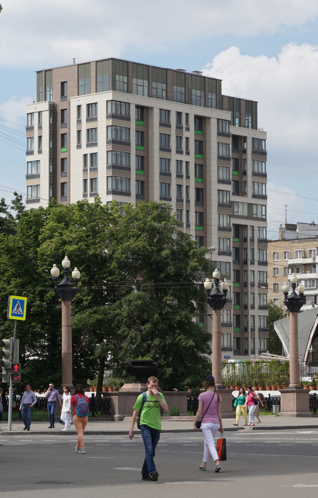
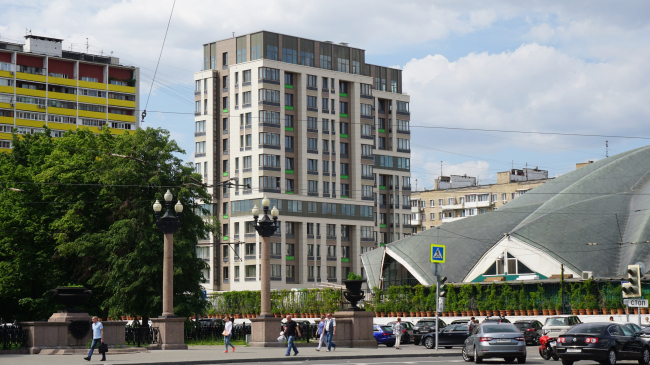
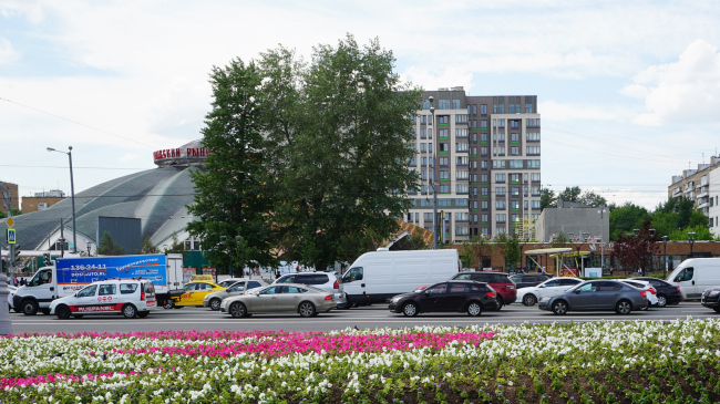
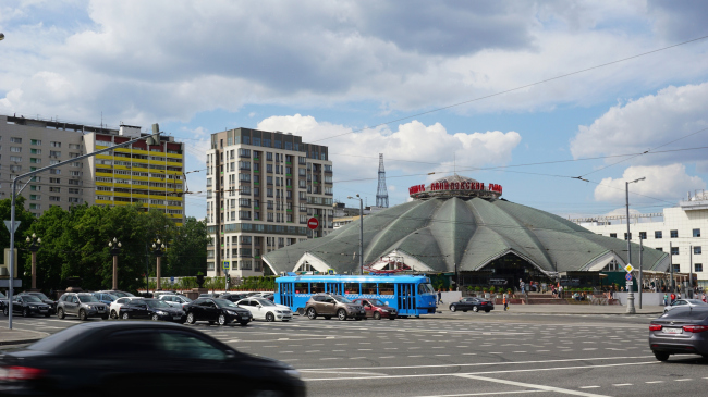
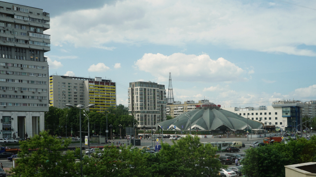
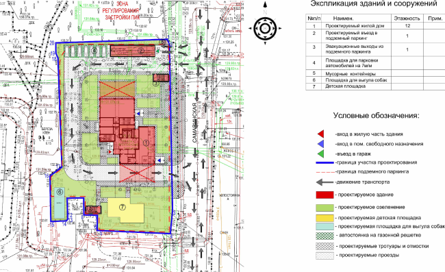
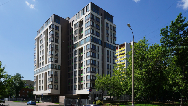
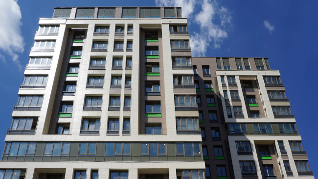
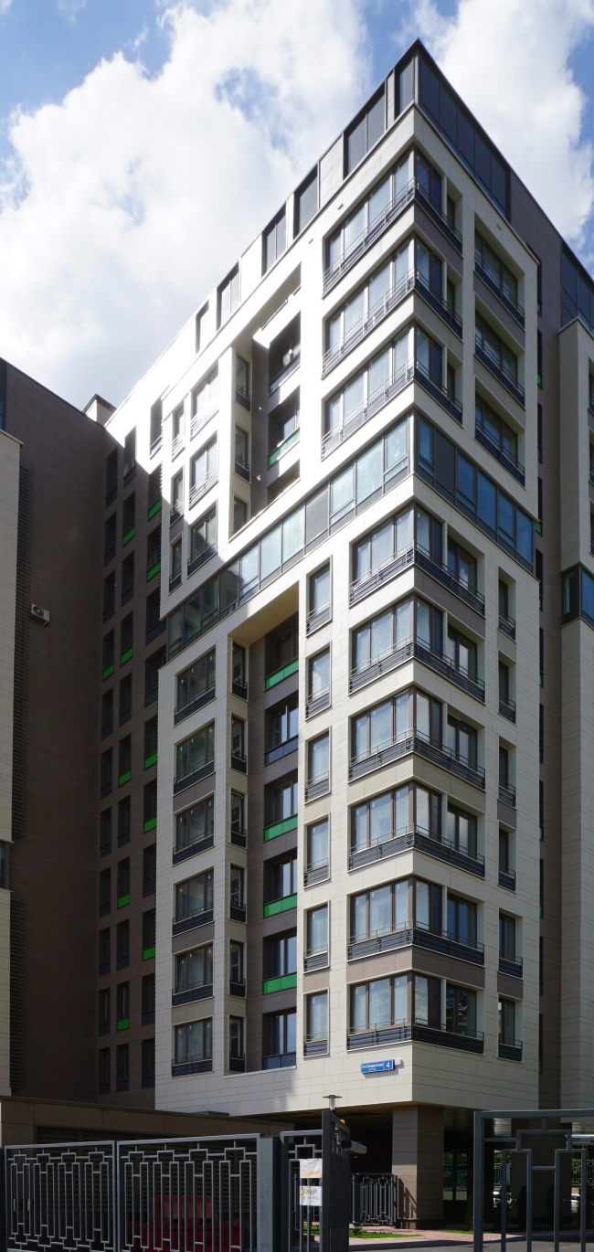
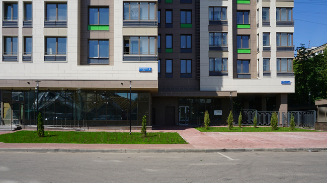
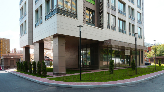
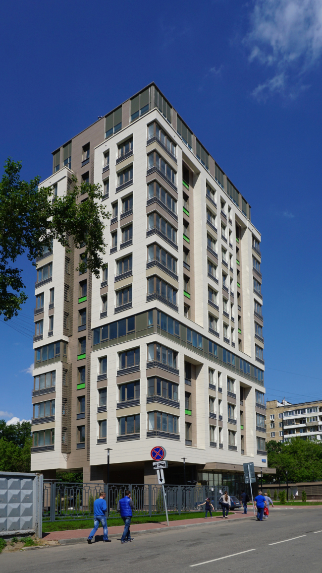
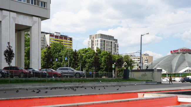
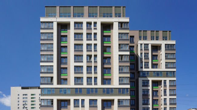
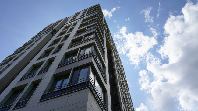
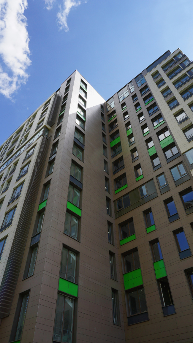
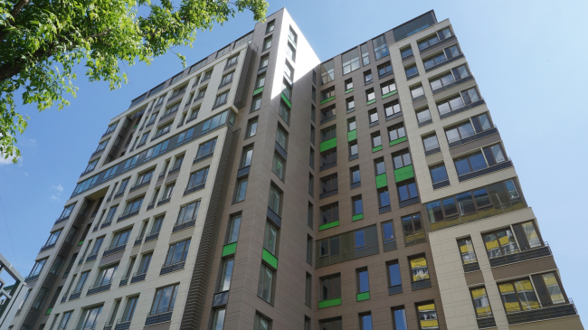
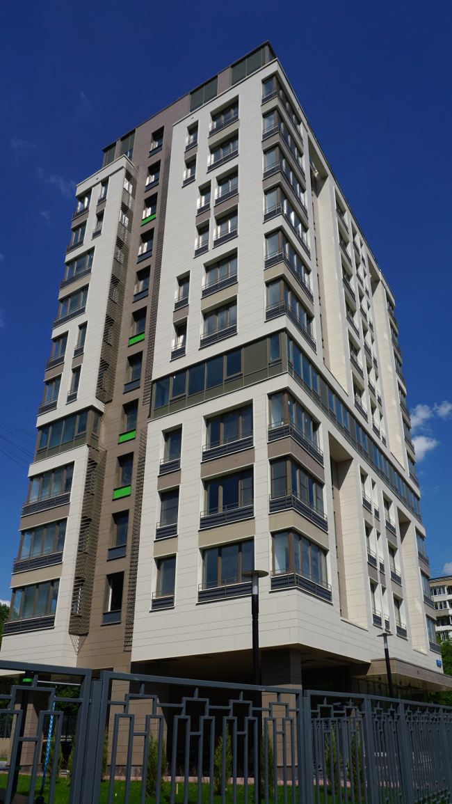
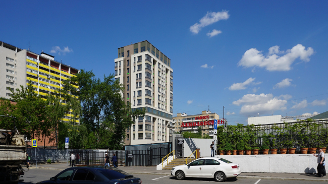
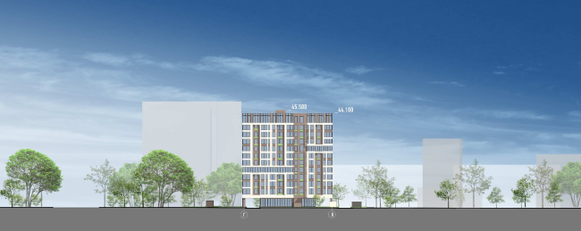
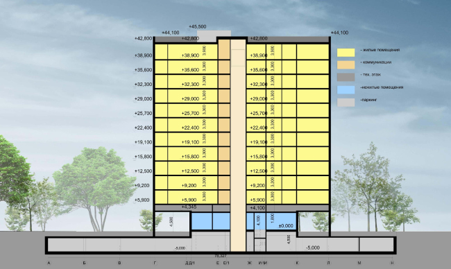
The strip of land between the "Ship" House next to the Tulskaya metro station and the Shukhovskaya Tower got a new building of a compact floor plan, with sophisticated façades and bright colorful accents; a project by Alexander Asadov and Karen Saprichyan. The residential project on the 2nd Samarinskaya Street. Construction, 2016 © GrandProjectCityThe land site on the 2nd Samarinskaya Street behind the Danilovsky Market was until recently occupied by a Moscow City Telephone Network sub-exchange station built back in the 1980's. After it was decided to build a housing project in its place, the investing company organized a mini-competition that was won by Alexander Asadov and Karen Saprichyan. The architects were to inscribe their future project into a rather mottled context - situated on the straight line that connects two such high-profile Moscow's buildings as the Shukhovskaya Tower and the "Ship" House on the Bolshaya Tulskaya Street, the territory of the sub-exchange had only the typical soviet-era "box" buildings for its immediate surroundings. Across from it, over the narrow Samarinskaya Street, the Danilovsky Market is spread out, also a high-profile place of today, one that promotes the new "food" philosophy - there are even guided tours organized to this place - so, this vicinity also adds to the project's prestige. In addition, one of the authors of the project, Karen Saprichyan, has personal feelings about this old area of Moscow: this is where he was born and grew up, and the school that he went to is mere three hundred meters away from the construction site. The residential project on the 2nd Samarinskaya Street. Construction, 2016 © GrandProjectCityThe residential project on the 2nd Samarinskaya Street. Construction, 2016 © GrandProjectCityThe residential project on the 2nd Samarinskaya Street. Construction, 2016 © GrandProjectCityThe residential project on the 2nd Samarinskaya Street. Construction, 2016 © GrandProjectCityRather compact on the plan, the building at all points stays within the limits of the construction blueprint of its predecessor; there are only twelve stories in it, the interesting thing being that, in comparison to its predecessor, the architects had to cut down the height of the building by six meters - this was the stipulation of the architectural council, even though there are plenty of taller buildings around. In spite of the fact that the structure of the building is of a single-section kind, visually it looks like two volumes glued together, one of them being shifted back from the street line. This solution helped the architects, first of all, to break away from the monotonous "box" shape of the building, and, second of all, considerably optimize its inside layout: without violating any of the norms and regulations, they were able to make do with but one staircase and elevator block. Thus, the architects reduced the loss in the residential square footage to a possible minimum, the corridors on all the floors ending up being rather narrow which always goes a long way to create an impression of a comfortable living environment. The residential project on the 2nd Samarinskaya Street. Plan © GrandProjectCityThe residential project on the 2nd Samarinskaya Street. Construction, 2016 © GrandProjectCityThe residential project on the 2nd Samarinskaya Street. Construction, 2016 © GrandProjectCityThe first floor of the building will be occupied by offices, and it will be accessible directly from the street; as for the housing part, the residents will be able to get into it through a landscaped yard, reasonably protected from the traffic noise. The volume of the first level is partially taken out, the building resting on ceramic-granite-coated columns under which a driving entrance for the emergency vehicles is organized. These columns are definitely perceived as accidental or deliberate echo of yet another nearby building that is directly visible from this point - the "Ship" House on the Bolshaya Tulskaya Street. Although the ideas of constructivism were not the number one source that the architects drew their inspiration from, Karen Saprichyan recognizes that "the building's framework is indeed on the constructivist side". Add to this such a dramatic technique as ribbon windows that belt both parts of the building (although at different levels) is, again, a direct rhyme to the famous "horizontal skyscraper". As for the main part of the architectural solution, it uses quite up-to-date elements. The residential project on the 2nd Samarinskaya Street. Construction, 2016 © GrandProjectCityThe residential project on the 2nd Samarinskaya Street. Construction, 2016 © GrandProjectCityThe residential project on the 2nd Samarinskaya Street. Construction, 2016 © GrandProjectCityThe residential project on the 2nd Samarinskaya Street. Construction, 2016 © GrandProjectCityThe residential project on the 2nd Samarinskaya Street. Construction, 2016 © GrandProjectCityAll along the entire height of the building, there are the verticals of glazed stanza balconies - on the corners they look like bay windows. The floor plans are different from floor to floor, the most spacious apartments being situated on the top floors - these are practically penthouses with ceilings up to 4 meters high. Absolutely all the details - such as the places for the air-conditioning units that, instead of the habitual "boxes" have the exquisite shapes of grilles on the bay windows, the railings of the stanzas, and the slender aluminum frames on the perimeter of the windows - all work towards the end of visual enrichment of the façades. "Because of the play of light and shade, the building looks rich and sophisticated, almost like a sculpture - Karen Saprichyan claims - I would say that it looks like a handmade work of art". The residential project on the 2nd Samarinskaya Street. Construction, 2016 © GrandProjectCityThe residential project on the 2nd Samarinskaya Street. Construction, 2016 © GrandProjectCityThe residential project on the 2nd Samarinskaya Street. Construction, 2016 © GrandProjectCityThis comes as no surprise considering the fact that Karen Saprichyan is not only an architect but an artist and a sculptor as well. He paid particular attention to the color set of the façades. The palette is based on the brown color that is there in three of its shades, the interesting thing being that while the street façade is ruled by a light shade (the verticals marking the outlines of the bay windows, the horizontals framing the central window belt), the color of the yard façade is a lot richer and darker. The extra colors are represented by a reserved grayish green shade of stemalite (a kind of smoked glass), and the exquisite gray-and-blue aluminum (in both cases, these inserts cover the intermediate floors). However, what the observer is most likely to remember best of all is the refreshing, like a spring rain, grass-green inserts under the windows, sparingly scattered over the façades, with a picturesque asymmetry. Incidentally, a while ago, they used a color just as cheerful to paint the railings of the stanzas of the neighboring high-rise, so, when set side by side, these two totally unlike buildings form an almost Mondrian-style cheerful picture, especially so in the sunny weather when the reflections of the green inserts in the bay windows are accompanied by the yellow squares of the neighboring balconies and pieces of the blue sky. The residential project on the 2nd Samarinskaya Street. Construction, 2016 © GrandProjectCityThe residential project on the 2nd Samarinskaya Street. Construction, 2016 © GrandProjectCityThe residential project on the 2nd Samarinskaya Street. Construction, 2016 © GrandProjectCityThe residential project on the 2nd Samarinskaya Street. Facade © GrandProjectCityThe residential project on the 2nd Samarinskaya Street. Facade © GrandProjectCityThe residential project on the 2nd Samarinskaya Street. Sectiion view © GrandProjectCity |
|
