|
Published on Archi.ru (https://archi.ru) |
|
| 08.06.2016 | |
|
Biotechnogenic Duality |
|
|
Alla Pavlikova |
|
| Studio: | |
| Arch Group | |
|
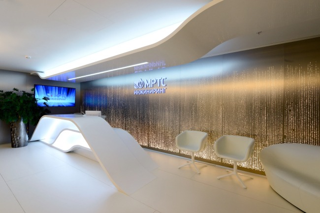
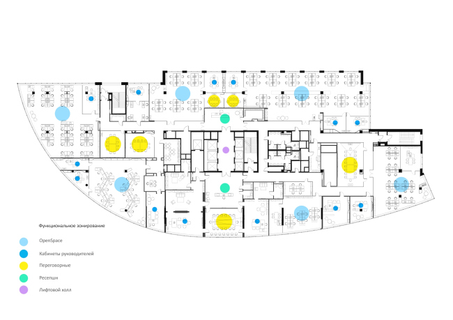
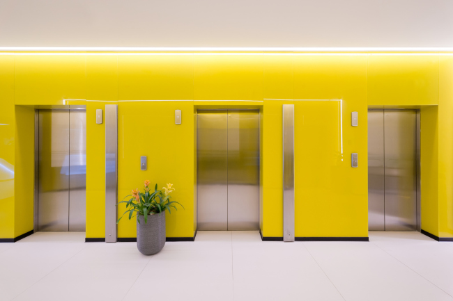
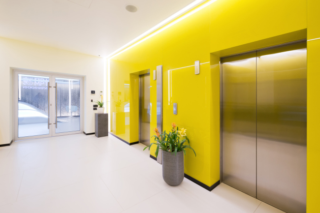
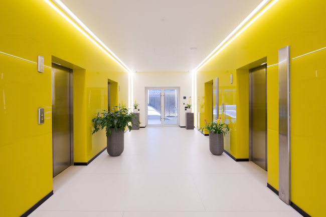
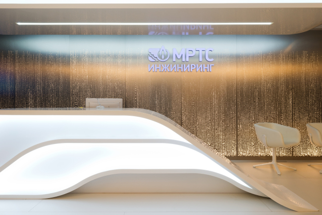
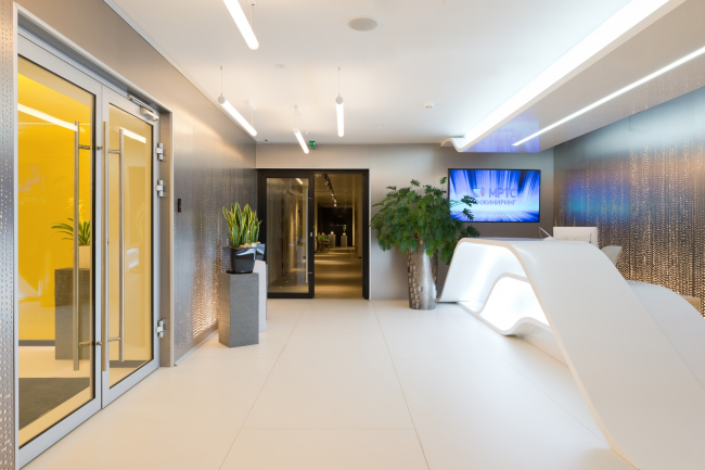
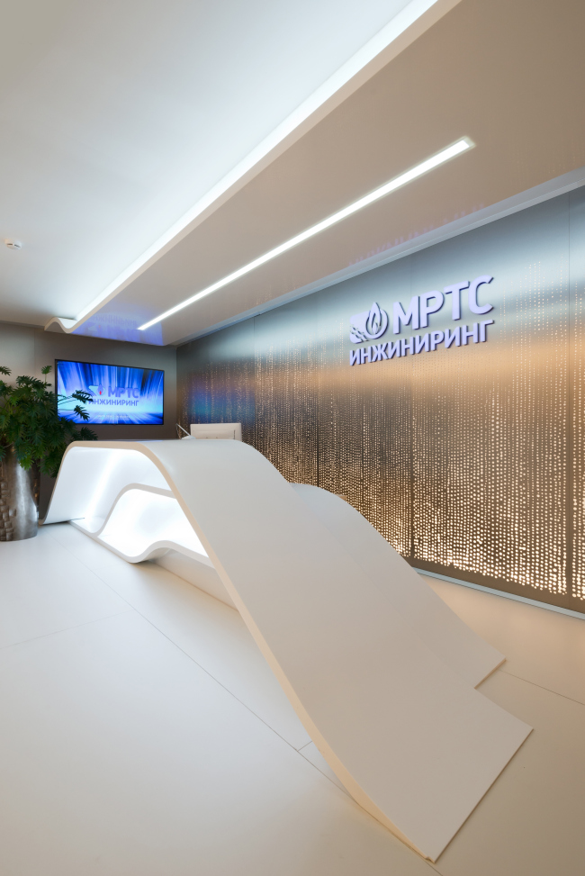
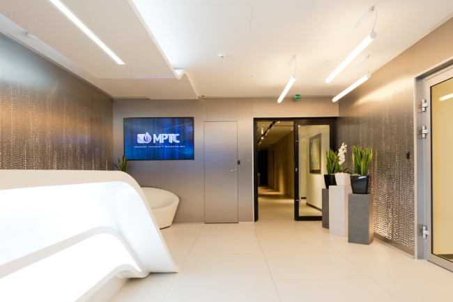
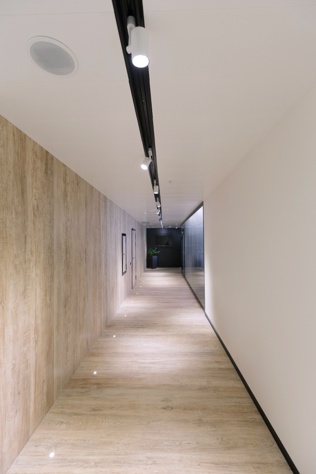
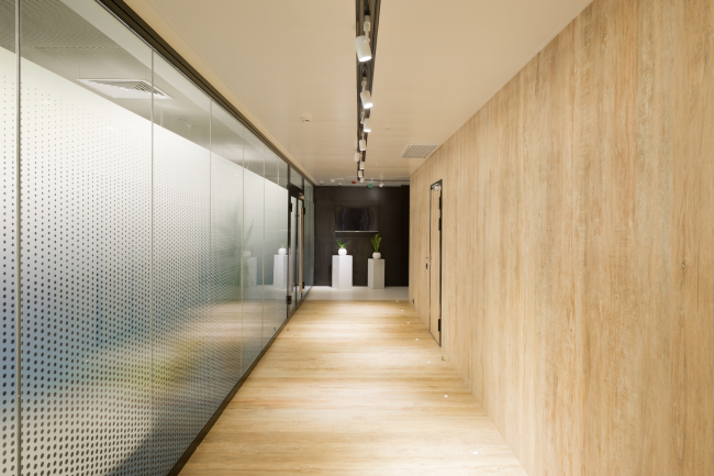
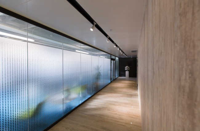
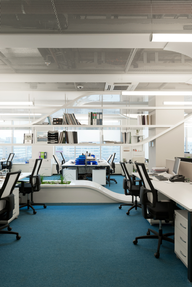
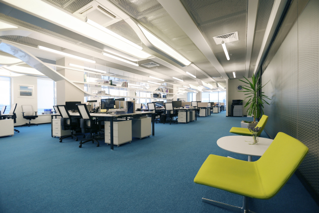
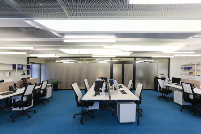
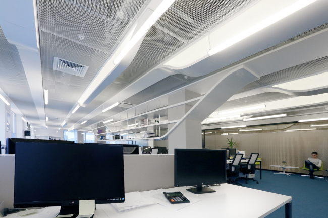
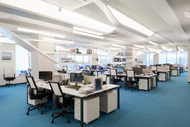
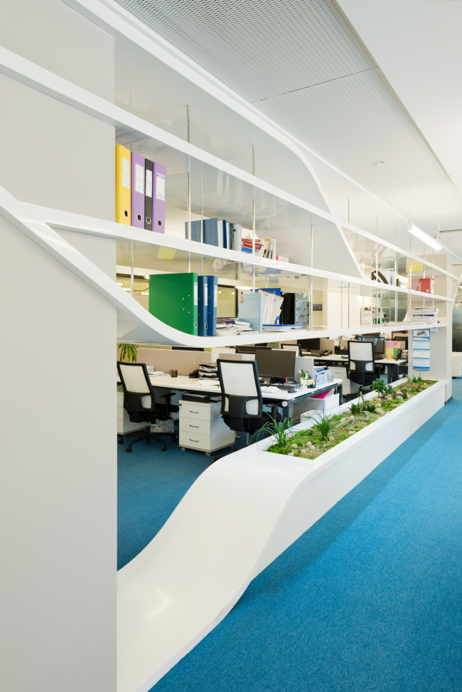
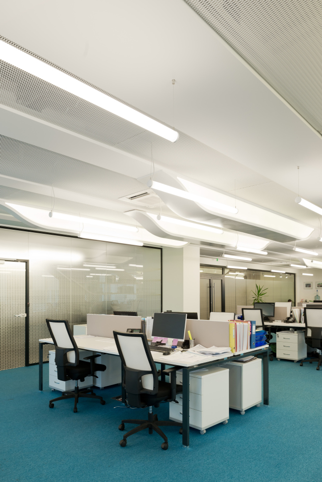
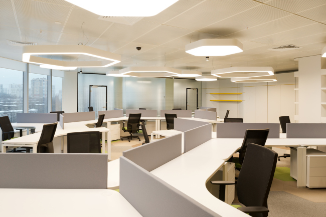
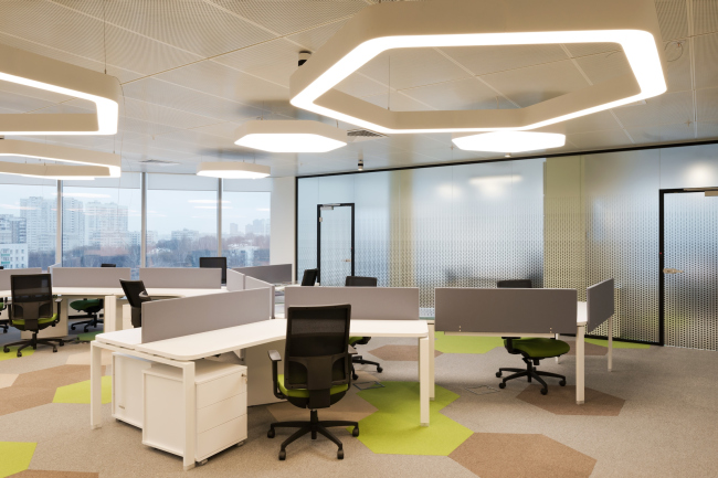
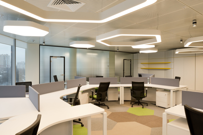
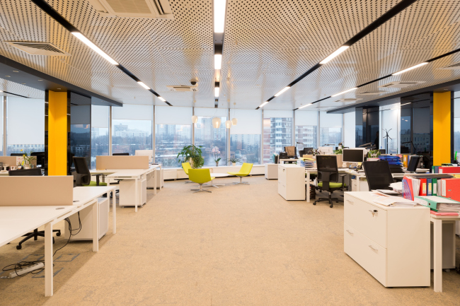
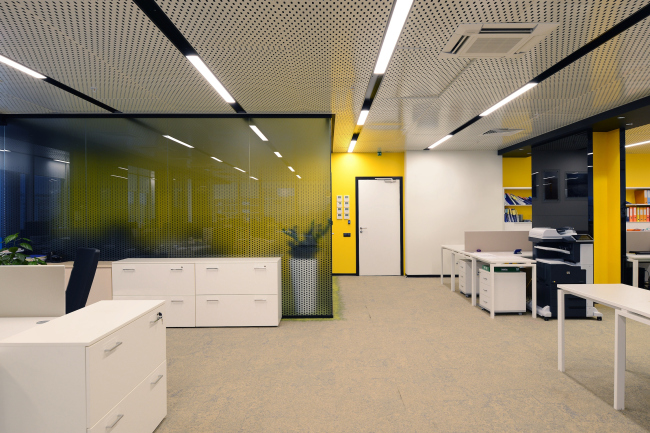
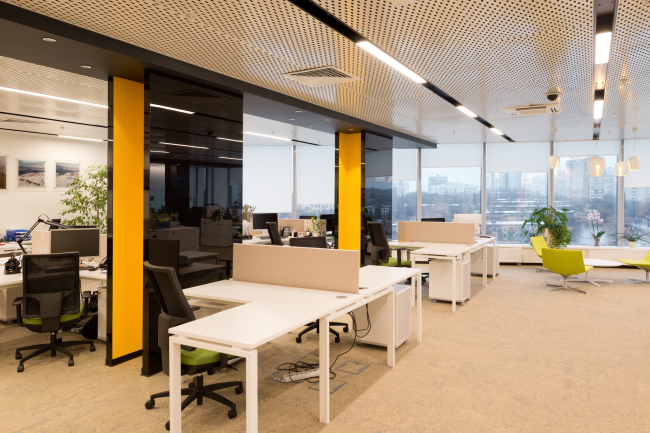
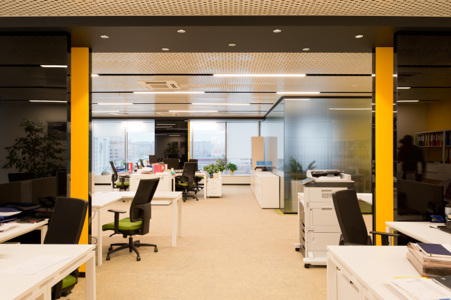
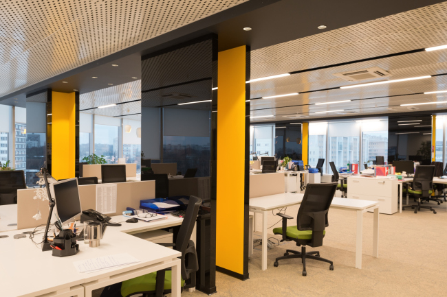
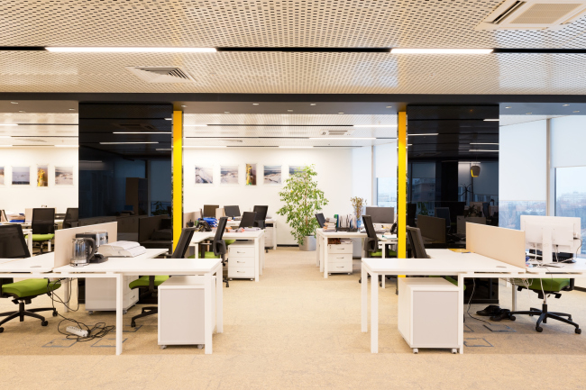
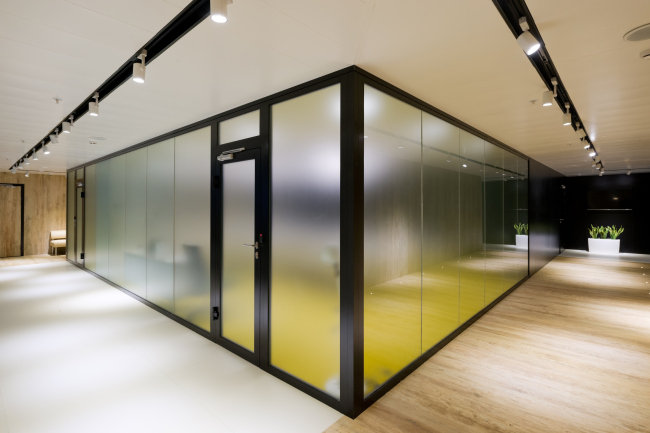
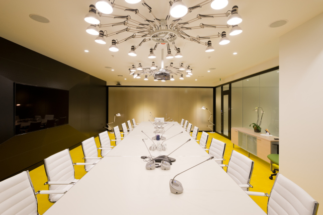
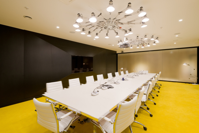
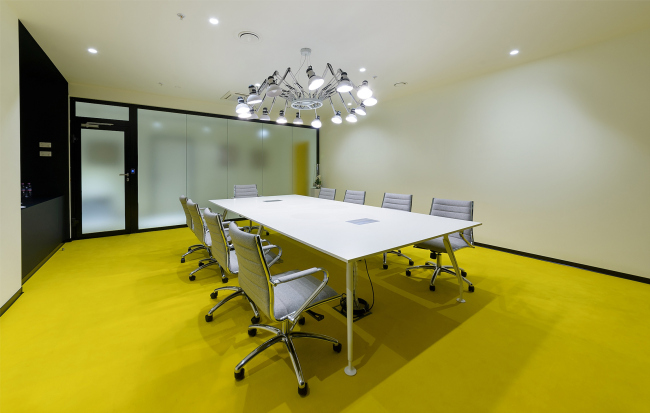
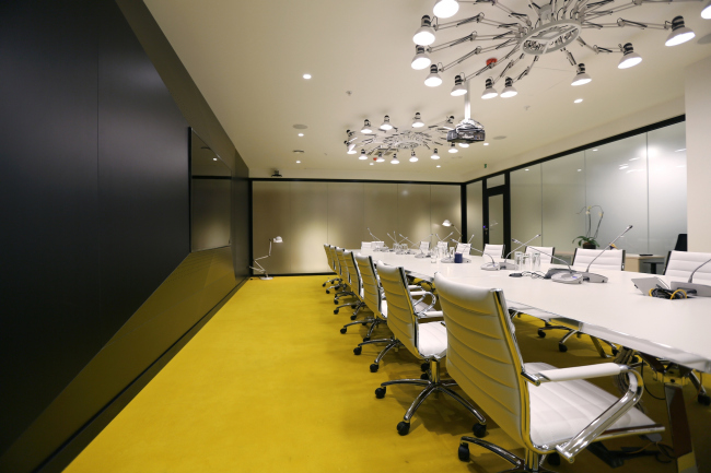
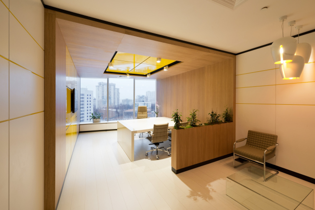
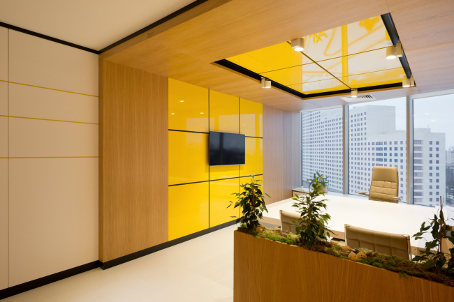
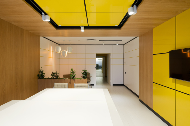
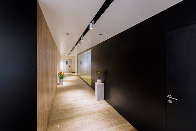
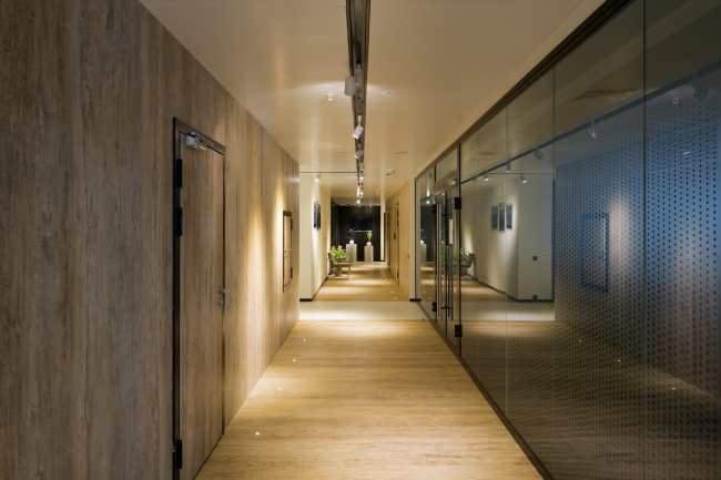
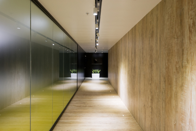
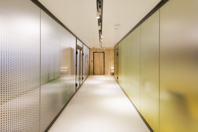
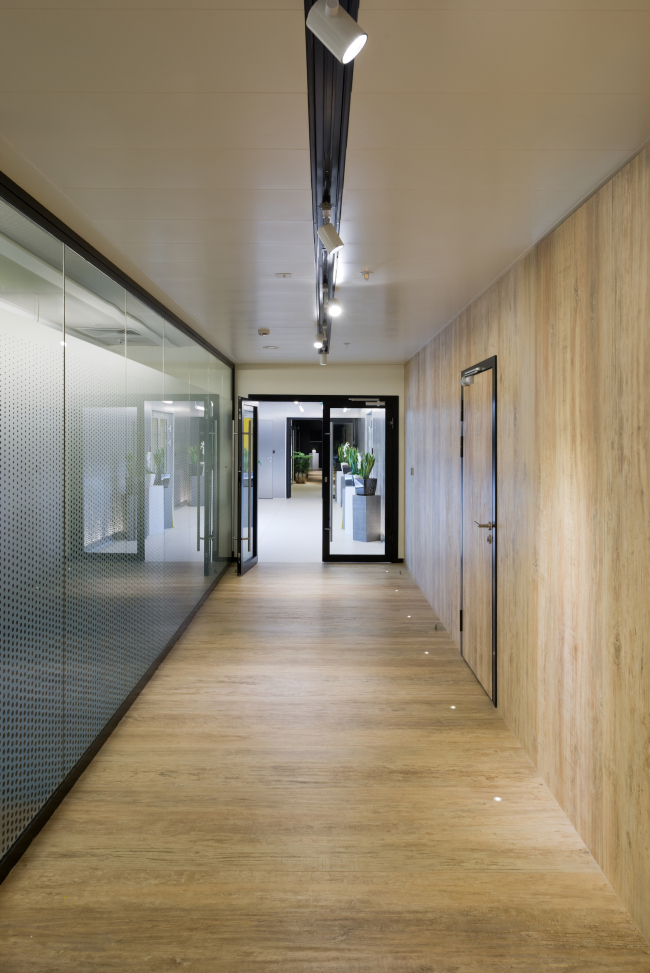
A concept of nature and technology combined in the interior of company MRTS, performing construction of major subsea pipelines. MRTS Office. Implementation, 2015 © Arch groupThe interior has been designed for “Mezhregiontruboprovodstroy” (MRTS), whose specialization is subsea pipe laying and reconstruction. The complicated specifics of the client’s work have in many ways determined the character of the project. The task of the architects of Arch group bureau was not only to build an office, but to represent the company’s image, create a space for work and inspiration for the whole MRTS team. The office, with the total area a bit exceeding 2 000 sqm, is located in a building in the south of Moscow, and occupies the top, ninth floor. However, despite the floor-to-ceiling glazing, the room cannot boast of a marvelous view from the window – all around is a housing development and industrial territories. Another problem is the original layout: tiny offices, narrow corridors and fixed position of the communication core. The architects proposed to transform this so irrationally-used space into a modern, wide open space designed in a single stylistics. They arranged all the working areas along the perimeter of the floor, closer to the light, whereas the central part was allotted for meeting rooms, offices, coffee-points for the employees and two reception zones. MRTS Office. Floor plan © Arch groupA perfectly traditional and maximally convenient layout has obtained a bold and original form. The main idea of the project was a symbolic union of natural and manmade elements. As explained by the authors – Alexey Goryainov and Mikhail Krymov – they tried to play with the idea of “eternal confrontment of nature and man”, in which the man has finally learnt to use the resources of the planet without harming it. This resulted in a contrast of natural and technogenic materials, calm and blazing colors, warm wooden and cold metallic and glass surfaces. You can feel this duality of the interior already in the lift lobby, where the rich-yellow stemalite walls compete with milky-matt horizontal floor and ceiling surfaces. A continuous line of built-in lights creates a soft glow in the whole room, reflected in the glossy surfaces of the glass. The fine line separating the snow-white floor from the yellow walls is highlighted in black, which creates an impression that the walls do not touch the floor. Black has become the symbol of technological effectiveness of the extraction and transport of minerals. Yellow, on the contrary, is associated with sun and sand shore. MRTS Office. Implementation, 2015 © Arch groupMRTS Office. Implementation, 2015 © Arch groupMRTS Office. Implementation, 2015 © Arch groupOn both sides of the lift lobby are the two main office areas – MRTS Engineering and MRTS Holding. The reception faced at the entrance to the main working area reflects the sea theme, so familiar to the employees. Minimum details, metal walls, white ceiling and floor, reception desk and stands for house-plants: all of this shapes a wonderful image – a snow-white ship on the background of waves. It seems that sprays of water are continuously falling down, shining in the sun, and the deck of the ship slightly fluctuates. The authors could achieve this effect by using silvery perforated alucobond with backlight for wall finishing. Round holes of different diameters, lit from the inside, look like small bubbles even close-up. The role of the ship is performed by the reception desk made of corian – it is multilayered, flowing and smoothly growing from the white floor. Above it – like a reflection in water – rises the ceiling construction, with lamps hidden in it. MRTS Office. Implementation, 2015 © Arch groupMRTS Office. Implementation, 2015 © Arch groupMRTS Office. Implementation, 2015 © Arch groupMRTS Office. Implementation, 2015 © Arch groupTwo corridors part both ways from the reception, leading to the work places. They are executed differently, but both in a laconic and clever way. For example, through combination of two finishing materials, that cover not the parallel, but adjoining surfaces, the architects manage to completely transform and turn around the space, cutting it diagonally. The corridors repeat the familiar approach with perforated metal walls. Though the “bubbles and water drops” hide behind the second layer of glass, they do not have to be lit from behind – the light coming from the “open space” is enough. MRTS Office. Implementation, 2015 © Arch groupMRTS Office. Implementation, 2015 © Arch groupMRTS Office. Implementation, 2015 © Arch groupThe floor is divided in several working areas, each with its own character. The interior of the largest room of 480 m² resorts to the sea and ships theme again. The space is founded on the contrast of the bright blue floor, symbolizing the sea, and the volumetric white ceiling, playing the role of the sky. The sky draws the most of attention due to the complex constructions of corian, reminding clouds. Long, wavelike constructions visually extend the room, and besides, serve as framing for the lights and absorb sound. One of them goes down so low, that it turns into a partition, provided with storage places. Under the hanging down construction, whose outlines once again remind of marine vessels, the authors arranged a beautiful planted green area. This not only helps to diversify the space, but also to zone it, making it cozier. Both the partition, hanging from the ceiling, and the ceiling itself were developed according to the authors’ drafts. MRTS Office. Implementation, 2015 © Arch groupMRTS Office. Implementation, 2015 © Arch groupMRTS Office. Implementation, 2015 © Arch groupMRTS Office. Implementation, 2015 © Arch groupMRTS Office. Implementation, 2015 © Arch groupMRTS Office. Implementation, 2015 © Arch groupMRTS Office. Implementation, 2015 © Arch groupThe complex ceiling in the other “open space” holds volumetric hexagonal lamps. As explained by the authors, the hexagonal shape is dominating in the room. It is repeated in the pattern of the carpet flooring with colorful hexagons and in the table constructions. For the other separate department the authors made up a more formal interior, based on the contrast of yellow and black. Here, the leading positions are given to glossy surfaces and geometrical forms. MRTS Office. Implementation, 2015 © Arch groupMRTS Office. Implementation, 2015 © Arch groupMRTS Office. Implementation, 2015 © Arch groupMRTS Office. Implementation, 2015 © Arch groupMRTS Office. Implementation, 2015 © Arch groupMRTS Office. Implementation, 2015 © Arch groupMRTS Office. Implementation, 2015 © Arch groupMRTS Office. Implementation, 2015 © Arch groupMRTS Office. Implementation, 2015 © Arch groupThe authors also found an original solution for the meeting rooms. It should be mentioned that color plays the main role in the office, where the key areas are executed in certain colors, which helps to find one’s way around more easily. The meeting room, just like the lift lobby, is marked yellow. The bright yellow glow can be seen from the corridor through the matt translucent walls. This glow appears due to the yellow carpet flooring. Apart from that, the room looks reserved. Lamps and a projecting prismatic black wall with a large TV screen in its center make the room a bit more futuristic. MRTS Office. Implementation, 2015 © Arch groupMRTS Office. Implementation, 2015 © Arch groupMRTS Office. Implementation, 2015 © Arch groupMRTS Office. Implementation, 2015 © Arch groupMRTS Office. Implementation, 2015 © Arch groupThe second reception is arranged before the MRTS Holding zone, where the management offices are. Their interior, with the emphasized high-status character, differs greatly from the stylistics of the whole office. That is why, the reception zone became a sort of connecting, transitional link. Here, instead of modern, synthetic materials, dominating in the interiors of the employees, the architects apply natural wood; the forms become softer, the furniture – traditional. All walls of the room are clad with wood; the reception stand is also wooden. White matt and black glossy MDF panels serve only to highlight the noble texture of wood. Light plays a significant role in the formation of the space: multiple dots of light are built in the ceiling, the walls are underlined with linear lighting that traces the pattern of the panels on wooden surfaces. The company’s logo is also glowing on the reception stand. Another noticeable room in this office is the main meeting room with a large floor-to-ceiling window. The dominating accents here are the white table of corian and an “island” of green plants in the center. A big square “window” made of MDF panels is fixed on the ceiling and colored in yellow gloss. MRTS Office. Implementation, 2015 © Arch groupMRTS Office. Implementation, 2015 © Arch groupMRTS Office. Implementation, 2015 © Arch groupThe hard and not very poetic work of the client inspired the architects to create a romantic and, at the same time, austere and practical interior, which became an icon of the company. The architects are convinced that the versatile interior that they got in the end fully reflects the modern spirit of the company, its unconventional approach to business, special care for the environment and advanced technology. The employees, who call the new office their home, agree with it as well. MRTS Office. Implementation, 2015 © Arch groupMRTS Office. Implementation, 2015 © Arch groupMRTS Office. Implementation, 2015 © Arch groupMRTS Office. Implementation, 2015 © Arch groupMRTS Office. Implementation, 2015 © Arch group |
|
