|
Published on Archi.ru (https://archi.ru) |
|
| 25.05.2016 | |
|
Borderline House |
|
|
Julia Tarabarina |
|
| Architect: | |
| Nikita Yavein | |
| Studio: | |
| Company: | |
|
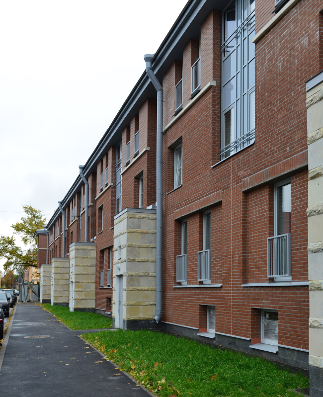
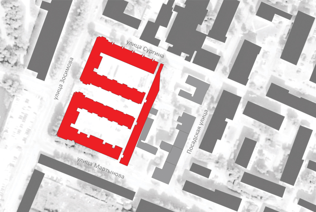
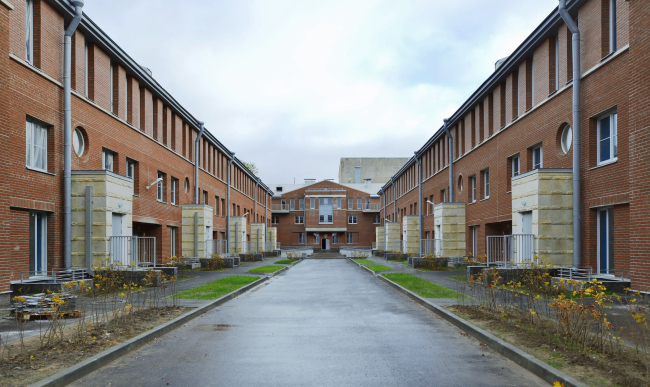
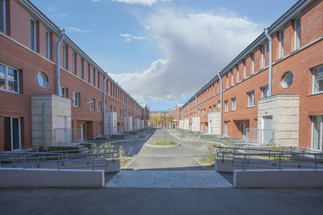
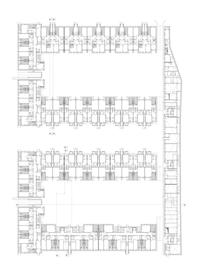
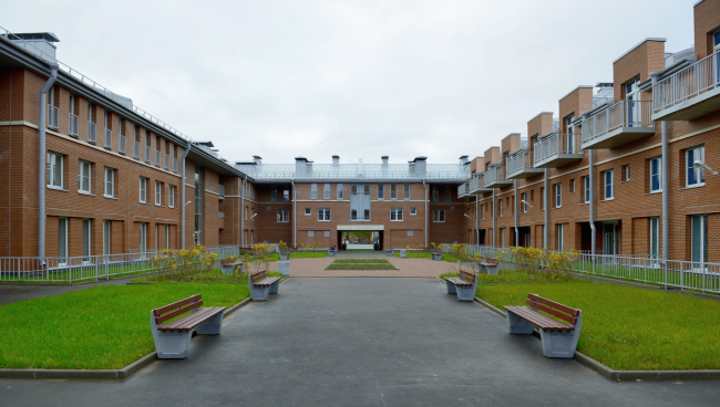
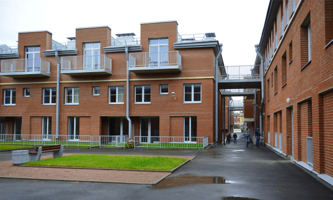
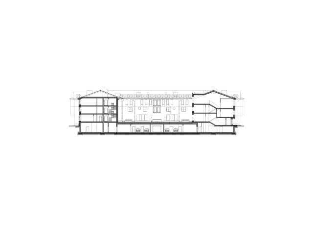
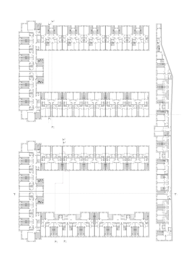
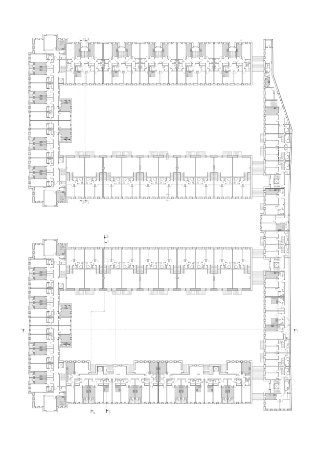
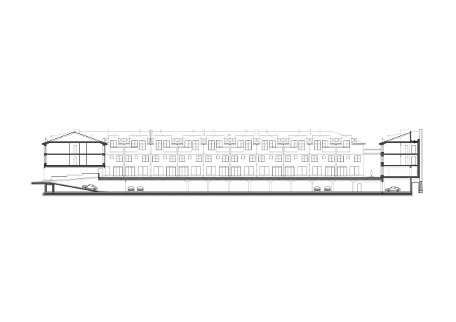
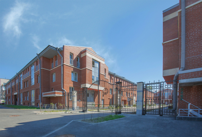
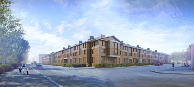
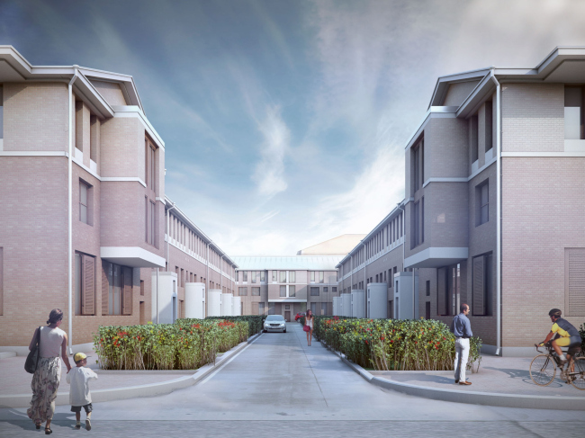
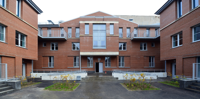
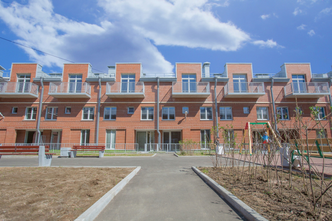
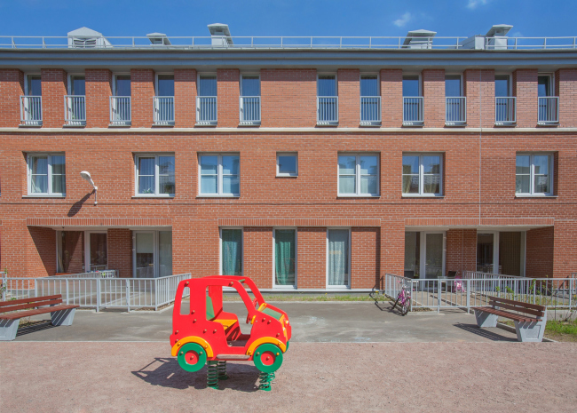
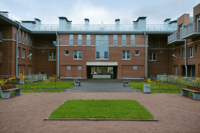
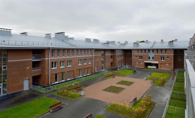
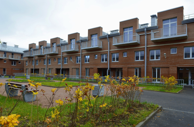
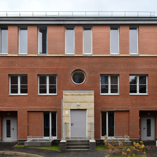
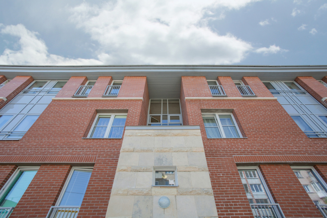
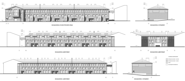
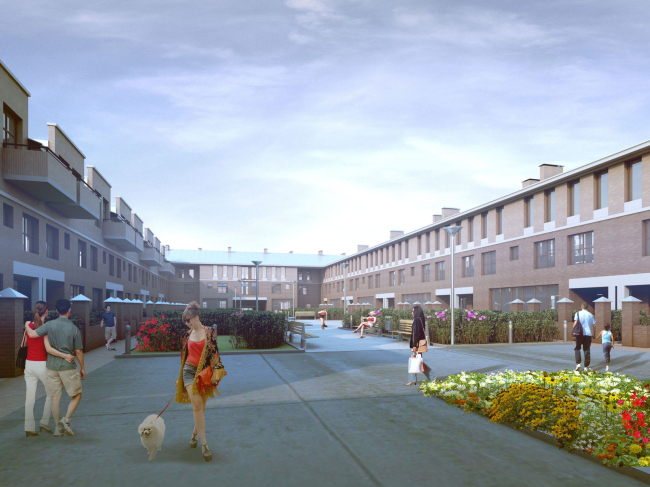
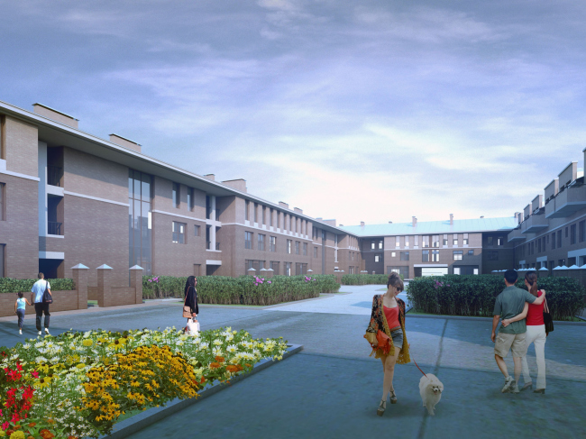
The residential complex that Nikita Yavein built in Kronstadt is low-rise and cost-efficient but, at the same time, it has a lot of unusual and interesting points to it, all the more so if we are to consider this project in the context of the "standardization" trend that is so characteristic of the Russian residential construction today. "Amazon" residential complex. Side facade. Construction, 2015 © Studio 44The city of Kronstadt is a place that is unusual in itself. This island strung on the dam supporting the Saint Petersburg Ring Road is a garrison town and at the same time historical and architectural monument. A fragment of Saint Petersburg, pristine and upright, even if a little bit battered, but its miniature version, very much like a scale model, mostly three stories high… At the same time, the outskirts of the town are spoiled a bit by the inclusions of the soviet-era silicon brick houses, crude fences, and checkpoints of a much-too-military appearance. It was exactly in such a place, between a long building of the so-called "defense barracks", built in the early XIX century, and the cozy Posadskaya Street - but also next to untidy fences and unkempt five-story affairs - that the new residential complex appeared, bearing the name of "Amazon", characteristic of our days but still not a wild fantasy of one of the developers but a namesake of one of the local water channels. We shared about this residential project back in 2013 when its construction was drawing to a close. Now it is completed, and, judging by the photos, the deviations from the original idea are minimal. The architecture of the complex is responsive to the peculiarities of the outskirts of the historical Kronstadt. First of all, the complex is only three stories high, with a one-level parking garage that (because of the place's complex hydrology) shows up a meter and a half above the ground, thus getting called "semi-underground". The three floors were, first of all, conditioned by the height restrictions of the protected zone that the town of Kronstadt is: they echo the height of the old barracks and the Posadskaya Street. However, I could venture a guess that "pulling up" the height of the buildings and increasing the number of floors would not be all that difficult in this case - with the already-mentioned five-story houses and the Stalin-era and a bit late-classicism house of the officers' families standing nearby. There are four-story houses even in the next yard. However, Nikita Yavein got back to the "roots" scale of the Posadskaya Street and "stretched" the building typology that it sets westward where, behind a fence though it is, the sea is spread. And the low-rise houses of the same kind that stand next to the sea remind of Holland where such two and three-story townhouses are quite a common sight at the of outskirts of many cities. In a word, as if following the dream of Peter the Great, a fan of all things Dutch, from boots to boats, this place got yet another contrast shade - the historical and geographical one. God only knows whether this fragment of a sea fortress will turn into a "piece of Holland" - but, as far as the scale of the project goes, this can already be considered a good start. "Amazon" residential complex. Location plan © Studio 44The plan of the complex is a direct descendant of Saint Petersburg's courtyards and it follows the contemporary "quarter planning trend". The yards, however, are unusually long, two of them being closed almost completely with the exception of a rear side pedestrian passage and an emergency driving entrance across from it; the middle yard being open to the Zosimova Street and looking like the court d'honeur of a large Saint Petersburg tenement of the early XX century. The axial "square" courtyard, however, interacts with the Posadskaya Street as well that stops the quarter from the east side: if one is to exit the complex, turn right, then right again, and look at the Posadskaya Street from the point where it crosses the Surgina Street, he will see a similar lineup of houses, long lawns, and a fronton in the perspective. This place, however, is pretty far away, so the architectural rhymes turn out to be not visual but rather speculative and contextual; this looks like an "inside charade" for those who is ready to guess that the architect sort of "grew" a semblance of the "provincial Saint Petersburg" inside the nucleus of his project. "Amazon" residential complex. Central courtyard viewed from the Zosimova Street. Construction, 2015 © Studio 44"Amazon" residential complex. Central courtyard. A look at the Zosimova Street. Construction, 2015 © Tatiana Strekalova, Studio 44But let us take a look at the complex from the inside. In this day and age, when experimenting with typology seems to be left in the past, ousted by the standardized residential projects, this house is virtually a daring experiment. It's not that something entirely new and groundbreaking was invented here - but the apartment range here is rather wide, as if designed in the spirit of the modern European ideal that strives to bring the various social levels closer together. The most spacious apartments, from 70 to 100 square meters, are placed in the quietest transverse volumes between the court d'honeur and the inside yards. In this part of the complex, the three floors have in them to apartment tiers, three half-levels each, connected with staircases. The apartments on the first floors are accessed from the "square" courtyard on a level with the city pavement; the doors are hidden in deep niches. Getting inside, one passes from the entrance lobby to a room of the first tier or goes up the staircase a meter and a half up to a larger room that provides an exit to the courtyard resting on top of the underground garage that stands up and out, as we remember, a meter and a half above the ground. In the yard, these apartments have their own little gardens, the entrance to which is designed in the form as a deep stanza balcony from where, hopefully, people will comfortably watch the Kronstadt warm summer rain. The room that has an exit to the yard is in fact a drawing room with a kitchen adjoining it. Ascending the staircase another meter and a half, we find ourself in the master bedroom, already on the second floor. It takes up but three rooms all in all. "Amazon" residential complex. Plan of the 1st floor © Studio 44"Amazon" residential complex. Inner courtyard. Construction, 2015 © Studio 44"Amazon" residential complex. Inner courtyard. To the left: stanzas and little garden belonging to the large apartment. On the right: suspension bridges to the "wall" house. Construction, 2015 © Studio 44"Amazon" residential complex. Section view © Studio 44The entrance to the apartments on the second floor is organized on the side of the "square" yard as an tambour sticking out, from where a two-flight stairway leads to a landing for two apartments, left and right. These apartments have four rooms each, and they are larger. First we get into the living room overlooking the yard, just like on the first floor, then ascend the stairs to the two rooms overlooking the square (these can be possibly used as bedrooms); still a little bit higher, there is yet another spacious room that can also be used as the living room or the master study, the room has a balcony overlooking the yard. The apartments on the first floor are perceived as the Italian piano terreno, while the upper ones - as piano nobile; they look like the top deal of this residential project, even if difficult to get to by the staircase. The structure of the inside "elite" units is sectional. The structure of the outside units is designed in a more fractured manner; a-room-and-a-kitchen apartments alternate here with tiny "pencil-box" studios. To compensate, this section has an elevator, and the apartments of the first floor are raised above the ground to the height of the yard pavement level; the street is commanded by quite tiny stanza balconies. The narrow "fence" building that separates the complex from the unkempt neighboring territory also has planning peculiarities of its own. It includes an elevator, three-room and two-level apartments, connected inside by an almost-spiral staircase. The northeast sidewall of this unit, one that is turned to the Surgina Street and adjoining the jagged border of the land site, has a Saint Petersburg-style cutaway - which, again, forms a "pencil-box" apartment, only a double-room this time and enriched by a comparatively large stanza on its sidewall. The longitudinal units, especially the "fence" house, show elements of "corridor" gallery planning. "Amazon" residential complex. Plan of the 2nd floor © Studio 44"Amazon" residential complex. Plan of the 3rd floor © Studio 44"Amazon" residential complex. Section view © Studio 44Some diversity of the plans in combination with their predominant modesty, to the point of being self-effacing at times, fully correlates with the notion of a historical city, both Saint Petersburg where one can encounter lots of different things, and the Dutch or maybe even British examples with their abundance of inside staircases. But also, somewhere at the back of one's mind, there lurk the avant-garde experiments with their love of corridors and miniature studios, diversity of combinations and planning options. One should hardly mention that in the current Russian situation, very obstructive to any experiments, this project looks very much like one of its kind - more, it looks like it was born out of some weird combination of conditions of a Kronstadt (military?) commission, some "borderline" specifications because it stands literally on the windowsill of Russia's "window to Europe", as Saint Petersburg is commonly called in this country. Some part here, of course, must have been played by the beliefs of Nikita Yavein, an architect who is very much into avant-garde and experiments. From the point of view of its outward appearance, the project looks rather ordinary at first sight. Furthermore, the combination of red brick with frontons and the jagged, sometimes to the point of being rough, outlines will quite possibly scare a snob away. What the architectural snob will see first of all will be the project's resemblance to Moscow-area "wannabe" castles - which will drive him away, disgusted. He would be wrong to run away, though. The most "scary" thing here is the red color of the bricks - yes, over the recent years we've grown allergic to it. However, taking a closer look, one will see that this red has in fact two shades of color: higher up, at the attic level, it is lighter. The railings are painted gray, and one would want the opaque glitter of pure metal; the rainwater pipes are exposed. In addition if one is to compare the complex to the original project he will see that some of the details were sacrificed in the construction process in order to cut costs. One can only lament the absence of the wooden inserts and the striped shutters that could have manifold enhance the feeling of class and quality of the decoration job and European associations. And – show me a Russian architect who has not run into such problems! But then again, the framework of the original idea is undoubtedly there. "Amazon" residential complex. Central courtyard viewed from the Zosimova Street. Construction, 2015 © Tatiana Strekalova, Studio 44"Amazon" residential complex. Project 2011-2013 © Studio 44"Amazon" residential complex. Project 2011-2013 © Studio 44"Amazon" residential complex. Central courtyard. Construction, 2015 © Studio 44To my mind, this is exactly the case when a not at all glamorous house is truly rich in high-quality architecture. In addition to the already described diversity of the apartments, the façades are interested in their polyrhythms of recessions, protrusions, niches, and cutaways. The proportions of the windows change from the narrow verticals, gathered in a square "lath" pattern in the bottom part to the ones devoid of fascias on the third floor and covered with the flat cornice or the roof very much like the teeth of a fortress wall; the latter are echoed by the attics in the yards - all these devices put together play the inevitable "fortress" theme of Kronstadt. "Amazon" residential complex. Inner courtyard. Construction, 2015 © Tatiana Strekalova, Studio 44"Amazon" residential complex. Inner courtyard. Construction, 2015 © Tatiana Strekalova, Studio 44"Amazon" residential complex. Inner courtyard. Construction, 2015 © Tatiana Strekalova, Studio 44"Amazon" residential complex. Inner courtyard. Construction, 2015 © Tatiana Strekalova, Studio 44"Amazon" residential complex. Inner courtyard. Construction, 2015 © Tatiana Strekalova, Studio 44However, what brings out the best in these façades is, to my mind, the white stone inserts. Some of them - the small obviously decorative ones – also had to go. The reserved and brutalist conception tilted once again in the direction of simplification. However, what remained was the cornice that separated the attic floor from the rest of the building and the large snow-white "slabs" that visually support both the arches of the emergency driving entrances and the bay windows. What is important here is the fact that the authors were able to keep the snow-white coating on the entrance tambours clad in Nikita Yavein's favorite "anti-rock-face" where the smooth polished stone alternates with what indeed is the "rock-face" coating. In conjunction with the sun tubes that light the staircases (originally, they were not there in the project, they got added along the way) - the main courtyard took on some unexpected Rome-like quality. These rugged strips fill the project with a whole new meaning framing both the "square" yard and the wall of the complex that runs along the Zosimova Street. "Amazon" residential complex. Fragment of the facade. Construction, 2015 © Tatiana Strekalova, Studio 44"Amazon" residential complex. Construction, 2015 © Tatiana Strekalova, Studio 44Saying that the house is not that simple would probably be an understatement. It is mesmerizing. It reminds of the postwar construction that the legend ascribes to "captive Germans": such houses are quite common in many Russian cities, for example, in Tver; they are two or three stories high, some of them sport frontons. It puts one in the mind of the suburbs of European cities, not just Dutch, and even not just overbuilt with townhouses - for example, the district of Vaksali in the Estonian city of Tartu with its Alvar Aalto memorial house is resonant with the complex under study with its combinations of glass vertical with tiny square windows, wide range of shapes, and the hints at the classic elements of the avant-garde "inside-out". In a word, it is an interesting house. It stands up against the Russian tradition of inside simplification of the dwelling combined with its outward brightness; which, probably makes it ultimately so valuable. "Amazon" residential complex. Facades © Studio 44"Amazon" residential complex. Project 2011-2013 © Studio 44"Amazon" residential complex. Project 2011-2013 © Studio 44 |
|
