|
Published on Archi.ru (https://archi.ru) |
|
| 19.05.2016 | |
|
Breaking the Pattern |
|
|
Maria Fadeeva |
|
| Architect: | |
| Vera Butko | |
| Anton Nadtochiy | |
| Studio: | |
| ATRIUM | |
|
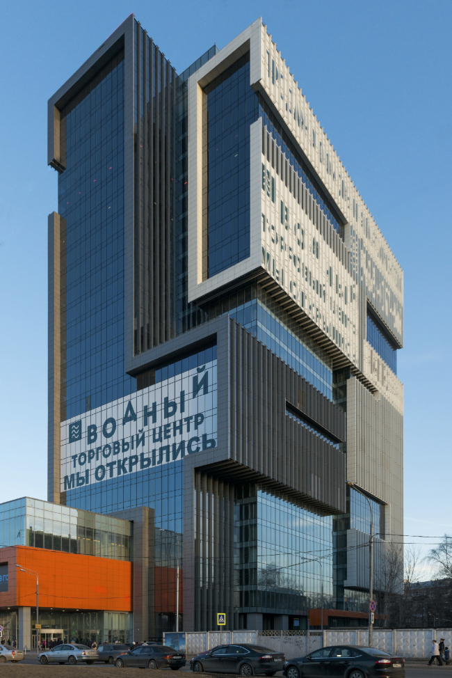
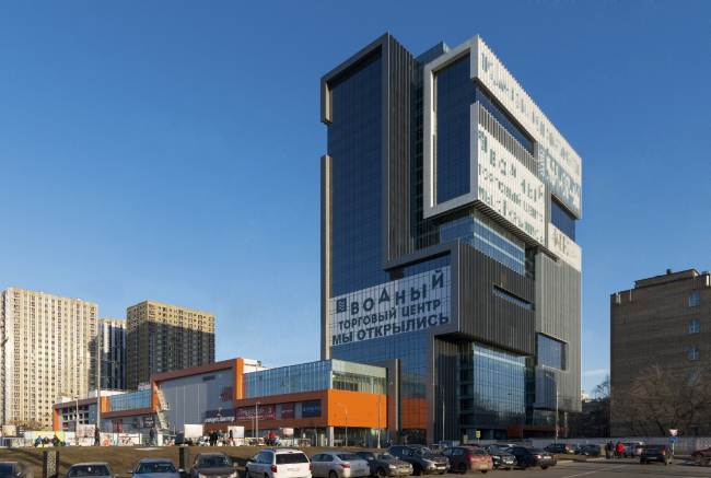
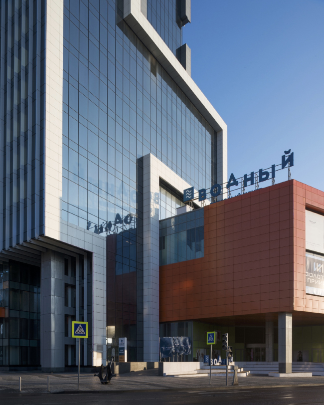
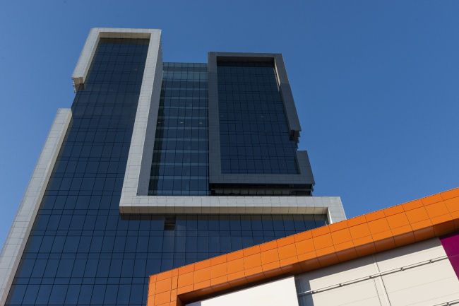
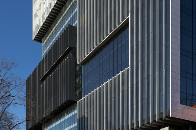
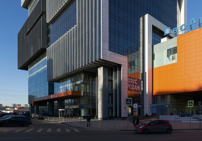
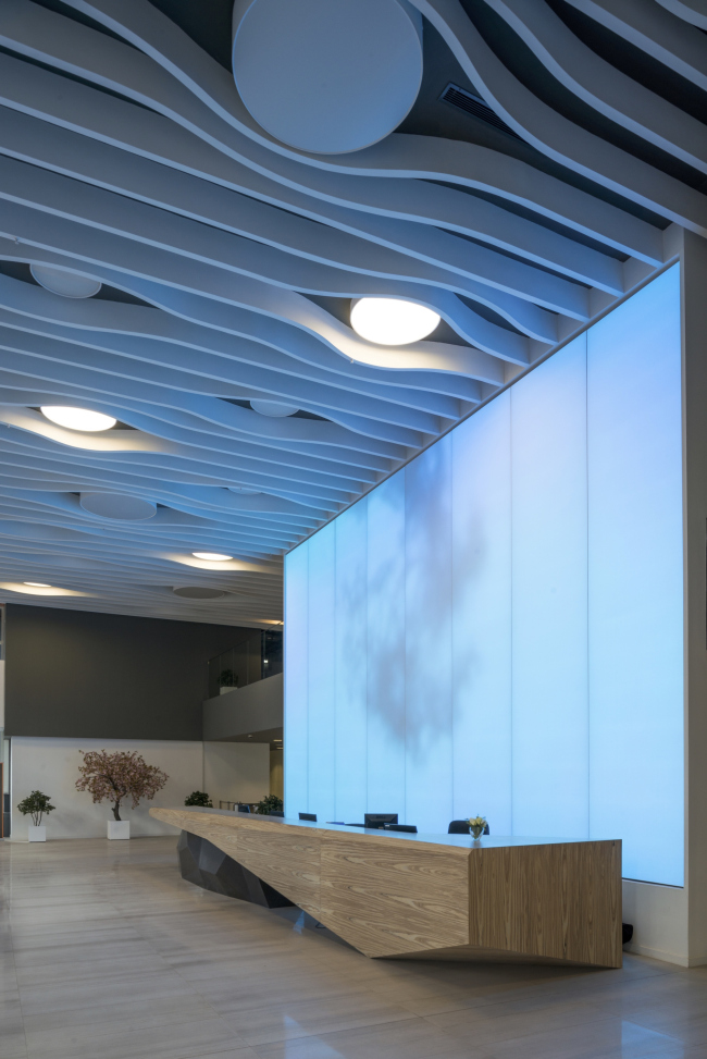
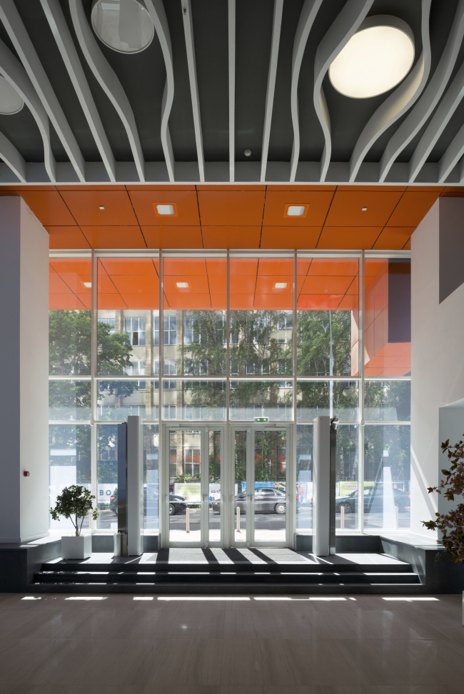
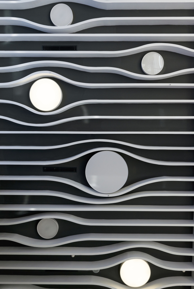
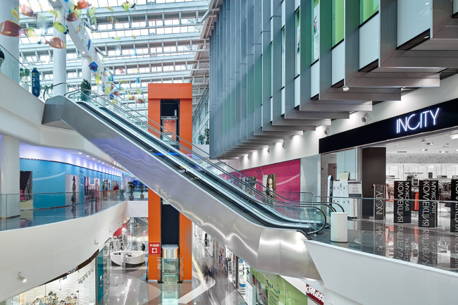
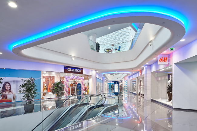
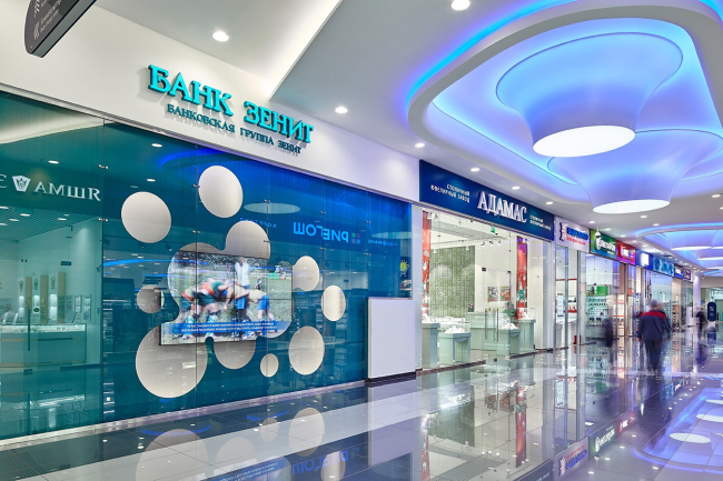
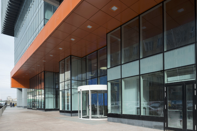
"Atrium" keeps on proving the versatility of its skills and approaches - each new project that it completes possesses a new function, yet the author's style is still inevitably recognizable in it. A year and a half ago the company completed a residential project with a sports complex; still before that - "KVN" youth center. The new building is a shopping and business center by the name of "Vodny" ("By the Water"). Shopping and business center "Vodny" © Atrium ArchitectsHitherto, "Atrium" has only worked with offices in the format of interiors and reconstructions, and, as far as the recently finished building is concerned, this is "Atrium"'s first project of this kind, let alone its mixed function. In addition, this is the first project of this height and magnitude in the company's portfolio - the 26-floor "cloud breaker" towers the whopping one hundred and six meters above the ground. Add to this the fact that the construction place that the architects got was not exactly inspiring: the Kronstadt Boulevard, next to the "Vodny Stadion" ("Water Stadium") metro station. Within a walking distance, the surroundings consist predominantly of a lot of haphazardly situated segments of the N44 "Bratsevo" industrial park (that includes a graveyard, among other things), and a few residential areas scattered around. The latter are so few in number that no infrastructure projects or appropriate public buildings are in sight, barring the building of the local hotel. As for the "title sightseeing point" that can, other things being equal, claim to be "high profile landmark", it is the good old water stadium of "Dinamo", designed by Movchan, now slowly decaying, and located not so near - a 20-minutes' walk away from the metro station, on the other side of the Leningrad Highway. Still, the place is a bustling one. The "Vodny Stadion" is a transport hub for a lot of overland routes: they carry the people out of the depth of the huge neighborhood. Their oversized parking lot is yet another discomfort factor that is felt the moment one alights from the metro line. In a word, this place could have easily gotten yet another garish "suitcase" of a shopping center; just like a lot of Moscow's pre-suburban metro stations already did. It was an extraordinary piece of luck that the development company MR Group that possessed the land site was far too ambitious to settle for any trivial solution. Not for nothing does it get for a few consecutive years the "developer of the year" at Urban Awards. "Vodny", by the way, also kept winning various prizes and awards throughout its entire first year: as the best shopping center, as the best office center, and even as "the best project that uses gypsum plasterboard in its interior". 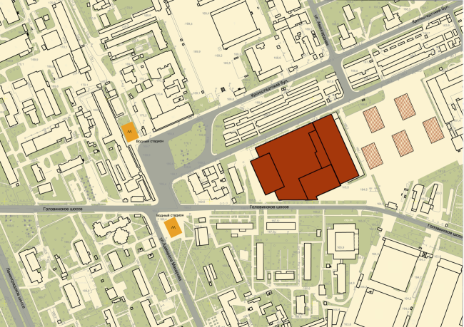 Shopping and business center "Vodny". Location plan © Atrium ArchitectsThe building of "Vodny" presents a rather sharp contrast to its surroundings but this is exactly the case when the conflict between the new building and its architectural context is just what the place needs. This looks particularly important now that it has become clear that the complex is but the first shot of retrieving the territories for a new urban life from the old industrial park. At the neighboring land site - as the second phase of construction - an apartment complex is now being completed, and, in the autumn of 2015, the city got the approval for building a hotel here and reconstructing the "Mebel Rossii" ("Russian Furniture") furniture supermarket, also situated in the immediate vicinity of this metro station. Now all these buildings will have to "mind" the "Atrium" project. The building came out really cool-looking, with its volume visually fractured in a thought-out way, which makes it look original without being too sophisticated. If viewed from distant vantage points, it looks like a neat sculpture, just like a high-rise landmark should. When viewed from a close range, however, in spite of its considerable volume, it looks almost ethereal. The cliché of "thanks to the rich texture of the façade" would be misplaced in this case because what we see here is interaction between volumes with cantilevers that are six-eight meters long. In the formal project diagram, the authors presented the project as an assembly model of several Tetris pieces; in the reality, however, things are a little bit more complex. First of all, the blocks that we consider to be the "Tetris pieces" are completely devoid of the "Tetris" monolith quality - embracing the necessary chunk of space, their lamellar casings vibrate against the light, the optical effect being enhanced by the cutaways in their "fabric". It is also noteworthy that this technique works equally great from the outside and from the inside office part that commands a broad cityscape view. One can easily imagine such casing being created with a 3D-pen but... when this project was being developed this gadget was not yet there! Shopping and business center "Vodny" © Atrium ArchitectsShopping and business center "Vodny" © Atrium ArchitectsShopping and business center "Vodny" © Atrium ArchitectsShopping and business center "Vodny" © Atrium Architects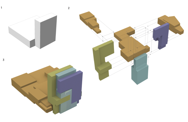 Shopping and business center "Vodny". Plan © Atrium ArchitectsSecond of all, the block of the office part wedges into the shopping one setting the main quality of the stores' interior - the abundance of light and air. The vertical of the tower is "strung up" through the roof of the slab of the shopping center. In the place of this penetration, we find a sun tube with a logical atrium underneath it. The crevice of the sun tubes runs away from the epicenter along the length of the shopping gallery lines. At one point, this line of sun tubes almost disappeared from the project because of the investor's desire to cut costs - but the architects were ultimately able to defend it. Now these spotlights make a positive impact on the demand for the food court points situated beneath them: the lighted space above makes the impression as if the very air here is thinner and invites people to take a break from the shopping spree. And, one must say that this is a very special feeling when you not just enjoy the natural ambient light in a shopping center but the very structure of the center's space pushes you to look up to the sky (and, of course, see the stores located on the upper floors). In a similar way, only in the opposite direction, meaning downwards, works the interior design of the entrance lobby of the office section - the least tense point of the building. Its double-height space is almost ethereal, its ceiling continuing the idea of the outside lamellae - only there they take on an unexpected agile quality. The softness of the interior design solution is also supported by a custom -designed reception desk. Developing the vertical volume of the office block inside the retail interior and visualizing their interaction the architects defy the stereotype of a retail space being horizontal. And this is but one of the unexpected and eye-pleasing elements that form a rather unique consumer experience. The curved outlines that appeared very early on at the advice of the retail consultants who claim that the customers feel a lot better when they flow among the stores along curved lines - they were really raised to high art. The inside space turned out to be quite sculptural - and, because, of that, very coherent which covers up beautifully for the inevitable motley crew of the goods on display. Shopping and business center "Vodny" © Atrium ArchitectsInterior of the entrance lobby of the office part of the shopping and business center "Vodny" © Atrium ArchitectsInterior of the entrance lobby of the office part of the shopping and business center "Vodny" © Atrium ArchitectsInterior of the entrance lobby of the office part of the shopping and business center "Vodny" © Atrium ArchitectsInterior of the shopping mall part of the shopping and business center "Vodny" © Atrium ArchitectsIt is also important to mention that the office high-rise penetrates the retail block not only on a formal level but also functionally: the office workers can get down, for example, to buy flowers for a colleague, for a business lunch at the food court, or just go to the movies after the day's work. The point where the office workers ooze into the world of retail trade is marked by a portal of the same color as the street entrance to the office block. Furthermore, leaving their cars in the multilevel parking garage, the office employees inevitably pass through the shopping center - thus increasing the retail figures. Interior of the shopping mall part of the shopping and business center "Vodny" © Atrium ArchitectsInterior of the shopping mall part of the shopping and business center "Vodny" © Atrium ArchitectsIn a word, the closer you examine the building and the more details you take in, the more you come to a conclusion that the classic modernist couple of "slab+vertical" still has a great potential and it's still got a lot to say to the modern architecture. And, handled by true professionals, two bulky "cubes" of functions can turn into a really beautiful city sculpture. Shopping and business center "Vodny" © Atrium Architects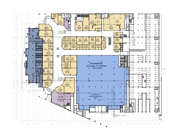 Shopping and business center "Vodny". Plan of the 1st floor © Atrium Architects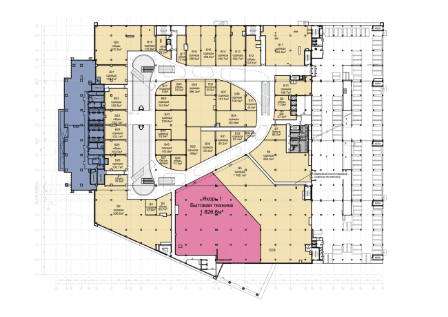 Shopping and business center "Vodny". Plan of the 2nd floor © Atrium Architects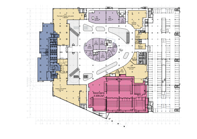 Shopping and business center "Vodny". Plan of the 3rd floor © Atrium Architects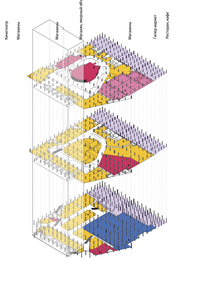 Shopping and business center "Vodny". Layout © Atrium Architects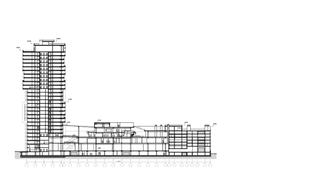 Shopping and business center "Vodny". Section view © Atrium Architects |
|
