|
Published on Archi.ru (https://archi.ru) |
|
| 02.03.2016 | |
|
Exhausted Modernism |
|
|
Lilya Aronova |
|
| Architect: | |
| Alexander Asadov | |
| Studio: | |
| GrandProektCity | |
|
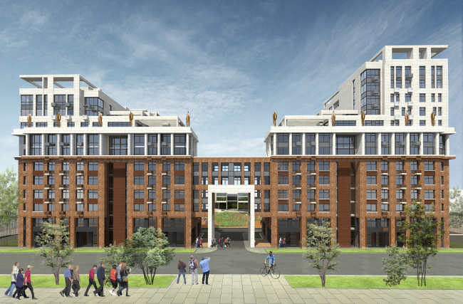
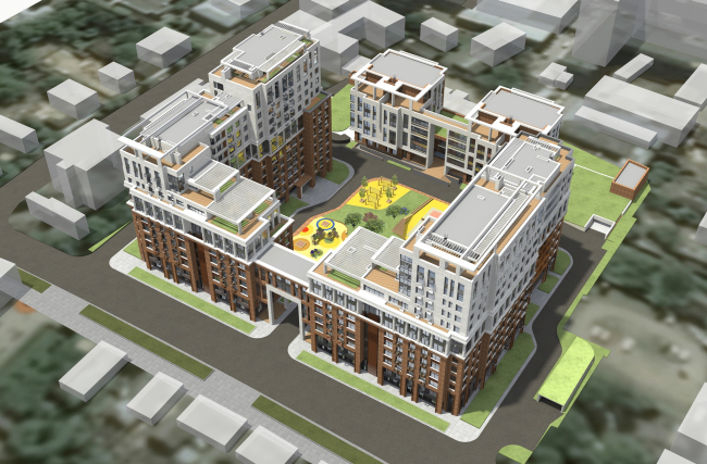
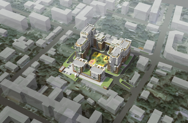
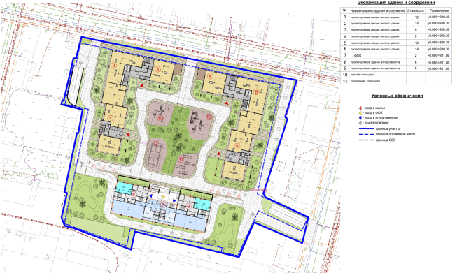
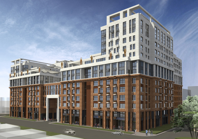
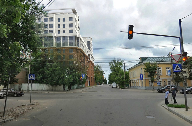
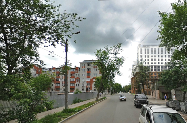
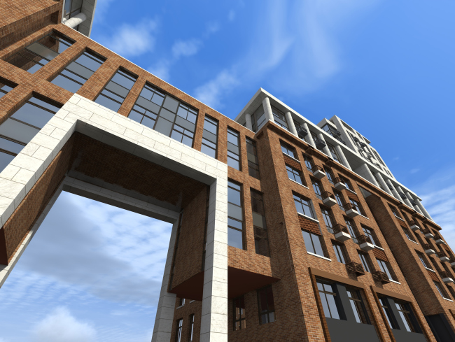
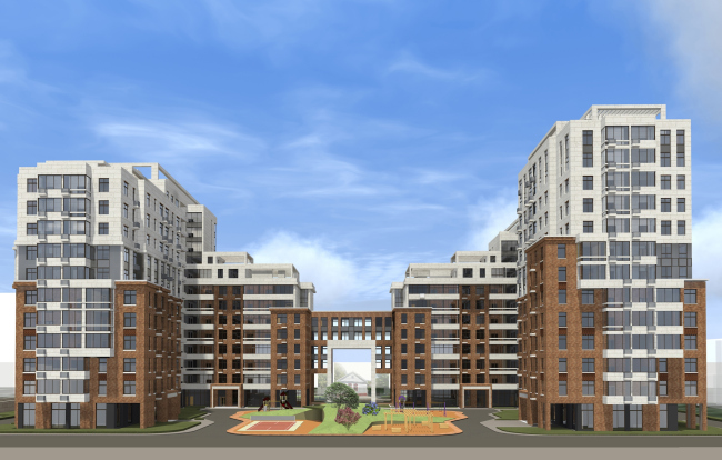
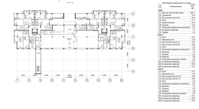
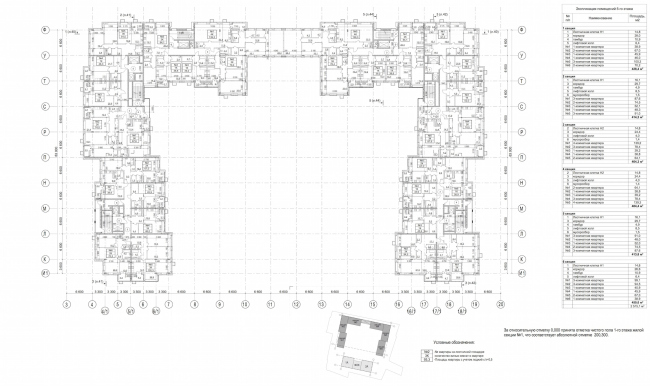
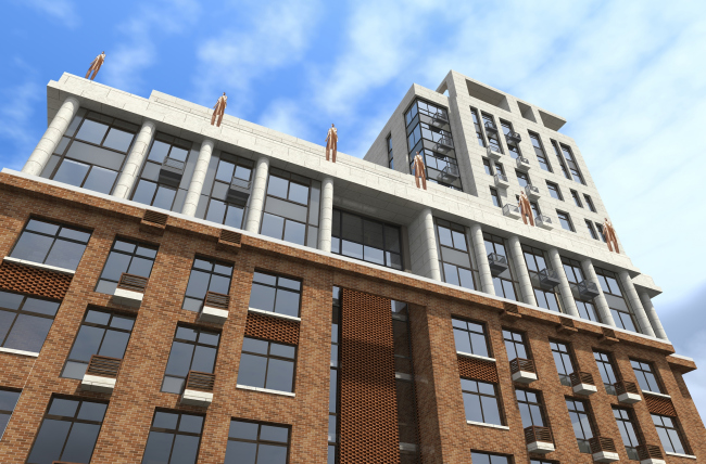
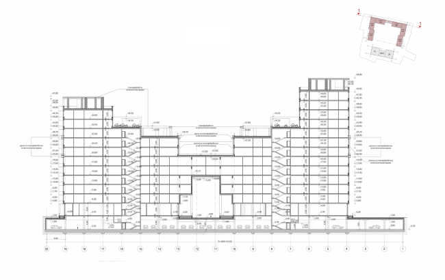
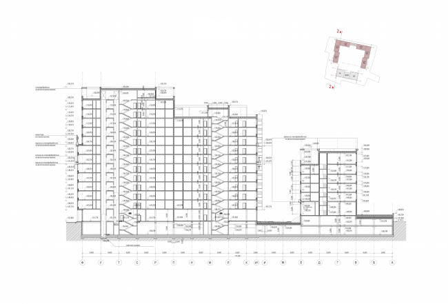
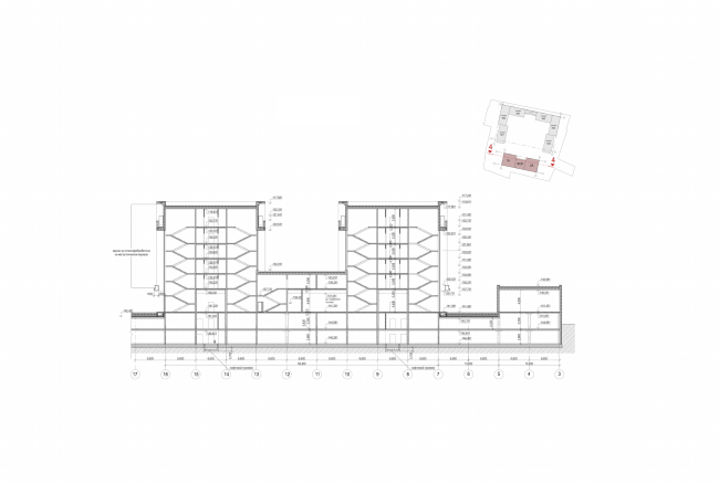
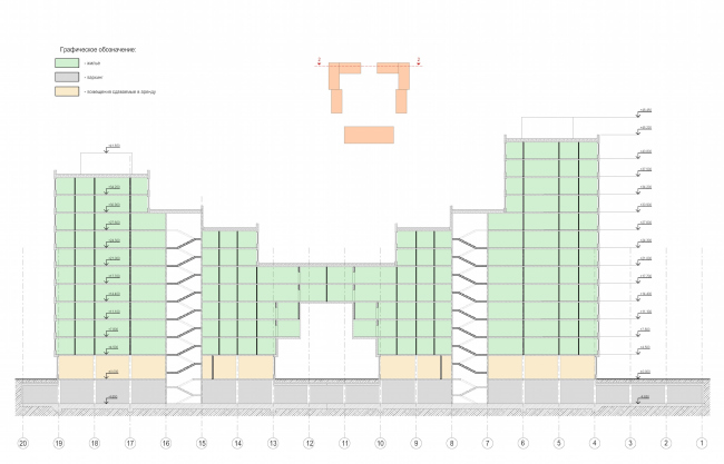
In the downtown area of the city of Kaluga, Alexander Asadov and Karen Saprichyan designed a residential complex that combines a whole number of archetypes of modern architecture and gracefully interacts with its historical environment. Residential complex in Kaluga. Project, 2015 © GrandProjectCityThe historical center of Kaluga: little parks and churches, classicism and empire, merchants' mansions, rank-and-file five-story houses, and the remnants of the wooden "two-story Kaluga" of different degrees of dilapidation. Across the street, there is the "Teatralnaya" ("Theater") Square with a neoclassical colonnade of the building of the drama theater that the local people take a fair amount of pride in; on the other side, there is a memorial house of the founder of the Russian cosmism Alexander Chizhevsky who lived here back in the XVIII century. This is the environment that surrounds the land site upon which Alexander Asadov and Karen Saprichyan are now designing a new residential complex. Had this been twenty years ago, the notorious advocate of the "storm and stress" method Alexander Asadov would have probably mesmerized the architectural community by building something radically curvilinear, ripping up the sleepy peacefulness of this old city. But not today. "We had quite a long and painful search for a solution that could help our building to fit in with the context, at least to a degree - Alexander Asadov shares - What we wanted to do was break away from the straightforward modernism that has now pretty much exhausted itself and is now looking for new ways: some architects stick to historicism, some - to the ecological "green" construction... We deliberately settled for building an eclectic house, even provincial to a certain degree, in spite of its significant size. We wanted to throw different architectural archetypes into our melting pot and create, on the one hand, a single composition, and, on the other hand, one that would bring up a whole range of allusions and memories, very personal for each individual who is looking at it. This project is like a distant echo of our internal search for the path that we are to go by further on". On the plan, the residential complex is in fact almost a typical traditional quarter that opens up to the south and consists of two three-section residential units - thanks to the connecting four-level gallery running through them, they look like a single volume if the observer is looking at the main facade - and an apartment unit that closes the yard from the other side, this unit also consisting of two blocks joined by a two-story link of the fitness center. This solution that looks quite logic, was in fact dictated by the crude necessity, and specifically the mysterious fact that the south side of the construction blueprint borders on the sanitary protection zone of a spaghetti factory that is in fact long gone! Because of this "smile of the Cheshire Cat", the architects were only able to place here the compact six-floor apartment units. As for the main grand façade, it is turned northward, to the Ogareva Street and the Chizhevsky memorial house. Residential complex in Kaluga. Overview. Project, 2015 © GrandProjectCityResidential complex in Kaluga. Bird's eye view. Project, 2015 © GrandProjectCityResidential complex in Kaluga. Master plan. Project, 2015 © GrandProjectCityParadoxically, the maximum allowed construction height reached no more nor less sixteen floors - and this, for crying out loud, is the center of a provincial city where even the contemporary buildings never made it past the standard nine floors. To do the customer justice, however, one must note that he did not choose to use the entire allowed height, and, upon joint consideration, the architects were able to cut the number of floors down to thirteen. In order to make the building fit in nicely with its surroundings, this height was also too much, so, from this point on, the architects had only architectural techniques to fall back on. The first idea that the authors of the project came up with was clear fracturing of the height of the building. In this case, the technique of "second ground" came to the architects' rescue: up to the sixth floor (the approximately average height of the surrounding buildings) the complex is in fact a giant stylobate, sturdy and squatting, with a broad cornice on top and coated with red bricks to enhance this "serious" look even more. Such decoration has yet another connotation to it: although by the moment when the Moscow architects appeared here the construction site was already cleared, the local people remember perfectly well the red-brick buildings of the "Kaluzhsky Avtopribor" factory that had hitherto been there on this spot. Residential complex in Kaluga. Project, 2015 © GrandProjectCityThe massive horizontal volume that works great with its surroundings and forms now the building front of the street is intercepted by a tall, four floors high, portal entrance to the yard connected to the residential units by a four-level residential gallery. Flanked by two other portals of a smaller size, the arch gives the portal a grand and monumental look of not at all provincial but quite Moscow architecture of the 1930's, adds lightness to the volume and echoes the colors of the upper floors that the authors of the project represented in the shape of "large townhouses" built upon the roof of the brick building and coated with light-colored ceramic granite. The first two levels are pure Le Corbusier: the tall, two story high rounded columns against a stained glass background bring up immediate associations with Le Corbusier's Savoye Villa. The higher ones look more like modern townhouses standing in a new expensive neighborhood of some European city: a moderate number of floors, an apartment or two on each floor, lots of glass, terraces, and a usable roof. What is interesting is the fact that the architects designed the two units of the complex as being of different height: 11 and 13 floors. In addition to the desire to make the volume lighter and more diverse, such solution is also based on the architects' respectful attitude to the context. First, the nine-stories stand up against the land site exactly from the side of the taller western unit, the buildings being lower on the west side. Second, it is on this particular side that one of Kaluga's main thoroughfares runs - the Moscow Street that the cars coming in from the direction of the nation's capital drive through. Considering the fact that presently the complex designed by Alexander Asadov and Karen Saprichyan must become the height centerpiece of Kaluga's downtown area, the architects wanted to avoid the situation when the first thing that the newcomers would see on the city would be the all-dominating massive volume. In this version, however, it will look like two buildings - tall, light (thanks to the large proportion of glass used in their decoration), but, above all, visually different: the larger one standing in the distance, the smaller one standing up front. Residential complex in Kaluga. Photo montage. Project, 2015 © GrandProjectCityResidential complex in Kaluga. Photo montage. Project, 2015 © GrandProjectCityResidential complex in Kaluga. Project, 2015 © GrandProjectCityThe design of the façades does not leave the monotony a single chance either. Bay windows and terraces, cornices and cantilevers, projections and cavities, galleries and balconies - everything is broken and fractured, there is not a single static piece, everything is bright and dynamic, the complex looks like it is a living and breathing thing that is engaged in an active dialogue with the observer and with the environment. This is particularly noticeable from the yard where, according to the apt saying of the architects, they "took the liberty of relaxing a little and putting on striped pajamas" - as opposed to the rigorous "white tie" dress code of the grand façade. The role of the white bow tie is played by the arch that, by contrast with the terra-cotta of the main bulk of the six-story stylobate, is coated with light-colored porcelain stoneware. For all their typological differences, the "white top" and "dark bottom" fit together nicely to become a graceful single whole: as if on cue, the white Corbusier-style columns pick up the verticals of the brick piers, the stained glass does not violate the rhythm of the wide windows, and the horizontals of the cornices and the awnings rhyme with the "ground" line. Across the center of each of the residential units, slightly stepping back from the pier line, a blind brick stripe runs up, behind which there is a fire escape staircase; as if to make up for this dull stripe, there is a square two-story fragment hanging over on top of it. The see-through galleries running around the portal and over its sides (these will include the stanzas and the panoramic drawing rooms of the adjoining apartments) precede the architecturally decorated void of the blue sky between the units. As if in reply to the visual junction of the two floors of the "villa", the lower part also gets a two-level gallery, only not ethereal white but made of bricks, with squatting supports and the first floor given to retail stores rooted firmly in the ground. The space along the gallery naturally asks for green plants, or at least a lawn; as the architects say, they would like, climate permitting, supply green plants to the terraces and the roof as well. Residential complex in Kaluga. Project, 2015 © GrandProjectCityThe effect of "pajama" stripes on the yard façades is achieved a looser, if compared to the street side, alternation of decoration materials. Just like the cuffs of a shirt, the brick coating of the portal gallery "turns inside out" and spills into the yard. Otherwise, the decoration of the yard façades is predominantly white, occasionally interrupted by fractions of brick inserts - the architects do not limit themselves with the level of "second ground" here. While these inserts create an effect of vertical stripes, the floor-to-ceiling glazing of the stanzas create an effect of horizontal ones, so at some spots, "chess fields" appear. Because the building fully rests on top of an underground parking garage tying the whole complex together, it is planned that man-made hills will be used to plant the green plants upon, these hills also serving as the borders of the functional zones. At the expense of the relief drop from the southern side, the roof of the parking garage will at one spot stick above the ground level - there are plans for embarking it and building a six-floor apartment building upon it. The apartment typology is pretty diverse: the architects designed lots of different types of apartments with intermediate spaces. The square footage figures are pretty modest but are made up for, to a large degree, by the thought-out planning solutions and plenty of light coming in: the windowsills are low pretty much everywhere, and there is a lot of "French" windows with little balconies. The hallway entrances are mainly situated in the yard but the corner L-shaped sections got auxiliary staircases, and are now also accessible from the street. Residential complex in Kaluga. Plan of the 2nd floor. Apartments, Fitness Center. Project, 2015 © GrandProjectCityResidential complex in Kaluga. Plan of the 5thfloor. Residential unit. Project, 2015 © GrandProjectCityThe architects came up with yet another intrigue for the people of Kaluga. On the cornice above the grand façade, they are proposing to install sculptures - monuments to some distinguished personalities. The architects chose to leave it up to the city people to decide who specifically will get the honor of adorning the façade of the residential complex. "Well, yes, it's a little teaser of sorts - admits Alexander Asadov - Will these be any specific people or just allegorical figures, the great heroes of the past or simple people, our contemporaries? We do not have any specific plans; this is an element of the project that is not even clear to ourselves yet. We are open to discussion!" And, considering the fact that one of the authors of the project, Karen Saprichyan, is not only an architect but also a sculptor, one can feel safe about the artistic aspect of "X Element". Residential complex in Kaluga. Fragment of the facade. Project, 2015 © GrandProjectCityP.S. Alexander Asadov and Karen Saprichyan express their gratitude to the architect Peter Zavadovsky for the exciting discourse on architecture, thanks to which, to a large extent, the solution for this project was born. Residential complex in Kaluga. Section view. Project, 2015 © GrandProjectCityResidential complex in Kaluga. Section view. Project, 2015 © GrandProjectCityResidential complex in Kaluga. Section view. Project, 2015 © GrandProjectCityResidential complex in Kaluga. Section view. Project, 2015 © GrandProjectCity |
|
