|
Published on Archi.ru (https://archi.ru) |
|
| 30.12.2015 | |
|
Point of Assembly |
|
|
Lilya Aronova, |
|
| Studio: | |
| Arch Group | |
|
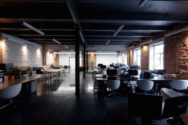
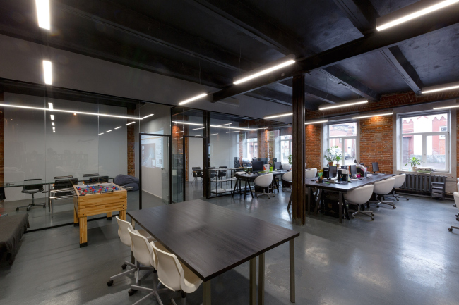
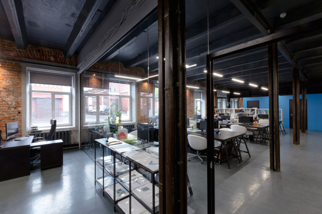
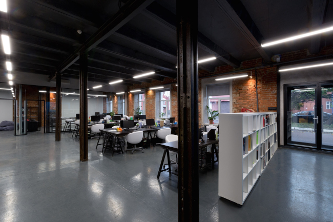
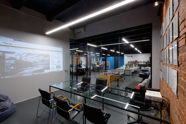
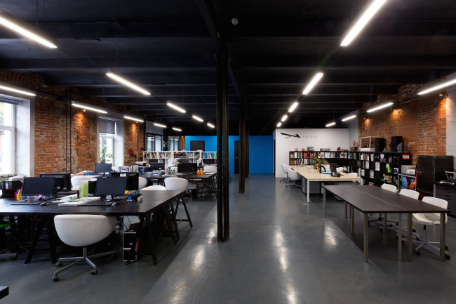
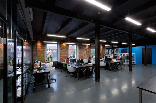
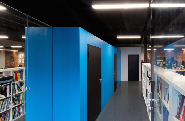
Arch Group has moved to a new office - a classic open space designed in the industrial style with authentic artifacts of the nineteenth century. Arch Group HQ at Byelorusskaya © Arch groupHaving considerable experience in reconstructing various industrial facilities, from separately standing buildings to whole industrial parks, Aleksey Goryainov and Mikhail Krymov "redeveloped" the former factory building into their own office quickly, smoothly, and cost-efficiently. Today, the company's HQ is located on the Presnensky Val, in the former electrical appliances assembly workshop of Moscow Power Tools Factory named after the Revolution of 1905. The factory, by the way, still operates, only some of its buildings being rented out for offices, so, the choice of industrial eclectic style was practically predetermined. The authors of the project were quite ok with it, though: the "loft" style is both practical and modern, and is also reasonably "brutalist" - meaning, it quite corresponds to the image of the workplace of this creative team headed by two young architects. Besides, with such an approach, the remodeling took up the least possible amount of time, which was something that did matter: Arch Group had but two weeks to move from their old office to the new one. The company's new office is a classic open-space; the company leaders' office and the meeting room are separated by glass partitions. For Goryainov and Krymov, it was crucial to create a one-chunk space totally devoid of any blind walls: in the company's old offices, the leaders sat separately from the employees - which indeed was inconvenient. And the glass wall, providing enough sonic insulation for conducting meetings or negotiations, visually does not separate the "bosses" from the rest of the company in any way, such arrangement going a long way to demonstrate to the employees that the company leaders are always available. Arch Group HQ at Byelorusskaya © Arch groupArch Group HQ at Byelorusskaya © Arch groupJust the way it should be in a loft, the ceiling was left the way it used to be in its "factory" past, its bearing structure showing. It was painted pitch black to visually push the limits of the space and hide the girders on the ceiling. Also, thanks to the black color of the ceiling, the architects were able to make an accent on the LED lights hovering freely in the space. The issue of light, it must be said, was addressed with all due seriousness, and without so much as a hint at stinginess - the architects carefully selected the brightness and the colors of the lights because the right lighting is not only necessary for productive work but also defines the overall atmosphere that definitely matters. The point lights on the walls capture bits of the texture of the original brickwork and the concrete walls with traces of framework enhancing their authentic beauty. And, of course, there is plenty of daylight here - it was decided that the large windows would be decorated with concrete slopes, the combination of which with the brick walls is a dramatic design solution in itself. Arch Group HQ at Byelorusskaya © Arch groupIf we are to speak about the details, the most interesting thing in the interior of the office is the bearing columns. Removing the plaster slabs that used to cover them, the architects ran into a real industrial antiquity - the real railway tracks of the XIX manufactured by KRUPP and Brown, Bayley & Dixon Steel. Each of the rails is individual, having its own curvature and time marks. The architects covered the rails with protective lacquer to keep them intact as long as possible. The tables, desks, armchairs of a few kinds, and the locker systems were also selected very carefully, the architects basing themselves not only on the economy and ergonomics but also on how much each object contributes to creating a comfortable working environment. "We care about our people - Aleksey Goryainov says - Each workplace is very individual and it is designed to make the person who works here want to come back to it again and again". A few things did require additional adjustment - for example, the architects joined three tables into a long single wine sawing off half of its legs. And the table in the meeting room has an even more interesting story behind it - it appeared thanks to the fact that after the installation of the partitions it turned out that there was one glass panel too many. Of course it would have been a waste just disposing of it - so the piece of glass was mounted on a metal framework, and the architects got an elegant, large, laconic, and virtually no-cost piece of furniture. The office, by the way, has in it yet another object so dear to the hearts of the company leaders: a recess in one of the walls turned out to be the perfect place for a small copy of Igor Shelkovsky's sculpture named "Head" that is the souvenir of Krymov and Goryainov participating in the contest for the monument to the victims of political repressions. "Of course, it's a bit on the ghastly side, given the very subject of that contest - Aleksey Goryainov comments - but it still made a perfect match for this specific interior". Arch Group HQ at Byelorusskaya © Arch groupOne may be a little surprised to see a beanbag chair in the corner of this strictly working facility - but, heck, the tired employees need to have a place to relax! And a quick warmup would also do them good - for example, a table football - such opportunity is also provided for in the office of Arch Group. There is yet another idea: organizing - literally under the ceiling - a rest area with sleeping mats where a person will be able to grab some shuteye during the rush of work. The architects have already thought out how this idea could be implemented - the kitchen and the bathrooms are designed in the form of multicolored cubes reaching just a little short of the ceiling height. And it is planned that the mats will be laid up on their "roofs". The architects even designed a cute little stairway for the employees to climb up to the mats - now the idea is just waiting to be implemented. In spite of the maximum austerity of its planning, the office space looks rather intriguing. The punctured lines of the ceiling lights that visually stretch the volume get reflected in the glass partitions and the dull glass of the gray floor, the "column" rails adding rhythm to the space, the monochrome tone of the black-and-white palette broken by the warm shade of the brick walls, and suddenly - by the life-affirming blue of the side wall that, together with the white low stack of shelves, forms the entrance group (the architects often use this technique: designing the interior, they leave the paint job just short of reaching the ceiling). "Maybe our next office will be designed in a different, more expressive, key - Aleksey Goryainov speculates - But today it seems to us that we chose a very right direction to go; the office turned out to be very cozy and really conductive to creative work". Arch Group HQ at Byelorusskaya © Arch groupArch Group HQ at Byelorusskaya © Arch groupArch Group HQ at Byelorusskaya © Arch group |
|
