|
Published on Archi.ru (https://archi.ru) |
|
| 09.11.2015 | |
|
Cloud of Knowledge |
|
|
Tatiana Timofeeva |
|
| Studio: | |
| Arhitekturium | |
|
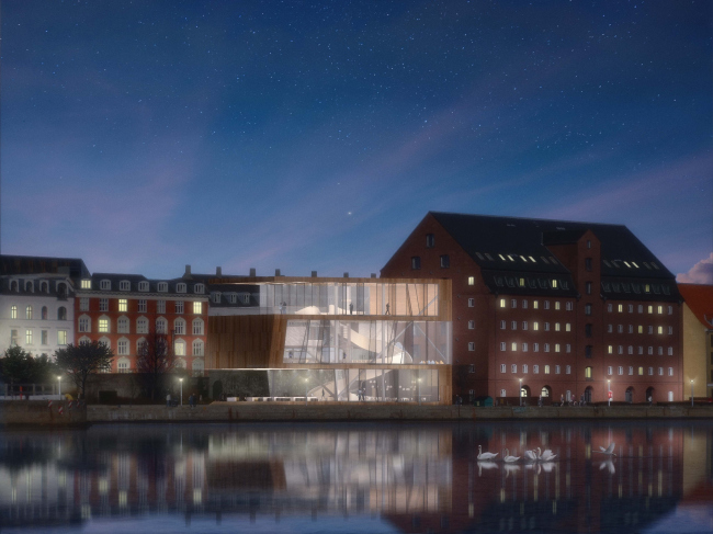
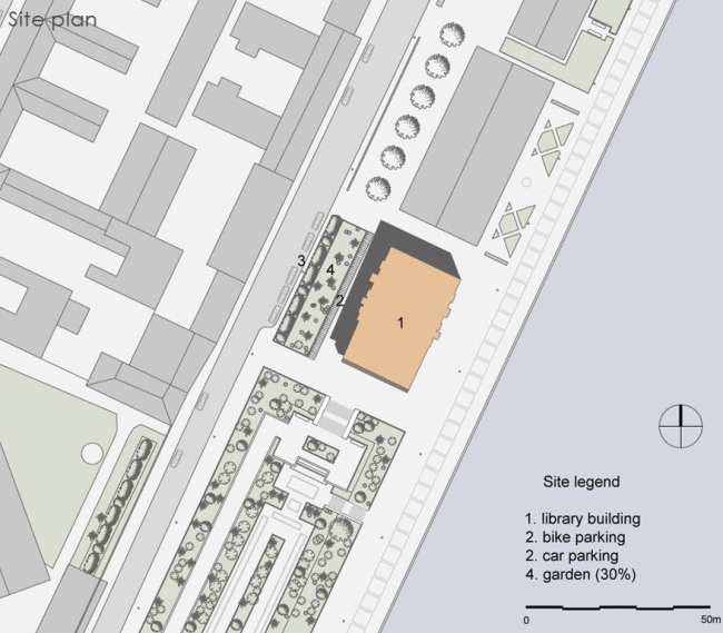
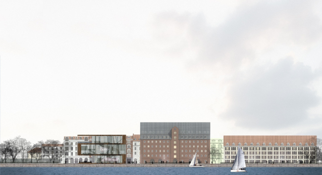
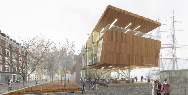
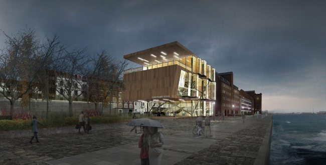
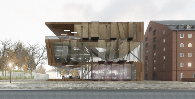
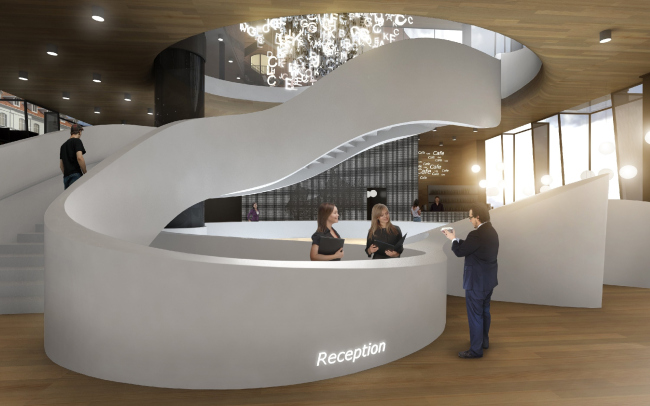
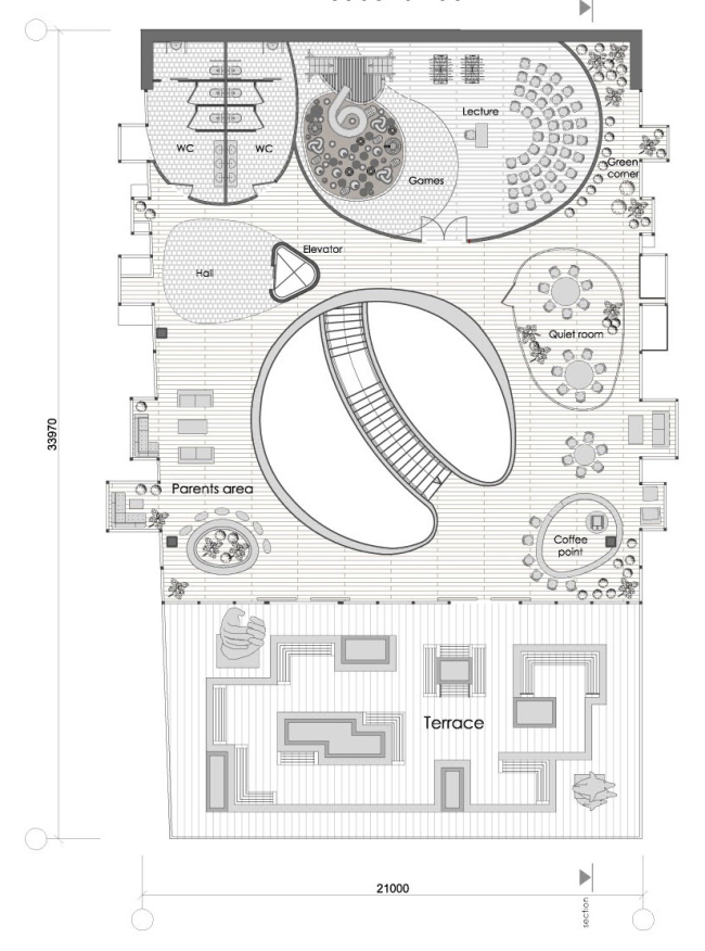
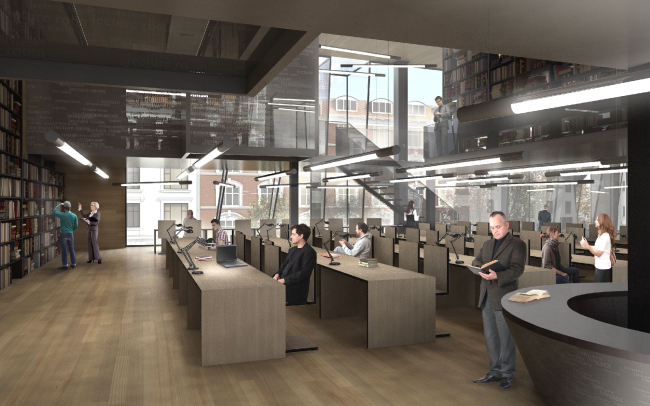
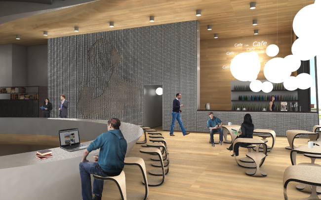
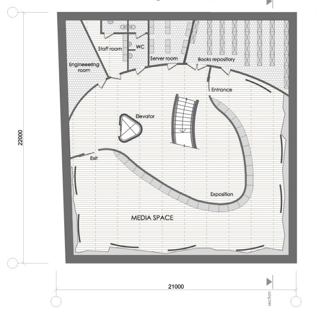
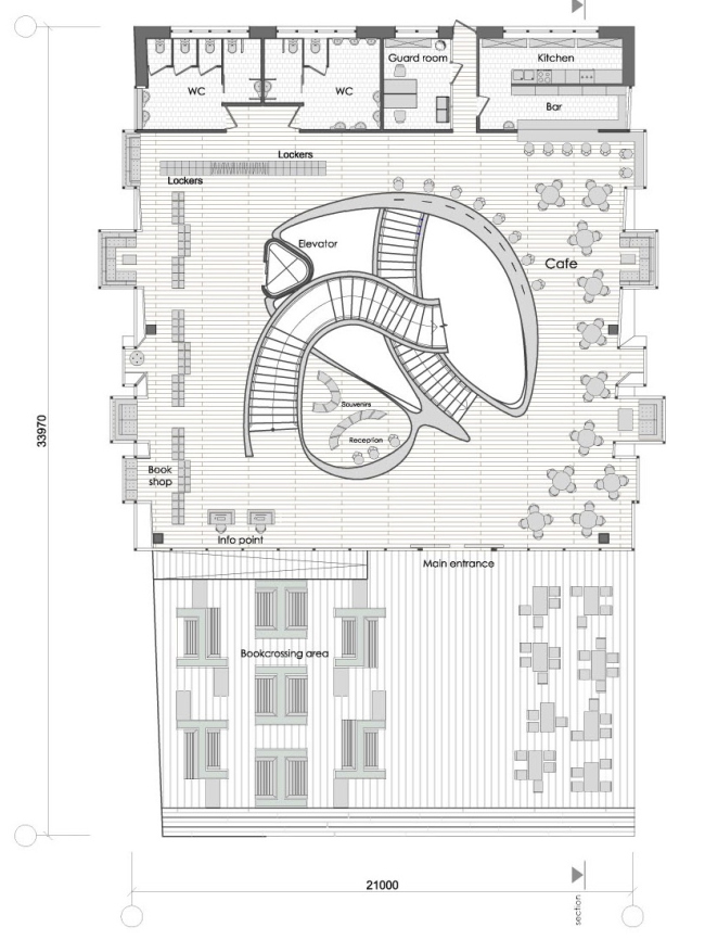
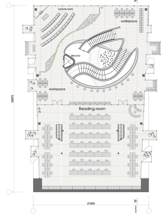
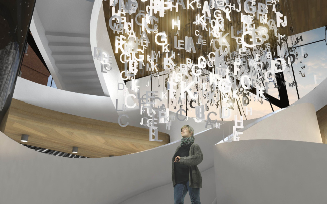
In the end of last year, Vladimir Bindeman's bureau "Arkhitekturium" took part in the open international competition for the project of a new city library "2.0" that will be built in the very heart of Copenhagen. Library in Copenhagen © "Arkhitekturium"As the architect himself reminisces, it was pure chance that prompted him to take part in this contest. Right about the time when the contest was announced, Vladimir Bindeman found himself in Copenhagen and spent almost a whole day in the area where the new library would be built. The opportunity to see the future construction site with his own eyes and get a detailed idea of what stands behind the laconic address line in the contest specifications seemed to the architect too much of an advantage not to make use of it, and the team of "Arkhitekturium" enthusiastically got down to solving the creative task. The new library will be built in the very heart of Denmark's capital, on Larsens Plads Embankment that is situated between Amalienborg Palace and the building of Copenhagen Opera. The future construction site adjoins one of the side facades of a former warehouse, a minimalist laconic structure of dark bricks topped by a gable roof - built in the early XVIII century and later on converted into an apartment building in the 1970's. Today, part of the site is occupied by a small park, part - by a parking lot for the tourist busses, but its central location, its proximity to the new Amaliehaven Park (in fact, it occupies a neighboring site on the embankment), and the direct access to the water area prompted the municipality the idea to find a more dignified application for it. As for the function of the new building, it nearly as much as suggested itself: today's Copenhagen is famous for its advanced libraries - both in intellectual and architectural sense of the word. There are already more than twenty of them in the nation's capital, and for the representatives of all generations they are pretty much like "power spots" - meaning, the places where people meet, communicate, and spend their time with family and friends. It was designing precisely such type of "community center" on Larsens Plads that the whole contest task was about: the traditional archives, book depositories, and places for secluded work alternate here with computer rooms, lounges, cafes, lecture halls, children's playrooms, and bookcrossing areas, so fashionable today. Master plan © "Arkhitekturium"As a matter of fact, it was the enumeration of all these functions that constituted the core of the contest specifications. As for the architectural solution of the future library as such, the participants of the contest were given the ultimate freedom of expression. As Vladimir Bindeman shares, the only mandatory requirement to the image of the future building stipulated in the specifications was that it should become a tourist attraction and match the facade line of the embankment. As for the town planning restrictions, it was only about the height of the building - the topmost point of the complex was not to be higher than the gable of the roof of the former warehouse. "The architectural image of a building that, on the one hand, is meant to promulgate reading and, on the other hand, serve as the place for the contemporary ways of communication, came to us almost instantly - Vladimir Bindeman recalls - This would be bookshelf gone through the transformation in the spirit of the ideas of Scandinavian design". In fact, the architects came up with a cross between a building and... a piece of furniture - because what we are seeing here is nothing other than a bookcase scaled up to the size of the neighboring historical building. What's more, a bookcase open on both sides, the kind that is used in small-sized apartments to split the room in two zones: on the one hand, it is a partition that separates the conditional "study" from the "living room", and, on the other hand, it is not a traditional wall that would ruin what insolation the apartment has. Same thing here: the new library continues the building front of the embankment without continuing the tradition of the very material and terminally palpable historical facades. The "bookcase" designed by "Arkhitekturium" is formed by one long shelf that bends three times at a right angle taking on a dynamic profile in the shape of a double S. It this particular profile of the building that commands the embankment, the architects turning to the brick volume of the warehouse the rectangular brackets of the shelves of the first and last floors, while the park (situated on the opposite side) is commanded by a dramatic slope of the cantilever of the central level. The ground-level open air terrace that appeared on this side and the terrace on the top floor that works in connection with it helps to better integrate the building into its environment: it looks as if it imbibes the adjacent park. Its "organic" origin is also enhanced by the material chosen by the architects - of course, a bookcase, especially Scandinavian, must be made of wood. Library in Copenhagen © "Arkhitekturium"Library in Copenhagen © "Arkhitekturium"Library in Copenhagen © "Arkhitekturium"As for the transparency of the bookcase, it is achieved by using a glass casing, the architects making bay windows of different depth and different tilting angle in respect to the main surface on each of the floors. These are the spaces for recreation, admiring the beauty of the building of Copenhagen Opera (located right across from it), or a friendly conversation - but in the context of the story invented by Arkhitekturium, these elements are unambiguously read as the backbones of books casually placed upon the shelves. Through the cracks between them one can see the street that runs parallel to the embankment, and, in order to keep the library from turning into a completely "see-through" fish bowl, the authors of the project came up with a snow-white staircase of an ostentatiously sculptural shape that runs around the central atrium and serves as the reception desk on the first floor and connects it to all the upper levels. What is interesting is the fact that the plan of the staircase is slightly different on each floor - which brings some sort of a "space" intrigue into the multi-height atrium. Come to think of it, this is also a very "Scandinavian" thing to do: such stairways that serve not as axis but as communication spaces are a hit with the Danish projects of public buildings: one cannot help recalling, for example, the dramatic crossing of the stairways in Black Diamond Library designed by schmidt hammer lassen or the tightly wound spiral of the staircases in the Orestad college 3XN. Library in Copenhagen © "Arkhitekturium"Library in Copenhagen © "Arkhitekturium"Plan of the 3rd floor © "Arkhitekturium"Totally, the library designed by Arkhitekturium has four levels in it: one underground and three above-ground ones. On the -1st floor, the authors hid a media room, a server room, a small book depository, staff-only rooms, and traditional shelve stands with books - together with reading desks. The first floor level includes the entrance hall, the reception desk, a store, a security office, toilets, the visitors' lockers, as well as an open air terrace with bookcrossing shelves, reading benches, and tub plants. The second floor performs the main library function - it contains a reading hall with an attic, a lecture zone, and places for individual and group work - while the upper level is occupied by the children's playroom, as well as another open-air terrace, the latter exhibiting the works of modern art. "What makes our project different is the fact that the library's work can be performed by the electronic management of the archives and the information can be accessed via the internal server - Vladimir Bindeman explains - The information can be accessed from any point in the building, the workspaces being organized on all the levels behind separate tables, tables for collective work, cafe tables, and relax zones equipped with soft furniture". Library in Copenhagen © "Arkhitekturium"Library in Copenhagen © "Arkhitekturium"Plan of the underground floor © "Arkhitekturium"Plan of the 1st floor © "Arkhitekturium"Plan of the 2nd floor © "Arkhitekturium"The interior decoration of the library uses the same material as the facades - the wooden plank (in fact, this is the inside surface of the bookshelves), while the part of the atrium's main light is played by a robust installation put together from numbers and Latin characters. Equipped with LED lights, the letters and figures form a peculiar cloud that symbolizes both the traditional notion of "knowledge" and the contemporary notion of "cloud" as an online resource for storing and processing large amounts of information. According to the architects' plan, the ascent of the stairway through the "cloud" will become an interesting "amusement ride" for the visitors of the library, while the scattered letters and numbers "readable" from the outside will unambiguously point to the function of the building to the passers-by. Thus, the "image" part of this project is closely connected with the functionality - just as it should be the case with a true sample of Scandinavian design. Library in Copenhagen © "Arkhitekturium"Section view © "Arkhitekturium" |
|
