|
Published on Archi.ru (https://archi.ru) |
|
| 10.11.2015 | |
|
Sergey Estrin: "Ceilings give you the ultimate freedom of expression". |
|
|
Lilya Aronova |
|
| Studio: | |
| Sergey Estrin Architects | |
|
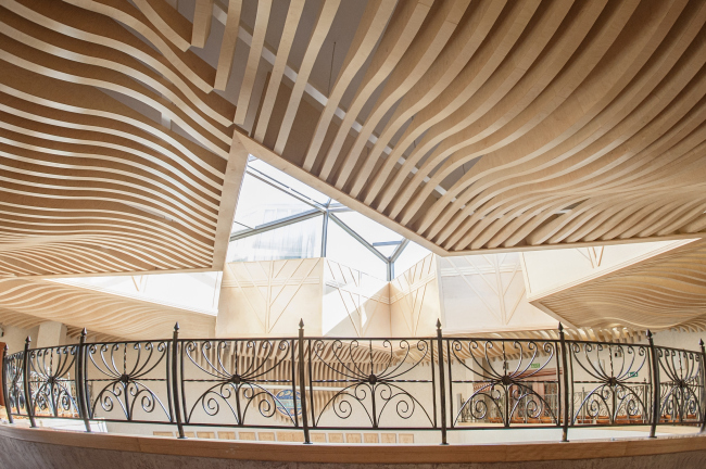
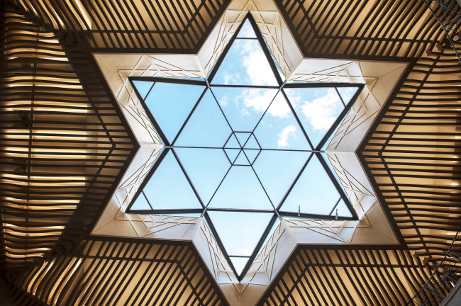
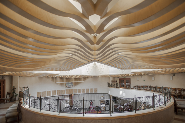
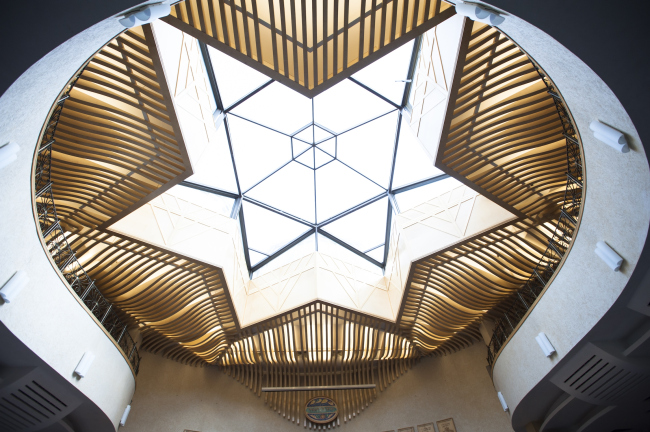
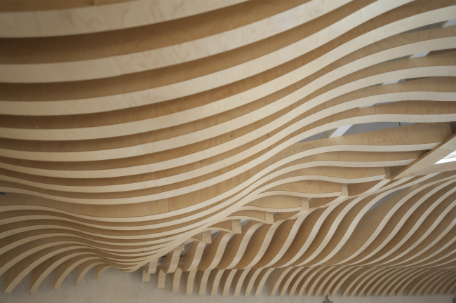
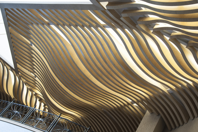
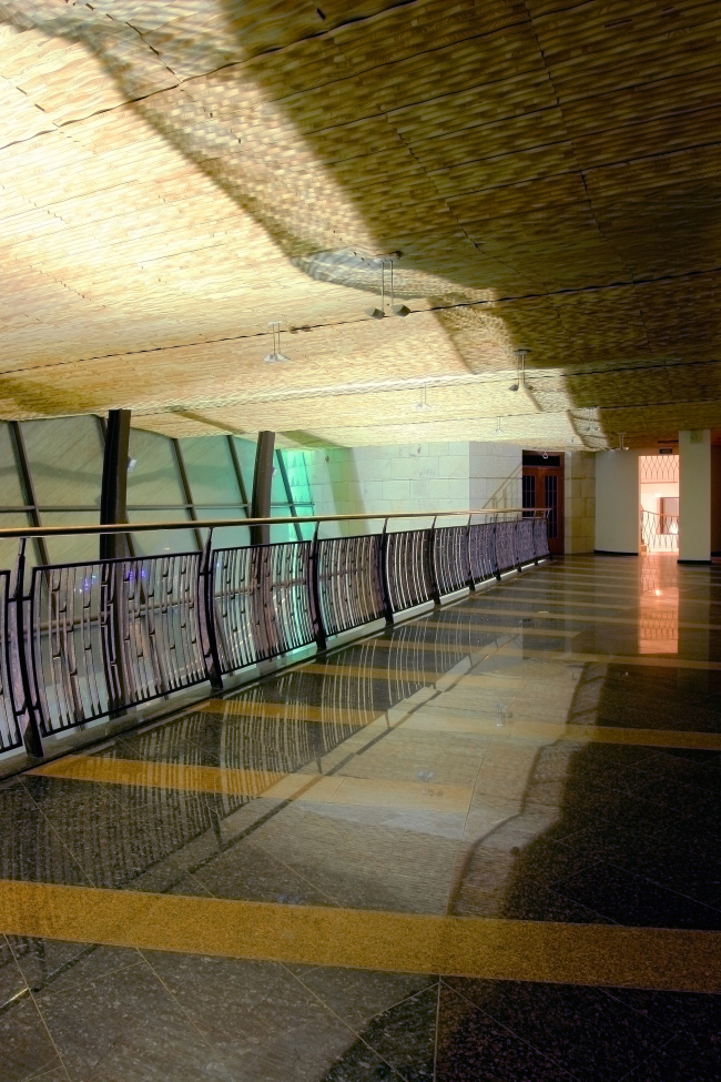
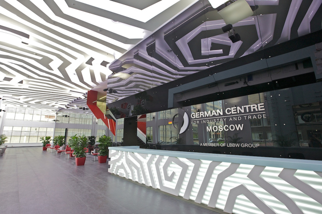
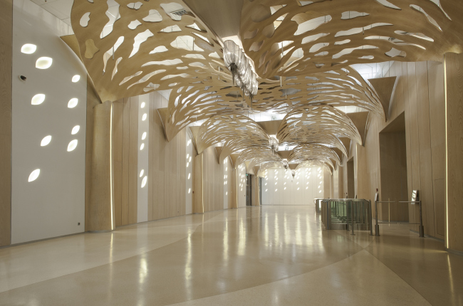
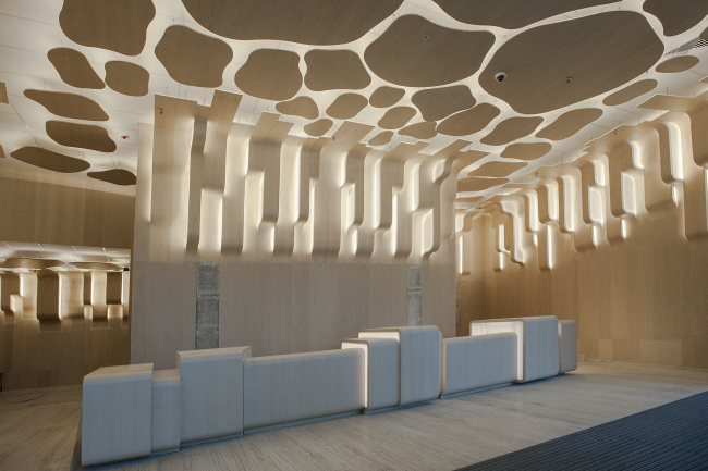
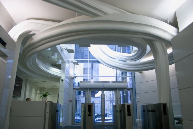
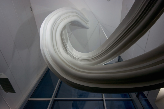
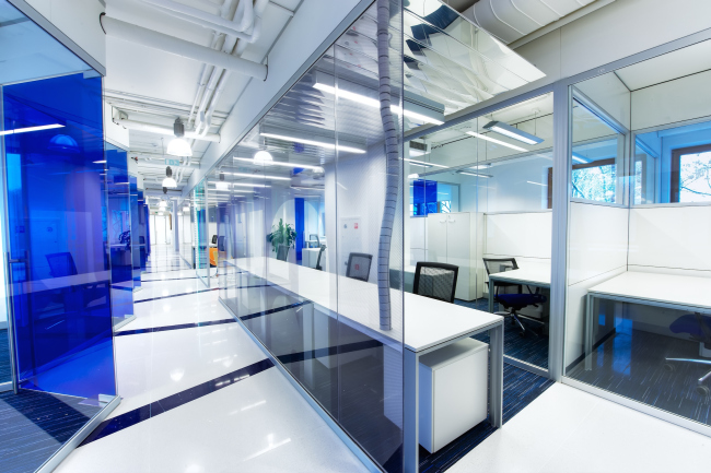
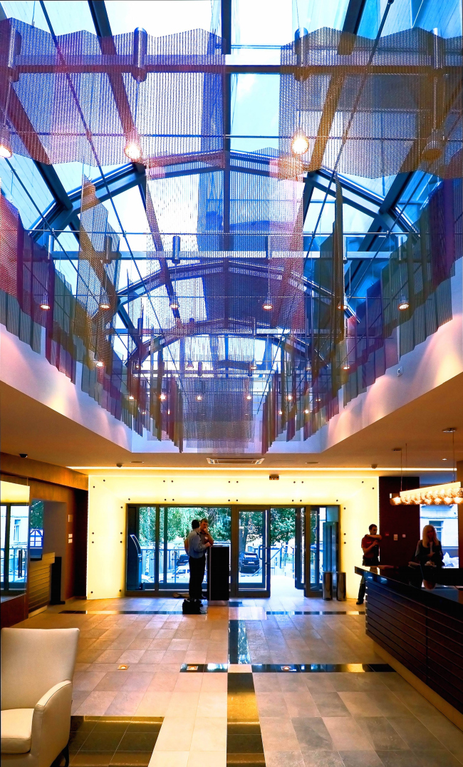
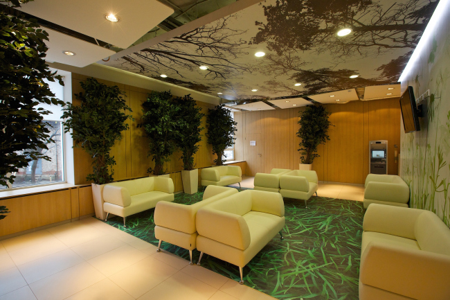
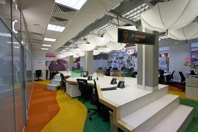
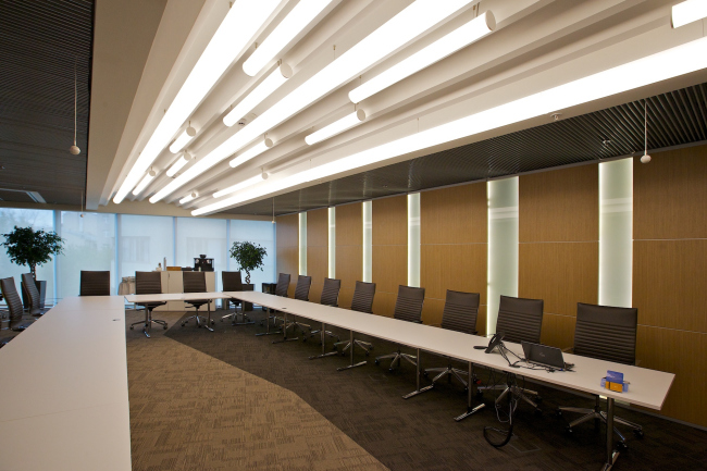
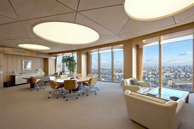
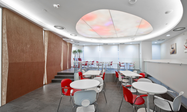
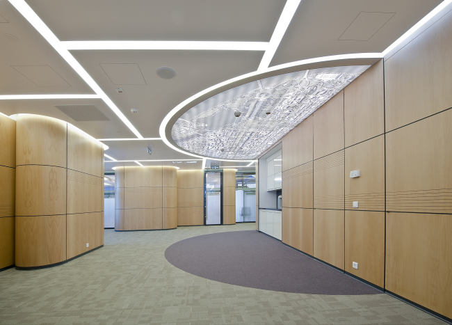
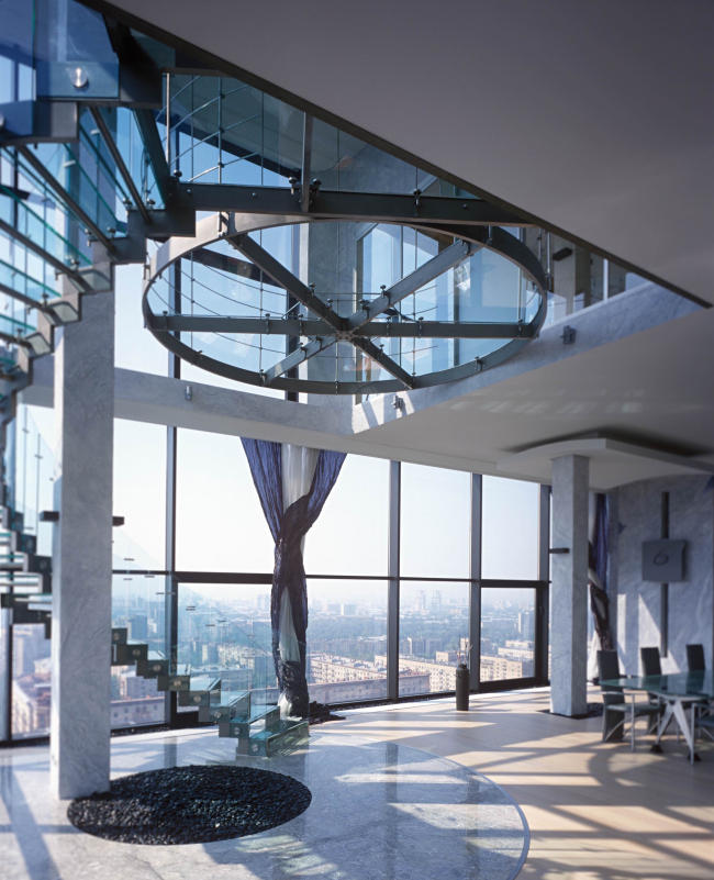
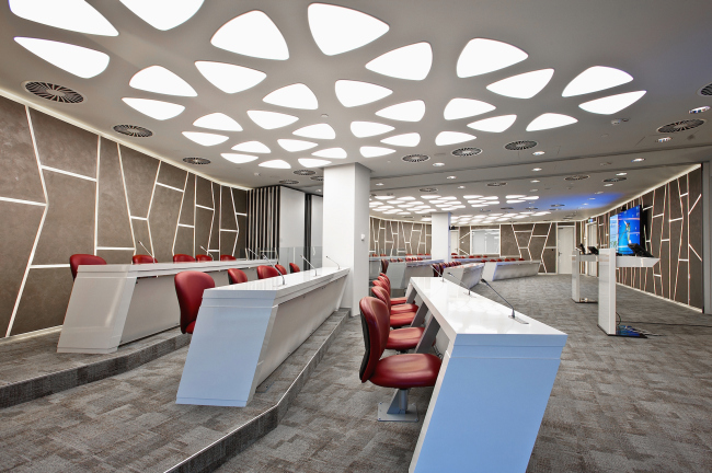
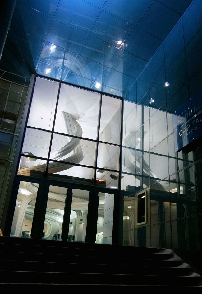
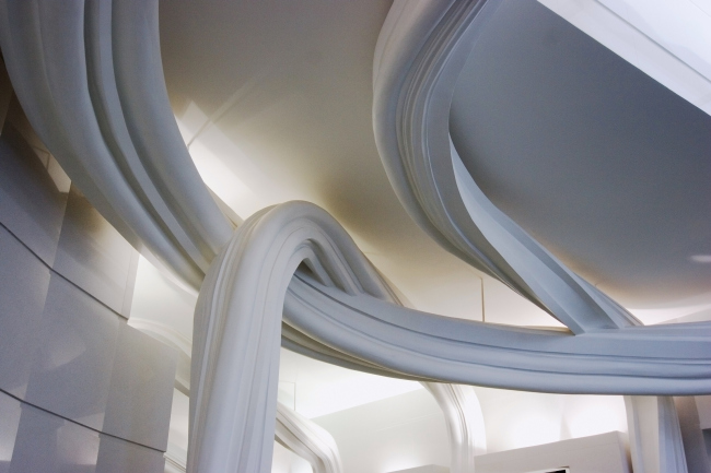
The completion of the work on the ceiling in the synagogue on Bolshaya Bronnaya Street became a newsbreak for us: we met with the author of the project Sergey Estrin and spoke to him about the functional possibilities and the ideological role of the ceiling as the culmination element of the interior design. Archi.ru: The ceiling in the Ceremonial Hall in the synagogue on Bolshaya Bronnaya Street © Sergey Estrin architectural studioThe ceiling in the Ceremonial Hall in the synagogue on Bolshaya Bronnaya Street © Sergey Estrin architectural studioThe ceiling in the Ceremonial Hall in the synagogue on Bolshaya Bronnaya Street © Sergey Estrin architectural studioThe ceiling in the Ceremonial Hall in the synagogue on Bolshaya Bronnaya Street © Sergey Estrin architectural studioThe ceiling in the Ceremonial Hall in the synagogue on Bolshaya Bronnaya Street © Sergey Estrin architectural studioThe ceiling in the Ceremonial Hall in the synagogue on Bolshaya Bronnaya Street © Sergey Estrin architectural studioA complicated thing... Sergey Estrin: Not as complicated as it might seem at first sight! Out this whole circle, we designed but one twelfth, and then this sector simply repeats itself. But, yes, this "one twelfth" consists of twenty different elements each! These wave-shaped girders of the sand color - is this the continuation of the theme of the Sinai desert that is set by the ceiling of the atrium? Sergey Estrin: More or less so. There are different materials and different forms there but, judging by the shade of color, and, more importantly, by the crucial role played by the ceiling, one can say that, yes, it is. The ceiling in the atrium in the synagogue on Bolshaya Bronnaya Street © Sergey Estrin architectural studioOne can see such accents in your projects very often. What do you think are the advantages of the ceilings as a means of architectural expression? Sergey Estrin: The huge advantage of the ceilings lies in the fact that they are always open - you cannot, say, block them with furniture, and they just don't get trodden upon by the crowds of people. Besides, as one moves around the room, the ceiling can be viewed from every conceivable angle. In short, yes, it is indeed a very dramatic element; probably, one of the main elements that we use in our interiors. For example, in the lobby of "German Center of Trade and Commerce" in the techno park of Nagatino i-Land, the ceiling, being originally and powerfully designed and reflecting in the dark glass, so much as organizes the entire large space of the center. The ostentatiously smooth floors and the ascetic plain walls only contribute to the ceiling setting the theme there. The entrance area of "German Center of Commerce and Industry" in Nagatino i-Land technopark © Sergey Estrin architectural studioRecently, we finished the public spaces in "Eurasia" Tower in Moscow City. We were looking to create an effect as if the sun shines through the crowns of the trees. Executing all these hanging plywood elements, by the way, was quite a chore, each petal consisting of four parts, even though you cannot see the seams. We've got a similar theme and pretty much the same decorative elements - only combined with the lamps - in the residential part of the tower, where the entrance to the apartment section is situated. Due to the fact that from the regularity of the bottom part of that space we make a gradual transition to the "freehand" design in the upper part, an association with nature and tree trunks is created... The piblic area in "Eurasia" tower in Moscow City © Sergey Estrin architectural studio""Eurasia" Tower in Moscow City, reception © Sergey Estrin architectural studioAnd this project is more than ten years old. In the entrance lobby of the "Capital Tower" on the 1st Brestskaya Street, we "wrapped around" the entire space but, again, it's all about the ceiling, particularly in the rush hour when people go in a stream, and everything else is inaccessible to the eye. This is why everything that was important was raised to a higher level, and all these wild vortex designs are plainly seen, including from the outside. The structure is rather light - it is all about plasticizers, plaster, and emptiness inside. The entrance lobby of "Capital Tower" business center on the 1st Brestskaya Street © Sergey Estrin architectural studioThe entrance lobby of "Capital Tower" business center on the 1st Brestskaya Street © Sergey Estrin architectural studioIn the interior of Schlumberger research center the effect is based on the alternation of mirror panels with open ceilings. In one of the clubs of "World Class" chain we simply took painted mesh, crumpled it, and hung it overhead - and it turned to be quite a success. In the office of the company Enter, we hung umbrellas to the ceiling: this company is young, and their office was in fact cluttered with rubbish, so, the ceiling was pretty much the only thing that we could work with. And for the tobacco company Philip Morris we decorated the ceiling of the meeting room with cigarettes. Of course, this idea is rather on the simple side but we placed these "cigarette" lights into a curious plaster "tub" with lots of curves that reflect the light in a really cool way and at the same time give a really interesting structure. Research and development center Schlumberger © Sergey Estrin architectural studioThe entrance area of World Class club on Klimashkina Street © Sergey Estrin architectural studioOffice of the company Enter, waiting lounge © Sergey Estrin architectural studioOffice of the compaany Enter © Sergey Estrin architectural studioMeeting room in the Moscow HQ of Philip Morris © Sergey Estrin architectural studioThe main expression element of the office of the C.E.O of "Nordstar Development" is, of course, Moscow outside the panoramic windows. This is why we made the interior pretty neutral but it is, again, the ceilings that "do the job" here. The large circular lamps overhead create the illusion of domes, as if there is a lot more space and light above your head than there actually is. This light is really noninvasive; it is beautifully softened, and the ceiling works in a number of different ways, the velour panels providing for great acoustic properties. Plus - these circles organize the space: there is one zone above the C.E.O's desk, another above the conference table, and yet another above the recreation zone. The C.E.O's office in "Noedstar Development" © Sergey Estrin architectural studioSo, the ceiling is capable of solving not only the imagery-related tasks but the functional ones as well? Sergey Estrin: And very successfully, too! For example, you want to get rid of a shadow. What do you do? You make multiple sources of light in the ceiling and you shadow is gone - the way we did in "Eurasia" tower. And in the cafeteria of the Visual Care Institute "Johnson & Johnson" we equipped the ceiling with a curious circular television - luckily, today's technologies permit that. It shows you the relax content: the people have dinner there, some are even studying or working, then they lift their gaze - and their eyes get a chance to rest. It's both pleasant and wholesome. Another example - in the office of the law firm "Baker & McKenzie" we were to decorate the air ducts, at the same time hiding the sensors. What we did was the following: we took the maps of the cities where they had HQ's, and selected one of the areas of the city the size of the air duct. This technique, by the way, allowed us to combine the sensors with this or that prominent building or a monument. Cafeteria in Johnson & Johnson Visual Care Institute © Sergey Estrin architectural studioFragment of the interior of the Moscow Office of Baker & McKenzie © Sergey Estrin architectural studioAnd what are the technical requirements for the materials that are used for the ceiling decoration? They are not supposed to be too heavy, I guess? Sergey Estrin: Actually, "not too heavy" isn't much of a requirement because there are many ways that you can even out your load over the ceiling. In "Eurasia" tower, these petals were pretty heavy - but there also was a lot of suspension points there. From the fire safety standpoint, these must be materials of some certain fireproof properties - but that's about it when it comes to restrictions. That's the beauty of it - ceilings give you the ultimate freedom of expression. Once we were doing a project for the Novolipetsk Metallurgical Plant, and one of the design options included suspending a huge metallic beam from the ceiling. As for wood, we also used it - take that same synagogue, for instance. In its atrium, the hard ceiling is made of spruce, and what's interesting, we would simply cut it; we were not interested in the seams; this was part of our design. And in the penthouse of the residential complex "Sokolinoe Gnezdo" ("Hawk's Nest"), the ceiling (being also the floor of the top level) is partially made of glass. Concrete, gypsum - there materials are also quite appropriate on the ceiling. I do not like stone so much, but then again, it can always be easily simulated. Interior of the private penthouse in the residential complex "Sokolinoe Gnezdo" © Sergey Estrin architectural studioNowadays, more and more projects are designed without a ceiling at all - what do you say to that? Sergey Estrin: When I was on the judging panel of Office Next contest I paid attention to the fact that about eighty percent of the offices were indeed designed "ceiling-less", like it was today's aesthetics or something. But this has long since stopped being the "hot stuff", and, besides, it is more expensive that actually having a ceiling! Because covering up all the engineering lines and stuff is a lot easier than trying to figure out how to run them through the walls and partitions... If we are to take that same company Enter, for example, in its waiting lounge we made a printed design on the ceiling - which was both artistic technique and something that covered up all the communications. Traditionally, a ceiling is the place where sources of light are fitted. Do you have any preferences in this area? Sergey Estrin: After this "LED Revolutuon" happened, literally everything became possible. While earlier you used to have to try and figure out how you would maintenance your lights, and how soon they would burn out, now a lot of such issues are solved for good. Heat removal is no longer a problem, these lights require very little maintenance and they serve a long time. So it is really a pleasure now creating some large lights compositions. However, you have a very hard time searching the catalogues for really large-scale lamps that could become the defining elements of the interior design. The architectural solutions, however, that are created with the help of these LED bands are quite a different thing. Here the architect's hands are completely untied; he can let his fantasy go wild, and he can implement things totally changing one's perception of the architectural space. In the conference hall of Johnson & Johnson we used totally standard lights but if you organize them in the right way, they look anything but "standard". Besides, they did not "eat up" the height here, and they yield a very comfortable shadowless kind of light, perfect for the conference halls. Conference hall in Johnson & Johnson Visual Care Institute © Sergey Estrin architectural studioAnd can a ceiling perform any construction function in today's interior design? Sergey Estrin: In all the projects that I showed here, this is basically about decoration. In modern construction, ceilings that are the continuation of the bearing structure are few and far between - if for no other reason then simply because you first build a house and then you do the interior design. If there is an opportunity to combine these two, you get such things as Oscar Niemeyer's temples in Brazil or Le Corbusier's Notre Dame du Haut in Ronchamp in France or Santiago Calatrava's projects... But as for this country, I cannot recall any projects that would be about structural bearing elements bleeding into the interior - that is, of course, barring the Olympic projects. Are there any specific techniques that make an individual raise his gaze towards the ceiling? Because when you enter the room, staring at the ceiling is not always the first thing you want to do? Sergey Estrin: Of course, there are! If we are to take the gothic style, for example, there is this whole vertical stream of columns that pulls your gaze upwards. If we are to take our projects, in "Eurasia" tower, the "petal" theme - that is to be seen mainly on the ceiling - first appears as a hint on the floor, and then manifests itself a bit more on the walls... In "Capital Tower", the space is first spun down below, and then it shoots upward. And in the office of BinBank, we simply took the walls and made them merge with the ceiling. As a matter of fact, most of the time, when a person goes to visit some office, he first enters a building that is designed and decorated in quite a different style. He comes through the entrance group, and ascends to the floor, totally unprepared for the place that he is going to. And when he opens the door - this is the moment that you have to do something to take his breath away! And what does he see first in the perspective? The ceiling! Entrance area of the business center "Capital Tower" on the 1st Brestskaya Street © Sergey Estrin architectural studioEntrance lobby of "Capital Tower" on the 1st Brestskaya Street © Sergey Estrin architectural studioSo, does that mean that the ceiling is actually the climax point? Sergey Estrin: Yes, the ceiling as such is one of the techniques that allow you to foster the climax for the individual that is walking through this or that space. For example, a person goes from a dark room over to a light one or from a small room over to a larger one: ceilings work just great in this case creating an emotional contrast. You've just been to a place with many little details and then you find yourself in a room with only one detail - but one that's large and bright. Where can you place such a dramatic detail? If we are to speak about something other than a museum - about a regular residential or office or retail store space, for example - then the ceiling is pretty much the only single undivided element there. It can even determine the hierarchy of the premises - this territory is important because it is, say, the leader's office, and this is the main meeting room, for example... Nobody gets tired of it, it is always there for you, and, if it is possible to move the furniture, change the exposition, and arrange the tables in the hall in a different way, the ceiling in any situation will "hold" the composition and create the character of the interior decoration. |
|
