|
Published on Archi.ru (https://archi.ru) |
|
| 01.10.2015 | |
|
A Fan of Versions |
|
|
Anna Gorodinskaya |
|
| Studio: | |
| Architectural bureau of Yuri Vissarionov | |
|
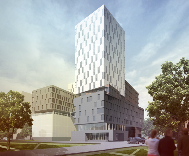
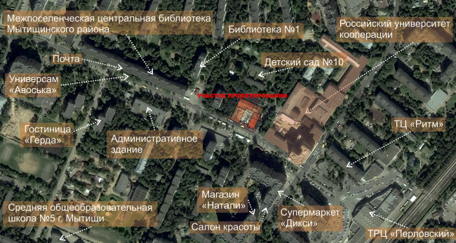
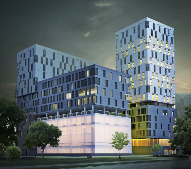
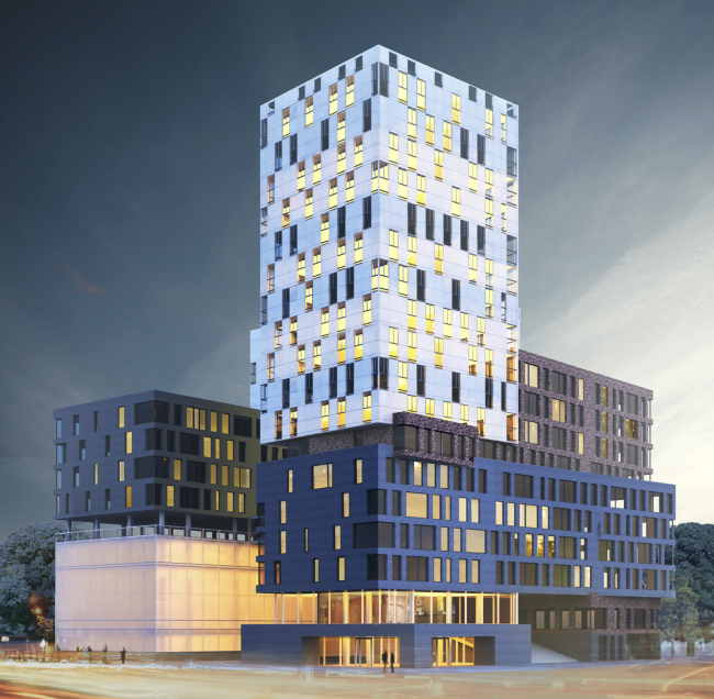
Vissarionov Studio proposed two versions of architectural and engineering concept of developing the territory of the Russian Institute of Cooperation located in the Moscow suburb of Mytischi. Instruction and administrative building №2 in Mytischi. Version 1 © Vissarionov StudioVissarionov Studio proposed two versions of architectural and engineering concept of developing the territory of the Russian Institute of Cooperation located in the Moscow suburb of Mytischi. The land site is located not far away from "Perlovskaya" railroad station of the Yaroslavl railroad branch, 800 meters outside the circle of Moscow Ring Road. Nobody is trying to form a now-fashionable campus or an innovative cluster here - probably because there are neither territorial nor financial resources for that. It is down-to-earth practical problems that are being solved here: "for providing the possibility of increasing the number of students and postgraduate students, as well as attracting highly qualified lecturing staff, including people from other regions of the Russian Federation, a construction of an extra residential facility is required". In a nutshell. As for the territory that is allotted for the designing, it is small indeed - less than half a hectare - and it must include the lecturing and administrative building with an underground parking garage, a gym, and a dormitory for the students, postgraduate students, and the already mentioned "magistral and lecturing staff from other regions of the Russian federation". The land was handed over to the university that over the years have proved the unflagging demand for the professions that are taught here, in 2012, for the 100's anniversary of this educational institution that originally bore the name of Shanyavsky People's University. The land site in question, is limited by the Vera Voloshina Street on the south side, borders on the yard of a twelve-story residential building on the northwest, on the territory of a kindergarten on the northeast, and from the southeast it is separated by the Yauza Promenade from the main university territory, being at the same time in fact its continuation both from the functional and compositional standpoint. Located within a walking distance, the stores and other infrastructure objects make this place comfortable for placing here not only the instructional building but residential facilities as well. The existing situation © Vissarionov StudioThe versions that the architects proposed differ not only in their space and imagery solution but also in their technical and economic expected performance. What they have in common, on the other hand, are the functions that are by default necessary for a university: residential stock for the professors and postgraduate students, a dorm, a large double-height gym, a swimming pool, an underground parking garage (2 levels), and small slots for cafes, shops, and administration on the ground floors. The first version has more plasticity to it, and it is more radical, too. An important part here is played by the counter positioning of volumes of different type and color that vividly demonstrate the functional diversity of the premises. The buildings (this, incidentally, is to be traced in both versions) are grouped in a classic "double L" around a small yard of vertical proportions that opens to the street. These buildings are rather high - up to 17 floors, the land site being a small one, and the demand for usable space being high - which makes both compositions inevitably compact. Instruction and administrative building №2 in Mytischi. Version 1 © Vissarionov StudioInstruction and administrative building №2 in Mytischi. Version 1 © Vissarionov StudioFurther on: in the first version, the facades follow the diversity of the functions of the premises, and are built, as the Greats taught us, from the inside to outside, particularly so at the bottom floors. The gym and the swimming pool take up four floors of the left building - their facades are covered with white opaque (as if misty) glass and are meant to glow enticingly in the evenings. Higher up, on the gym's roof, there is an open-air terrace with round Corbusier supports - an air pillow that bears the next four floors of the student dormitory with a dark-gray finish - its pitch-black volume of course accentuates the whiteness and the glow of the sport part. The second "leg" of the "double L" looks pretty much the same only the warm light is emitted by the transparent shop windows caught between the dark-gray of the base terrace and the volume of the four floors of the lecturers' apartments. Although without changing its function, further on this volume "changes its skin": the walls of the next floor recede a little bit and become brick-brown, with a slight ripple, artificially aged, as is the custom nowadays. The brick volume, receding from the edge, stretches into the depth, "growing" from the dark-gray. Still, though, the brick sprout below the gray volume as well, as if running it through - and if one is to look at the building from the Yauza Promenade, through the lower floors he will see a broad grand staircase that leads to the second floor between two flanking volumes: a glass and a brick one. At the corner of the Vera Voloshina Street and the promenade - a keynote place, almost a crossroads, hence allowing for a centerpiece - the architects took a brick "beam" and placed on top of it a white tower - square and tall. The white tower is supported and continued by the farther building that is in fact the same volume, only placed crosswise and horizontally, really looking like a skyscraper, only lying on its side.  Instruction and administrative building №2 in Mytischi. Version 1. Development drawing along the Vera Voloshina Street © Vissarionov StudioInstruction and administrative building №2 in Mytischi. Version 1. Section view © Vissarionov StudioThe project description sparkles with verbs - "strung", "installed", "hoisted" - because the project follows the ASNOVA's classic rules and enhances the various types of mutual penetration of volumes and materials. The effect of composite forms strives to be convincing and palpable: what can be more veritable than the air pillow one floor high between the gym and the dorm? It divides the sport and the residential function, helping to stick to the construction norms; the students will have a great time resting from sports and studies on this terrace. It will be also a great place for romantic dates, too. Meanwhile, however convincing is the plasticity of the project, we must note that it is not always "true to life". At some places, especially on the bottom floors, the plasticity manifests function - specifically, it marks and visually separates the gym and the cafés realizing one of the main principles of classic modernism and hitting a slight retro note. Higher up, the play of volumes works for itself and the city as well, forms a centerpiece, and intrigues the passers-by, although not reflecting the diversity of functions right now. On the other hand, it bears a slight resemblance to a warehouse of containers - or a disarray of books on a student's table. Which was also, probably, made on purpose. And who said that you must always play by the rules, especially obsolete? Sometimes you can indeed indulge in going for MVRDV structures. ***
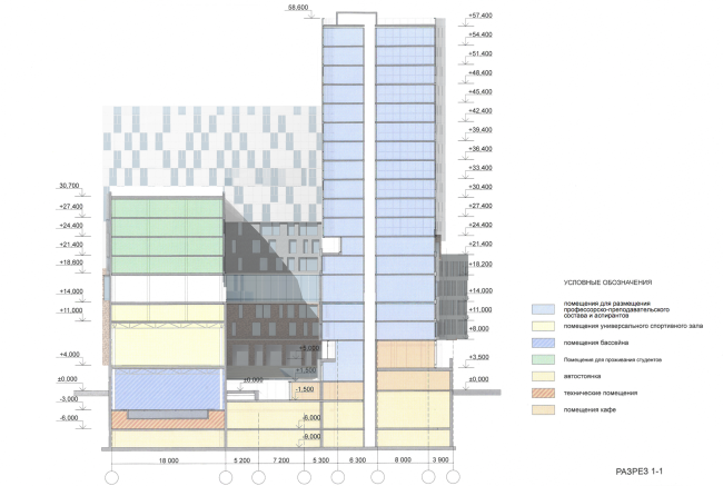
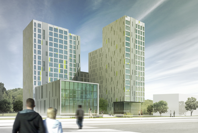
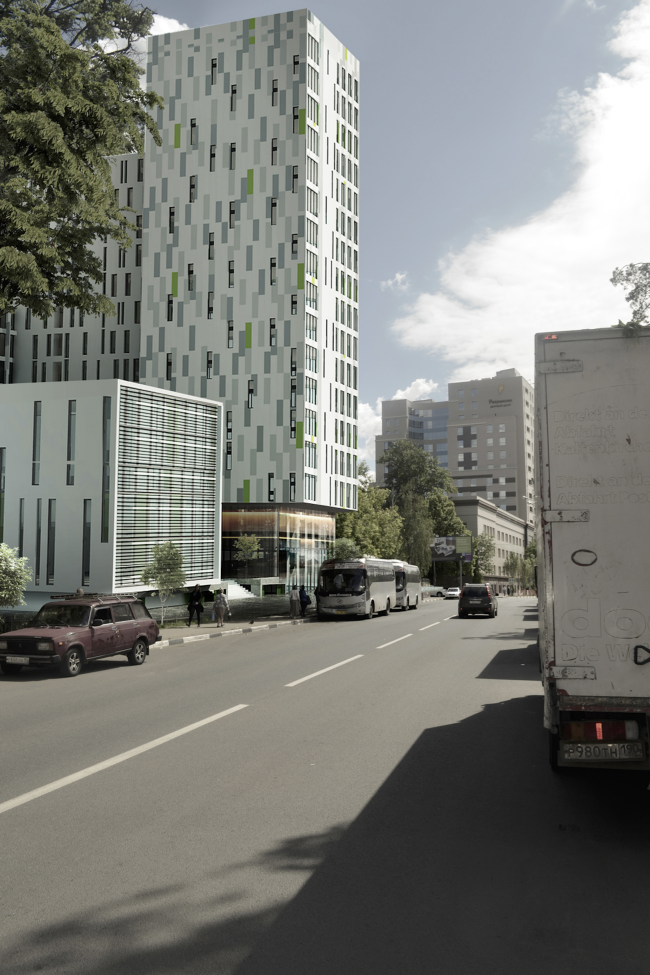
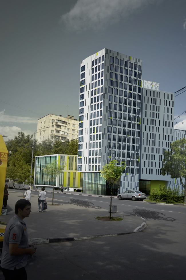
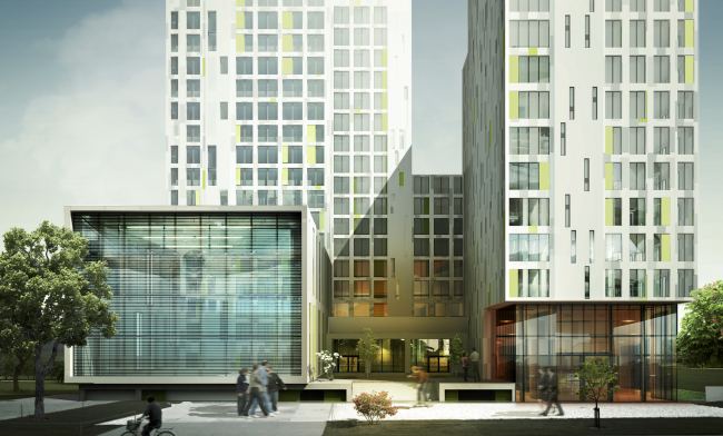
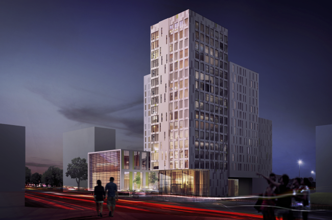
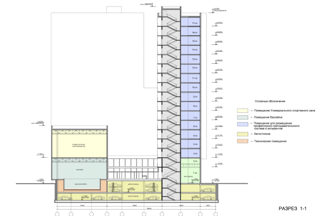
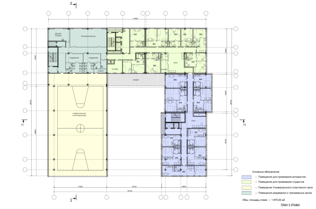
Instruction and administrative building №2 in Mytischi. Version 2 © Vissarionov StudioThe second version looks more reserved and more like a cluster of residential buildings executed in today's style in the vein of "Airbus": look at this grid of broad windows, something here is from "Welton Park" (to which we are referred by the pixel strokes of the springtime gray and salad-green spots on the white background, at some places turning the wall into an enlarged fragment of a wall carpet. A later modernist theme is traceable here: that of a "slab" building, very much like the "House of Tourists" which also adds a slight twist of nostalgia for the seventies, so fashionable today. The volumes are taller and more compact here: the architects were able to squeeze the main square meters into two tall volumes, one in the depth of the land site and the other stretching along the promenade, linked by an overpass; nothing is built above the gym. Instruction and administrative building №2 in Mytischi. Version 2 © Vissarionov StudioInstruction and administrative building №2 in Mytischi. Version 2 © Vissarionov StudioThe slabs have two types of walls - the "blind" and the "transparent" type. In actuality, neither of them are quite blind or transparent but the difference is enough to visually separate the facade and the background. The transparent walls are in fact a grid of thin-faceted windows, they have more glass in them, and they are turned on to the street and the promenade - the buildings here are anything but introverts. Compared to them, the walls whose windows are optically hidden amidst the pixels, look blind and monolith. Then we see the variations; the strokes on the windows can go without the pixel coloring but they still enhance the monolithic character of this white wall. The volumes also visually grow into one another and also "raise" together a tower on the corner but in this case they "camouflage" this peculiar feature, hiding the true magnitude and the rhythm and confusing the observer. The tower is not accentuated so much either. The first version also was trying to throw the observer off track a little, by it was done in rather a logic way, while here it is done by pure artistry. Instruction and administrative building №2 in Mytischi. Version 2 © Vissarionov Studio Instruction and administrative building №2 in Mytischi. Version 2. Development drawing along the Vera Voloshina Street © Vissarionov StudioSome of the bottom floors recede inside, and some remain within the plane of the facades; they alternate the glass surfaces with salad-green walls - the sources of specks of light and reflexes. All of this put together makes the bottom tiers look lighter and more transparent, and works for the levitation effect enhanced by the overhanging cantilever of the right "tower" and the "TV-screen" of the sports center that also hovers ever so low above the ground. Everything is slender, white, and ethereal. ***
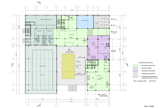
Both first and second versions solved the issues going way beyond the original task - at a minimum, a graceful balance is kept between the bright form that arrests the eye and the not-so-attractive, although habitual, suburban city environment. Arrest and not destroy. Only time will tell which of the two versions the customer will choose and which of the two projects better solved the university's problems. One thing is clear though: either of the two versions is worthy of being implemented. Instruction and administrative building №2 in Mytischi. Version 2 © Vissarionov StudioInstruction and administrative building №2 in Mytischi. Version 2. Section view © Vissarionov StudioInstruction and administrative building №2 in Mytischi. Version 2. Plan of the first floor © Vissarionov StudioInstruction and administrative building №2 in Mytischi. Version 2. Plan of the third floor © Vissarionov Studio |
|
