|
Published on Archi.ru (https://archi.ru) |
|
| 19.06.2015 | |
|
Palazzo on the Krestovsky Island |
|
|
Lilya Aronova |
|
| Studio: | |
| Evgeniy Gerasimov & partners | |
|
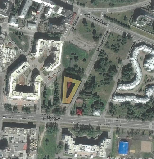
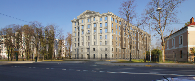
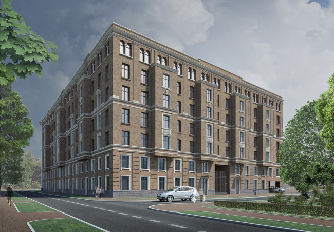
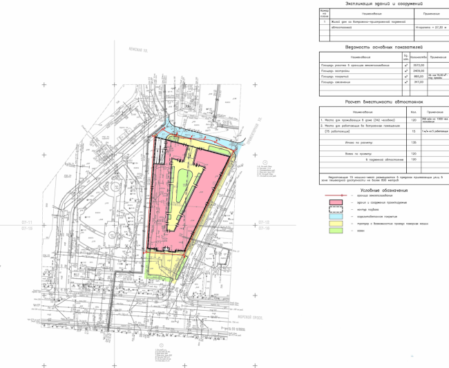
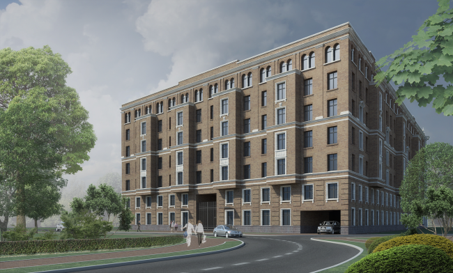
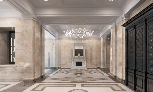
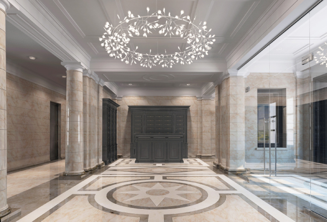
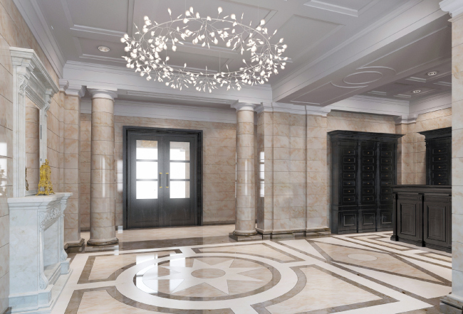
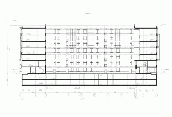
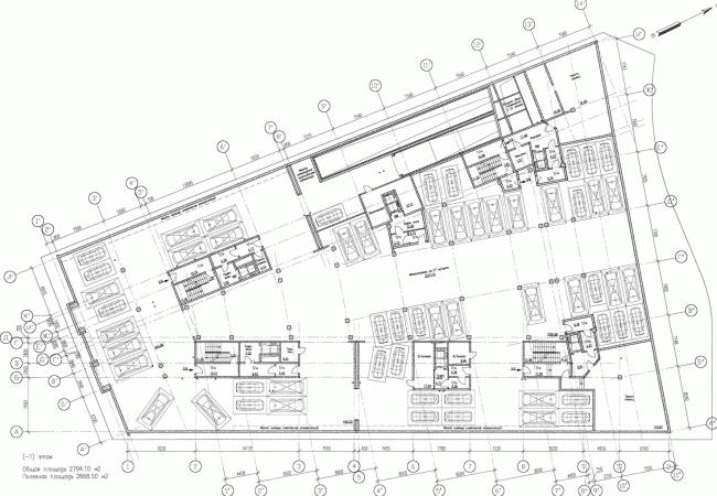
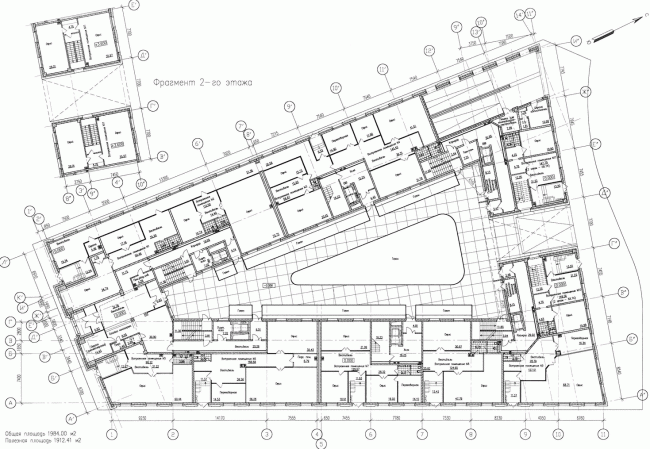
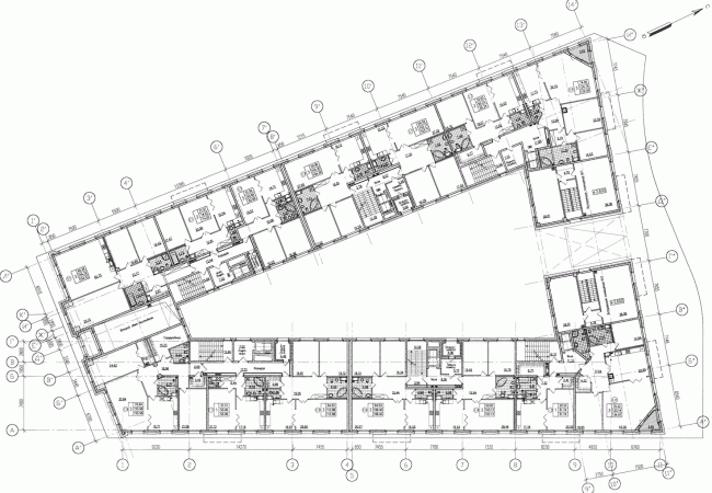
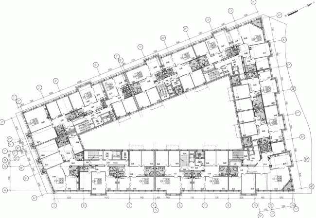
Eugene Gerasimov continues his "Italian series" on Saint Petersburg’s Krestovsky Island. Following the "Venice" house, the construction of "Verona" started that combines the features of a country residence and a city palace of the Renaissance epoch. It is common knowledge that, until the late XIX century, the Krestovsky Island was considered the place where the lower classes came to have a rest, these swamps being unattractive for the more sophisticated people. Today, the people of Saint Petersburg take this fact as a historical anecdote: today, the island is getting overbuilt with residential complexes of premium class, the price of square meter in them being one of the highest in the city. Eugene Gerasimov is the pioneer of this process - his complex "Green Garden" was put into operation in the year of 2000, and, during the next decade, his studio implemented a number of other brilliant projects on this island. Today, the process of building the high-profile real property at the "green gem of Saint Petersburg" has slowed down a bit, there are almost no suitable land plots left anymore, so "Verona" designed by Eugene Gerasimov (its construction is now beginning on the Morskoy Avenue) has every chance of becoming the last new elite-class residential complexes to be built here, thus beautifully closing the historical circle. Location Plan © Eugene Gerasimov and PartnersThe complex will be built at Morskoy Avenue 29, in the place of the recently-demolished constructivist building that consisted in fact of twelve units of the Krestovsky residential area. The land plot is handled by the corporation "Revival of Saint Petersburg" that, capitalizing on the success of the recently built neighboring "Venice", has continued the cooperation with the bureau "Eugene Gerasimov and Partners". This is not the only sign of the continuity: as the stylistic centerpiece, the architects again chose the image of Italian Renaissance palazzo, and, in their search of the selling name they did not even cross the border of the Veneto region - the future house got the name of "Verona". Incidentally, this complex will become a third "palazzo" in Eugene Gerasimov's portfolio: the first and the most high-profile one is the project of a hotel at the Ostrovsky Square, next to the "Alexandrinka". This is quite a natural archetype for Saint Petersburg, a city whose connection with the Italian architecture hardly needs any proof. So, what is a Renaissance palazzo all about, or, in this particular case, its Roman variety? First of all, it is about a closed perimeter whose facades are notable for their austerity and laconism, while the main human activity is concentrated in the courtyard. From today's standpoint, such stuffiness would have probably felt inconvenient in the close-knit array of the houses adjoining to one another but, surrounded by the large and small parks of the Krestovsky Island - 60% of it is woodland - this separately standing building looks a bit different, pretty much like the outpost of the city. This effect is also strengthened by the design solution of the facade opened to the island's main thoroughfare - the Morskoy Avenue. The clearly expressed hierarchy of the main facade versus the side ones, built with the help of the classic architectural lexicon, is enhanced by the choice of the materials, so expressive that it alone would have sufficed to show who is the boss here. The Morskoy Avenue facade is completely coated with opaque light-beige plaster, while the sides of the building, on the other hand, are decorated with rather dull decoration bricks, only inheriting from the main façade's grandeur the exquisite (and at times not really exquisite) numerous details: the window casing moulds, the frontons, and the floor-to-floor pull rods. The combination of the red-brown brick and the light-colored natural stone again refers us to the epoch of the Italian Renaissance - in particular, to the belfry of the Venetian church San Giorgio in Maggiore, the one that Eugene himself names as his source of inspiration for this project. Multiapartment building with inserted premises on the Morskoy Avenue © Eugene Gerasimov and PartnersMultiapartment building with inserted premises on the Morskoy Avenue. Northwest side © Eugene Gerasimov and PartnersPlanning organization of the land plot. Diagram © Eugene Gerasimov and PartnersThis is here that some interesting nuances begin. The building, particularly when viewed from a distance, looks not so much as a belfry as the whole San Giorgio: a quick glance catches the magnitude, the contrast of brick and stone, as well as the large portico whose fluted Corinthian semi-columns unite four floors. When viewed from afar, it produces quite a Venetian, even Palladian, impression - it is this feeling that the light-colored stone façades of Andrea Palladio create being applied to the stone giants of those churches. But then again, not only its façades produce this impression: the representative plastic applied to the massive brick volume waiting for its hour, almost undecorated or but partially decorated, is the frequent impression that the Italian churches produce. And not only churches - a similar combination of some slightly inert brick and some ostentatiously organized stone i.e. subjected to some specific architectural order, is to be often encountered in the city gates that were "applied" in the XVI century to the earlier-built brick city walls. If, following the realtors' selling name, we are to take a look at Verona, we will find in it two similar gates built by Palladio's contemporary Michele San Michele. Facades © Eugene Gerasimov and PartnersSo, the effect of a Renaissance facade applied to the building, is captured rather accurately here. Later on, however, we notice that the proportions are significantly stretched here, the frieze between the capitals and the fronton has grown to the size of a whole floor, and the rock face basement floor consists in fact of two levels. The space between the columns got a semicircular "thermal window", the sign of architecture of the times of Napoleon wars and of even later days, while the gusts of the columns are fluted, which we will not find in Palladio's architecture, this also being a feature of a later architecture, on the one side, still more oriented on the antique examples, and, on the other hand, "burdened" by the new scale and magnitude... Further on, we notice that the façade has in it yet another theme, namely, that of Saint Petersburg, given to it by the "flattened" background - it is through this very theme that the portico grows forward. The rock-face that unites the third and fourth floors is not of the Renaissance type, but rather, of the local Saint Petersburg kind; it looks more reminiscent of the "Twelve Collegia" building (correction: this does not make it any less Italian because "Twelve Collegia" was built by Trezzini, an Italian architect). Higher up, the flat pilasters unite not four but three floors, thus missing a beat and highlighting the mutual shift of the basis and the center. And, finally, the small entrance stanza, framed by the close-knit array of columns of the Tuscan order, definitely reminds us of the northern Saint Petersburg Art Nouveau: at this point we notice that the vertical composition of triple windows built on top of it belongs to the Silver Age alone, while the empire thermal window was probably inspired by the passéisme of the early XX century. This is a tribute to the context: maybe not the best, not the kind that there is at the Kamenny Island, but a few samples of Art Nouveau are still to be found here on the Krestovsky Island. So the façade is pretty sophisticated - at least three themes are superimposed on one another both geometrically and in space; on the periphery of one's mind, there is also a lurking thought of the Celsus Library, and the shadow of the Stalin architecture, the almost inevitable companion of any Russian experiments with the classics, is also persistently there, although it is not really strong in this project - for the exception of some influences of Mussolini experiments that one can discern on the side facades, still softened by the "medieval" mullioned windows. Multiapartment building with inserted premises on the Morskoy Avenue. Northeast side © Eugene Gerasimov and PartnersThe house also got a not really important but a very curious town-planning role. The buildings of the Krestovsky Island that surround it, are predominantly of the "Moscow style" type, spaced out rather freely and at some places even haphazardly. The two houses designed by Eugene Gerasimov - "Venice" and "Verona" - look quite aristocratic among these no-ceremony things. "We deliberately placed the main facade parallel to the thoroughfare's red line: thanks to this solution, the building turned into a small "quarter" building that enhances the planning structure of this area" - explains the chief architect of the project Oleg Kaverin. Indeed, both houses "hold the line", one of the avenue, the other of the embankment, and signify the lines of the streets. It is really a treat to watch just how uptight these two houses are while all the others are just taking a stroll. Besides, in spite of the earlier mentioned presence of several conceptual and plastic layers, both houses are notable for the palpable cohesiveness of their composition and graceful and certain proportions - this is a whole new level of treating the traditions of classical architecture. The two houses rhyme and echo one another, and even look like the "agents of influence" of the urban culture of the new type in the "country-club" atmosphere of the elite Krestovsky Island. It is planned that the inside yard will be tile-paved and places will be found for the lawn and the small architectural forms; the yard facades will be decorated with large slabs of ceramic granite of the same light-beige tone as the coating stone of the main facade. The theme of the Italian classics will be supported by the decoration of the entrance lobby: the architects plan to install here the same kind of columns as near the entrance on the outside - they will highlight the direction of the building's main axis. The color palette will be reigned by the exquisite tone of the light plaster (all the floors and walls are exclusively decorated with natural stone). Multiapartment building with inserted premises on the Morskoy Avenue. Interior © Eugene Gerasimov and PartnersMultiapartment building with inserted premises on the Morskoy Avenue. Interior © Eugene Gerasimov and PartnersMultiapartment building with inserted premises on the Morskoy Avenue. Interior © Eugene Gerasimov and PartnersEugene Gerasimov is an exceptionally versatile architect. He is not really comfortable within the rigid limits of one specific style, and he has equal interest for today's architecture, and for the new interpretation of the classic traditions. As far as architectural historicism is concerned, Eugene Gerasimov's attitude to it is respectful but not doting: "The time of joking around on the historical subjects is gone" - he says. The clear-cut and laconic project of the building on the Morskoy Avenue is a great example of the modern interpretation of the classical tradition. With no hidden irony, quite serious. Section view © Eugene Gerasimov and PartnersPlan of the underground floor © Eugene Gerasimov and PartnersPlan of the first floor © Eugene Gerasimov and PartnersPlan of the second floor © Eugene Gerasimov and PartnersPlan of the third floor © Eugene Gerasimov and Partners |
|
