|
Published on Archi.ru (https://archi.ru) |
|
| 14.05.2015 | |
|
Taking Flight |
|
|
Julia Tarabarina |
|
| Architect: | |
| Sergei Tchoban | |
| Studio: | |
| SPEECH | |
|
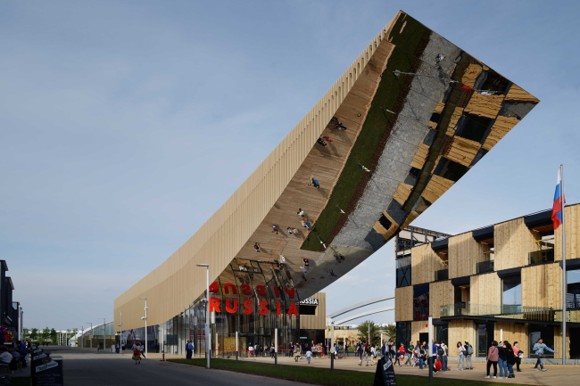
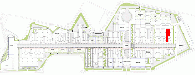
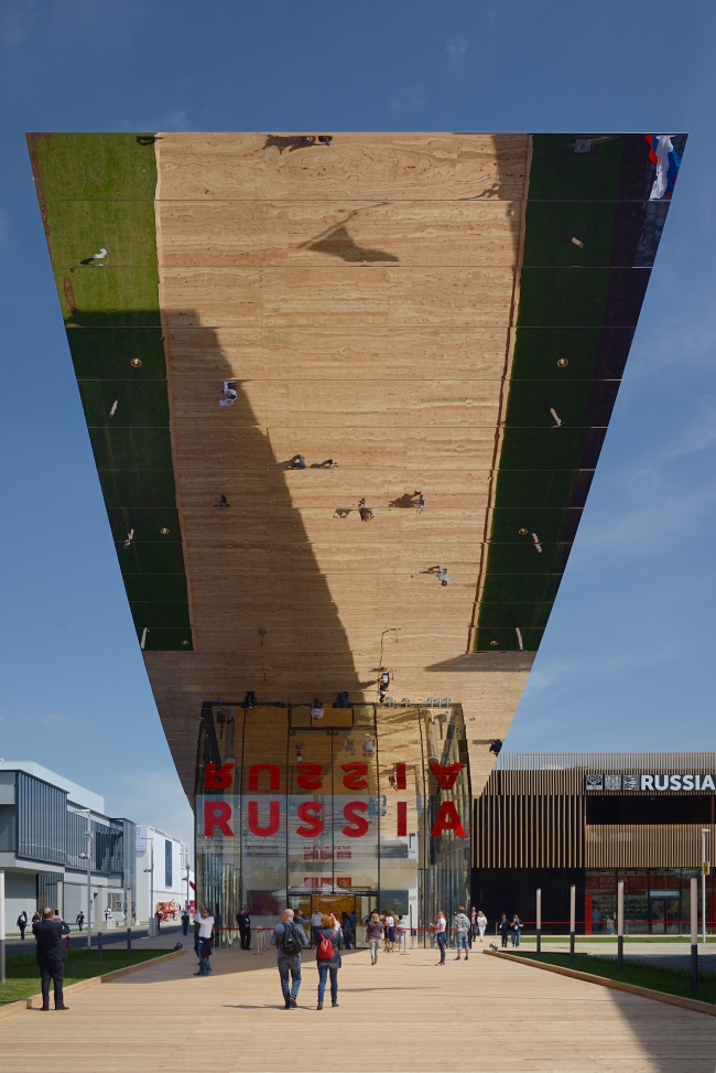
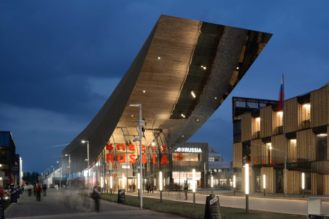
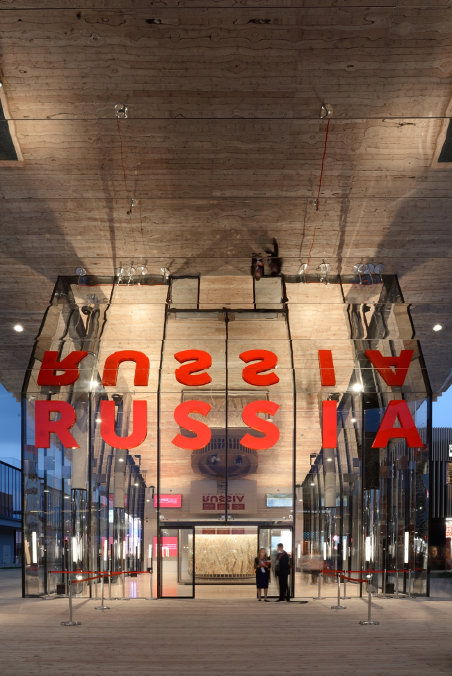
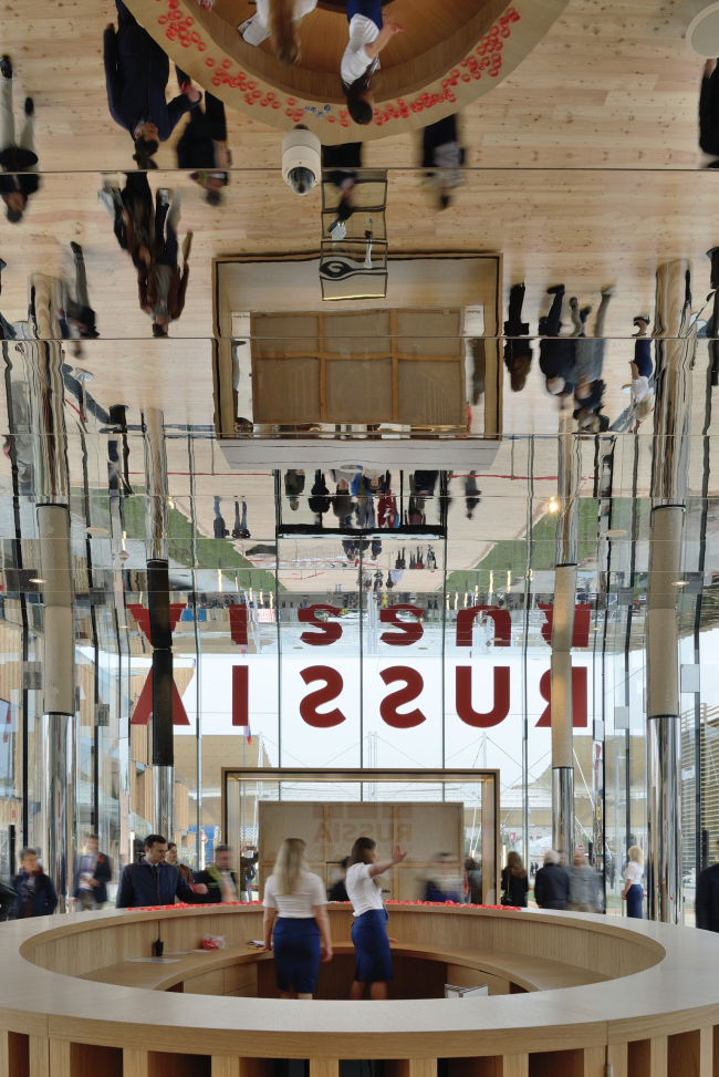
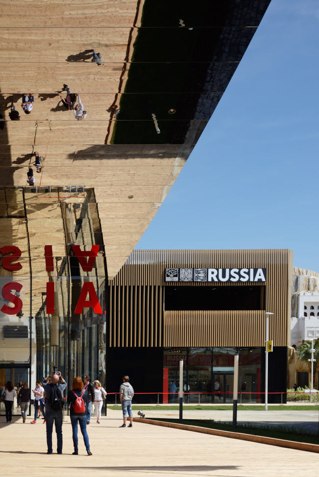
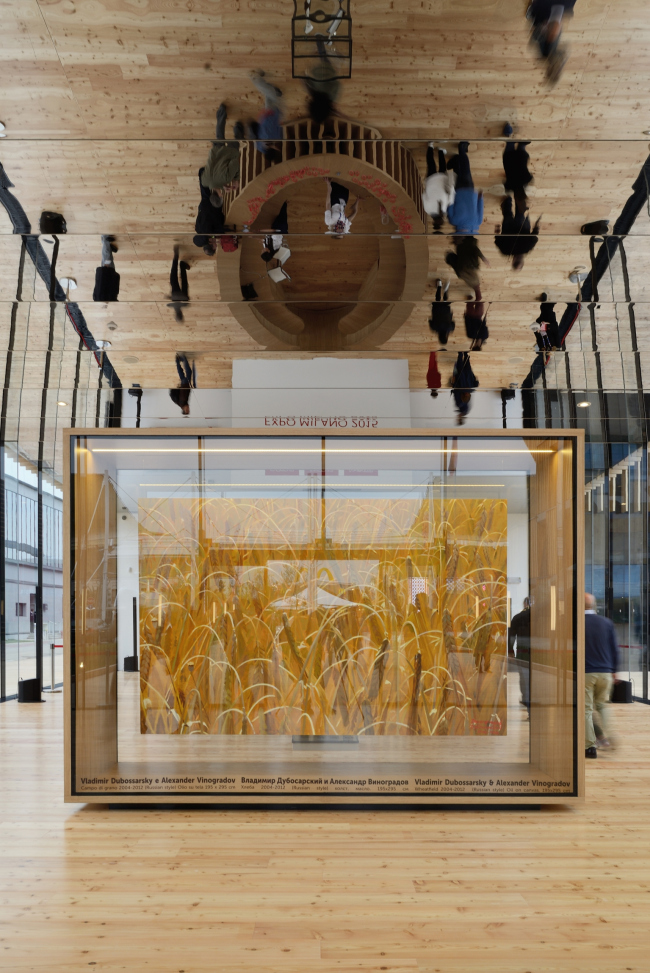
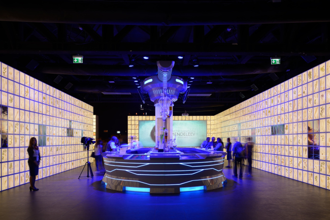
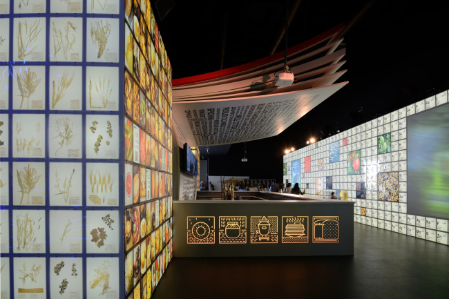
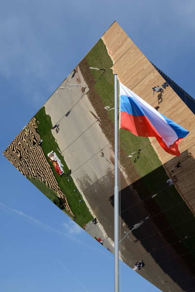
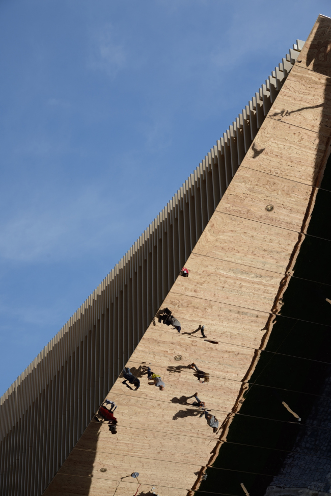
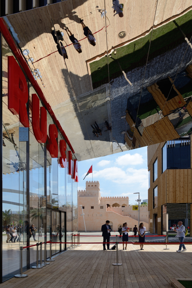
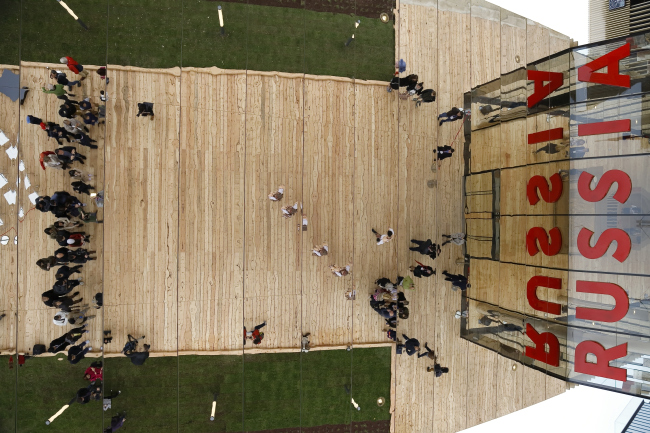
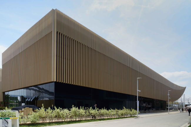
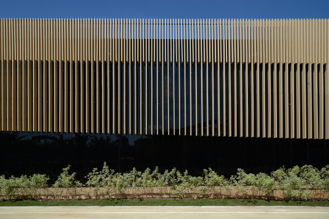
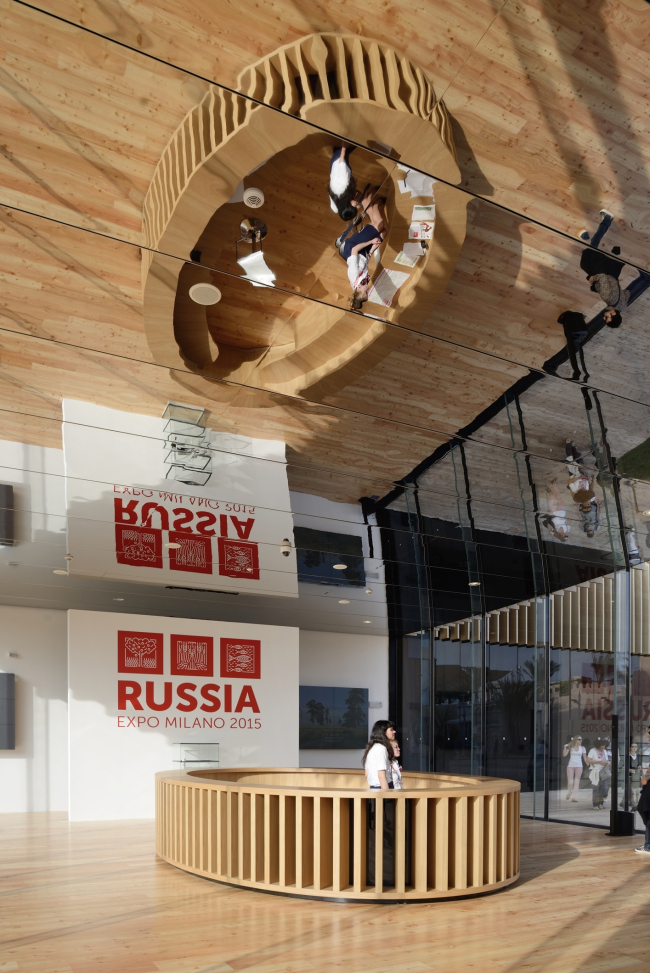
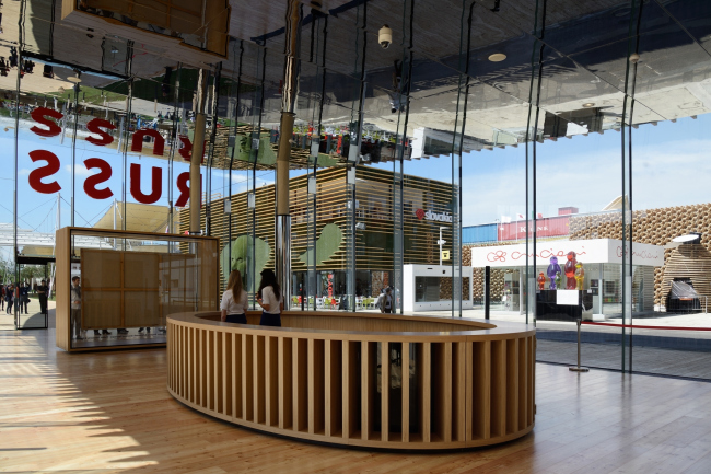
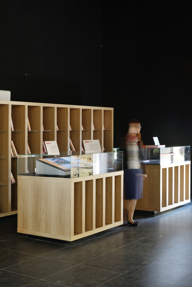
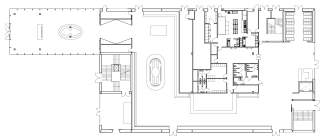
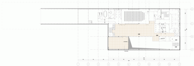
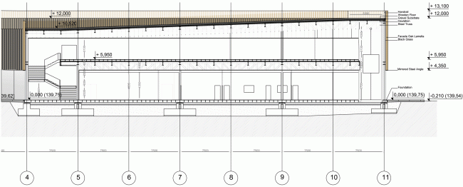
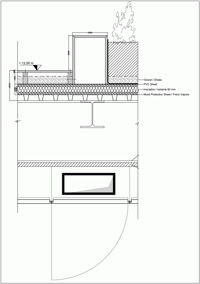
The pavilion that represents Russia at EXPO 2015 in Milan was designed by Sergey Choban. Russian Pavilion at EXPO 2015 in Milan. SPEECH. Photo © Aleksey NaroditskyThe pavilion representing Russia at EXPO 2015 is located in the western part of the mile-long axis of the world exposition, which the organizers called in the spirit of antiquity: decamanus. It is rather far, about a thirty minutes walk, from the main entrance, back from the main square of the exposition. However, the pavilions of Japan, Turkey, and the USA are also situated nearby, and the territory was evidently divided by way of lottery – there is no logic to be seen in their mutual alignment – it seems to be quite random. The sections of the national pavilions are densely collected around the main axis and are cut up in three different ways. Middle-sized sections – narrow lines, bigger sections that have a P-shape in plan: a narrow arm leads to the decamanus and the wide convenient rectangle is placed deeper; a corner cut on the side of the main street forms another small lot of the next pavilion. The section of the Russian pavilion is one of the large P-shaped ones. The project by Sergey Choban, Alexey Ilyin and Marina Kuznetskaya was selected at a closed selection organized by the selection committee of the Russian section in February 2014. According to Sergey Choban, the result was in particular determined by the right choice of the high-rise accent in the context of a dense development, limited viewing angles and exact height restrictions. It was also important that SPEECH was able to offer a bright, distinctive volume, that develops the traditions of the Soviet and Russian buildings at world expositions in the previous years and, what also matters, a volume that could be built within a limited time and budget. Master plan EXPO 2015, the Russian pavilion marcked in red. Image courtesy by SPEECH.So the densely cut master plan of the exposition set a tough task before the architects: how to make the entrance noticeable if it faces the main street only with its narrow fore part? EXPO offers plenty of answers to this question: ramparts, amusement arcades, maze gardens… The version introduced by Sergey Choban is one of the most architectural ones - his pavilion falls into line with the well-defined plastic gesture: the long canopy of almost extreme proportions. Its sharp peak with a slightly bowed mirror backing strip easily soars up over the narrow square paved with wood attracting the visitors with the wholeness of its shape and the clarity of its image – particularly attractive in the background of the prevailing complicated solutions. A lot of other pavilions for some reason preferred to hide their entrances by placing it in some unusual spot: on a side of the building, behind it, or even by “protecting” it with a maze – which turned the exposition into a challenging quest with long runs that are not always entertaining for the visitor. The Russian pavilion is one of the lucky exceptions – its entrance is not only easy to find but it also becomes the central architectural attraction. The authors underline: the mirror allows for making selfies quite conveniently – and indeed, already on the opening day, despite the unpleasant drizzle, few would walk past it, everyone went onto the wooden platform with interest, threw their heads back, and, yes – took their photos in the giant mirror. Russian Pavilion at EXPO 2015 in Milan. SPEECH. Photo © Aleksey NaroditskyOne must say that mirror surfaces are one of the favorite themes of Sergey Choban and SPEECH architects in general. It is enough to recall the NHow hotel in Berlin and the Russian pavilion at Venice Biennale 2015, where the dome – like in a pantheon – reflected itself placing the spectator into the center of the imaginary sphere. Renaissance patios of the Milan University is currently hosting an exposition by Interni magazine, where an installation by Sergey Choban, Sergey Kusnetsov and Agniya Sterligova makes its centerpiece – and it as well is completely glassy, so as to dissolve in the surroundings at times. The foundation of the soaring, smoothly curved canopy is supported by four large mirror columns inside of a transparent glass tambour: thin joints of the glass slabs make the entrance area of the pavilion completely see-through. The cantilever seems to be lying on the glass. The image is completed by the hatch of the wooden lamellas that visually extend the line of the canopy where it is practically no longer there – on the facades of the volume of the main exposition that, as opposed to the tambour, are made of black glass. The canopy visually rises from the volume and seems even longer because of that – the idea can be best appreciated looking from south-east: the view point that Sergey Choban calls the main one, is located in the way of the main flow of the visitors, so the majority of the spectators will not miss this perspective anyway. Russian Pavilion at EXPO 2015 in Milan. SPEECH. Photo © Aleksey NaroditskyRussian Pavilion at EXPO 2015 in Milan. SPEECH. Photo © Aleksey NaroditskyRussian Pavilion at EXPO 2015 in Milan. SPEECH. Photo © Aleksey NaroditskyRussian Pavilion at EXPO 2015 in Milan. SPEECH. Photo © Aleksey NaroditskyThe black volume with the exposition itself is built in the deep of the lot and following its contours spreads eastwards. Its upper part is on all sides finished with wooden lamellas which, according to Sergey Choban’s idea, are supposed to remind the traditional Russian building material. The oval reception stand inside of the glass vestibule is decorated with similar ribs. There is not that much wood however, and it only slightly masks the glass-metal volumes. SPEECH bureau designed the architecture of the pavilion and the reception stand inside the tambour. The exposition “Growing for the World. Cultivating for the Future” was made by another team. Right after the entrance, in the lobby, the visitors face a painting by Vinogradov-Dubosarsky named “Rye”, then, behind the transparent lobby, it gets dark. The walls in the first hall are covered with pictures of plants from Vavilov’s seed collection, and in the second hall – with Mendeleev’s Table interlaced with scripts about elements valuable for nutrition. The concept of the exposition was based on an idea of a recipe catalog suggested by Yuriy Avakumov, but was later transformed. The book of recipes however was published specially for EXPO. The first hall meets the visitors with a glowing model of a distillation still, the visitors are treated to alcohol-free drinks; in the second hall, they can take part in food tasting; at the back, there is a restaurant. The halls of the first floor are arranged along the perimeter of the technical rooms located in the middle, and all together it reminds a styled letter P. There is a boardroom and a VIP-stanza on the second floor, and the roof, built in a form of a smoothly rising rampart is made green and, according to the architects, will soon be open for the visitors. Russian Pavilion at EXPO 2015 in Milan. SPEECH. Photo © Aleksey NaroditskyRussian Pavilion at EXPO 2015 in Milan. SPEECH. Photo © Aleksey NaroditskyRussian Pavilion at EXPO 2015 in Milan. SPEECH. Photo © Aleksey Naroditsky Plan of landscaping the roof. Russian Pavilion at EXPO 2015 in Milan. SPEECH. Photo © Aleksey NaroditskyBack to the canopy: the mirror surface of its cantolever reflects not only the people taking photographs on the square in front of the pavilion, but also the glass tambour, and, when viewed from afar, it is even misleading: it seems that the lobby with the red letters “RUSSIA” above the entrance extends upwards, curving, growing into the surface of the canopy, there seems to be twice as many people coming in and it forms a kind of a swirl – only in a couple of seconds the illusion is unveiled and you start to understand what is real and what is a reflection. It is also a part of the idea, and unlike many other mirror attractions that are more often hidden inside the pavilions of EXPO, here the plot is brought outside. Architecture has become a significant part of the exposition, besides in a way it summarizes the many years of Russian participation in previous world expositions, calling on the historic pavilions and summing up their methods.  Longitudinal section. Russian Pavilion at EXPO 2015 in Milan. SPEECH. Photo © Aleksey NaroditskyOf course, first of all, I asked Sergey Choban why his project remind Mikhail Posokhin’s Montreal pavilion at EXPO’67 so much – the likeness is obvious, in both cases there is a soaring canopy placed upon a glass volume emphasizing the effect of a levitating roof line. In response the architect suggested me to recollect a wider historical context. According to Choban, the Montreal pavilion is simply the most famous example of a general tendency connecting a whole series of other soviet pavilions at world expositions. In particular, Sergey Choban reminded a project that Konstantin Melnikov drew in 1962 for a world exposition in New York, 1964 (the project remained on paper, the USSR did not take part in the exposition). Opinions concerning the connection between the Montreal pavilion and the unimplemented Melnikov’s project have been already aired (for example, see here). 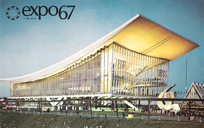 The USSR pavilion at EXPO 1967 in Montreal. Source: alamedainfo.comYou can learn more about the the sequence of the Soviet pavilions at world expositions from a recent review made by archspeech website. Part of them really does follow the “up and ahead” urge, like “The Worker and Kolkhoz Woman”; others are more pompous, but also fly to somewhere, maybe into space. The flying theme does not go down to world expositions – the titanium monument of the “To the Conquerors of the Space” is just as energetic. In other words, the project of Sergey Choban not only continues the line famous due to the Montreal pavilion, but to some extent restores historic justice, returning both to Mikhail Posokhin and to Konstantin Melnikov. It is interesting that Melnikov planned to execute his pavilion “at the end of tether” – and Sergey Choban speaks practically the same words about the canopy built in Milan. The overhang of the cantilever is 98 feet – the maximum possible for such a construction. The rise in the highest point – 55 feet, which is 15 feet more than the height of the main building, subdued to the 40 feet of height restrictions set in the master-plan of the exposition. At that, according to Sergey Choban, the rise of the console could start only outside of the main volume, in the glass vestibule. It gives a feeling that the architect aims to use up this theme completely, develop it up to the limit of technical and emotional possibilities. The pavilion in Milan is more scaled-down than the Montreal one, but its long narrow console flies up more energetically and the mirror adds to the effect giving staginess of the exposition installation to the architectural solution. The impression really is closer to Melnikov’s draft where the console aims towards stars and visually, and symbolically – there is even a cosmic drawing on it, and the project description, in keeping with the best traditions of the 60s, tells about the “hidden power of celestial mechanics”. It reminds both of the first satellite and the passion for the starry sky – zodiac and astrological – of the Renaissance architects, and the scientific, astronomical interest in it of the Empire. And here we probably reach the essence of the plot: Sergey Choban’s mirror console makes us look up at the sky – to see ourselves in it. There is something special in it. But on the other hand what difference does it make, for what reason exactly we looked at the sky – even seldom? Even for the sake of a making a selfie today? The mere fact of us looking up is great! Russian Pavilion at EXPO 2015 in Milan. SPEECH. Photo © Aleksey NaroditskyRussian Pavilion at EXPO 2015 in Milan. SPEECH. Photo © Aleksey NaroditskyRussian Pavilion at EXPO 2015 in Milan. SPEECH. Photo © Aleksey NaroditskyRussian Pavilion at EXPO 2015 in Milan. SPEECH. Photo © Aleksey NaroditskyRussian Pavilion at EXPO 2015 in Milan. SPEECH. Photo © Aleksey NaroditskyRussian Pavilion at EXPO 2015 in Milan. SPEECH. Photo © Aleksey NaroditskyRussian Pavilion at EXPO 2015 in Milan. SPEECH. Photo © Aleksey NaroditskyRussian Pavilion at EXPO 2015 in Milan. SPEECH. Photo © Aleksey NaroditskyRussian Pavilion at EXPO 2015 in Milan. SPEECH. Photo © Aleksey NaroditskyMaster plan on the level of the first floor. Russian Pavilion at EXPO 2015 in Milan. SPEECH. © SPEECHPlan of the first floor. Russian Pavilion at EXPO 2015 in Milan. SPEECH. © SPEECHPlan of the second floor. Russian Pavilion at EXPO 2015 in Milan. SPEECH. © SPEECHCross section. Russian Pavilion at EXPO 2015 in Milan. SPEECH. © SPEECHDetail. Russian Pavilion at EXPO 2015 in Milan. SPEECH. © SPEECH |
|
