|
Published on Archi.ru (https://archi.ru) |
|
| 02.04.2015 | |
|
The Masterstroke |
|
|
Alla Pavlikova |
|
| Studio: | |
| Totan | |
|
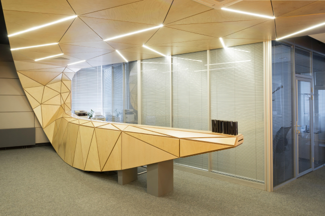
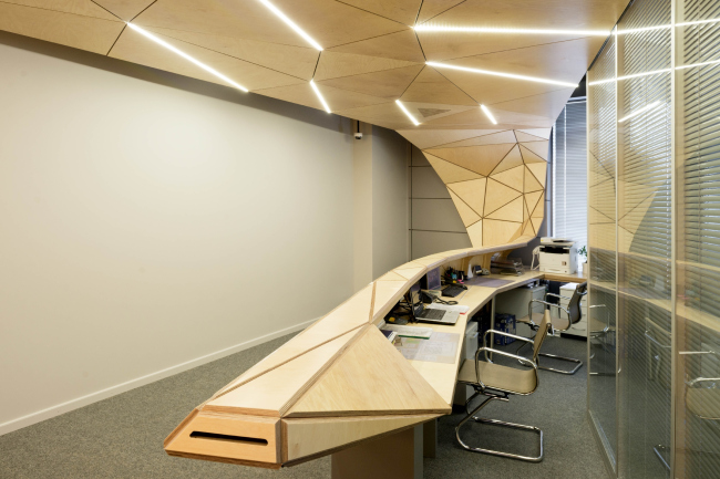
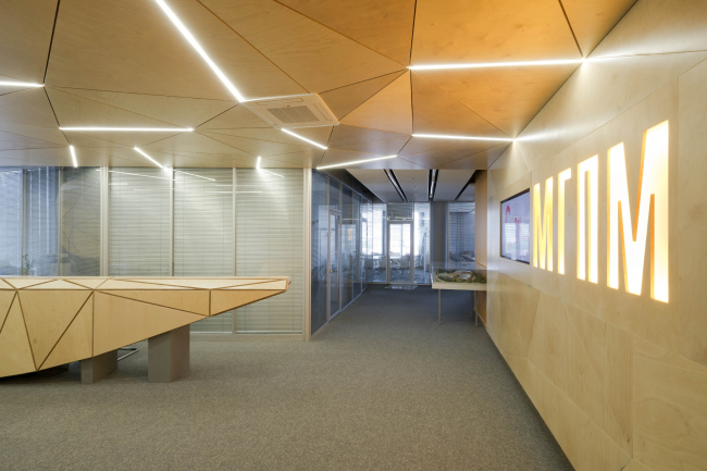
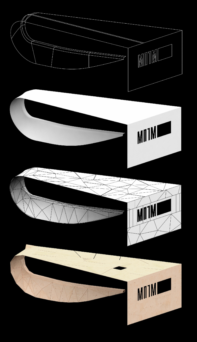
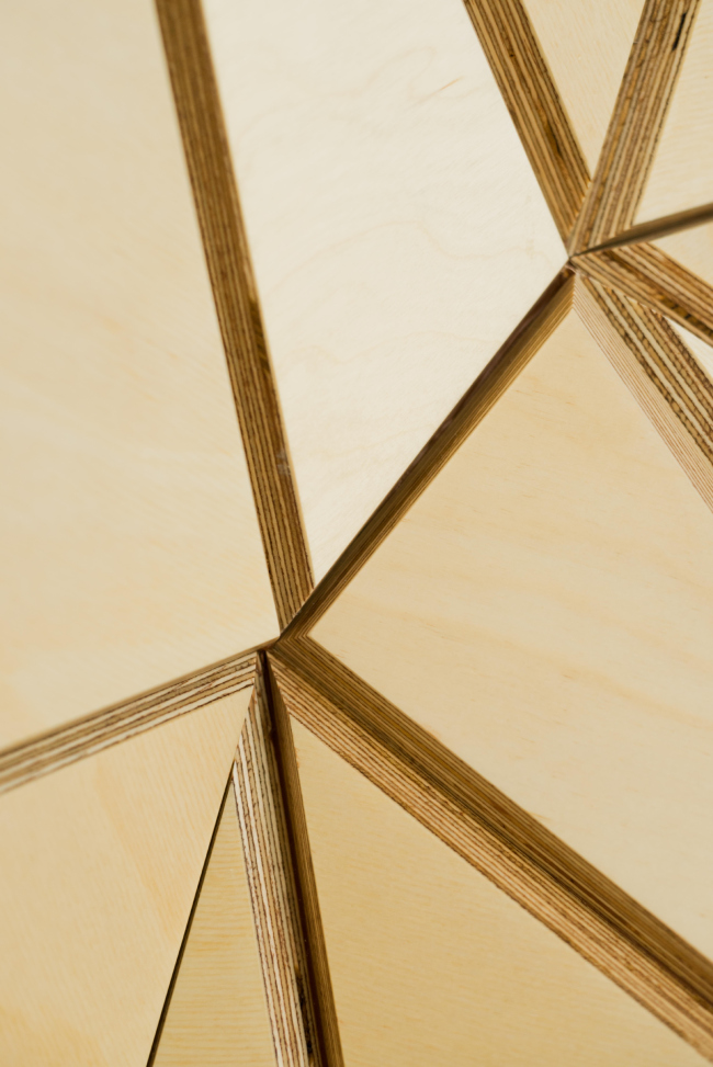
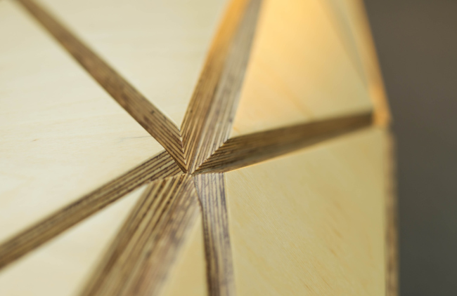
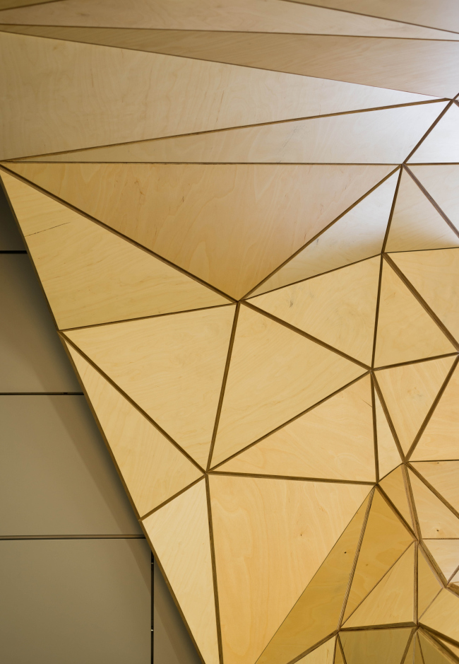
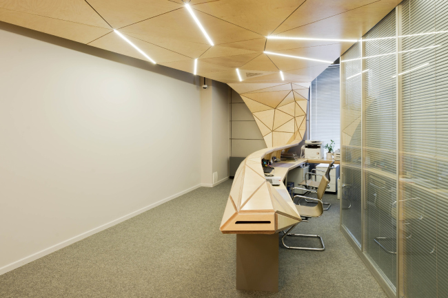
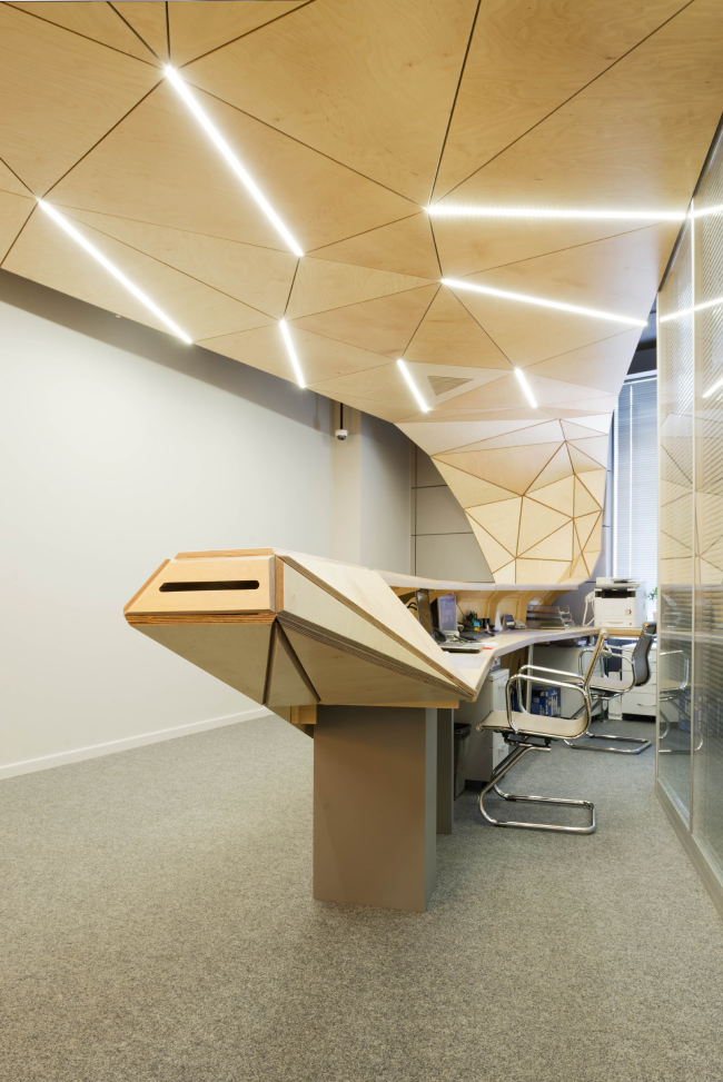
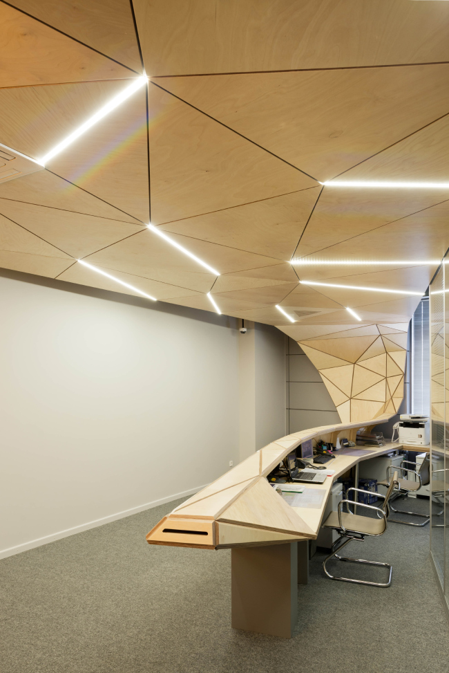
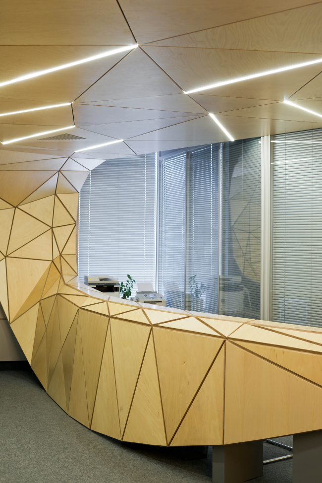
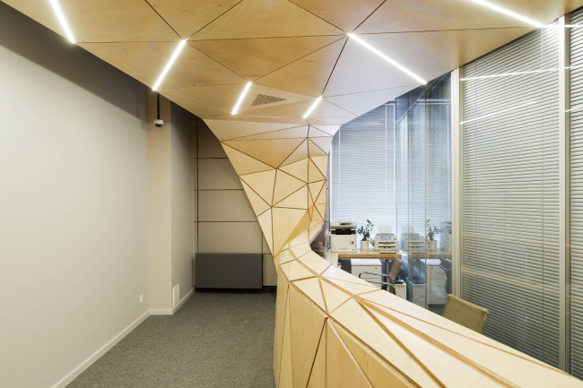
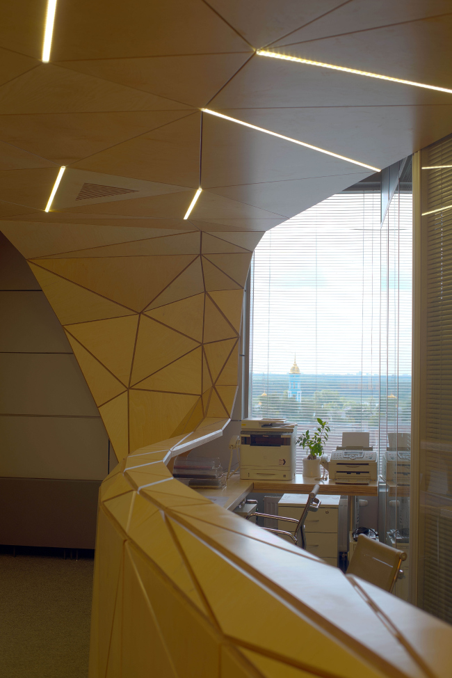
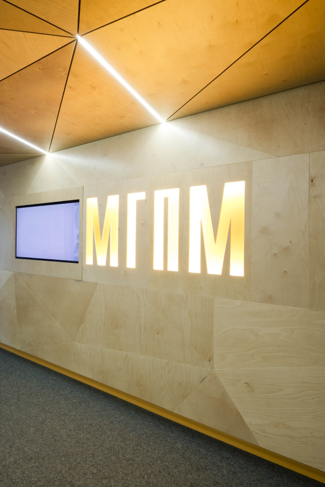
Olzhas Kuzembaev turned a reception desk into an art object making the plywood snake rule the entire small space of the entrance lobby of the office of MGPM Company in Moscow area's town of Mytischi. The interior design of the reception area of MGPM © Totan Kuzembaev Architectural StudioThe close and long-standing cooperation of Totan Kuzembaev Studio and MGPM has lead to a whole number of interesting projects among which one cannot but note the interior design that was developed for the office of this construction company itself. Or, rather, we should speak here not about the interior of the entrance lobby on the whole but only about one of its elements that, however, has totally transformed the existing space. The company's HQ is located in Moscow area's Mytischi, not far away from the local railway station, in the building of "Alta" business and shopping center built in 2008 upon the project of this very company. Inside this tall striped tower, the MGPM HQ occupies two floors, designed in moderate tones, with the use of modern materials, open spaces with high ceilings, and meeting rooms with floor-to-ceiling windows. Spending some time within the walls of this cozy office of their own, the management of the company came to a conclusion that the entrance area that meets the visitors immediately after the elevator lobby lacks some bright accent - not garish but one that would help it stand out from the crowd of rank-and-file solutions. In particular, they were after highlighting the reception zone, without violating at the same time the integrity of the existing interior design. As for the decoration material, it was decided to use exclusively natural wood - a favorite with Totan Kuzembaev studio that was one of the first companies in this country to turn back to using it after a long hiatus and demonstrated the unique possibilities that it offers. So it is not surprising that it was his studio that the management of the Mytischi office turned to. For them, Olzhas Kuzembaev came up with a solution that is very simple to implement but at the same time very interesting - what he did was wrap the small space of the reception area with a three-dimensional shell that, for all the dynamics of its shape, is made of warm static wood. Entering the office, the visitors at once see the reception desk that looks like a moored boat. Its narrow up-tilted "bow" rests upon massive supports, while is board sides are finished with large panels. The flexible sculptural form is dissected into the planes of plywood panels with ostentatiously wide joints - they look like pencil or maybe computer lines of volume-building but the trick is that all of the elements are triangular, a triangle being the basic module, just the way it was the basic form-shaping element in another Kuzembaev project - the facade of "Five Planets" shopping mall. Docking the wall, the "boat" grows up in a semblance of a cracked tree trunk or even ivy: from this point on, the grid of the joints start looking like a geometric pattern of twigs and branches - the surface grows on, entwining in a broad canvas the entire ceiling, and, finally, getting to the opposite side of the miniature reception room, abruptly goes down, closing the side wall with a wooden screen - smooth and jointless but with the company's logo and a TV upon it. The interior design of the reception area of MGPM © Totan Kuzembaev Architectural StudioThe interior design of the reception area of MGPM © Totan Kuzembaev Architectural StudioThe interior design of the reception area of MGPM. Concept © Totan Kuzembaev Architectural StudioThe result looks as if the sharp bow of the reception looks and even points out at the logo - like a finger or a snake's head. Circulation of shape within a closed space… It is even hard to tell whether it is actually a boat or some kind of streaming animal, sci-fi, and movie type but still snake-like: it flows over the wall, then over the ceiling and gradually gathers itself into a ribbed "neck" so as to lie staring at its own long-forgotten tail. At this point, Totan Kuzembaev's "dragon" house immediately comes to mind - and this solution makes perfect sense taking the theme of a fantasy beast to a new level. But in the former case the beast was ribbed and in some respects even archaic while here it is futurist, unable to break away from its computer prototype. One could go as far as to say that some "incomplete" quality and some imminent "sketchy" aspect of this triangle-based volume strikes a chord with the plywood as an essentially makeshift type of material. Although here the panels are thick and dense, and the idea of sketchiness only appears at the back of one's mind - the object is perceived as something that is absolutely complete and sturdy. The multilayer plywood panels not only, as was indicated above, have the shape of diverse triangular modules - they were sawn off in an ostentatiously "relief" manner: the striped texture of the joint and the step that it creates play an important part in forming the overall impression of this art object that looks as if it grew into this space. Each of the elements was made by digitally controlled machines, and then the elements were rigged on the framework. In spite of the difficulties that the task presented, the project was implemented on a rather short notice - already last summer the curious art-object was completed. The interior design of the reception area of MGPM. Fragment © Totan Kuzembaev Architectural StudioThe interior design of the reception area of MGPM. Fragment © Totan Kuzembaev Architectural StudioThe interior design of the reception area of MGPM. Fragment © Totan Kuzembaev Architectural StudioThe interior design of the reception area of MGPM. © Totan Kuzembaev Architectural StudioAs one can see, the integrity and the continuity of movement played the key part in forming the space here. It was also rendered all the more spectacular by the backlight: the long lamps, very much like a leaf's threads, run in between the plywood modules. One must note that, as one's gaze moves from the nose of the reception desk up to the ceiling, the joints become ever more seamless and then, on reaching the opposite wall, disappear completely. In that area lacquered surface bears a large inbuilt TV screen and the large backlit letters of the company's logo that reminds everybody who comes in that they are in a corporate HQ, and not in a picturesque seaside haven. The interior design of the reception area of MGPM. Backlight © Totan Kuzembaev Architectural StudioThe interior design of the reception area of MGPM. © Totan Kuzembaev Architectural StudioThe interior design of the reception area of MGPM. © Totan Kuzembaev Architectural StudioThe interior design of the reception area of MGPM. © Totan Kuzembaev Architectural Studio |
|
