|
Published on Archi.ru (https://archi.ru) |
|
| 23.02.2015 | |
|
The Wings of a Seagull |
|
|
Anna Starostina |
|
| Architect: | |
| Daniel Lorenz | |
| Natalia Sidorova | |
| Konstantin Khodnev | |
| Studio: | |
| DNK Architectural Group | |
|
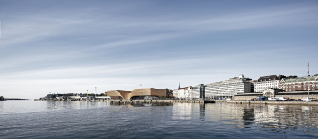
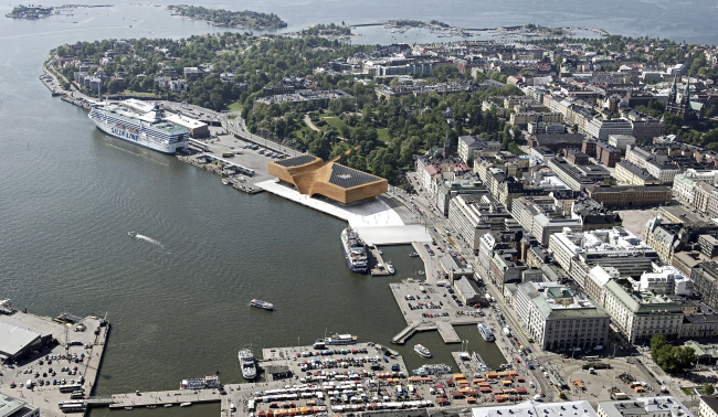
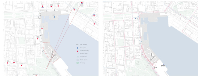
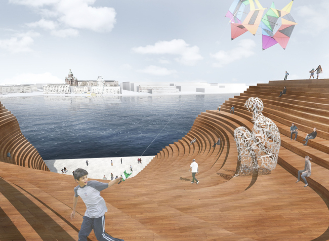
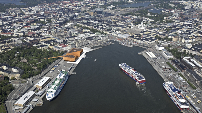
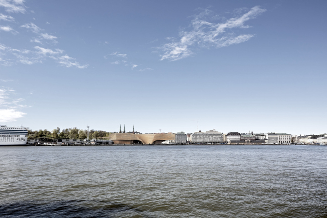
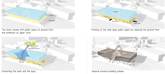
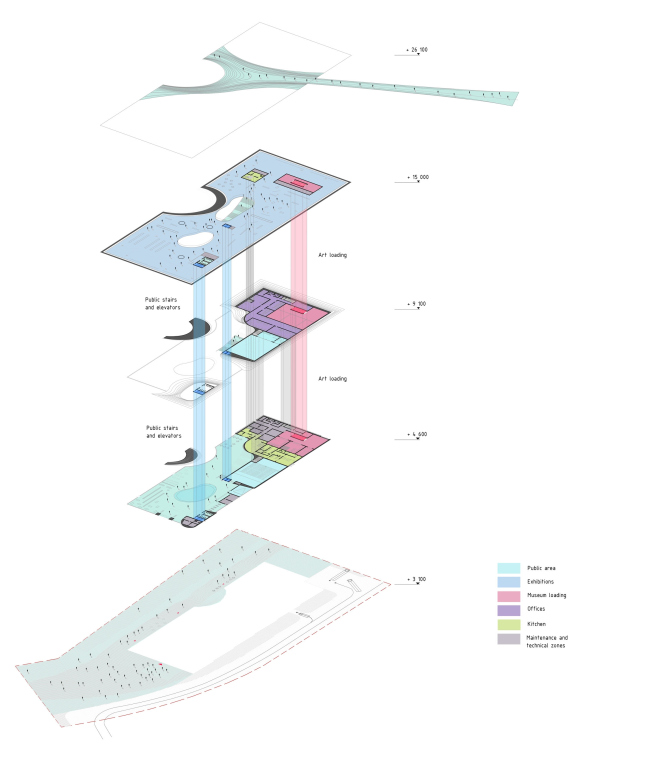
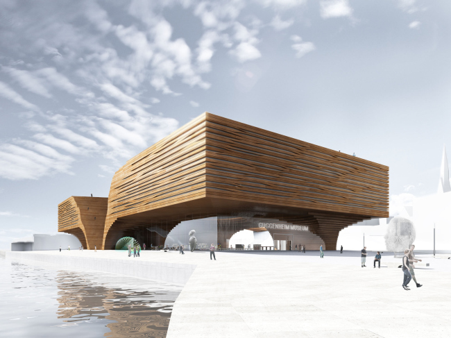
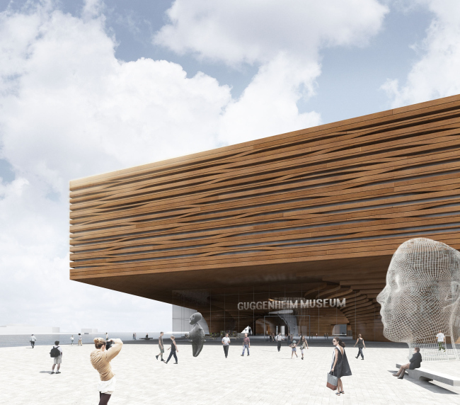
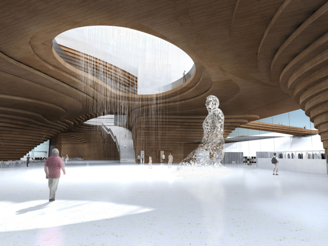
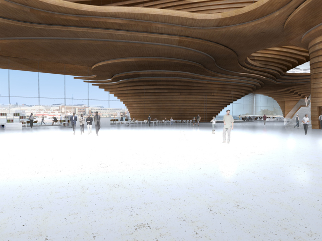
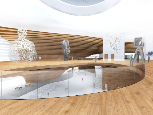
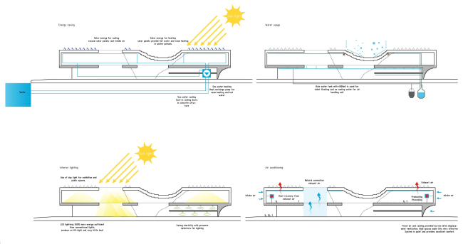
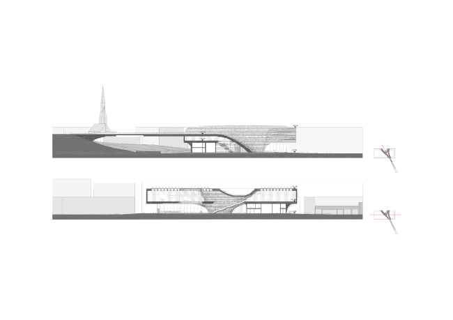
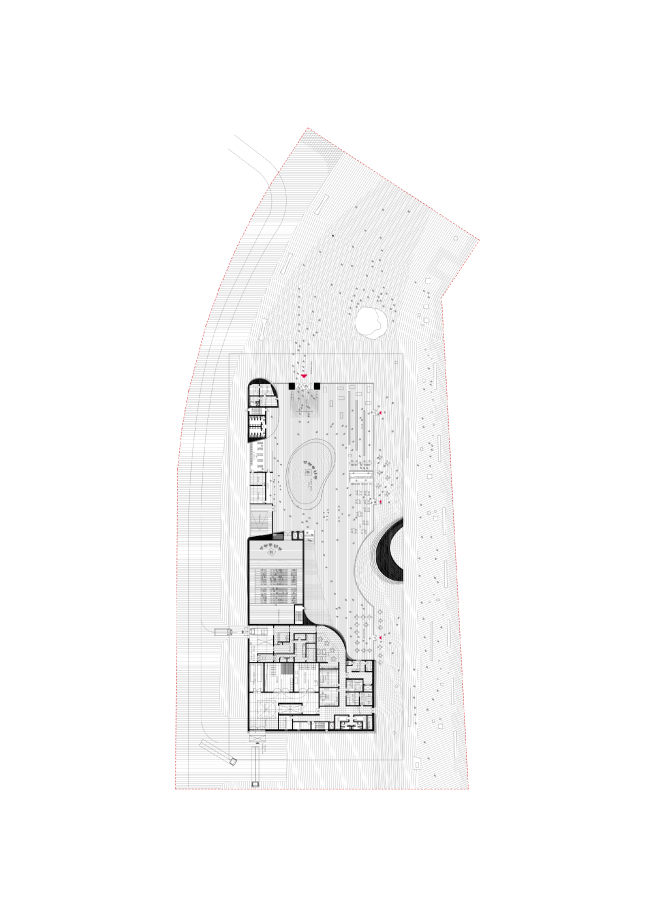
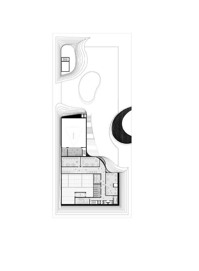
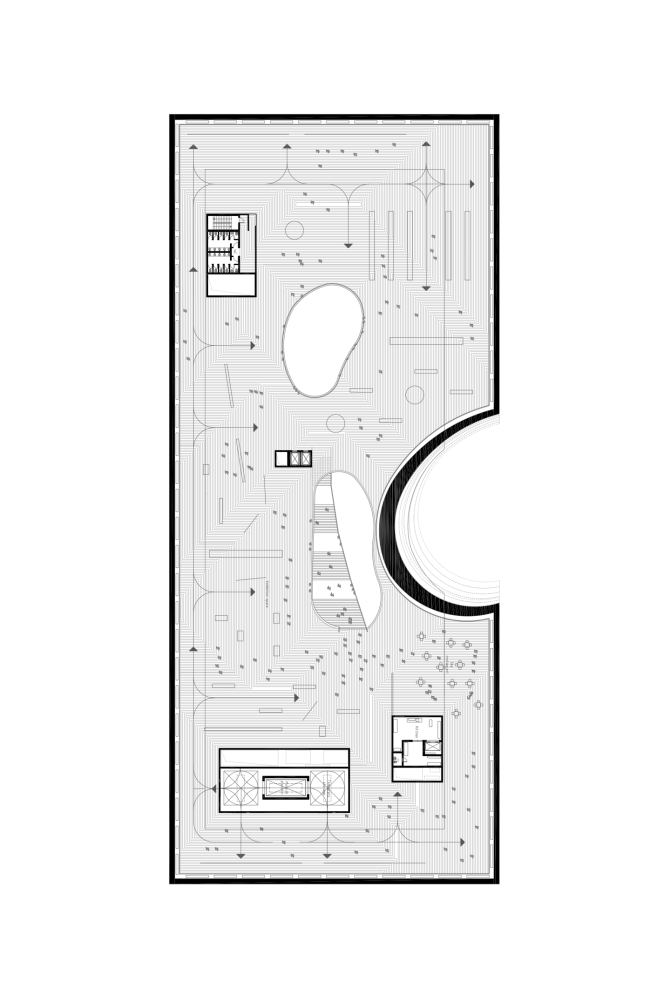
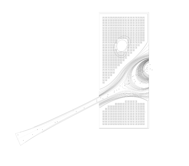
The architectural group DNK took part in the international contest for the building of the Guggenheim Museum in Helsinki. The solution that was submitted to the judging board proposes possible ways of the further development of the principles of the Scandinavian architecture. Guggenheim Museum in Helsinki © DNK AG"It was very exciting for us to take part in this contest in spite of the heavy load of our day-to-day work - the architects share - for a number of reasons: first of all, designing the Guggenheim Museum is quite a professional challenge as such; second of all, Helsinki is a city that makes a lot of sense to us and one that we know pretty well from our travels; besides it has a lot to do with the Russian history; third, the land plot is located in the center of the city but it is now occupied by the unattractive-looking warehouses of the seaport terminal, and the very opportunity to include it into the city's social life seems exciting to us; fourth, the Scandinavian architecture and culture have always been close to ours in spirit; and, last but not least, the conditions of participation were quite clear and transparent". The place that was chosen for the future museum is indeed a high-profile one. As a matter of fact, this is the sea gate of the city and its very tourist center; besides, the beautiful park Tähtitornin Vuori is located nearby, not far away one will find the busy market square with the President Palace, and on the other side of the gulf there is the Assumption Cathedral. The solution proposed by the DNK architects is gracefully inscribed into the historically formed Helsinki skyline. The building "steps back" from the quay a few times creating a free public territory. "The land plot that we deal with is not really large, the contest specifications limiting the height of the construction, underground work also prohibited - all combined with the fact that the functional program of the building is rather extensive. In spite of this, we left a considerable part of the plot building-free and accessible to the general public" - the authors explain. Furthermore, the first floor is designed almost transparent - which provides complete mutual permeability of the outside and inside territories, and the second one literally overhangs over the embankment making part of the public territory comfortable to be in in any weather. Guggenheim Museum in Helsinki © DNK AGDiagram of the visual connections of the park with the city and the transport logistic plan © DNK AGRectangular on the plan, the building is connected by a wooden bridge with the adjacent green hill that provides the connection between the park and the embankment. This bridge bleeds into the peculiar "slit" in the body of the building that is located on the visual axis "the park's sightseeing platform - Assumption Cathedral". Gradually widening, it dissects the volume in an angular fashion into two asymmetric parts and descends to the embankment, in the form of a striking-looking amphitheater. This new city territory, that evokes associations with the famous stairway on the Senate Square leading to the Metropolitan Cathedral, commands a fine view of the gulf, the Orthodox Cathedral, and the President Palace. And, when viewed from the opposite side of the gulf, as well as from the ships and boats coming in, the building looks a bit like a seagull spreading its wings. There are lots of them here. Guggenheim Museum in Helsinki © DNK AGGuggenheim Museum in Helsinki © DNK AGGuggenheim Museum in Helsinki © DNK AG ImageryIn Swedish, the name of the city sounds as "Helsingfors". The word "fors" can be translated as "straits" or "riffles". This image is also reflected in the project: the recession in the bulk of the building that channels the pedestrian flows from the park to the embankment really looks like a riverbed with a characteristic relief drop. Yet another image is the ancient sacral stones, the so-called "seitas", that are found in Northern Europe. Very often, these things are in fact unstable-looking boulders raised on low "legs". Quite naturally, it was wood that the architects chose as their primary material. The entire upper volume is faced with wood panels with characteristic glazed slits that look like cracks in old timber. The amphitheater is also made of wood, the use of surfaces of various textures being planned. The architects only use the wood from the local manufacturers, and this wood is recyclable. Since the social constituent part of the project is extremely important, the architects functionally divided the building into two primary volumes - the lower, "city" part, and the upper one containing the museum halls. More transparent, the lower part will be open to public regardless of the opening hours of the museum. It includes a lobby, a conference hall, a retail store, a restaurant, and the educational classes. Essentially, both functionally and visually, the first floor becomes the continuation of the embankment and solves one of the main town-planning issues of this plot that consists in including it into the city fabric. The driving access of the vehicles servicing the museum and the restaurant is organized at the opposite side and is combined with the loading bay of the freight terminal of the port so as to remove the vehicles completely out of the pedestrians' way. Plan © DNK AGFunctional diagram © DNK AGGuggenheim Museum in Helsinki © DNK AGGuggenheim Museum in Helsinki © DNK AGBy contrast with the transparent bottom, the upper volume of a regular rectangular shape is made completely "material" and is designed for the museum expositions. Its inside space is rather neutral and will fit exhibitions of any kind. The wooden volume descends to the bottom level in stair-like supports. Their layered, gradually shrinking shape reminds the pattern of a tree's annual rings. The main support is the opposite side of the "funnel" that forms the space of museum lobby. The wooden supports have inside of them the extra maintenance facilities - and thus the visitors of the museum perceive this space as a single and open one. Guggenheim Museum in Helsinki. Lobby interior © DNK AGGuggenheim Museum in Helsinki. Lobby interior © DNK AGGuggenheim Museum in Helsinki. Museum hall interior © DNK AGOf course, such an ambitious project would be impossible without the sophisticated engineering communications and integration of the current energy-efficient technologies. Proceeding from the specified embankment location, the architects proposed to use the water of the haven for both heating and cooling the building by using the heat pumps. There are also rainwater collectors that are meant to recycle the "grey virtual water". The roof of the building has in it sun tubes covered with glass cones, their north side letting the light in, and their south side having on it solar batteries that also cut down the sunlight. Directly below them, there are mirrors that redirect the sunlight downwards inside the museum halls. A similar system of double reflection works in the slits of the side walls. On the inside of the building, the ceiling and the walls are made of opaque glass. Underneath the glass, there is a layer of TIMax GL heat-insulator. Plan © DNK AG Plan © DNK AGThe Scandinavian architecture is generally reputed for its openness, environmental friendliness, natural materials, simplicity, and laconism of shapes. The critics of this trend call these projects boring, too "righteous" and even insipid. It looks as though Daniel Lorentz, Natalia Sidorova, Konstantin Khodnev, Alexandra Koptelova, and Alena and Igor Kashirins were able to keep the best-loved features of the Scandinavian style at the same time creating a vivid and memorable architectural image.  Development drawing © DNK AGSection view © DNK AGPlan of the fitst floor © DNK AGPlan of the second floor © DNK AGPlan of the top museum floor © DNK AGPlan of the roof © DNK AG |
|
