|
Published on Archi.ru (https://archi.ru) |
|
| 11.02.2015 | |
|
In Two Layers |
|
|
Anna Martovitskaya |
|
| Architect: | |
| Sergey Skuratov | |
| Studio: | |
| Sergey Skuratov architects | |
|
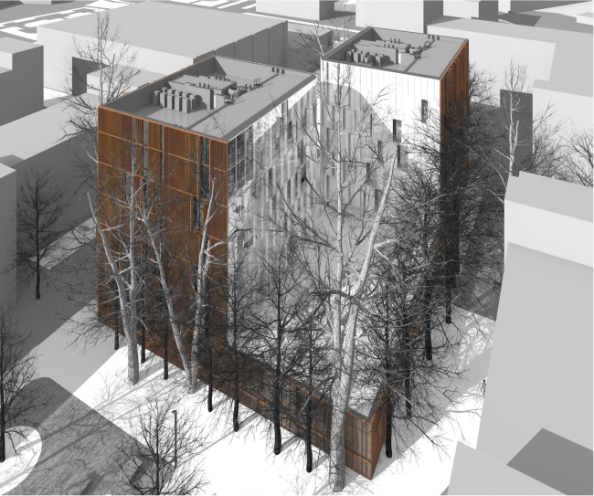
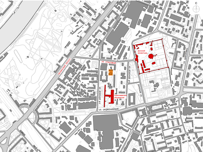
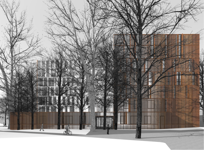
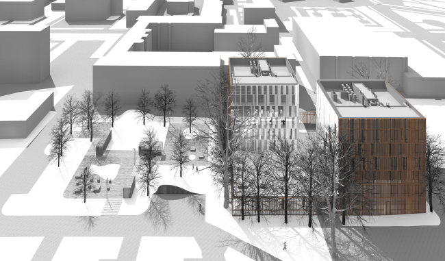
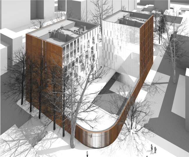
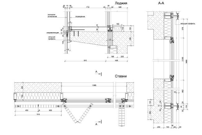
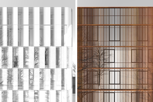
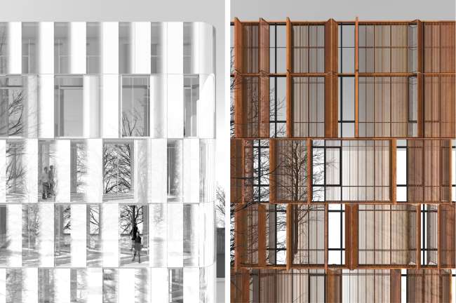
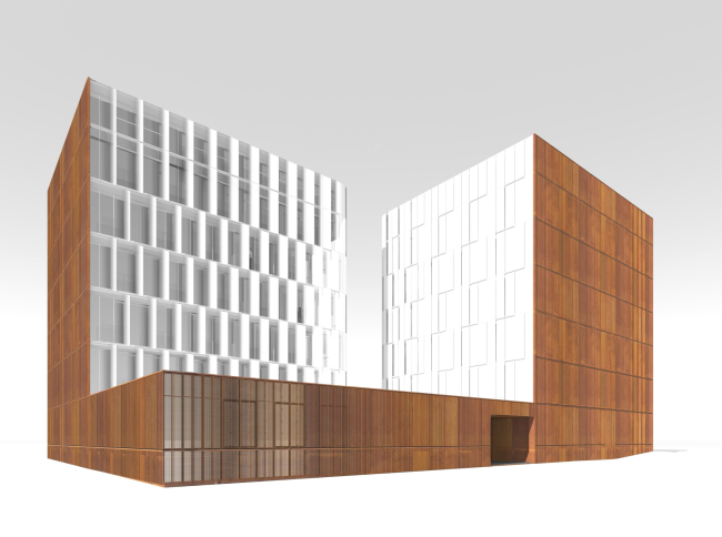
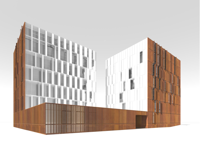
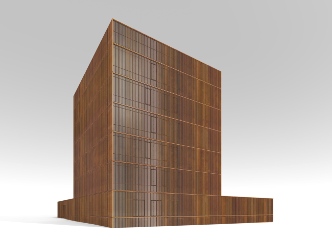
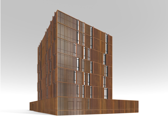
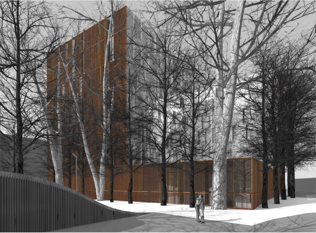
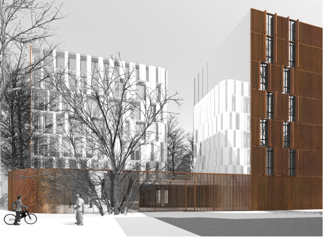
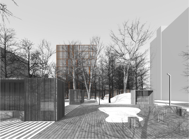
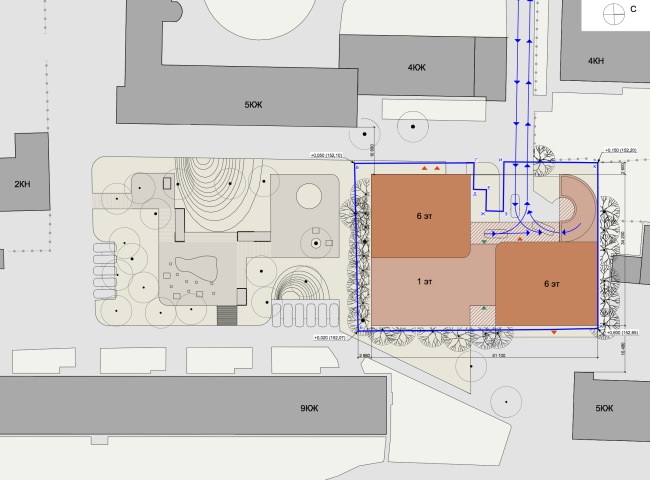
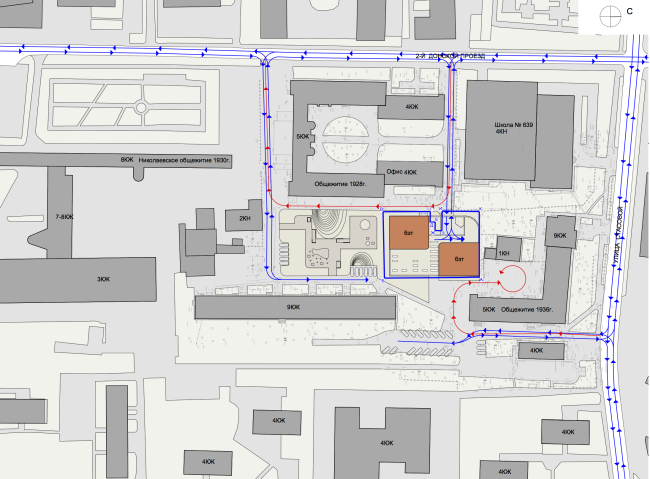
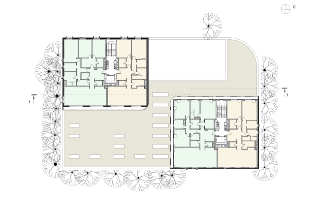
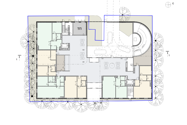
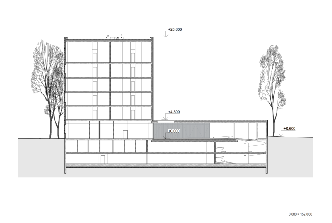
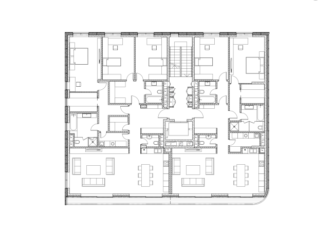
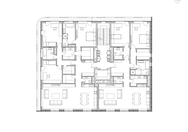
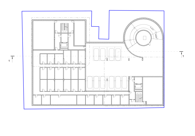
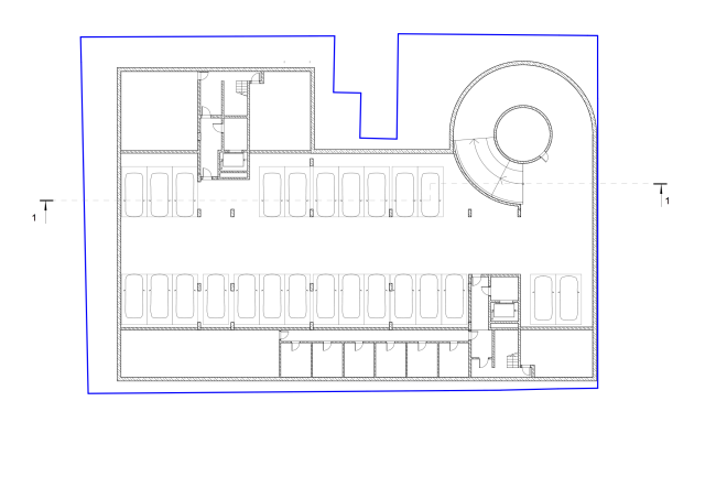
One block away from the Donskoy Monastery, Sergey Skuratov has designed a double-part residential house in the image of which the architect develops his favorite technique of a dialogue between the materials. South facade, birds's height view © Sergey Skuratov ARCHITECTSThe land plot on which the residential house is being built is located between the Donskoy Monastery and the Lenin Avenue. The monastery walls are but three blocks away from the noisy federal highway, only one of these blocks having the classic rectangular shape. And it is in this block, bordering on the Stasovoi and Ordzhonikidze streets, as well as two driveways - 2nd Donskoy and 3rd Donskoy - that the land plot intended for the construction of the new residential complex is located. The strict geometry of the block did not really tell on the character of its planning, though: different epochs left here a pretty chaotic legacy. It includes a school, a substation, a typical residential high-rise, and a few dormitories of Moscow Textile Institute located nearby, these dormitories even having a heralded "elder brother" - built upon the project of the architect Nikolaev (1930), the "commune house" proudly towers but a hundred meters away. Lack of space and lack of light - these are probably the first two things that come to mind when one sees the land plot for the first time, and Sergey Skuratov confesses that he had a hard time making up his mind as to whether to take the job at all. His doubts were overcome by... the trees - very tall and very old - that grow along the entire perimeter of the land plot creating a natural screen and this guaranteeing at least some privacy both to the future complex and to the people that will live in it. Location plan © Sergey Skuratov ARCHITECTSIt was these trees that became the "irredeemable capital" and the starting point of the future residential complex. The object got a symmetric composition of two six-story buildings placed on the opposite sides of the conditional rectangle and united by a single stylobate. And, because the trees fringe the land plot from all the four sides, the architect shifts the main volume of the stylobate with the usable roof to its southern, more shaded, side. The vis-a-vis of the single-story building is the entrance to the underground parking garage that does not need any additional screen. "Arranging the volumes along the diagonal of the plot allowed us to tactfully introduce the new object into the existing urban matter meeting the insolation requirements and the optimum scale of the construction itself" - comments Sergey Skuratov on the solution of the master plan. Also, interesting is the fact that in accordance with the author's plan the southeast end of the plot, saturated with trees, sees the acute angle of the stylobate, which helps to move the facades as close to the tree-trunks as possible, while the opposite corner is ostentatiously rounded: following the configuration of the ramp it yields a very tactful but still adequate response to the proximity of the inner driveway, giving the geometry of the facade a friendly but still quite self-sufficient character. East facade. Entrance © Sergey Skuratov ARCHITECTSEast facade, birds's height view © Sergey Skuratov ARCHITECTSSergey Skuratov also rounds the corners of the residential buildings, as if melting the facets of the parallelepipeds in the places where they come closest to each other. This technique can remind us of the architect's other work - the project of an also double-part house at the Vernadskogo Avenue that was still remained on paper. In that project, the buildings also "embraced" over the stylobate, and, in order to soften these rather brutal tectonics, Sergey Skuratov made the facades completely glazed, and significantly rounded the corners. These projects are also akin in their facade solutions: in both cases, the architect divides them into "outside" and "inside", making the former ones ostentatiously palpable and the latter - quite ethereal. Although, while at the Vernadskogo Avenue this dichotomy was played out by the pair "clinker brick - glass (with just a tiny twist of sputter)", this time around the role of the "shell" is played by the weathering steel in the protective oxide shell that gives it an "anti-washout", somewhat rusty, textured look. And this is not some static facing material but shutters filled in by the grilled of vertical blinds. In other words, in this house, the "casing" is capable of changing its character completely depending on the weather and the lighting conditions, as well as just because of one's angle of vision: the blinds and their more-on-the-ethereal-side reflection in the glass create together the effects of "clouded" waves and a visible gradient, a transition from the almost mirror-like quality to the material, palpable, and down-to-earth bright-rusty facade. For the already-mentioned "rounded" street facade, this is particularly important: the casing that the architect came up with looks like it stretches in the bending areas, thinning out almost completely and stressing the conditional status of the saying "my house is my fortress" in today's megalopolis. North facade, birds's height view © Sergey Skuratov ARCHITECTSDetails of the facade: structure of the blinds © Sergey Skuratov ARCHITECTSFragments of the closed facades © Sergey Skuratov ARCHITECTSFragments of the opened facades © Sergey Skuratov ARCHITECTSEast facade. The blinds are closed © Sergey Skuratov ARCHITECTSEast facade. The blinds are opened © Sergey Skuratov ARCHITECTSSouth facade. The blinds are closed © Sergey Skuratov ARCHITECTSSouth facade. The blinds are opened © Sergey Skuratov ARCHITECTSThe same "two-layer" technique is used on the inside facades of both buildings - the defenseless "flesh" that is turned to the roof of the stylobate and the courtyard. The role of the "outside" layer is played here by the glazed balconies that are painted in a gradient manner from milky-white to transparent, while role of the "inside" layer - by the walls themselves that are in fact a combination of the windows of maximum size and the mirror-like piers of stelamite tinted glass. South facade © Sergey Skuratov ARCHITECTSWest facade. Entrance gate © Sergey Skuratov ARCHITECTSOrganization of the yard © Sergey Skuratov ARCHITECTSThis complex is very much "Skuratov" in all respects. It shows abundant examples of everything that is characteristic of the works done by this architect - the unconventional but still recognizably strict geometry, the aptly chosen contrast of the materials, and the full exploration of the land plot's potential. And, of course, the feeling of a "living" facade that the author himself values so much! In his earlier projects, however, the latter used to be created most of the time at the expense of the material - the brickwork or the gracefully aged copper - and now Skuratov, if we can put it this way, has involved mechanisms to work alongside the materials. Each of the shutters, just as any pull-out window here, can be opened both manually and automatically - according to the architect's idea, such variety of scenarios is the best way to provide for the constant changing of the facades. A "stunt" of a house or an aptly found image of a house living up to its environment? Definitely, the latter: the residential complex is engaged in an ongoing but quite unobtrusive dialogue with its surroundings, harmonizing the block that hitherto used to be but a part of unintelligible town-planning "noise". Master plan © Sergey Skuratov ARCHITECTSLocation plan © Sergey Skuratov ARCHITECTSPlan of floors 1-6 © Sergey Skuratov ARCHITECTSPlan of the 1st floor © Sergey Skuratov ARCHITECTSSection 1-1 © Sergey Skuratov ARCHITECTSPlan of apartment section 1 © Sergey Skuratov ARCHITECTSPlan of apartment section 2 © Sergey Skuratov ARCHITECTSPlan of the - 1st floor © Sergey Skuratov ARCHITECTSPlan of the - 2nd floor © Sergey Skuratov ARCHITECTS |
|
