|
Published on Archi.ru (https://archi.ru) |
|
| 07.07.2015 | |
|
Two shopping "parks" built by UNK project |
|
|
Alla Pavlikova |
|
| Architect: | |
| Yuliy Borisov | |
| Julia Tryaskina | |
| Studio: | |
| UNK | |
|
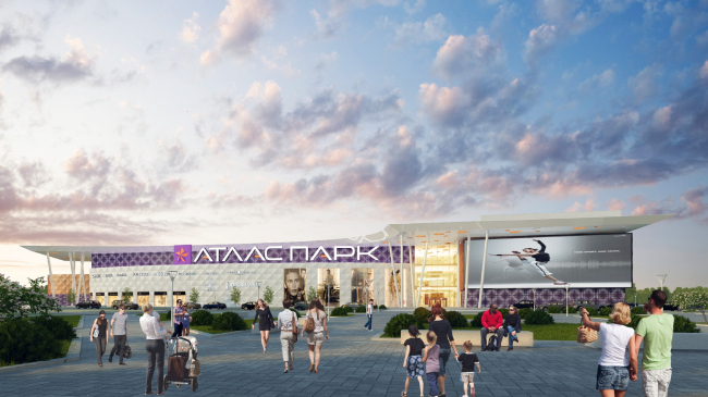
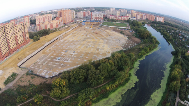
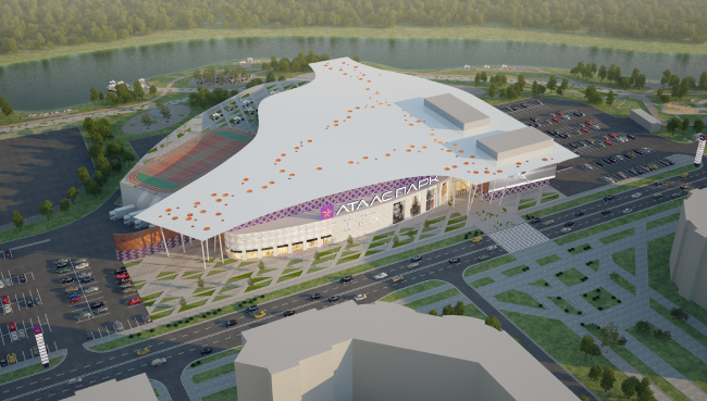
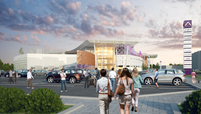
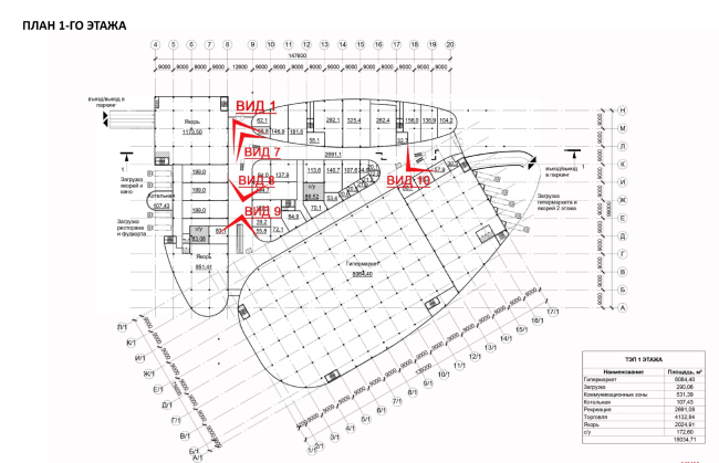
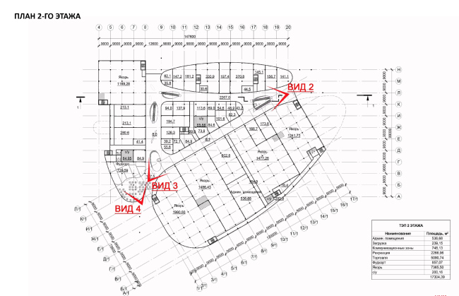
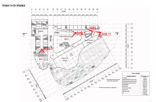
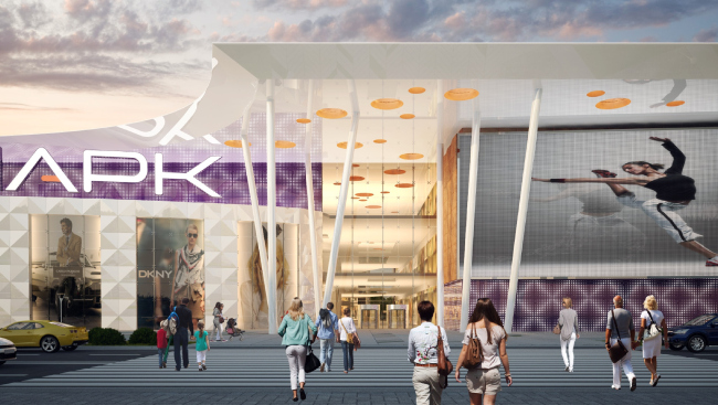
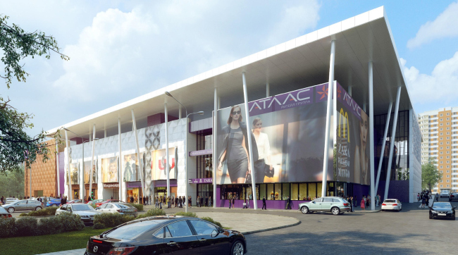
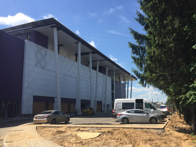
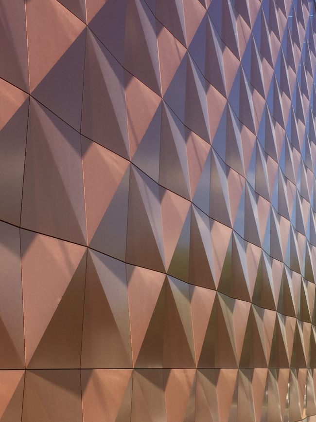
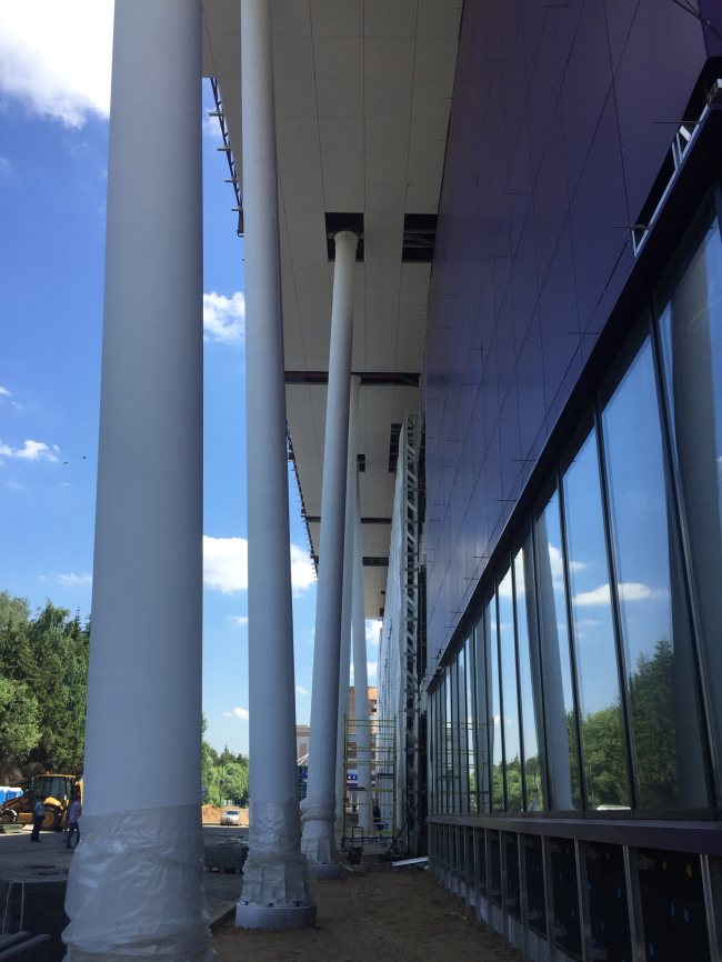
Efficient organization of the designing process enabled the architects of UNK Project to subject the architecture of two shopping centers to a single recognizable image despite the differences in their scale and construction conditions. Shopping and entertainment center "Atlaspark" in Zhukovsky © UNK projectThe project of the large shopping and entertainment complex "Atlaspark" in the town of Zhukovsky has been handled by UNK Project for about a year. The land site is located in the lowland near a very sharp bend of the small Bykovka River the landscaping of which has recently been taken up by the town's municipal council. And, while formerly the townspeople used to have to make their way to the water through the fences and deadfall, now this place is getting a long pedestrian promenade, landscaping work is being done, the river water is getting purified, and a new road is being built that will connect the riverfront to the residential areas. If we are to add to this the proximity of this land site to the new freshly-built residential complex that is in a dire need of infrastructure objects of all kinds, the location of the shopping center is as advantageous as it can ever get. In their search for the optimum solutions, the architects specifically proceeded from the location of the building that made it necessary to create not just an entertainment object but the city's new activity center with a large park and various recreation spots. The image of the bending river proved to be the strongest here. Thus the architects came up with a light natural shape looking like a bird that hovers over the water with its wings spread wide or maybe a white ocean yacht plowing the sea. The main idea was not just inscribing the building into its green surroundings but make it a part of the park and its continuation. Shopping and entertainment center "Atlaspark" in Zhukovsky. Construction © UNK projectWhen they had already developed a detailed concept of the complex, the architects were faced with a new and somewhat unexpected challenge: inspired by the image that they came up with, the customer asked them to design in this same style yet another shopping center located at the outskirts of Moscow area's town of Odintsovo. The challenge consisted in the fact that its framework, parallelepiped in shape and thus very far from "flying", had already been built, and now the architects were to somehow apply and adjust the new image to the already existing basis. Unlike the spacious site in Zhukovsky, the Odintsovo site is tightly squeezed between the existing residential buildings and the noisy Mozhaisk Highway. A few years ago it was planned that a supermarket would be built here within a walking distance for the people living in the nearby houses. A framework was erected full of all the design mistakes one could possibly think of: the wrong seat, the incorrectly organized entrance, the inner space inefficiently organized, and the shopping premises of an unjustified size, averaging from 300 to 500 square meters. All of this, given the realities of today's life, made the shopping center unsustainable. And on this very basis or, to be more exact, on this framework, the architects were to create a second "Atlas", as bright and as striking. At first, the mission seemed practically impossible. As Julia Tryaskina, who took the responsibility for all the work on re-designing the insides of this "prodigy" complex, shares, finding the right solution was quite a tall order. Because it is one thing designing something from scratch, on a spacious land site next to an active natural landscape, and it is quite a different thing having to deal with the pre-built concrete "box" of quite a different scale, namely, a tenth of the size of its "elder brother", trying to endow it with the features of the latter's trademark style. By the time the work on the Odintsovo project started, Zhukovsky's "Atlaspark" already had a completed outlook: the low-rise streamlined building with three above-ground and two underground floors following the intricate lines of the land site's terrain. When viewed from above, the "blanket" of the flat awning above the usable roof looks like a casually thrown veil touched a little by the wind. There are two tennis courts on the roof, a few jogging tracks, an open-air panoramic terrace belonging both to the restaurants and the swimming pool, as well as a skating rink in the wintertime. The awning partially covers the three main volumes "spun" around the common entrance gallery and naturally lit atrium spaces, the largest of which is situated immediately behind the central entrance, the consecutive atriums growing smaller in size. Shopping and entertainment center "Atlaspark" in Zhukovsky © UNK projectShopping and entertainment center "Atlaspark" in Zhukovsky © UNK projectOn the plan, all the three blocks that, apart from the shopping premises, include an eight-hall movie theater, a fitness club, a children's playing room, and various cafes and restaurants, when viewed together with the communication nucleus, look like water-polished pebbles washed ashore by the tidal wave. The largest and the heaviest one took up the position right next to the water, another, more slender and elongated, looking a bit like a moored boat, is turned with its face to the town - it proudly bears the name and the logo of the complex. Shopping and entertainment center "Atlaspark" in Zhukovsky. Plan of the first floor © UNK projectShopping and entertainment center "Atlaspark" in Zhukovsky. Plan of the second floor © UNK projectShopping and entertainment center "Atlaspark" in Zhukovsky. Plan of the third floor © UNK projectIncidentally, the entire color solution of the complex - golden and purple - grew up from the "Atlas" logo. The deep purple color is always a bright accent, and, in this particular case, not just an accent but a colorful outburst of white and golden 3D panels that refer us by association to the same "water" image. Together with the large glass showcases, the 3D panels glitter in the sunlight, enhancing the striking impression. The third, and the most "uncut" stone that ends on one of its sides in a square-plan volume stands perpendicular to the two others. Its rounded end is turned to the river. Its clear-cut facade is turned to the residential houses. Such position allows for not only neatly "inscribing" but even "embossing" the large sophisticated building into the borders of the land site, following the curve of the river bend, completing the overall picture and bringing it to balance. In all the three entrance areas, including the riverside one, the awning of the roof rests upon a forest of slender columns. Tilted at different angles, they look a lot like brushwood, with trunks that are still slender but already crowned by lush foliage. Shopping and entertainment center "Atlaspark" in Zhukovsky. Central entrance © UNK project***
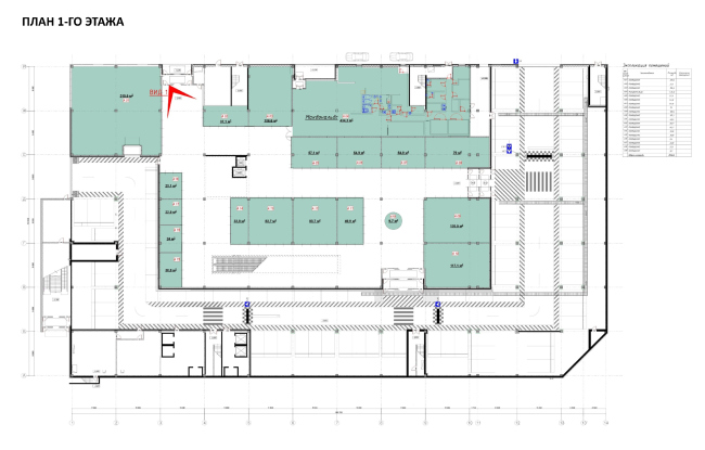
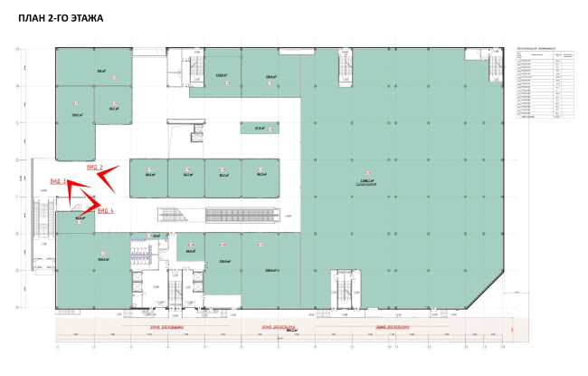
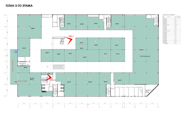
In Odintsovo, on the other hand, water and vegetation gets replaced by concrete jungle but here the Zhukovsky design solution looks quite appropriate, if a little bit more reserved. Transferring the style and the mood to the rigid geometric framework proved not that difficult at the end of the day: the same berth of the "hovering" roof that has now become strictly rectangular but in the same style - only partially - covers the building. The same protruding awning with a forest of "tree trunks" of the pillars that support the plaque of the roof accents the visitors' attention on the entrance groups. The decoration is based on the same materials and trademark colors as in Zhulovsky. The resemblance of the two projects is also stressed by the visual fracturing of the facade into several independent volumes with a thought-out concept of placing the commercial and information billboards. Everything looks light, delicate and almost weightless. Shopping and entertainment center "Atlas" © UNK projectShopping and entertainment center "Atlas" © UNK projectShopping and entertainment center "Atlas" © UNK projectWhat was by far more challenging was finding the solutions for the building's inside problems. First of all, the authors needed to consider its "seat" - particularly in view of the elevation gain of the land site. Strange as it is, the preceding project only provided for one entrance to the building, the one from the street side, because of which the people living in the area adjacent to the building from the opposite side, would have to circle it around in order to get inside, making an uphill climb. Julia Tryaskina proposed to organize yet another entrance from that side for the locals. Leaving the central entrance in its original place - next to the Mozhaisk Highway - the architects added yet another one on the residential area side equipping it with an escalator for those that want to get to the grand entrance quicker. Shopping and entertainment center "Atlas". Plan of the first floor © UNK projectShopping and entertainment center "Atlas". Plan of the second floor © UNK projectShopping and entertainment center "Atlas". Plan of the third floor © UNK projectOn the inside, the dead-end corridor got replaced with a pass-through perimeter gallery. Along its outer border, small shops are lining up, while in its center there is an atrium with the elevator group that gives the idea about the overall size of the complex and literary calls on to the visitors to go further upstairs. Next to it, there are the "island" stores. Making these drastic changes to the plan of the complex, the architects had to relocate all the escalators, exits, and entrances, as well as change the configuration of the stairways. As a result, there was nothing left of the previous project besides the outside bearing walls - but the plan got clear-cut logic and the efficiency of all of its solutions without which a modern shopping center just cannot be successful. The functional capability of the complex also got enriched - not to the degree that it is in Zhukovsky but it can still offer a great selection of stores - from the supermarket to the "children's paradise", as well as a gym, restaurants, and cafes. Shopping and entertainment center "Atlas" © UNK project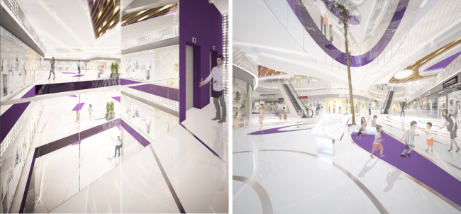 Interiors of the shopping and entertainment center "Atlas" in Odintsovo and "Atlaspark" in Zhukovsky © UNK projectAs far as the interior design solutions are concerned, just like in the cases of the facades, both projects show easily recognizable features. Essentially, it is only the scale that differs. Used to the full extent in Zhukovsky, the theme of the park bleeding into the interior of the building is successfully implemented within the walls of the Odintsovo shopping center. It also has in it quite the "park" trails on the floor designated by the rich purple color, and the benches in the form of snow-white chunks, lots of light and green verdure. Framed in wooden lamellae, the glass-covered fragments of the ceiling refer us to the image of a garden pergola. In Zhukovsky, under the awning of such symbolic pergolas that let in a sufficient amount of ambient light the architects decided to plant living trees. The stretch ceiling with a glittering effect that spreads the light is turned into a semblance of sky in fluffy clouds. The atriums, at some places crossed with overpasses, are permeated with numerous round bull's eyes but the real sky and the rays of sunlight only get inside through the glass domes overhead. What is interesting is the fact that the traditional natural materials neighbor here on the most up-to-date ones while the natural balanced colors give way to almost garish ones. The sci-fi futurist quality of the image of the park is felt particularly strong in the design solution of one of the atriums in Zhukovsky where the architects recreated a picture of an unusual garden with giant fruits hanging down from its ceiling. Because of these persistent inclusions one gets mixed feelings: you cannot really tell if you have found yourself in a park of the future or miraculously ended up at some orbital station and you are now wandering in space on the verge of shock and delight. The construction of both shopping centers is already underway and in some time the futuristic spaces will be able to take in the first visitors. |
|
