|
Published on Archi.ru (https://archi.ru) |
|
| 26.06.2008 | |
|
Symmetry without symmetry |
|
|
Anatoly Belov |
|
| Architect: | |
| Ilya Utkin | |
| Studio: | |
| U-Studio | |
|
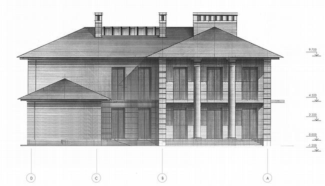
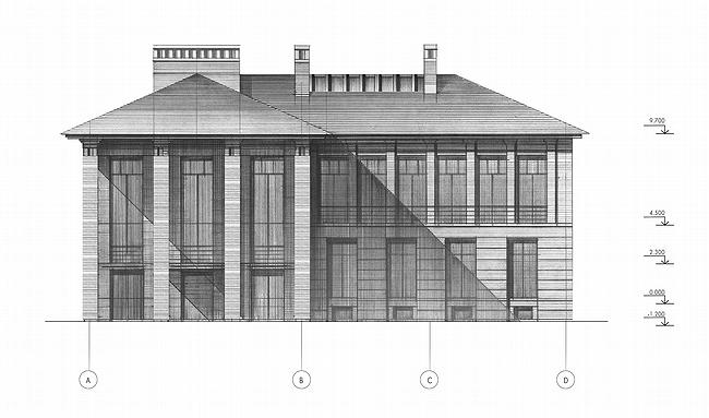
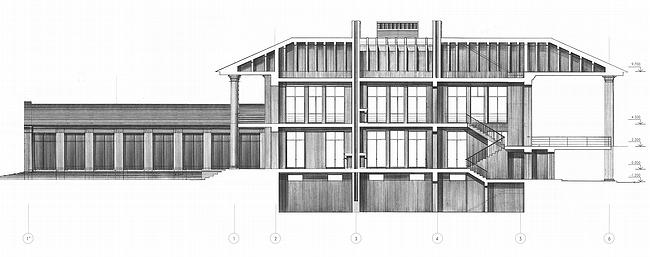
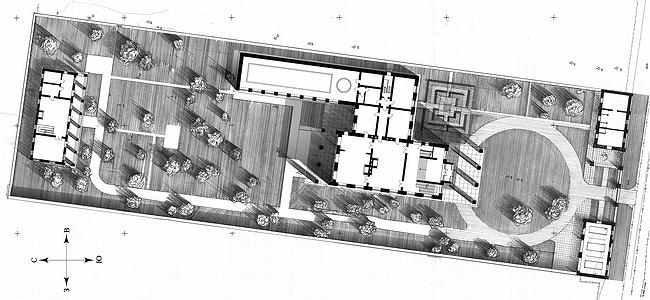
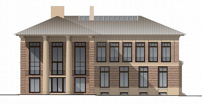
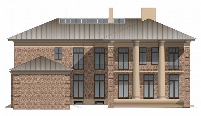
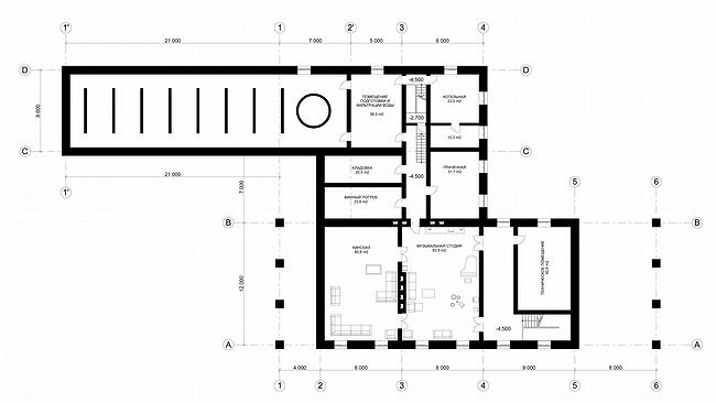
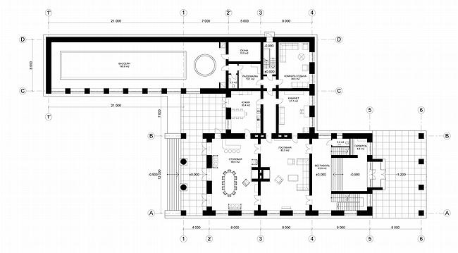
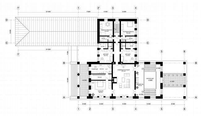
Studying paradoxes of Ilya Utkin's art, Anatoly Belov discovered in the project of country house «Gorki-2» symmetry without symmetry First thing one thinks over looking at the project of villa «Gorki-2» by Ilya Utkin: and what it, actually for style? Most likely it is Classics, but not so sure. Well, the front and yard facades of the building are decorated with porticoes, the house is belted by the eave. But both porticoes are not topped with fronton, attic, and beside the eave and columns there are no elements of an exterior décor. Moreover, the plan is deliberately asymmetric, and porticoes have no traditional "cap" and they also are shifted onto corners of the building instead of being on the center of facades. Well, one may doubt that asymmetry of the plan highlights Classic style. Andrey Voronihin did Institute of Mining asymmetrical and everything was fine. Anyway it would be considered as classical. But shifted porticoes look too provocative – there are no such in classics, it is more like Leon Криера. However if one sees the form and sizes of site, and also the accomplishment, everything clears up in a moment. At first strange and inappropriate appears to be different. The site has the form of a strongly extended rectangular, proportion of its sides are about 1 to 3. That is like a keyhole. To place a classical villa on such narrow territory, to avoid suppressing surrounding by its massif, to make it airy, is a really tough problem. And Ilya Utkin solved it masterfully. The matter is that entering the site from propylaeum, formed by the garage and guard post, we see nothing but the portico of the front facade – the wing with a swimming pool remains outside of sight. So, the mentioned propylaeums take role of a photodiaphragm, artificially narrowing angle of those looking at the house, role of a framework that cuts all unnecessary. However there is an axis of symmetry and it is only visual. It goes from the entrance gate, through the block that includes entrance and public zones and designed as amphitheatre, up to a guest small house in the distant end of the site. No doubt, the plan of the main building is far from academism. But that was the price the architect paid not to make the house cross the site as a wall. In general, on the whole, in the project of «Gorki-2» everything is gathered around the visual axis – including porticoes. Actually, Ilya Utkin could do without them or place them in the centre of facades but then the symmetry would be broken, villa would be completed compositionally but it would not be so fine and parade. Such classical look of the project is not in its decor, and not in its layout, but in the line of movement marked by the architect. Such things happen. To discuss the quality of facades, in my opinion, is senseless, they do not play the main role. Basically, on many parameters they are quite successful: proportions are accurate, materials are picked up with a taste – delicate rosy brown, almost Roman, the brick (most likely it will be a brick tile) is quite harmoniously combined with beige, obviously, from plaster, decor. Front entrance has smart design: central columns of the portico are round, those along the sides are square, when looking at the projection of the main façade it seems as if the portico is framed by antaes. There is something exclusive about it: had anyone done false antaes before Ilya Utkin? The project «Gorky-2» is remarkable due to the following: though it has minimum classical features but this is really Classics. This paradox attracts. Classics without classics, symmetry without symmetry. How such can be? How the architect achieved it? But those questions are not to me, but to the author of the project. NoneNone NoneNoneNoneNoneNoneNoneNoneNone |
|
