|
Published on Archi.ru (https://archi.ru) |
|
| 25.02.2015 | |
|
Moscow Volga |
|
|
Alla Pavlikova |
|
| Architect: | |
| Andrey Romanov | |
| Ekaterina Kuznetsova | |
| Studio: | |
| ADM | |
|
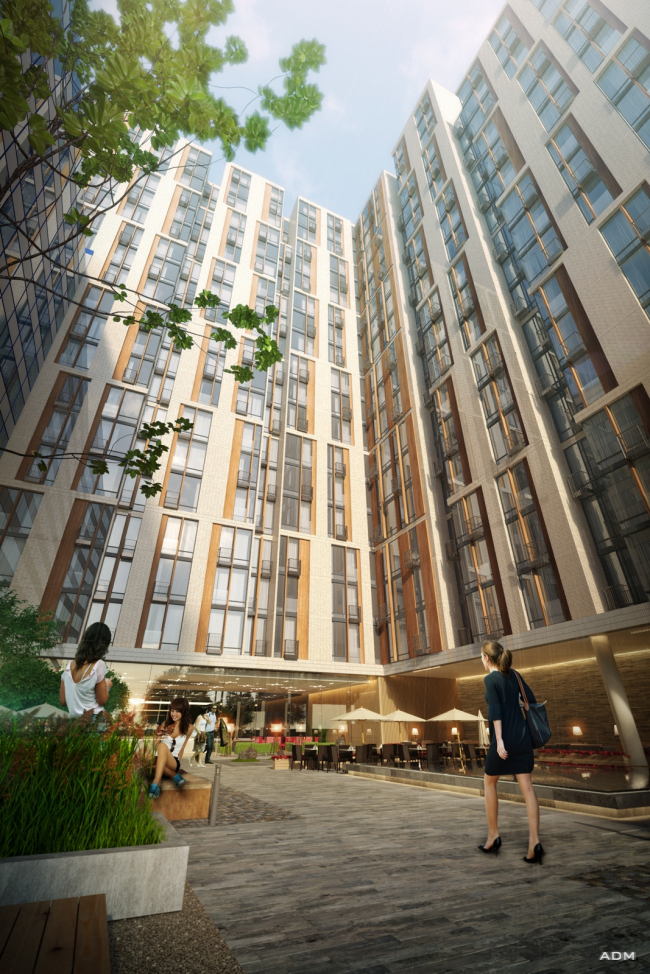
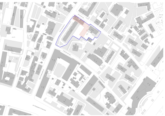
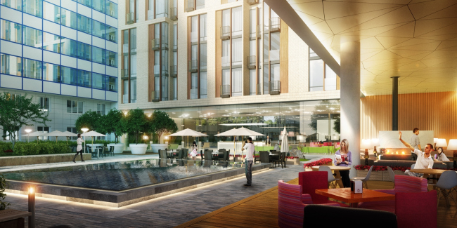
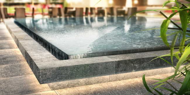
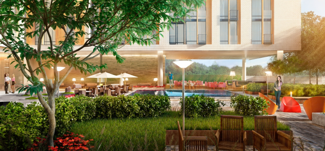
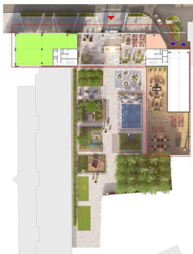
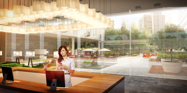
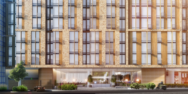
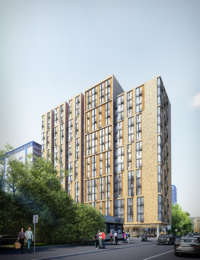
The multistory addition to the hotel complex "Volga": yet another version of imitating a fully-fledged city within the confines of a single building. And, as is always the case with ADM, shifting the accents to landscaping its territory. Apartment complex "Volga" at the Bolshaya Spasskaya Street © ADMReportedly, the new building will be built almost in the very center of the city, inside the Garden Ring: the Dokuchaev Side-street is a place not entirely devoid of its share of fame - it leads from the Sakharov Avenue to the Bolshaya Spasskaya Street, with the Sklifosofsky Clinic, Botanical Garden of Moscow State University and the notorious "Three Station Square" located nearby. The buildings of the apartment-hotel "Volga" were built back in 1976, the twelve-story slab stretching along the Bolshaya Spasskaya, the sixteen-story tower standing on the line of the Dokuchaev Alley. About a year ago, the customers asked the architects to fill the gap between these two buildings with a new one: they were to come up with, on a comparatively cramped land plot, more than 30 000 square meters of useful floor space. Andrew Romanov and Ekaterina Kuznetsova came up with a volume immediately adjacent to the blind side walls of the two existing buildings. Still, not only does this volume complete the front of the Dokuchaev Side-Street but also, meeting the tower, turns into the yard (an L-shaped plan). Meanwhile, in order to keep the new building from breaking the yard in two, the architects, in a Corbusier fashion, raised it on slender round columns - organizing underneath it a public territory accessible not only to the guests of the hotel but also to the general public. Currently, the yard has in it a fenced parking lot and a dozen maple trees growing along its perimeter. The yard will get: an open-air summer cafe, a stone garden, wood decks and colored arm-chairs (just like in the Viennese Art-Quarter), simple yet stylish lampposts, flowers and trees in tubs or without them, trimmed shrubbery, a lawn, and a picturesque little park. As well as a fountain of quite a "Louvre" appearance in the shape of a rectangular rock slab with water flowing down its sides - everything done in strict accordance with the rules of landscaping that ADM architects pay so much attention to in their every project. The space of the yard and the cafe beneath the volume of the new building will be walk-through, one being protected from the rain, the other open to the sun, while one of the most unexpected and pleasant elements of the cafe will be a large fireplace placed outside. Apartment complex "Volga" at the Bolshaya Spasskaya Street. Location plan. © ADMApartment complex "Volga" at the Bolshaya Spasskaya Street. The fireplace niche © ADMApartment complex "Volga" at the Bolshaya Spasskaya Street. The fountain in the courtyard © ADMApartment complex "Volga" at the Bolshaya Spasskaya Street. Courtyard. Terrace of the summer cafe © ADMApartment complex "Volga" at the Bolshaya Spasskaya Street. landscaping © ADM"The necessity to achieve the visual impression of pushing the limits of the yard's territory became one of the key tasks of our project - shares Andrew Romanov - hence the diversity of the things that we are filling it with. For the same reason, the wall of the lobby that has the reception area in it is made completely transparent". We are speaking here about the first floor of the slab that stretches along the alley: almost the entire width of the yard, its inner and outer walls are completely made of glass, the street is viewable perfectly well from the yard and the other way around. The reception is situated at the very center of the lobby that is permeable not only de facto but, more importantly, visually, which helps to subliminally expand the territory of the yard. In the decoration of the lower floors, glass also prevails: from the street side, all the bottom floors are given to large glass shop windows, the glass being sunken in a bit, and the walls of the upper floors slightly overhanging forming a sort of an awning running above the shop windows - like a gallery for the window-shoppers. Apartment complex "Volga" at the Bolshaya Spasskaya Street. Big glass lobby © ADMApartment complex "Volga" at the Bolshaya Spasskaya Street © ADMIn view of the lack of the area and the necessity to consider the dimensions and the space logic of the two already-existing buildings, the resulting volume came out quite laconic. Nevertheless, this did not stop the architects from embellishing, without really crossing the line of revising the modernist style, the outlines of the building and radically altering its proportions, making them distinctly vertical, almost to the point of brittleness. To be more exact, the elongated volume does not look like an extended beam: it looks more like an array of tall slender towers strung on some sort of a single common core - almost Manhattan. The overhanging cantilevers are a lot broader than the habitual bay windows and the lintels between them are narrow but they regularly alternate both on the street facades and inside of the yard. The illusion of the multiplicity of the volumes is also supported by the relief drops, the lintels between the sections being sixteen stories high, while the main volumes tower three floors above them which also enhances the "self-sufficiency" of the towers. The side end sections alone are devoid of the three top floors - they starkly level out the skyline with the slab of the old hotel thus keeping the harmony with the environment. Apartment complex "Volga" at the Bolshaya Spasskaya Street. Street view © ADMThe three-story module is important not only for the volume drop; the windows of all the floors, for the exception of the first public one, are grouped into vertical clusters of three, their width always varying, at the same time staying true to some common aesthetics of the vertical sashes without turning, however, into a classic holland wall. The plastics of the facades, essentially very reserved, is reigned by the soft wood and ceramic colors. What is interesting is the fact that the basic grid is formed by the light golden hue brick with brown "scorch-marks" - the domination of the light tone is subjected to the good old task of visually expanding the complex. Slightly sunken in, the other, "inner" layer of the facade is given away to the ceramic panels that imitate the color and the texture of wood: they form both the broad piers and the vanishingly thin lintels that give to the pattern of the windows some special graphic subtlety. Incidentally, it is these thin lintels that produce this impression of fragile brittleness that is only intrinsic to this particular project. The deepest layer - the metallic bands of the intermediate floors form some sort of "filling thread" of the multilayered facade matter. The picture is completed by the grilled metal balconies placed in a staggered order that are also capable of functioning as the boxes for the air-conditioning units. The facades look pretty much alike but not all of them are completely identical - one volume located to the right of the main entrance is approximately twice as wide as the others and stylistically closer to the postwar modernism. The bricks form a thin outstanding frame but the "ceramic wood" gets all the lintels between the windows; it has something of the designer objects the seventies (can it be an homage to the neighboring buildings?) One way or another, this "different" facade only enhances the basic impression of this city of a building. The result is austere yet elegant; interesting is the fact that the image subtexts are given by the authors very tactfully and on the form of a hint: a casual observer will only see the quality finish and the freshness of the shop's newly washed windows, or maybe the diversity of the textures at most. Meanwhile, looking at this "mini-Manhattan", a connoisseur could notice more than one emotional allusion. For example: not far away, as was already said, the "Three Station Square" is situated - meaning, the Leningradskaya Hotel is also near; not far away there is yet another high-rise, one of the best, built by Aleksey Dushkin at the Red Gate. The light-beige tones, the warm-colored insets, and the gothic verticals put us in the mind of the fact that both American skyscrapers standing in lines along the ravines of the streets, and the Moscow chic high-rises have a lot more in common than we usually tend to think. Or think about it this way: around the house in question, far and near, there are the institute buildings of the late soviet era built from pink bricks with crimson lintels and the broad verticals of the pseudo pilasters - the new "Volga" looks like it is humming a new tune to the old harmony, rewriting the same idea in a more certain yet more subtle way. Or making a cross of both - which possibility also cannot be ruled out completely; adds to the alchemy of the matter of the "soviet institute" a drop of Stalin high-rise style, an injection of classics into the body of modernism. One more thing! In 1976, the massive buildings of the soviet hotel replaced the fractured development of the XIX century, leveling out its variety to the limit. Today, in this new project, the architects have been able to combine, although only on a visual level, both of these two qualities: the magnitude and the fractured character. As they are, well, not "recreating", it is loo late for and there is little point in that - but revise the structure of the city that once was there. Or maybe this is the spirit of our time. The construction of the complex has already begun; it is due to be launched in operation in 2017. |
|
