|
Published on Archi.ru (https://archi.ru) |
|
| 27.01.2015 | |
|
Apartment Hotel in "New World" |
|
|
Alla Pavlikova |
|
| Studio: | |
| Arkhstroydesign ASD | |
|
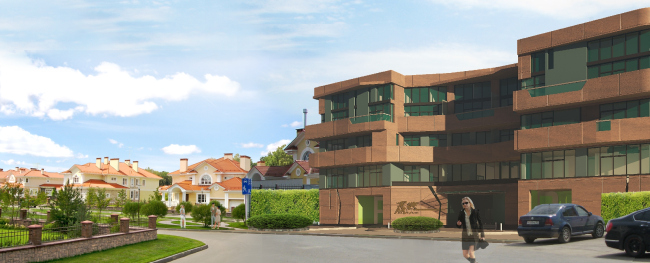
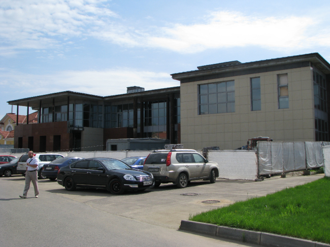
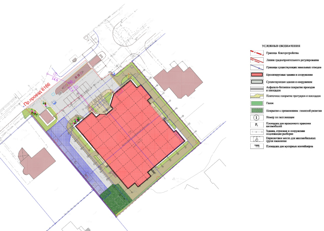
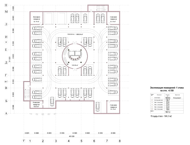
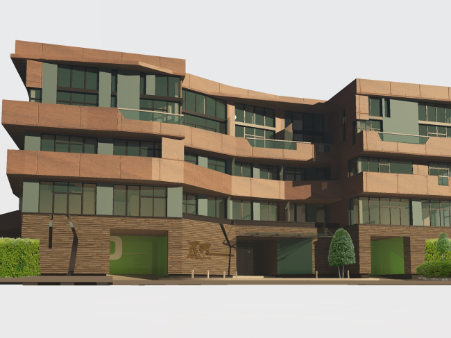
A story about architects reconstructing their own unfinished building that stands at the entrance of a villa community. NoneThe story of the construction of "New World" villa community located three kilometers away from Moscow Ring Road down the Altufyevskoe highway and the story of this building started simultaneously. Over the years that have passed since that day, this settlement has become one of the symbols of the perfect out-of-town life of the early 2000's: houses with mezzanines and slate roofs, green lawns, well cared-for flowerbeds, a lake, a forest... But this is what usually is referred to as "residential territories". Apart from the residential houses, the small outpost of the suburban paradise was to get what they call the "entrance group" - eight thousand square meters of a residents-only multifunctional center: shops, restaurants, a fitness club with two swimming-pools and hotel rooms. It turned out, however, that the elite settlement showed little demand for this community center and the building that was left unfinished back in 2006, got completed only recently - at the customer's request, the architects chose the most cost-efficient of the available solutions. What was required was not only reconstruct the surviving framework but also, and most importantly, revise its purpose. There were lots of ideas. Aleksey Ivanov recalls how it took them almost half a year to find the optimum solution for the reconstruction and practical use of the existing territory: the architects were choosing functions and kept changing the configuration of the premises. There was even a proposal to demolish the framework together - but it turned out to be still more challenging and expensive. NoneAt the end of the day, it was decided that the most sound idea was to keep the framework as intact as possible. From a community center, the building turned into an apartment hotel with a rather flexible planning structure - for example, a few 30 and 40-square meter apartments are arranged inside one section in such a way that if necessary they can be grouped into one large suite. The most spacious and the most expensive apartments are situated on the corner parts of the building where the ambient light reaches deeper inside. A significant portion of the first and the basement floors is given to the social functions and the residents' parking space that is accessed by a beautiful-looking long driveway that ends in the light atrium territory of the stairway and elevator lobby. Situated in the very heart of the building, the circular atrium has been inherited from the previous project; it provides the apartments situated deeper inside the building with the necessary amount of daylight as well as improves the quality of their environment. Besides, descending down to the parking floor, the atrium gave an exquisite quality not only the above-ground but also the underground entrance group. NoneNone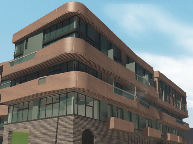 NoneNoneThe outward appearance of the house also changed beyond recognition: at the customer's request, the original volume was overbuilt with another two floors. Technically, this task could be accomplished at minimum expense - just by strengthening the framework. From the standpoint of the restrictions that applied at this site, however, a paradoxical problem arose: with the allowed height of 19 meters, only the construction of a four-story building was allowed. You can build less but you cannot build more. With both conditions met, each floor would have to be about five meters high - which would have been, to say the least, strange. However, foregoing the idea of the incongruous giant first floor, the architects proposed to build three standard floors instead, turning the six-meter tall fourth floor into a penthouse with a loft. 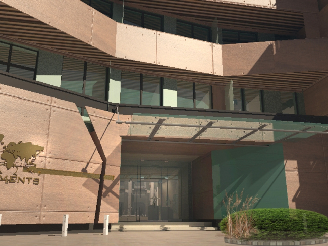 NoneAs for the facades, out of the multitude of options, including the laconic horizontal and vertical fracturing, quite appropriate in this environment, the authors chose the Aalto technique - with the protruding cantilevers of the balconies that belt the building with continuous bands with clear division into "top" and "bottom". Over the stone basement, there are glass walls that are hidden in the deep shadow of the wooden balconies - the Spanish panels with a golden copper hue. Everything here falls in with the principles of the great Finn, including the recession of the grand entrance's wall surface away from the construction red line and a glass marquee over it. It is easy to see that the volume of the apartment hotel contrasts with the classics of the stuccoed villas but this, as Aleksey Ivanov confesses, was the whole idea of the project - stressing the fact that this building belongs to a different period. |
|
