|
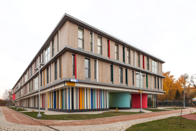
Architectural bureau ADM (stands for "Architectural Dialogue with a Megalopolis") entered this time into a dialogue with the educational system and built in Moscow-area's Mamontovka a school for some 350 students.
| School in Mamontovka. Photo © ADM |
 |
Mamontovka is a district of the town of Pushkino, a typical Moscow suburb standing on the Yaroslavl highway; for those that drive from Moscow, it starts just outside the town of Korolev. This place still consists more of wooden cottages rather than of five-story buildings and industrial parks, but new construction starts in Pushkino as well: the developer company GLOBE is building the complex named "O-Pushkino" (in Russian, pun is intended - translator's note). Performing the social obligations before the city, the company financed the construction of a new city school in the place of the old two-story building of 1950 in the "village" part of Pushkino, not far away from the picturesque river Ucha. The resulting volume is enough to house two recently united schools - #13 and #14 - and a library.
***
This is the kind of school that we dream our whole life about. First - as kids, when we enter each morning the lobby of a panel building designed for almost 1000 students. Then - as students in our fourth year of studies in Moscow Institute of Architecture when we try to model the ideal space for "660" students. And then as adults, running around the city in search of the best school for our children, we start daydreaming just as kids again. Those who will be lucky to go to this school or send their kids to it will not need to conjure up in their heads some blurred image of an ideal school bearing a distant resemblance of Eton, or maybe an educational center of some Swedish eco-city. There are no analogues in the Russian practice of school construction - nothing even comes close! Three floors, the standard set of the necessary and sufficient classroom facilities, a playground, a stadium... And the pretty unconventional organization of the school garden with a staggered order of trees and lampposts on the circular "fields" of green and white… And even these stand "against the rules". Everything is done according and still against the rules here. This school looks nothing like what we commonly think of as "school". Or, rather, it is so much "school" that all the other school buildings automatically seem to fall short.
| School in Mamontovka. Photo © ADM |
 |
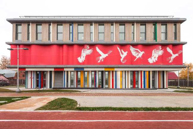
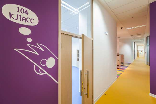
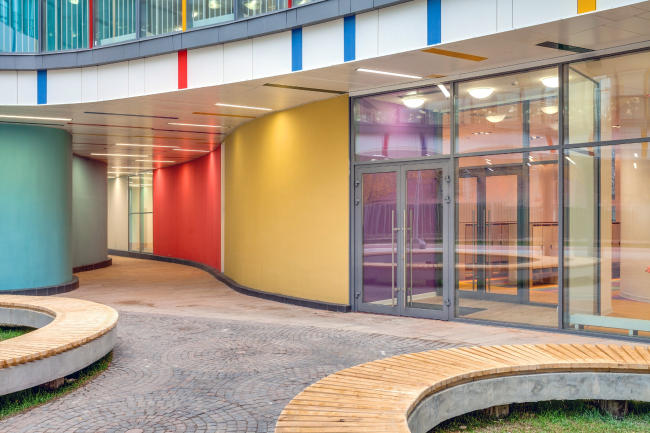
The first thing that catches your eye when you walk in is the abundance and variety of colors. Nothing is too shy to look bright: the columns, the walls, the window sashes... All the colors of the rainbow are there: Richard of York gains battles in vain! Everything starts with red, of course. The red walls, the red columns, the bright-red verticals of the window sashes; on the second floor, behind the flexible band of imitation of red mock-up cardboard with a pixelated image of a split-second anatomy of a bird in flight, there is an auditorium. Here and there in the courtyard one can see a fragment of an orange wall. Then a green, a light-blue, and a blue one. Without losing their intensity and at times becoming even brighter, the colorful spots jump off the facade to the interior, leaving it completely devoid of any "regulation" facelessness. And, finally, the violet inserts next to the classroom doors. It is here that the battles are given, and not in vain. And you understand that the birds that were flying upon the facades, have now gotten inside and froze on the walls imitating chalk drawings. Probably, if you take a piece of chalk off the blackboard shelf and draw a bird of your own next to such a bird - then no punishment will follow. Only the bird will be less lonely. Also - the right angles (meaning - corners) are really hard to find here - so the proverbial "putting a student in the corner" is totally meaningless.
| School in Mamontovka. Photo © ADM |
 |
| School in Mamontovka. Photo © ADM |
 |
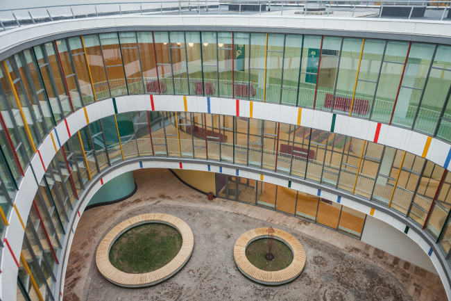
All the windows in the classrooms, offices, and student lounges are of the wall-to-ceiling type. As a result, the spaces are easily viewable from the outside, from the splashed drop of the courtyard. And when you stand in the yard, with the school life bubbling around you behind the cascades of glass, you realize that this is the place you've always longed to be, easily identifying your inner child with this school. And, no, you do not need a pioneer scarf (Soviet English - translator's note) for that. This is a very warm and welcoming environment that at the same time securely protects you from the cruel world outside. I look at it and I realize that I would want my children, and, if I'm lucky, my grandchildren to study here.
| School in Mamontovka. Photo © ADM |
 |
Meanwhile, though rectangular on the plan, this volume is by no means perceived as a lapidary parallelepiped. The three floors are easily readable on the facade as three independent levels. Each one of them has a life of its own but together they form a single compositional solution, simple and harmonious.
"For us, it was important to separate the flows, dividing the elementary and the junior high in such a way that the students do not get in the way of one another - shares Andrew Romanov - Indeed, the inner courtyard, water drop shaped and opened wide on the level of the first floor, hidden between the pale of colored "counting sticks", conceals two entrances: one leading into the elongated building of the elementary school in the southern part of the yard, and the other leading to the square volume of the junior and senior high. The very young - on the left, the teenagers - on the right. There is also yet another entrance into the yard - the glass ravine in the side wall of the rectangle that is also convenient for the young kids.
While the plan of the classrooms on the first floor is subject to strict geometry and looks like "r" letter, the northern angle of the rectangle is occupied by a bionic volume whose wavy outline looks like six small "pseudopods" - this place is the home of the local branch of Boris Yeltsin electronic library. The looseness of its plan is supported by the completely transparent walls of the first floor and a very light, almost snow-white interior with a double-height mini-atrium, a "younger brother" of the school yard on the inside.
The library is inserted into the volume of the school building, even "hidden" within its contour, and its interaction with the school buildings reminds the principle of splitting the light beam running through a prism to become a host of rainbow colors. The white and light library in this interesting story is the initial ray of white light, the sum total of all the aspects of knowledge, and it is also the glass of the prism: let's imagine a ray of light, pointed from somewhere in the northeast, not that important, really. Passing as white through the transparent library, the light (in our imagination, of course) gets refracted, and the school gets bright rainbow-colored walls, columns, and colorful flares on the atrium's ceiling. One could hardly think of a more joyful image of sorting your knowledge out inside your head than the refraction of a light beam onto the colors of the rainbow that, according to Genesis, mean salvation and hope, at the same time, symbolizing in this day and age the most rewarding part of the science of optics: newton's theory of light. Looks like the birds if paradise on the walls of the school corridors sing praises to the purity of rational knowledge.
None
None
None
None
None
None
None
None
None
None
None
None
None
None
None
None
None
None
None
None
None
None
None
None
None
None
None
None
None
None
None
None
None
|