|
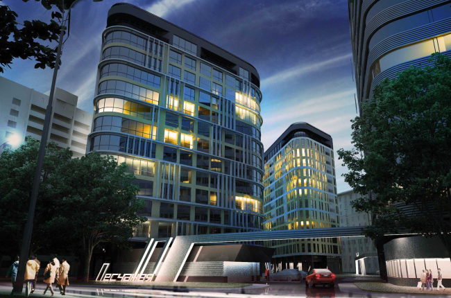
A housing development on the Peschanaya Street consists of three streamlined volumes. Their architectural plot interacts with its surroundings and is based on smooth transition from serious classical notes to “guardedly modernistic” freedom.
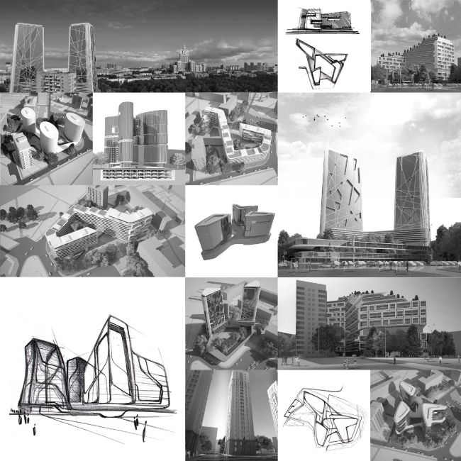
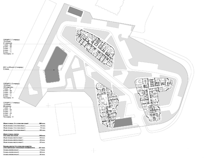
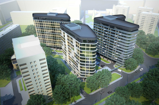
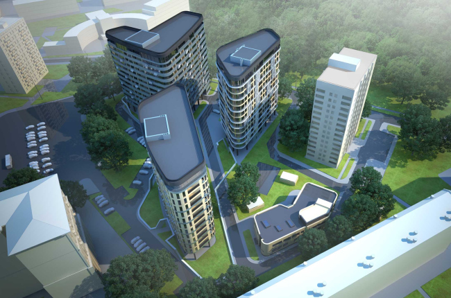
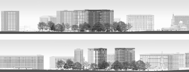
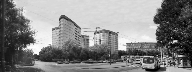
Moscow, “Sokol” metro station, Peschanaya Street. “The Fourth Dimension” is working on a design project for a housing development on a four acre lot – three large volumes, looking like smoothly hewn stones on plan, as if accidentally driven ashore. The complex is surrounded by the strict rhythm of the Stalin quarters on the one side and by hardly streamlined 1980’s towers on the other. The new project echoes this three-tower ensemble with its triadic composition.
The authors deliberately refused to continue this closed quarter line of the Stalinist development avoiding blind walls and counting on the preservation of the maximum openness of rooms facing the neighboring park. And the tower “stones” literally rise up amid the green massive adjoining the park, admitting air into the yard of the complex without screening anything – even the Church of all the Saints that stands a bit in the distance. This neighboring church, however, imposes tight restrictions such as on height. And even though there are some thirty-storey buildings around here (with the city development plan allowing but twenty two) the architects have decided to settle on thirteen floors and came up with three buildings proportionate to the surroundings instead of two high ones. The complex contour of the lot allowed placing the towers so that they would not overcast one another. Therewith the authors managed to keep the rather spacious room of the yard, clear of cars and rich with green, children’s playgrounds and promenade areas. There is also a two-storey kindergarten for 55 places in the west part, on the rise of the yard. It is “painted” in the same style as the residential towers – another tiny atoll in the sea of urban life.
But this will all be later. For now, there is a residential house that was once a school there. The building was through several fires, is now in dire state, and is due for demolition. As Vsevolod Medvedev – one of the authors of the projects said: considering the circumstances, the customer committed himself to resettle all the people living in the former school-house into one of the new buildings of the complex, having it built long before the demolition.
Besides the complicated surroundings and the location of the land site that are to be inevitably dealt with, there are some tricky soils here – a subterranean stream crosses this area. However, the customer practically gave the architects full swing relying on their experience and taste.
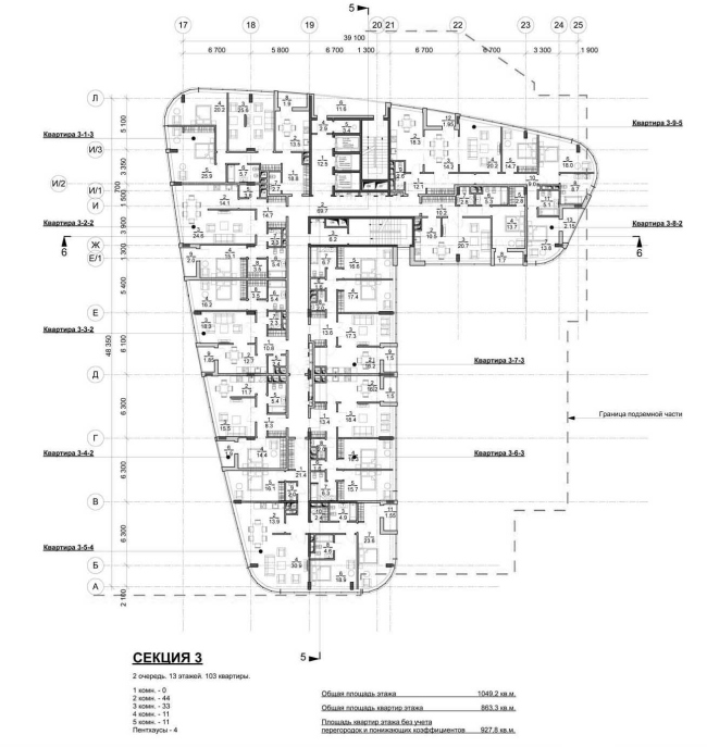
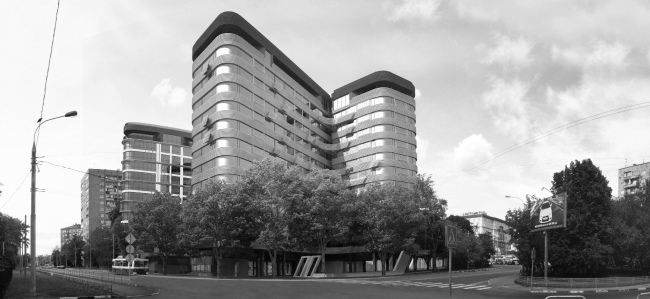
After a long search for the solution, a simple and easily readable concept was born from a huge number of complicated drafts. The main point of the project is about the absence of any angles. Wandering among the buildings a person will not find a single barrier. His or her sight will sort of spiral up - following the fluent lines of the facades.
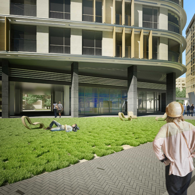
All the three volumes are solved in a different manner. But one can easily trace the fluent transit from a rather heavy stone finishing of one of the buildings to the almost completely glass, weightless facades of the V-shaped tower in the back of the plot. The first, stone building stands closer to the Stalinist houses and adopts some of their features without copying or mimicking the sample. Its architecture distinctly gravitates toward classic: it is the outspoken rhythm of the windows, horizontal lines of the cornices, the typical coloristic solution and of course the stone finishing that forms the monumental, austere image.
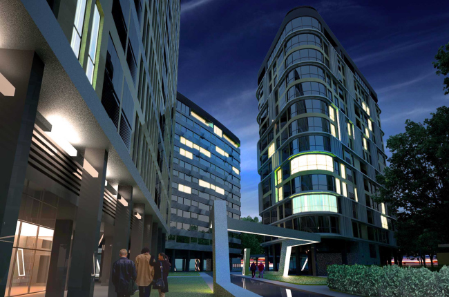
The other, “transient” block is distinct for its brave modern character. The horizontal rhythm of the cornices is broken every now and then by the vertical lamellae or the thick cutting of large square windows. Its facades seem more open and diverse. The third, and most radical volume is made of glass and metal. This tower looks as if refuses to look back on the surroundings and demonstrates lightness, permeability, maximal openness and, most importantly, the fact that it belongs to the XXI century architecture. The only courtesy towards its neighbors are the cornices tightly belting the building along the perimeter with wide steel bands.
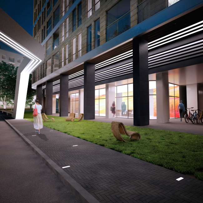
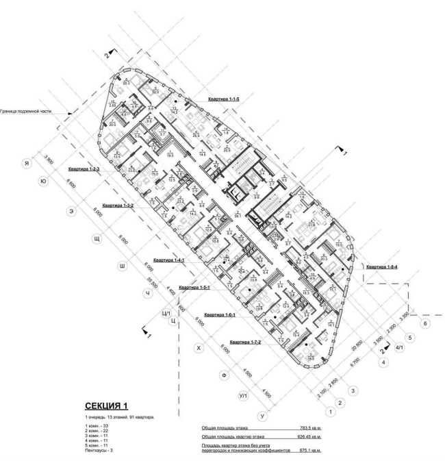
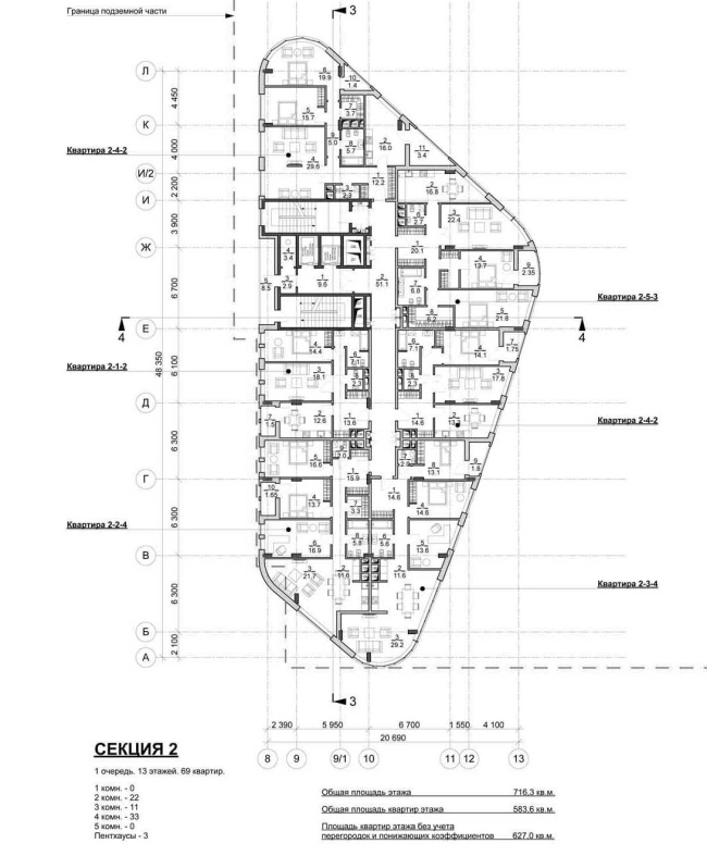
The similarly built penthouses that look a bit like European student graduation caps is the uniting element for the three towers. And below, at the eye level, the authors clearly mark the stylistic commonness of the buildings: long glass window-cases and open galleries with canopies stretch along the ground floors and let the pedestrians move around the yard without fearing to be sopped in the rain. The project is accompanied by charming improvement details as is common: a band of lights over the sidewalk, the “herring-bone” pavement with strokes of built-in lamps, rocking-chairs with their stream-line silhouettes reminding the plans of the houses.
Telling us about the project Vsevolod Medvedev expressed his pity that the complex turned out to be overly “bridled” and a bit archaic. However, this approach does not let the new architecture, rising up in the dense Moscow development, disturb the wholeness of it. On the contrary, it is all about preserving the link of times that is slowly slipping away from our hands.
None
None
None
None
None
None
None
None
None
None
None
None
None
None
None
|
