|
Designed by "A.Len" Bureau, the residential complex on the Vasilyevsky Island can be understood as a modern transcription of a Saint Petersburg residential quarter.
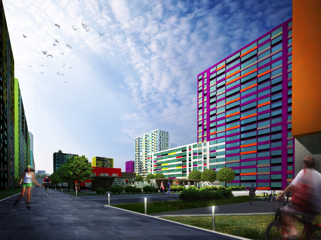
| Residential complex at the Vasilyevsky Island © "A.Len" |
 |
Designing a new residential complex in Saint Petersburg - a city that, being virtually spoiled by the historically formed quarter building system, never did take the block building system seriously - is quite a challenge. Designing on the Vasilyevsky Island is a double challenge: too strong is the very tradition of the place and too palpable is the influence of the "square" planning, the main axis of the latter being neither a boulevard nor an avenue but the Smolenka River. And it is on the wave-built land of the Vasilyevsky Island, not far away from the Primorskaya metro station that the residential complex "Me, Romantic" will be built that will form one of the fragments of the city's "sea facade" with the facades of its economy-class residential houses. And it was this particular condition that made the task especially difficult. However, the authors made every effort to make the complex stand up to its location, be up-to-date, unconventional, and look great from the water area.
On the one hand, "Me, Romantic" is one of the economy-class residential complexes that overlook the so-called "Western High-Speed Diameter" Highway; on the other hand, this complex is the most unusual out of its peers. From the town-planning standpoint, this is a system of "starburst" layout objects put together to form a trapeze-shaped block. And, in spite of the fact that there is no "quarter" in that place in the traditional sense of the word - the houses that spread out in a fan-like fashion do not even always close up their ranks - the whole thing still functions as a "quarter", dividing the city life into what goes on inside the complex and outside of it. And as for the closeness, however incomplete and split in two by the future street, it still created this "inside-the-complex" world and helps to protect the inside territories from the chilling winds blowing from the Finnish Gulf. This is the algorithm inherent to the town-planning philosophy of this city where once upon a time every house was in effect a "residential complex" sporting its own grand entrance that opened up to a courtyard of its own, from which you could, passing through the arch, get into the neighboring yard, this neighboring yard being through its very address quality also almost "your own". And from the yard that was the last in line, through "your own" arch, you finally could get out on the street... The yards securely protected people from the sea winds, and any postman knew where he would find "seventh yard, twenty-first grand entrance, and apartment 137".
In "Me, Romantic", you will not find the yards going deeper and deeper inside the land site - instead, you will find a system of interconnected and at the same time independent territories of the kindergartens, playgrounds, schools, roller-blade, skateboard, and bicycle trails, the whole thing looking like a modern transcription of the classic "my own courtyard" of Saint Petersburg. There is also an "own" observatory here - but this rather belongs to the fantasy projects of Saint Petersburg constructivism architects whose dream was to build a "commune" house "for the full and complete life cycle" where you could "grow your own heroes, your own dreamers, and even your own scientists". But then again, maybe it is this observatory that gave the complex its name... who knows?
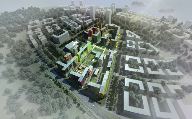
| Residential complex at the Vasilyevsky Island © "A.Len" |
 |
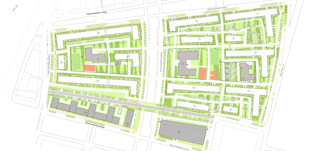
| Master plan. Residential complex at the Vasilyevsky Island © "A.Len" |
 |
Speaking of the space-and-volume solution, one must note that this project is dominated by pragmatism and the architects' ability to achieve great results and virtually fit a square peg into a round hole. Ultimately, on a rather narrow building site, two independent functional zones peacefully coexist: the residential and the commercial one, separated by a wide pedestrian boulevard. Each of the two, both visually and "space-wise" works for itself and for the surrounding residential quarters. The residential part consists of thirteen buildings from 6 to 20 floors high with all the described social infrastructure and underground parking garages that can only be entered from the outside thoroughfares. Occupying the land plot that is located at a little distance from the residential houses, the commercial part consists of a multifunctional business center, a hotel, and a multi-tier parking garage.
The image, however, is quite a different thing. The facades are completely no-frills: just the intense color and the individual for each house balconies, protrusions, or stairway railings. However, in spite of the seemingly scarce arsenal of artistic means of expression, thanks to the bright palette of the volumes, a little shift in respect to one another, and the presence of windows of different sizes, one will not find here any monotony that is so characteristic of the multi-apartment houses.
What is important is the fact that the rhythm, the shades of different colors, and the subtle plastics are subjected not only to the author's artistic will but are also based on the clear-cut theory that fills the flashy image with extra meaning.
Sergey Oreshkin is sharing about his original idea: "The project is based on the ideas of suprematism of the 1920's - such as Ritweld's research of colors. Every color that we used in our project is non-monochromatic; it is a sophisticated combination of pixels of different shades that create a special tone when viewed from a distance". Indeed, the bright mosaic of the facades of this project is significantly different from the traditional pixel decoration that looks pretty much like enlarged computer graphics: in our case, the pixels are different - they look more like a pointillist's strokes rather than like a digital color that was stretched out.
The bright inserts create the accents and make interesting contrasts; besides, the colors that are used by the architects are also rather unconventional, or, rather, they are unconventionally numerous. The naturally expected "acid" green, orange and sunny yellow are added by violet - a dangerous color to play with - that totally embraces one of the large buildings and, thanks to the multitude of red, black, gray, or yellow inserts, does not look gloomy at all (as one might have feared) but rather tasty, like maybe some sort of a merry berry. The color combinations are really numerous, and among them, there are some really unexpected or, rather, "non-hackneyed" ones. The "Mondrian" black-and-white-and-red-and-yellow set is intervened, for example, not by the expected blue but by the already-mentioned berry-violet, its spots getting at times more dense, at times more sparse, and at times stretching into stripes, looking like maybe a TV color bar test pattern or some op-art picture meant to test your eyesight. At times the prevailing life-affirming tone gets inverted, and the background part is played by the dark gray - against such background, the bright spectral inserts look almost glowing and remind some kind of lens flares. The variety of the rhythm and color combinations is picked up by the windows: the bands give way to squares, the windows of vertical and horizontal proportions on the side walls of the buildings line up to make shaky zigzags - but all these things, the color and the form is subjected to the subtle polyphonic rhythm and looks as a single harmonious whole - possibly, held together by some sophisticated code or principle based on the already-mentioned Ritweld's research. One should hardly say now that no two buildings here are exactly alike, each volume being distinctively individual, although the common rhythm and the tension of colors still hold their family together.
Saying "nothing extra", we should note that on the outside there are neither balconies nor stanzas that in today's houses, according to Sergey Oreshkin's apt comparison, line up into glass vertical "medical thermometers" set up against the building. Here all the balconies are sunken in, leaving the part of the mosaic picture up to the facade. Besides, the architects paid special attention to the verticals of the staircases and optimized their design solutions.
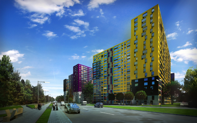
| Residential complex at the Vasilyevsky Island © "A.Len" |
 |
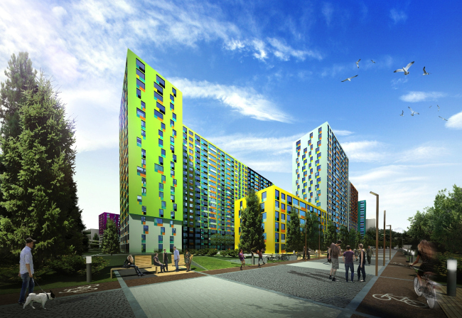
| Residential complex at the Vasilyevsky Island © "A.Len" |
 |
Everybody has long since grown used to the fact that when buying an apartment, we are in fact buying the square meters of the concrete floors and the outside walls hardly capable of protecting these square meters from the wind and the rain - because the windows are just not there! We buy the square meters of the structures that are yet to be turned into square meters of the human dwelling. What makes "Me, Romantic" different from the city's other residential complexes is the "turn-key" status of all of its apartments: they come with the furniture, household appliances, and even some decor elements. Of course, one could argue whether it is a good thing or not that there are but three design options: "Classical", "Oriental", and "High-Tech" - but still, they are there and therefore we are still buying a place one can live in. As for the design, it can always be remodeled to fit your own taste - the slide down is generally easier and quicker.
Special mention must be given to the architecture of the schools and kindergartens. We all remember the dull bleak houses to which our still sleepy parents would drag us every morning. The schools were just as bad. What made things worse, some of us had to actually commute to get there, which was quite an ordeal in itself. Things are entirely different here: the little houses look more like a set of nice playing cubes that you can build anything out of. And these cubes are scattered right under the windows of your own apartments. Even from above they look sweet and cheerful - it is the roof, "the fifth facade" that comes into play. And the entire complex leaves an impression of freshness and brightness that the rainy Saint Petersburg is in such a desperate need of.

| Residential complex at the Vasilyevsky Island © "A.Len" |
 |
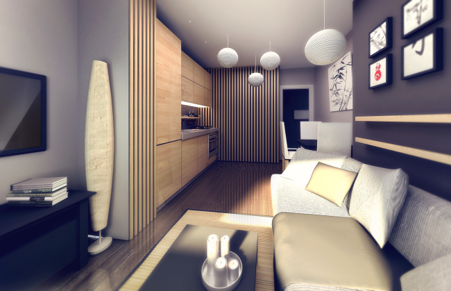
| Design of a two-room apartment. Residential complex at the Vasilyevsky Island © "A.Len" |
 |
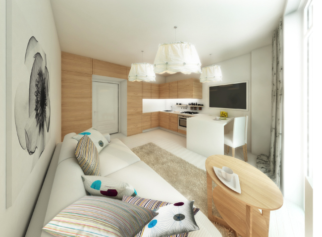
| Design of a studio apartment. Residential complex at the Vasilyevsky Island © "A.Len" |
 |
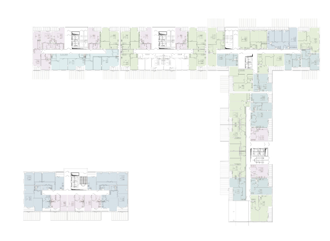
Plans of the first floor of Buildings 3 and 5.
Residential complex at the Vasilyevsky Island © "A.Len" |
 |
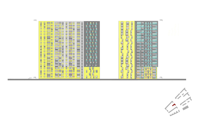
| Facades of Building 11. Residential complex at the Vasilyevsky Island © "A.Len" |
 |
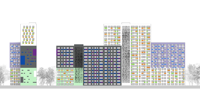
| Color solution of the facades. Residential complex at the Vasilyevsky Island © "A.Len" |
 |
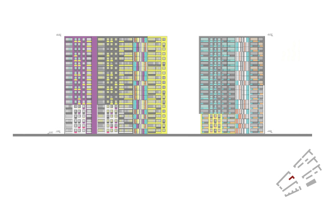
| Facades of Building 11. Residential complex at the Vasilyevsky Island © "A.Len" |
 |
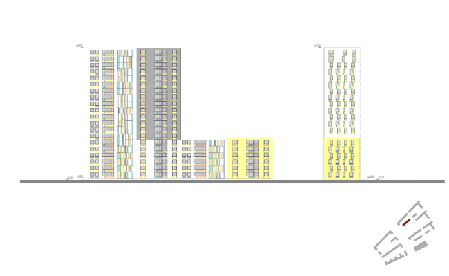
| Facades of Building 7. Residential complex at the Vasilyevsky Island © "A.Len" |
 |
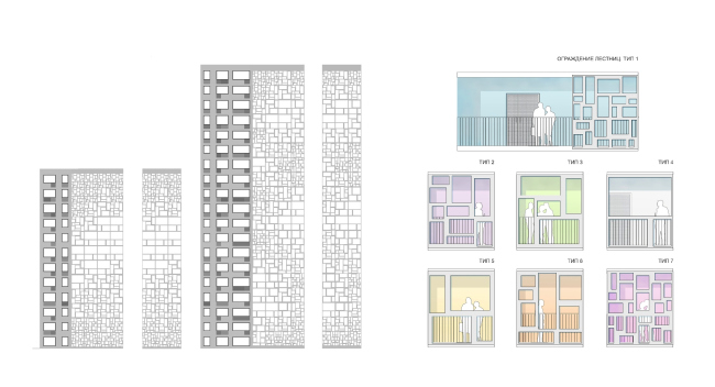
| Fencings. Residential complex at the Vasilyevsky Island © "A.Len" |
 |
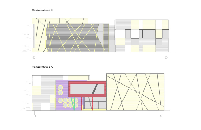
| Facades. Residential complex at the Vasilyevsky Island © "A.Len" |
 |
None
None
None
None
None
None
None
None
None
None
None
None
None
None
None
|