|
Published on Archi.ru (https://archi.ru) |
|
| 12.02.2014 | |
|
From under the Tuscan Sun |
|
|
Anna Martovitskaya |
|
| Studio: | |
| Studio of Roman Leonidov | |
|
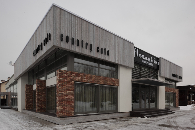
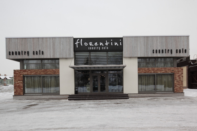
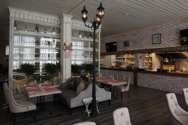
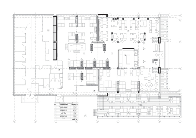
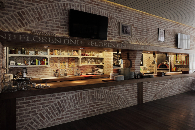
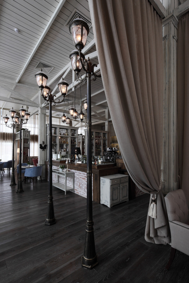
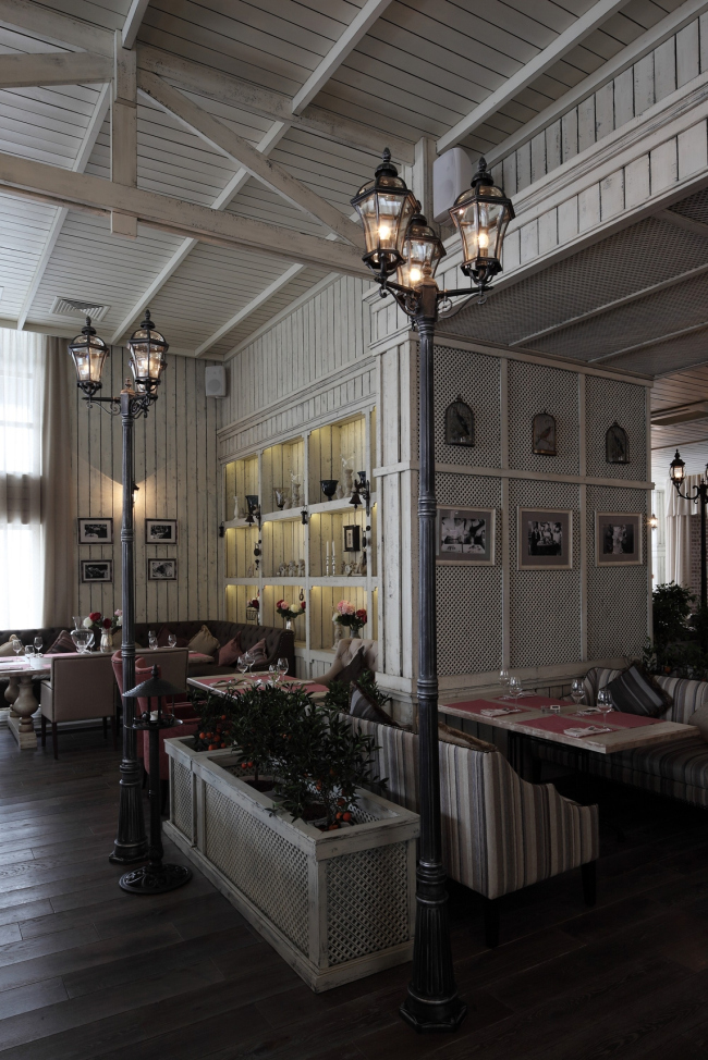
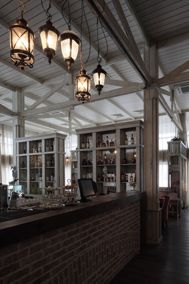
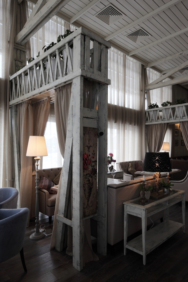
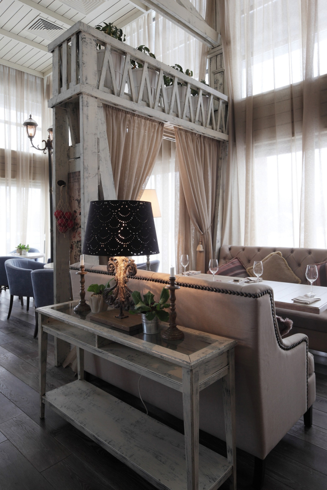
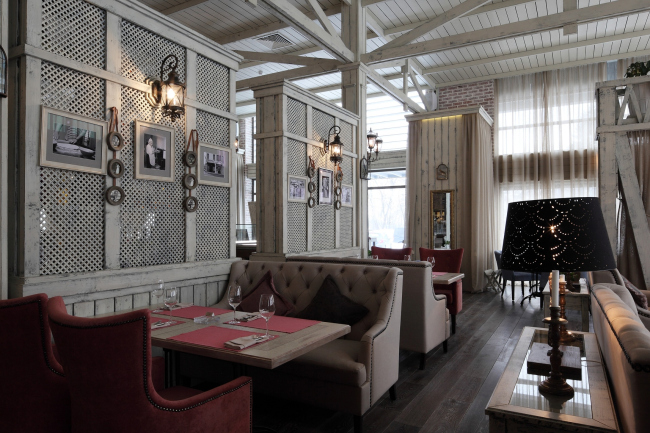
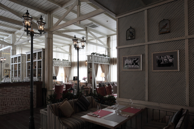
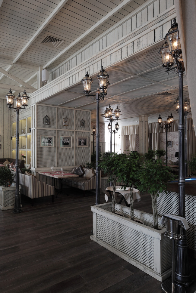
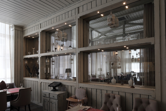
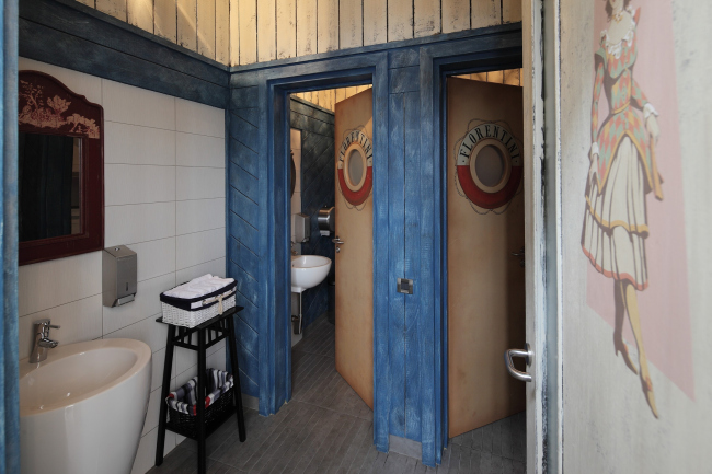
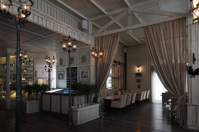
Upon the project of "Roman Leonidov Architectural Bureau", New Moscow got the restaurhttp://i.archi.ru/i/650/154395.jpgant named "Florentini".  "Florentini" Restaurant © Roman Leonidov Architectural Bureau "Florentini" was built in Dubrovka - a huge townhouse village located down the Kaluzhskoe Highway, some 6 kilometers outside of Moscow Ring Road. Stretched along the highway for nearly a kilometer, this settlement from the very start had in it a few restaurants that constituted the so-called "communal zone" that separated the highway and the residential area. However, in spite of the fact that the village is but a little shy of its tenth anniversary, the local restaurants never enjoyed any particular popularity (for the exception of McDonalds’s, maybe), and thus regularly changed their concepts and appearances. One of such reincarnations happened very recently - upon the project of Roman Leonidov, the standard "cube" of the cafe was reconstructed and turned into a plastically intriguing volume, perfectly viewable from the highway. 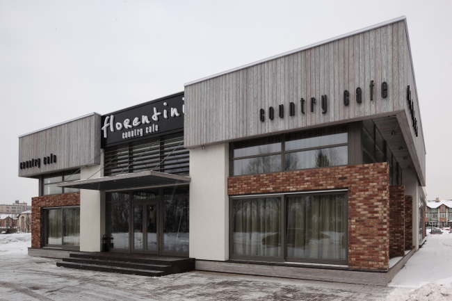 "Florentini" Restaurant © Roman Leonidov Architectural Bureau First of all, a few words about the new trend of the restaurant. In search of a sure-fire concept, the restaurant owners, first of all, took into consideration its location (this is how the "country cafe" definition came up), and, second of all, placed their bets on Russia's currently most popular cuisine (this is how the former Japanese restaurant gave way to the Italian one). Furthermore, it was decided that the new restaurant will be of a "multi-format" type - it will have in it the cafe zone, the dining halls, the banquet area, a wine room, and a children playing room. Considering the location of the restaurant, this is a rather wise move: people rarely come here to stop by for half an hour, and the restaurant needs to offer to them diverse types of recreation; however, the available premises would not have been sufficient to house such a diverse functional program. For this very reason, it was decided that, instead of "cosmetic" remodeling, the facade would be completely rebuilt.  "Florentini" Restaurant © Roman Leonidov Architectural Bureau The architects in fact doubled its area by extending the building in the direction of the residential area. The structure also grew taller: it has now a flat roof, and beneath it, there appeared the "air" - a fully glazed attic floor. Generally, there is a lot of glass here: while the predecessor of "Florentini" was in fact a blind "box", now this volume looks totally permeable. This effect is also achieved at the expense of almost complete absence of direct interaction between the facade materials and the glass: the narrow brick strip turns into a developed pylon that stands out considerably from the main volume, while the wooden paneling of the cornice frames the building along the edge of the roof, significantly stepping back from the walls.  "Florentini" Restaurant © Roman Leonidov Architectural Bureau The first thing that catches the eye, though, is the prominently neutral color of the building. The aged brick and the wood that is toned grayish - these two materials, according to the architects, will help to ideally connect the two "cornerstones" of the concept of the restaurant: country style and Italy. The wood, as if seasoned in the bright sunshine, reigns in the interior design of the restaurant as well. The architects use this material not so much for coating the ceiling and the walls, as for creating a system of girders and the main pieces of furniture. Thus, they are able to completely hide the carrying metal frame and create a surprisingly homogeneous place the color of baked milk. 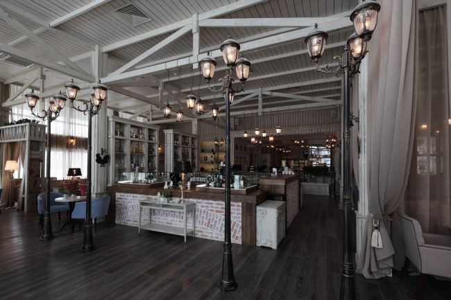 "Florentini" Restaurant © Roman Leonidov Architectural Bureau  "Florentini" Restaurant © Roman Leonidov Architectural Bureau The large height of the ceilings that gave birth to the girders also conditioned the inner layout of the restaurant. It is based on the principle of a single space, in which separate zones are designated very conditionally. This "openness" principle holds true even for the kitchen - it is of the "island" type and is in fact a "culinary" attraction that any guest of the restaurant can visit, that is partial to the art of the Italian cuisine. However, the heart of entire restaurant is the huge bar located in its center, whose "facades" are made from the same baked bricks as the facades of the building itself.  "Florentini" Restaurant © Roman Leonidov Architectural Bureau As designer Helen Volgina explains, “cutting" such a large area into separate rooms and little halls made no sense whatsoever - therefore, instead of the traditional walls, the architects use partitions of the same kind of wood, the upper tier of which is used to place green plants upon them. On a number of occasions, the function of the conditional partitions is performed by drapes of fabric of a sufficiently dense structure that perfectly matches the color of the wooden paneling.  "Florentini" Restaurant © Roman Leonidov Architectural Bureau This solution made it possible to fill absolutely all the premises of the restaurant with daylight, which, in the opinion Helen Volgina, is in fact the "chief designer" of this interior. This statement is hard to disagree with: penetrating through the huge windows that spans the entire perimeter of the building, the light of day gives the monochromatic palette a charming softness and authenticity. And in the nighttime this work will be performed by... the street lights. These are placed, naturally, not outside, but here, in between the restaurant tables. It all comes down (or up?) to the ceilings again - with their height, any lamps placed above the guests' heads would have looked small and insignificant; this is why after bringing into the interior the lush greenery and the materials employed in the facade of the building, the architects made a bold decision to supply it with even more elements of street decoration. And they did hit the mark here: radiating warm yellow light, these lamps organically supplement the Italian theme, reminding one of warm evenings on the boulevards and embankments.  "Florentini" Restaurant © Roman Leonidov Architectural Bureau Taken as the basis of the aesthetics of the interior of the restaurant, the atmosphere of sunny Italy is enhanced by the carefully selected accessories - convenient furniture with the soft velvety upholstering, the comfortable veil of blinds and diverse vintage decor that help one to forget for a moment about the true geographic location of this place. 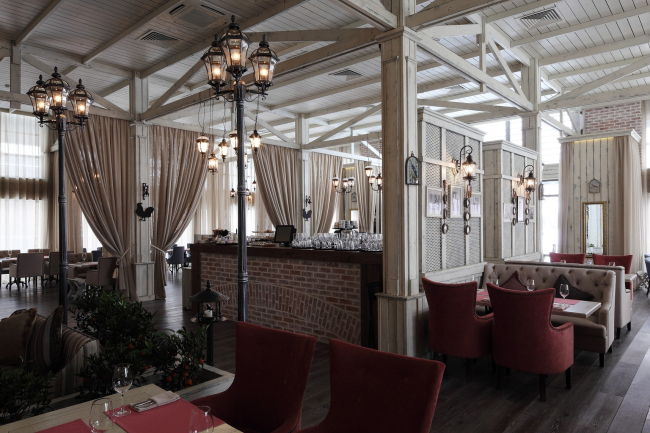 "Florentini" Restaurant © Roman Leonidov Architectural Bureau  "Florentini" Restaurant © Roman Leonidov Architectural Bureau  "Florentini" Restaurant © Roman Leonidov Architectural Bureau 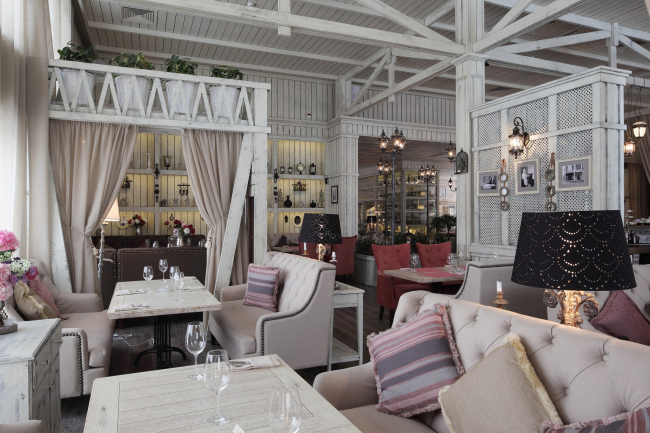 "Florentini" Restaurant © Roman Leonidov Architectural Bureau  "Florentini" Restaurant © Roman Leonidov Architectural Bureau  "Florentini" Restaurant © Roman Leonidov Architectural Bureau  "Florentini" Restaurant © Roman Leonidov Architectural Bureau 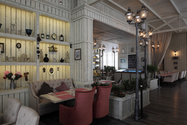 "Florentini" Restaurant © Roman Leonidov Architectural Bureau 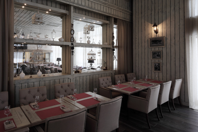 "Florentini" Restaurant © Roman Leonidov Architectural Bureau 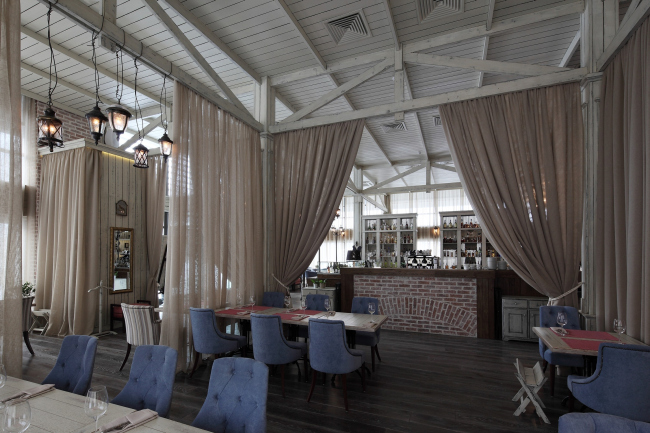 "Florentini" Restaurant © Roman Leonidov Architectural Bureau  "Florentini" Restaurant © Roman Leonidov Architectural Bureau 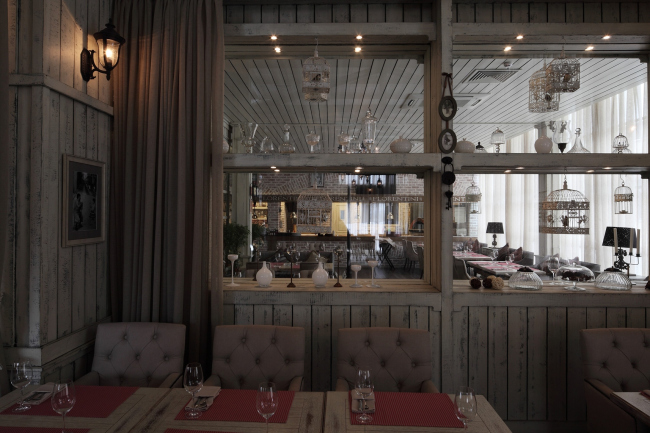 "Florentini" Restaurant © Roman Leonidov Architectural Bureau 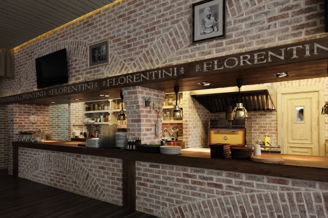 "Florentini" Restaurant © Roman Leonidov Architectural Bureau 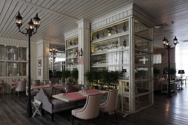 "Florentini" Restaurant © Roman Leonidov Architectural Bureau 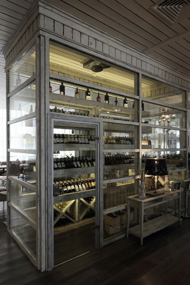 "Florentini" Restaurant © Roman Leonidov Architectural Bureau  "Florentini" Restaurant © Roman Leonidov Architectural Bureau 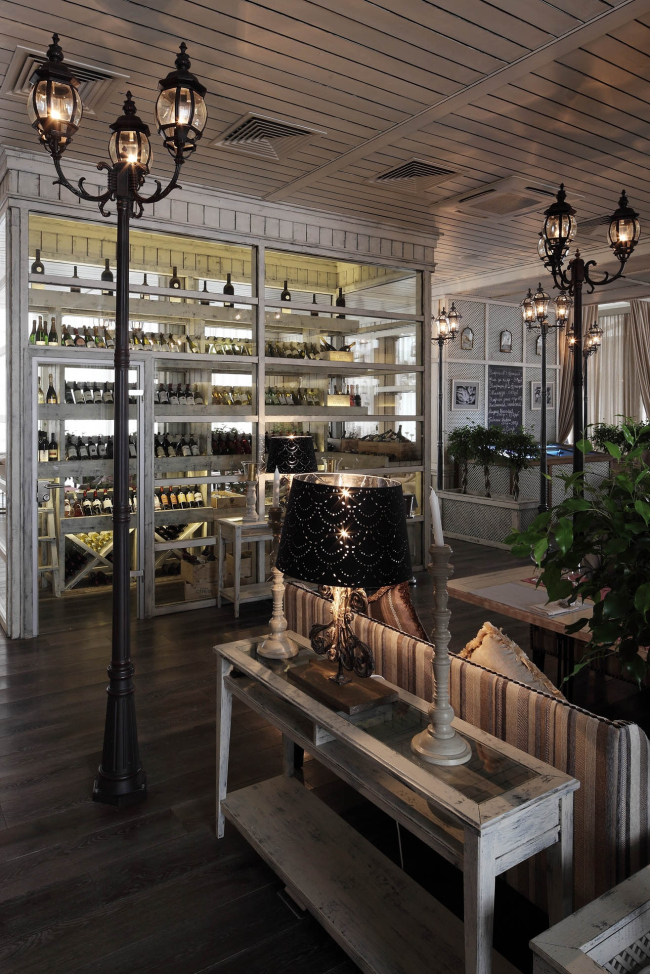 "Florentini" Restaurant © Roman Leonidov Architectural Bureau  "Florentini" Restaurant © Roman Leonidov Architectural Bureau  "Florentini" Restaurant © Roman Leonidov Architectural Bureau 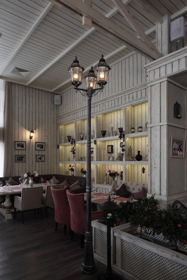 "Florentini" Restaurant © Roman Leonidov Architectural Bureau 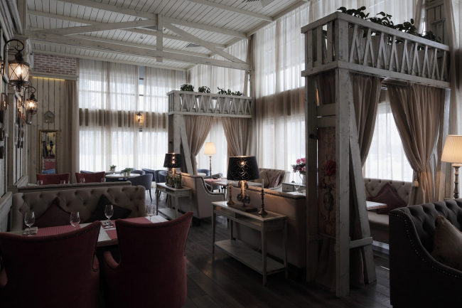 "Florentini" Restaurant © Roman Leonidov Architectural Bureau NoneNoneNoneNoneNoneNoneNoneNoneNoneNoneNoneNoneNoneNoneNoneNoneNoneNoneNoneNoneNoneNoneNoneNoneNoneNoneNoneNoneNoneNone |
|
