|
Published on Archi.ru (https://archi.ru) |
|
| 22.05.2014 | |
|
Symmetry and Proportion |
|
|
Alla Pavlikova |
|
| Studio: | |
| ABV Group | |
|
In the Grafsky Side-street, the architectural company "Group ABV" is designing a large office and business center. The office and business center will be built in the vicinity of "Alekseevskaya" metro station, in the place of the former "Variator" factory. The latter is subject to complete removal; the surroundings are dominated by residential houses, and thus the overall dimensions of the future complex were predetermined: it had to come out not taller than 65 meters and have an area of not more than 100 thousand square meters.
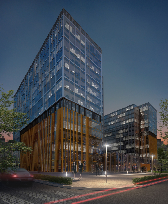
On the spot of the former production facilities, "Group ABV" from the very start proposed to build a complex of two 15-story volumes. The only discussion - first within the team, and later on with the customer - was on the subject of the entrance group: initially, it was to be replaced by a 4-story stylobate. It looked as if it was “embracing” both buildings - but this solution stole two whole floors from the buildings’ beauty. Because of this, the complex, on the one hand, makes a more "complete" impression but, on the other hand, looks really on the squatting side, and the authors ultimately placed their bets on the freehand arrangement of the buildings over the site.
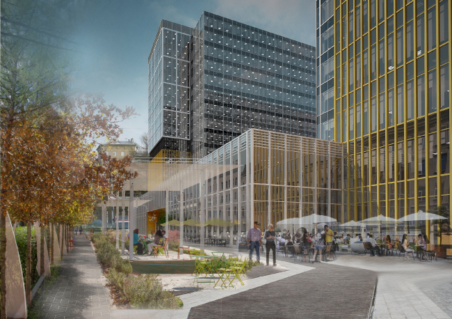
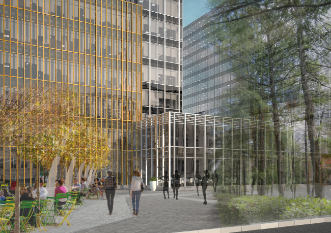
The fractional composition and thought-out finishing of the facades conceal the fact that both buildings in reality are absolutely identical and they are in fact mirror reflections of each other. Next what the architects do is introduce into the stained glass three colors - yellow, black, and gray metallic - which allows them to create three totally different types of facades. The yellow grid is used to accentuate the lower part of the buildings, putting one in the mind of Moscow's cozy courtyards with a multitude of small windows. Above it, the architects run a broad band that looks like the black lattice of the garden enclosure, and still higher up, almost merging with the sky, the transparent and visually almost weightless tower tops rise. Thus the authors succeed in breaking away from the heavyweight mono-volume that suppresses its environment with its "grand-scale" dimensions.
The entrance lobby is also "singled out" from the overall stylobate volume. The completely glazed parallelepiped forms the "intimate" building front, turning to the townspeople with its restrained, clean facade, deprived of any unnecessary details or decorations. Here, on the two lower floors, besides the entrance group as such, all the public territories of the complex are concentrated - the cafeteria, the restaurant, and the fitness club. During the summertime, the territory around the central entrance can be easily turned into the recreation area with open-air cafes under the quick-mount awnings. One of the customer's requests was the detailed elaboration of the inside territory of the complex. He wanted the planning to provide for most various scenarios of using the office premises. This is why the architects developed a few options that included both dissecting the floors into small offices and large-room plans meant for two to four large leaseholders. There were also solutions that provided for but one leaseholder using the entire floor. Under the entire territory of the center, there will be built an underground parking garage with an entrance from the side of the Grafsky Side-Street.
Special attention will be given to landscaping the territory which will include creating a lawn, beautiful flower beds, comfortable street furniture, high-quality pavements, and backlight that would enhance the beauty of the contemporary architecture of the complex. Important is the fact that the architects are doing their best not for the future leaseholders alone: the territory of the business center will be open to the general public and will become an integral part of the Grafsky Side-street.
NoneNoneNone |
|


