|
Published on Archi.ru (https://archi.ru) |
|
| 07.03.2008 | |
|
Towers on the crossing |
|
|
Julia Tarabarina |
|
| Architect: | |
| Sergey Kisselev | |
| Studio: | |
| Sergey Kisselev & Partners | |
|
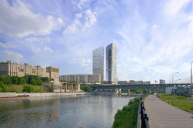
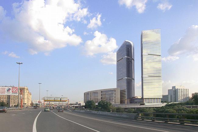
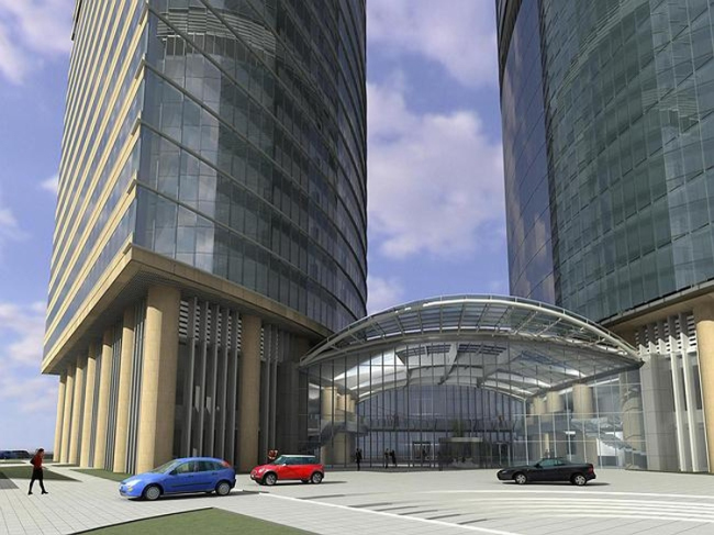
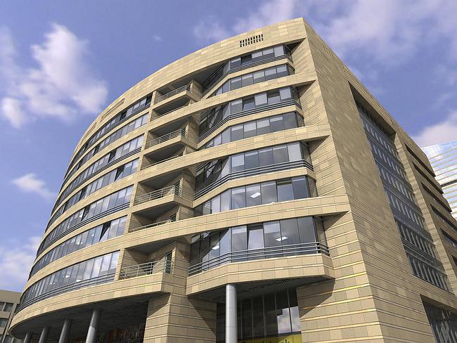
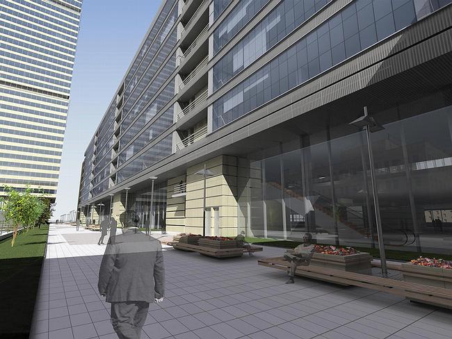
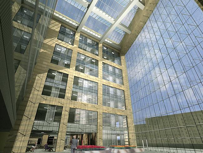
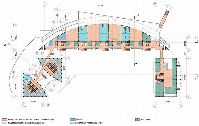
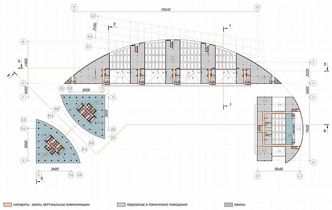
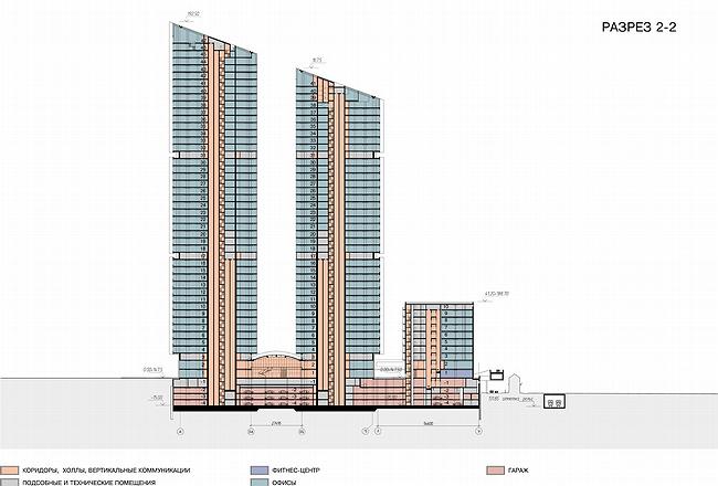
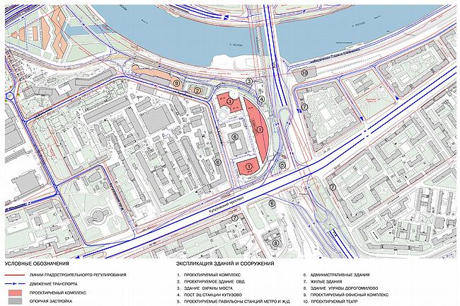
The complex “Miraks-Plaza” is a most large object that is being built today, designed by the architectural company “Sergey Kiselev and the Partners”. It is very large, the total floor space is 368 square meters. And the site for construction development is problematical. Yuri Luzhkov looking at the site said: ”…a most complicated one in Moscow, even in Russia” The pessimistic remark certainly is not reasonless. There is the metro, railroad and pressure canalization by the site’s boarders. Also, the difference in relief is around 10 meters, strictly saying, there starts the flank towards the Moscow-river. They also had to tear down and build again the building of local OVD and round the rectangular of the saved at its place “Prezident-servis” from the three sides. This is true, but the territory is not only complicated but also is very advantageous. Its location is very observable – it is right on the cross of the two important roads: from one side there is the prestigious yellow-stoned “Kutuzovka” of the Stalin period, and from the other – the third ring road, the main for the past years Moscow route. Diagonally, across the river and the bridge, there are the glass towers of Moscow-City, and one of the most famous of them is the “Federaciya”, which is also being built by “Miraks”. “Miraks-Plaza” by Sergey Kiselev will not just really grow from the crossing but figuratively as well. The two glass towers make its core, one is higher (47-storey) and the other is lower (41-storey). In the upper level their volumes are cut towards Kutuzovka, and it is done so smoothly and evenly, as if the glass giants are made of butter and a knife has cut them. The towers are positioned close and there is an X-gap between them that also seems to be cut from an imaginary “skyscraper pattern”, not along a straight line but along the two arches. The arched “inner” surfaces are entirely glazed and the flat “outside” facades are divided into storeys by horizontal stone stripes that add them materiality. Besides the described facade intrigue, the outline of the two towers remains plain and strict, very skyscraper-like. From some viewpoints the towers can be mistakenly taken for a part of the CITY ensemble, they blend with it very harmoniously. From the other views, particularly for those driving along Kutuzovsky Highway, the towers will look like an “ambassador” of the CITY, a giant, which separated from its party and stepped over the river to have a walk. In the main body of the towers there will be offices, in the upper level – apartments. The other part of the complex responds not to the CITY but to the Stalin period empire of Kutuzovsky Prospekt. The two 10-storey constructions, which facades are more of brown stone, round the “President-servis” in an arch. In fact, the external outline is inserted into a regularly-shaped oval – but this is well seen only on the layout, and those passing by can see only a dynamic curve that visually joins the two buildings into a single stone “stylobate” – a pedestal for the towers decorating the crossing, supporting the facade line of “Kutuzovka” and roundly finishing the neighboring institute district between Kulnev street and 1812 goda street. Except for the dynamic curve, the most impressive part of the “stylobate” is the 4 giant atriums of 10 storeys, on facades they will appear as huge panels of continuous structural glazing, like thin membranes between “inside” and “outside”. The glass surfaces without frames will hang on metal ropes fixed to strong reinforced concrete beam over them – the German engineers were engaged into strength calculations. Inside there will be as much light as outside – the roofs of the atriums consist of triangle skylight lights (quite like shades of Kiselev’s “Krasnaya Roza”), and the walls have a double solution – the side walls are lined by stone-glass squares and resemble the facades, the side wall that meets those entering atrium – is mostly of glass, like the entrance glass panels. Atriums turn into a full transition between the city and the interior – it will be warm there, and light as well. It would seem everything is clear now – we have an impressive object, bright, which uses all the advantages of its remarkable position. It is not surprising that the complex, together with “Federaciya” is one of the “significant” elements of “Miraks-Group” company’s advertising. But a medal has another side (this does not at all exclude the first one). The thing is that according to Sergey Kiselev’s idea, the location of the site is not advantageous, but on the contrary – absolutely inconvenient for construction development. First of all this concerns transport issue: there is no other way to get here except by the 1812 goda street and vehicles will drive up making a considerable loop. But yet, the location of the constructed “Miramaks-Plaza” the architects poetically characterize – “between the two Cities”. Here, by the line of the today third ring road, Ekaterinburg Kamerkollezhsky Val and the Stalin period circular railway, once was the boarder of Moscow. So, the new complex is right behind the border of the “old” capital, in a kind of border area. If imagine the once disappeared ground wall, on the line of which there is now the third ring road, “Plaza” would adjoin this imaginary city wall. Sergey Kiselev is convinced that it is better not to build anything huge either on crossing or by “boarder areas”. The best way is to leave the area empty. If it is necessary to construct there, then it must not be grand, without any extravagancy. Quite a paradox. The impressive, good for advertising object with the two towers, the typology and the appearance of which are obviously close to skyscrapers, from one side, and from another – the authors want to make the architecture of the complex most calm, and, strictly saying, intelligent. All these things – the boldness of a skyscraper, advertising showiness and effectiveness and intelligent care for the context, history of the place, wish to calm the energy of the architectural giant – are seemingly dissonant and are even opposite. They destroy each other. Either the skyscraper, or the context. Actually, there are skyscrapers in the closest surrounding. And the Kiselev’s “Miraks-Plaza” is somehow manages to combine the incompatible, playing with form and material. Regularly and exactly arranging different materials on the facades – glass and stone. Letting the towers grow, the “stylobate” curve – and at the same time taking them into firm geometrical frames of square and oval. Reducing the “city” of 368 thousand meter to the two volume structures: vertical parallelepiped and the “spreading” over the horizontal oval – and due to plainness of the forms achieving the needed level of composure and modesty.
NoneNoneNoneNoneNoneNoneNoneNoneNoneNoneNoneNone |
|
