|
Published on Archi.ru (https://archi.ru) |
|
| 07.11.2013 | |
|
Shadow of a shadow |
|
|
Julia Tarabarina |
|
| Architect: | |
| Stepan Liphart | |
| Studio: | |
| iCube Architectura | |
| Bavykin architects | |
|
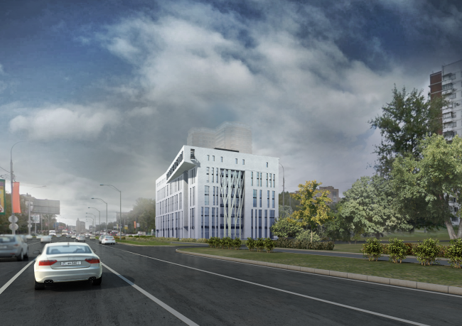
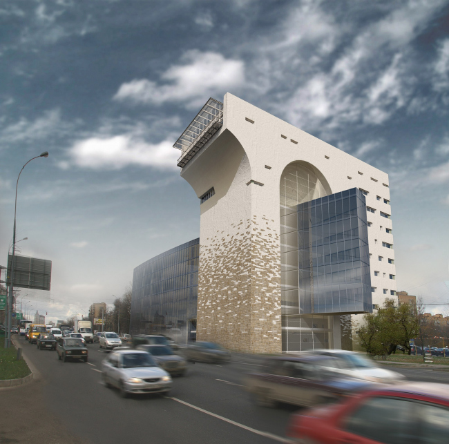
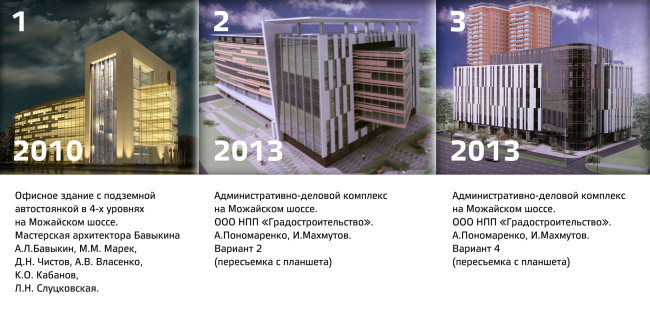
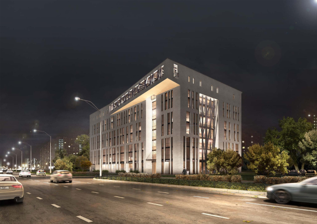
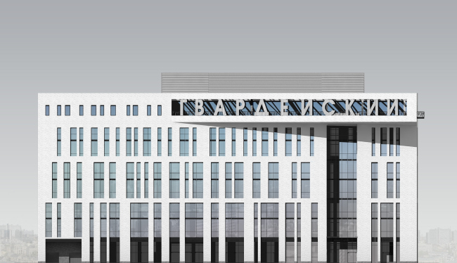
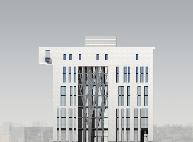
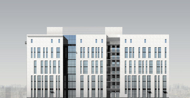
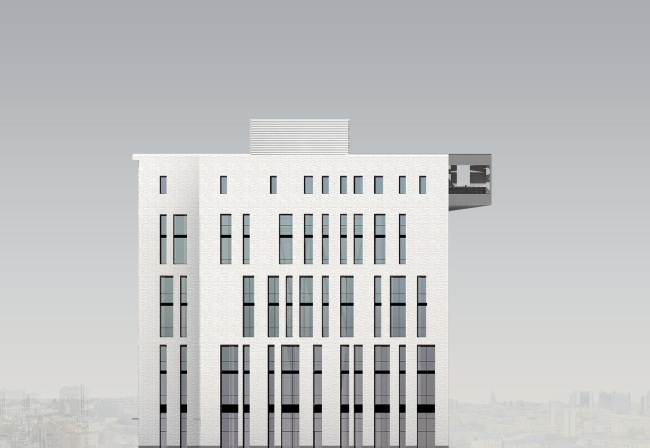
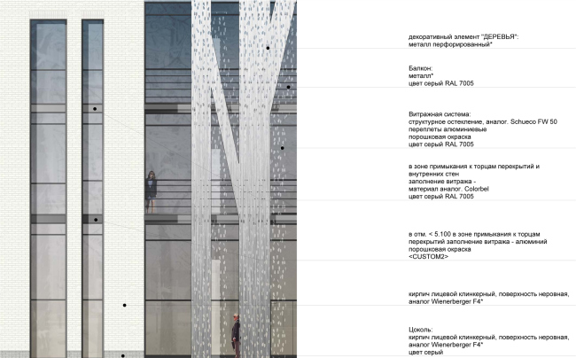
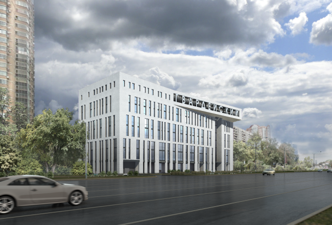
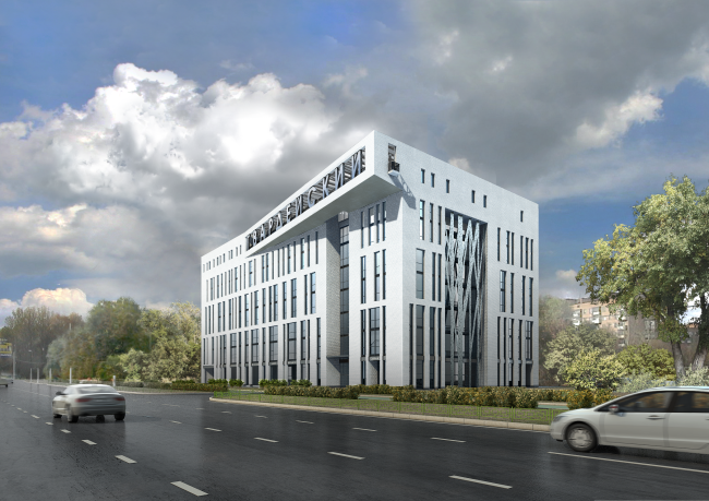
Office building in Mozhaiskoye Road’s project is once again approved by Moscow officials – now as a reworked design by Alexey Bavykin. NoneAt a recent meeting the work group led by the Moscow City Architect approved a project of a business complex in Mozhaiskoe Road in its new version created this year by Alexey Bavykin. Last July the project made for the same site and client by another firm (Research and Production Enterprise ‘Gradostroitel’stvo’ LLC) had been discussed at the Moscow Architectural Council’s meeting and the members of the Council unanimously decided that the previous design version of the same building – also by Bavykin – had been more compelling. The client once more turned to the Bavykin's studio for a design and got from them new elevations and somewhat corrected plans (the plans had been already approved so it was not allowed to radically change them). Now this project is approved by the work group and it seems that it would be realized. We are following this project since 2006. The story of its discussion and approval is extremely complicated and curious. It even reflects – obviously, only to a certain degree – how notions of architecture have changed in Moscow during last 7 years. Through its example professionals discussed idea, plasticity and contextuality in architecture instead of gross area and diagrams that being a rare occurrence for Moscow in itself. Later on, the project turned out to be a test of sorts because during these discussions many prominent figures of (then) Moscow architectural scene all of a sudden started to reverse their views. Mayor Yury Luzhkov, apparent devotee of the stylization idea, criticized the project for its ‘ruined state’; Kirill Asse, architect and critic who had never been known to support the Mayor’s ideas suddenly agreed with him this time, though his motivation was not the same as Luzhkov's. Only architecture historians liked the project which was more than understandable: one could not help being impressed by the bravery of the architect who took the liberty of drawing in the wide Moscow street a gigantic shadow of either Joseph Bové’s Triumphal arch or a Roman aqueduct. NoneNoneBut one cannot go against the community (and the community rarely takes into account historians' opinion) and now even Alexey Bavykin himself acknowledges that his idea of transformation of a regular office centre into a gigantic visual attraction was not quite valid. Everything has its place and time. In 2010 the arch turned into a square pylon inspired by the ‘classicized’ modernism of the 1980s and was approved by the Public Council led by the Mayor (still Luzhkov at the time). Then the client gave the project over to the ‘Gradostroitel’stvo’ firm that proposed three even more ‘composed’ design versions of lesser height which were presented at the above-mentioned Architectural Council’s meeting in July 2013. And, finally, over the past few months Alexey Bavykin's studio produced a new ‘edition’ of the project. The authors of the third design are Bavykin himself, Mikhail Marek and Natalia Bavykina. The architecture of this version is very reserved, the elevations clad in small bricks are almost white. Narrow windows join together three floors at the lower part of the building and two floors at the top; their rhythm is slightly broken down and they remind of a keyboard instrument or a one-dimensional barcode. At the top the outer wall becomes thicker, frequency and height of ‘line bar’ windows is gradually being reduced. The same thickening of the mass takes place at the corners which is rather in the spirit of the classical paradigm than of the avant-garde one. NoneNoneNoneNoneNoneNoneNoneThe first project, that of 2006, was the shadow of Bové’s arch, but only the shadow of this arch remains now. Or, rather, the present shadow is left by the pylon proposed in 2010 and by the halfarch-like ruin that was designed at the very beginning. ‘The shadow of the pylon’ are high glass loggias that cut through the façade in points where the pylon has been before that. The glass surface of the elevation that faces the city centre was once cut through by an dynamic ‘prow’ but now it is covered by a large ornamental grill depicting trees (we remember the tree trunks from the first version of the project too so this motive is also preserved). NoneNone‘The shadow of the ruin’ is a small skewed console pulled out from the volume of the top floor towards the street (that is how shelves are pulled out from the wardrobe where they are attached to the single joint). At the long side of the console the name of the business centre is written in large letters, and at its lateral end (that looks to the city centre) there is the most interesting detail of the new project: ‘a balcony of a lonely smoker’ marked as a particular point of Alexey Bavykin's hand by Grigory Revzin (or was it Nikolay Malinin?) back in the 1990s. I would interpret this detail as a somewhat prideful caption ‘here we are, we can overcome any obstacle’, and I won't be surprised if the architect Alexey Bavykin with the building built and its story of seven (by that time it will be eight or even nine) years finally ended will make time to mount this balcony and have a smoke while looking at the Bové’s arch, at the Kutuzovsky Avenue, at Moscow. |
|
