|
Published on Archi.ru (https://archi.ru) |
|
| 26.11.2013 | |
|
Deep Alternative |
|
|
Anna Martovitskaya |
|
| Studio: | |
| Sergey Estrin Architects | |
|
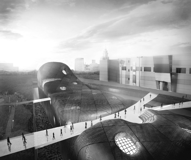
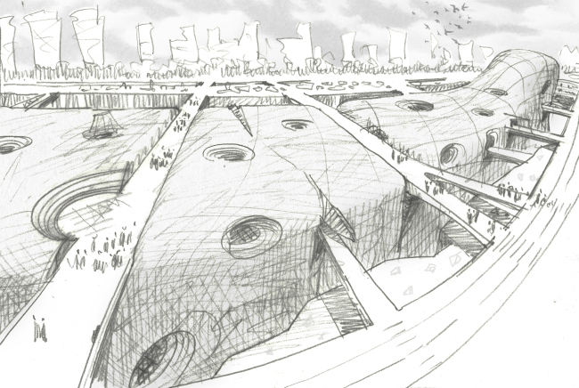
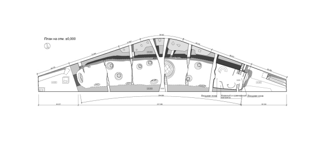
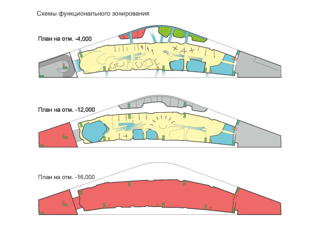
Sergey Estrin shares with Archi.ru about his project that was developed for the first round of the competition for the new building of the National Center for Contemporary Arts. Just like all Russian architectural bureaus, Sergey Estrin Studio took part in the contest for the project of the new building of the National Center for Contemporary Arts - not with the qualifying application but with a specially designed concept for the museum. This project did not pass into the second round but for the architect it became not only an interesting professional challenge but also the result of a complex meditation about the very venue and the purpose of the future museum, and this is exactly why Sergey Estrin decided to show it to the public. "I will not deny the fact that one of the things that made me publish my project was the interview with Sergey Skuratov in which he said that he made a decision not to take part in the contest for the new building of NCCA because he thinks that the place where the new museum is going to be built is not really fit for this purpose - Sergey Estrin shares - I feel the same about this place. The Khodynskoe Pole Street, in its current state, seems to me unfit for the museum to be built at, this is why one of the goals of our project was finding a compromise between the gentle cultural institution and the rather aggressive surroundings". 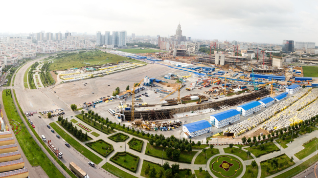 Current state. Photo from newncca.ru At this point we will remind you that the complex that must become the main national center for displaying and studying modern art in all its manifestations will be built at the Khodynskoe Pole Street. Concurrently with NCCA, there are a few other projects that are in construction there, including two hotel/office complexes, a shopping mall, a park on the spot of the former airfield runway, and even a new subway station. Most of the issues out of this list are caused by the shopping mall - a giant structure (its developer proudly promises that his building will be Europe's biggest one in its class) that even faces the future museum not with its entrance but with its loading bay with two wide ramps. And, even though the contest specifications allowed for a rather tall building (up to 170 meters), Sergey Estrin decided that creating yet another high-rise in this case would not be the right solution here. "First of all, the town-planning landscape of the "Khodynka" all but completely consists of such verticals as it is, and adding to them yet another one would have made, to my mind, little sense - all the more so because this building could get lost anyway against the background of the huge shopping mall that is in construction. And, second of all, and this was crucial for me, a museum simply cannot get involved into a losing game of competing with a shopping mall - it is below a museum's dignity to be supplement for the shopping, an entertainment for those people that were, say, late for the action movie in the mall's movie theater". 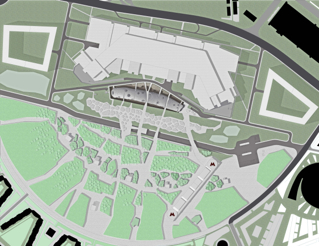 The disinclination to enter into a direct dialogue with the shopping giant and create for it a partition of sorts pushed the architect to the idea of partially sinking his building into the ground. Of course, it could have been sunken completely underground - but then the building would have hardly attracted any visitors, so Sergey Estrin decided to make not an "invisible building" but a volume that is placed into a sort of a shell that is able to "neutralize" the immediate town-planning surroundings and create around it a self-sufficient medium that is resonant with the theme of modern art. In fact, what the architect does is sink the entire land site that was allotted for the construction of NCCA 24 meters below the ground level creating on the border of the former runway a canyon of sorts. In the center of this area, the museum volume is placed, that is elongated, with sloping sides and a head that is raised in the direction of the future subway station. Its roof is straddled by a few pedestrian bridges that are meant to connect the shopping mall and the future park, while the spaces that are left between the building and the walls of the canyon are used for organizing a circular pedestrian route that seems to take the visitor completely out of today's Moscow. Creating an atmosphere radically different from the aura of Khodynka and the wild rhythm of Moscow in general was, probably, what this whole project was all about for Sergey Estrin who thinks that the alternative reality is in fact the core of the modern art, the field where its heroes operate. "It was in the oppositional and underground state for such a long time that even now, in spite of the increased wealth and the rising tourist activity of the population, the interest to the national contemporary art is all but extinct - explains the architect - And the image of NCCA that we came up with perfectly reflects that: Russian modern art is only trying to make it above the "surface" of life". 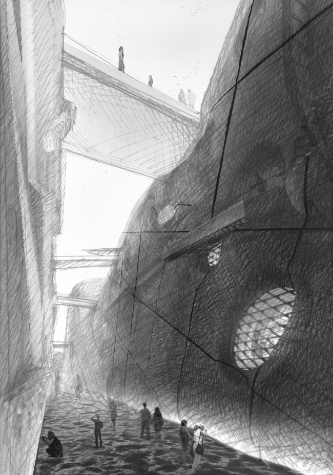  The outside walls of the canyon, whose width is some 20 meters, were to be coated with rough concrete or uncut stones, the bottom was to be treated as solidified lava, while the facades of the museum were to be upholstered with a material that looks like hide or thin snake scales. This "hide" was not supposed to be perfect, by the way - at some places it comes apart and literally bursts at the seams - in this way the architect wanted to underline the ambivalence of the notion of "modern art". The body of the "whale" has in it a lot of small craters – the windows that will let the visitors look inside and will probably entice those who may have not initially been planning to go to see the expositions. In the center of the roof, next to the widest bridge from the park, the architect proposes to make an open-air amphitheater, allotting a dedicated volume for the restoration studios that, very much like a stalactite, gets built upon the opposite wall of the "canyon". 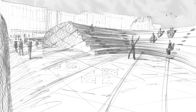 The "wonder fish" rises above the ground only some 3-4 meters and at the expense of its plastique and textured finish it looks not so much like a building but rather like a landscape object, a flesh-and-blood offspring of the park that is being created here - and this shows through particularly clearly on the master plan. It was exactly the effect that Sergey Estrin was trying to achieve reasoning that, considering the excessive proximity of the mall, a building of any configuration is doomed to look like one of its wings or annexes. It was exactly because of this that the architect opted out of re-doing his project after the contest specifications got a new clause about the impossibility of using the underground space. "We decided that we would leave the concept as it is and thus will make a statement about our attitude towards the very idea of building a National Museum at the backyard of some shopping mall - says Sergey Estrin - As it seemed to me, there was a fair chance that our voice would be heard but, alas, this was not the case".  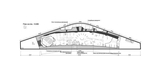   NoneNoneNoneNoneNoneNoneNoneNoneNone None |
|
