|
Published on Archi.ru (https://archi.ru) |
|
| 06.11.2013 | |
|
Two Arrows |
|
|
Anna Martovitskaya |
|
| Architect: | |
| Andrey Asadov | |
| Studio: | |
| ASADOV architects | |
|
The contest project of a new airport in Rosfov-on-Don - developed by "Asadov Architectural Bureau". The results of the international architectural contest for the project
of the airport complex "Yuzhny" ("Southern") were announced
in Rostov-on-Don on the 10th of October. As was already reported by
"Archi.ru", this contest was won by the British bureau "Twelve
Architects". "Asadov Architectural Bureau" won the second place;
we are publishing their project. This contest of architectural concepts was all about finding the right
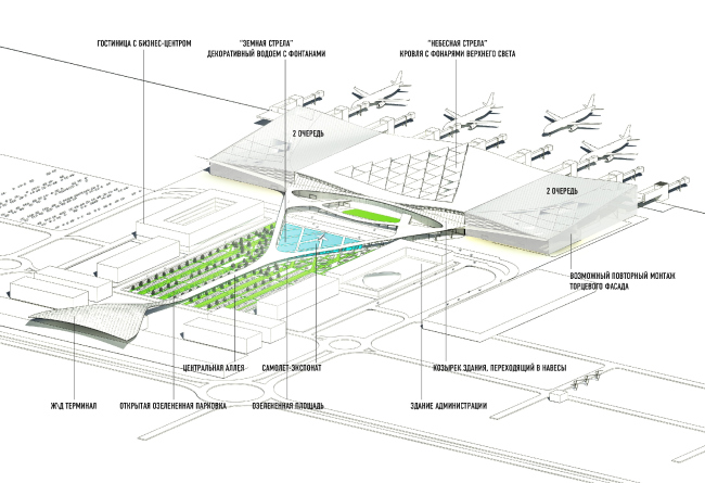
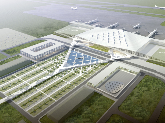
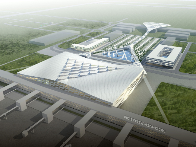
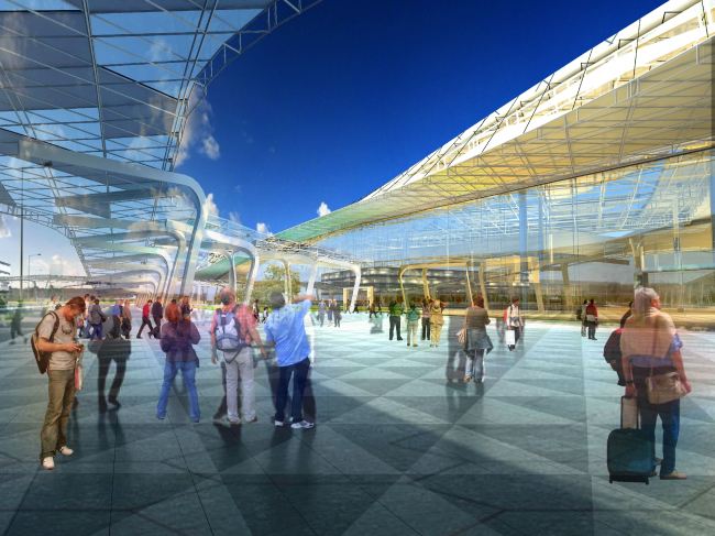
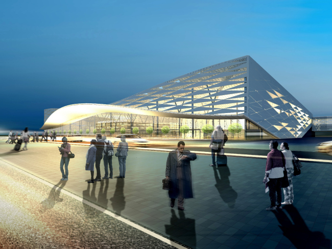
building worthy of becoming the symbol of In the original version of the project, such elements were the gently sloping arches. They would blend into one another, tying into a single entity the roof, the walls, and the extended entrance marquee turned to the pedestrian-only square in front of the airport building. The intertwining arches created by "Asadov Architectural Bureau" got high critical acclaim from the judging panel, first breaking into the second round of the competition, and then into the super final when the experts started choosing between the British and the Russian projects, at the same time recommending their authors to develop their initial ideas, i.e., show what else they were capable of. In particular, the experts strongly recommended Asadov's team to make their project look a little bit more dramatic, as well as consider the possibility of creating a covered overpass to the car park located on the opposite side of the square. It was these particular guidelines that conditioned the end-result image of the "Yuzhny" airport.
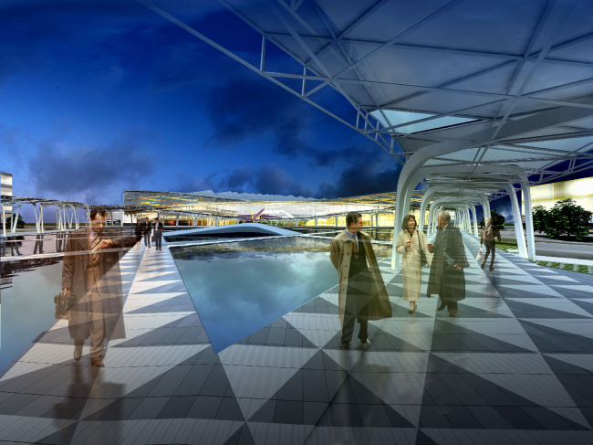
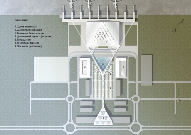
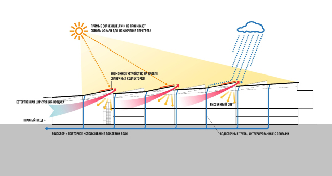
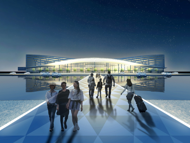
"We felt that stretching the usual-type awning from the airport to the car park would have been too much of an obvious choice, so we came up with what we call a "perimeter" awning that smoothly bleeds into the roof and skirts the part of the square that has on it a decorative creek with fountains" - Andrew Asadov explains. On the plan, this creek has the shape of an equilateral triangle that adjoins the airport building with its base and turns its opposite angle to the car park and the future railway terminal. Encasing it into an elegant "frame" of slender pillars supporting the pedestrian galleries, the architects thus highlight its geometrically perfect shape. Thus the Russian team came up with the image of an "arrow" that clearly reads on the plan: scaled-down, such triangular "arrow" signs are generally characteristic of airport info graphics, where the most important question is just in which direction to go. In this case, the "arrow" is pointed towards the city and in the direction of its communications - this is why the architects called it the "ground" arrow, deciding to balance it off with the "sky" one.
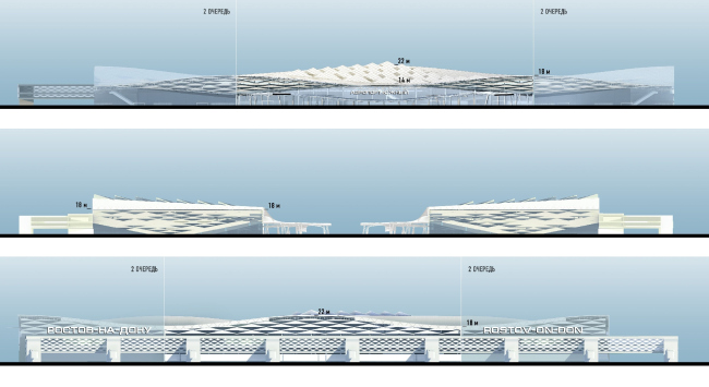
Another arrow that points in the direction of the takeoff is the same
equilateral triangle, only it cuts not into the square before the airport
building but its roof. The "sky arrow" is made up of triangular
skylights - a multitude of tiny arrows pointed in the direction of the runway. Their
direction accentuates the inclination of the roof that rises smoothly towards
the boarding gates. And, so as to keep the direct sunlight from overheating the
building, the architects propose to allot some of the zenith triangles for the
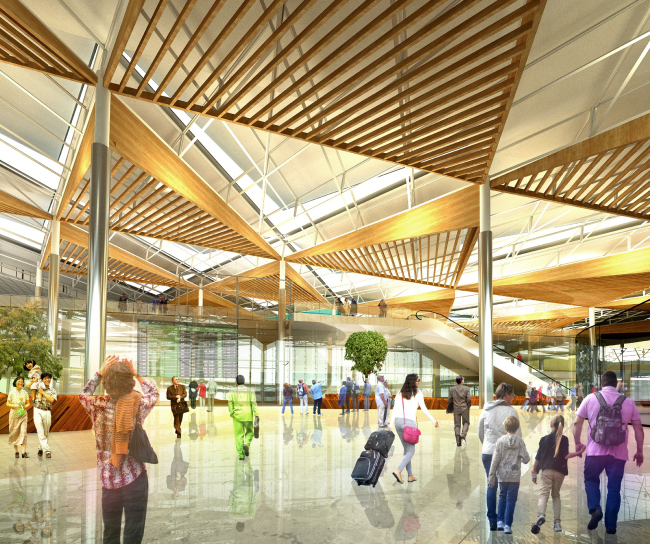
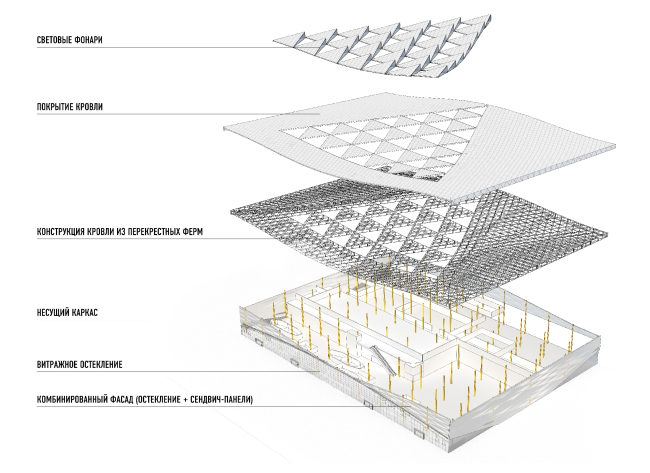
solar batteries. In the interior design, the architects also put a spin on the "arrow" theme. While from the outside the central part of the roof looks as if it is made up of multicolored scales, from the inside the roof lights look like imposing cones that draw the sky closer to those that are about to soar up to it. The bearing part of the roof consists of metallic crossbeams that the architects propose to decorate with the triangles of the acoustic screens. These "wooden" panels also have an "arrowed" shape - only they point downwards, to the ground.
It is generally worth mentioning that the "triangle" theme
that was introduced at the finishing stage of the project, ultimately became
the key one here. The architects assemble the shell of the terminal building
also from triangular modules - they are the most rigid from the constructional
standpoint and they are geometrically flexible at the same time - meaning, they
allow the architects to create dramatic multi-layered surfaces. Combining,
within the resulting framework, stained glass and "sandwich" panels,
the authors achieve an interesting visual effect - the facades of the airport
building look as if they were cut from paper and as if they are actually
fluttering in the wind. This feeling is strengthened manifold at the expense of
the outline of the roof that soars not only towards the runway but also towards
the side facades of the building forming something that looks both like a giant
wave and two wings, proudly spread.
 None None None None None None None None None None None None None None None None None None |
|