|
Published on Archi.ru (https://archi.ru) |
|
| 10.09.2013 | |
|
Dream Factory Mirrors |
|
|
Anna Martovitskaya |
|
| Architect: | |
| Julia Tryaskina | |
| Studio: | |
| UNK | |
|
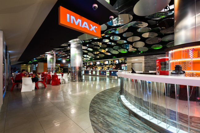
UNK Project designed the interiors of the public areas of Sochi's "Luxor IMAX" Movie Theater. The movie theater is situated in the building of
"MoreMall" that was only built last year. The three-story building
with a total area of 168 thousand square meters appeared in the very heart of
the resort city and is already recognized as the largest complex of this kind
in The anchor architectural image for this project was
hard to find. According to Julia Tryaskina, it was clear to the architects
that, on the one hand, it must somehow be connected with the sea but, on the
other hand, what they really wanted to do was to break away from the hackneyed
metaphors. Water, glitter of sunlight, sea foam, and underwater creatures - all
of this insistently suggested itself to be used in the design but the
architects continued to filter the associations that came to their minds hoping
to find something that would be truly original. The sea bottom theme seemed to
be appropriate also because of the fact that one of the main decorations of the
complex is a giant lantern executed in the shape of a glass wave billowing over
the main volume of the building. So it made perfect sense that while, thanks to
this lantern, the shopping areas were permeated with sunbeams, the artificial
backlight of the movie theater is something like their reflection, as if the
sunlight had passed through the blue.
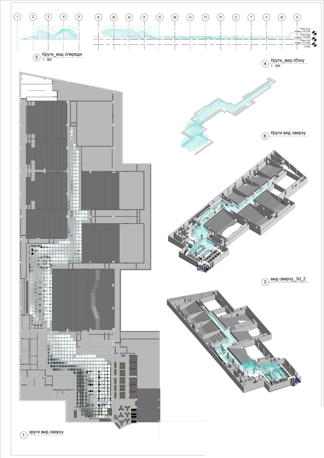
The solution was also prompted by the very
configuration of the movie theater premises: when the architects developed its
layout with the required number of halls, restaurants, and ticket windows, it
became obvious that on the plan the public territories have the shape of a few
overlapping rectangles that gradually transform into a narrow corridor that
ultimately leads to the movie halls. Something like a protuberance or the
proverbial ever-fading ray. In order to convey the impression of the light that
is fading away, the architects, of course, were to use the appropriate lighting
system but even here they chose to do some "out-of-the-box" thinking.
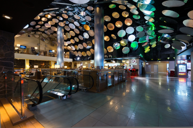
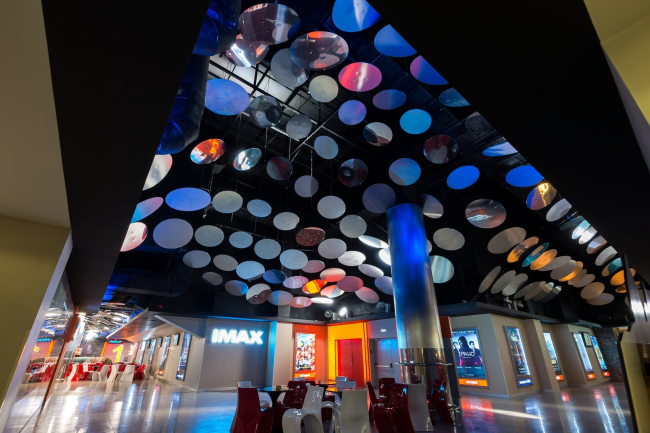
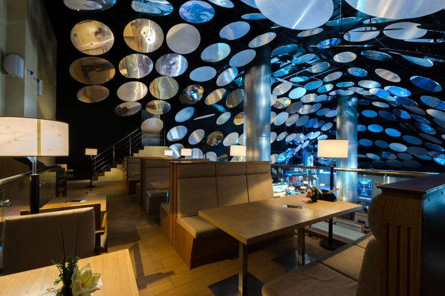
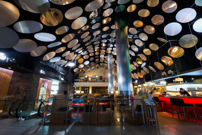
Situated on either side of the broad corridor, the
movie halls are connected to the entrance area by the interior
"shell" executed in the shape of a wave-like flowing sphere that,
bypassing the suspended communications and the different-height slabs of the
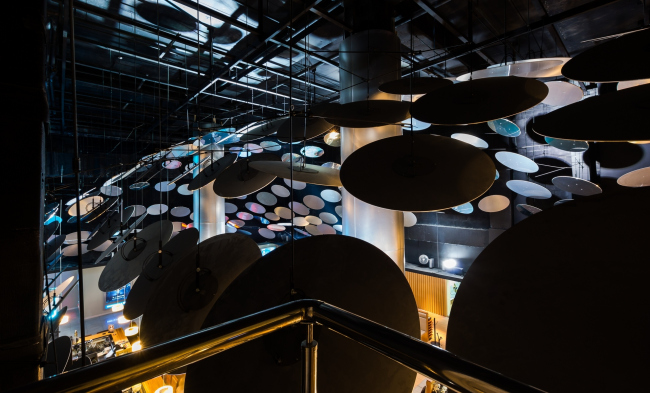
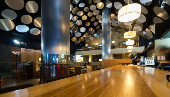
intermediate floors, smoothly goes from one area to the other. This sphere is
formed by the round polished mirrors that are placed along the entire perimeter
of the ceiling and at different angles. The abundance of mirrors on the ceiling
literally makes one head spin but, just as the architects planned, does not
cause any direct associations - the enchanting space can be treated as
"underwater", and as "cosmic", and even as
"musical".
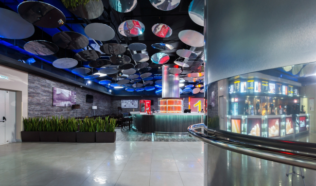
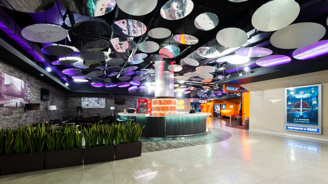
The mirrors, most of which are opaque ones, play the
key part in the lighting scenario of the halls because it is these mirrors that
diffuse the light from the spotlights creating an illusion of the flecks of
light of various intensity. As Julia Tryaskina explains, all the mirrors here
are different both in their diameter and in their type of surface: the large
circles alternate with the small ones, and some of them are opaque. The latter
take on most of the light from the spotlights and diffuse it; by gradually
increasing the number of opaque surfaces as one progresses farther inside from
the entrance, the architects achieve the effect of light that is smoothly
fading away - just like it gets darker and darker in the deepening water, and
which perfectly matches the atmosphere of a movie theater where bright light is
always undesirable.
The abundance of the mirrors set at different angles
to the ceiling helps conceal the spotlights themselves which adds extra
intrigue to the space that the architects get. The same purpose is served by
the ceiling design - it is also painted opaque which erases the visual
boundaries of the room creating an illusion of being in some fantasy grotto.
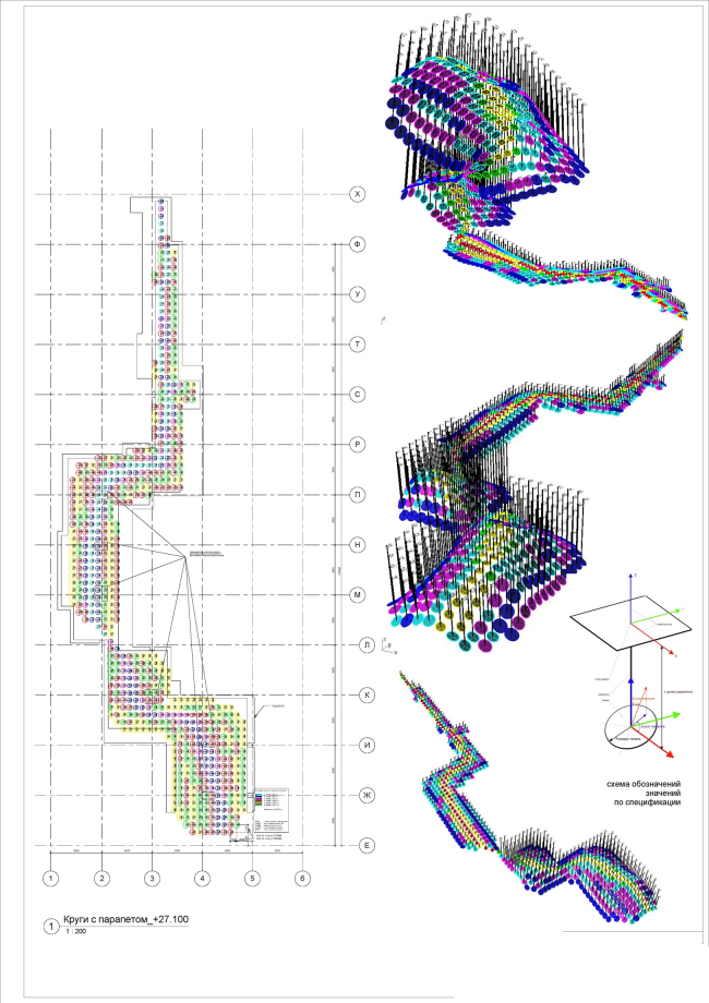
The shell of the hundreds of round mirrors, for
designing which UNK Project used 3-d modeling software, became the main element
of the interior design, highlighting the individuality of this particular
"Luxor IMAX". In such a project as a movie theater with its really
rigid pre-calculated layout that the architects were to obey, the passage from
the ticket windows through the restaurants and to the movie halls became in
fact the only place where maneuvering was possible. And UNK Project used it to
the fullest creating an interior that is as functional as unconventional.
NoneNoneNoneNoneNoneNoneNoneNoneNoneNoneNone |
|
